• Skip to primary navigation
  • Skip to main content
  • Skip to primary sidebar
  • Skip to footer

RealClimate

Climate science from climate scientists...

  • Start here
  • Model-Observation Comparisons
  • Miscellaneous Climate Graphics
  • Surface temperature graphics
You are here: Home / Surface temperature graphics

Surface temperature graphics

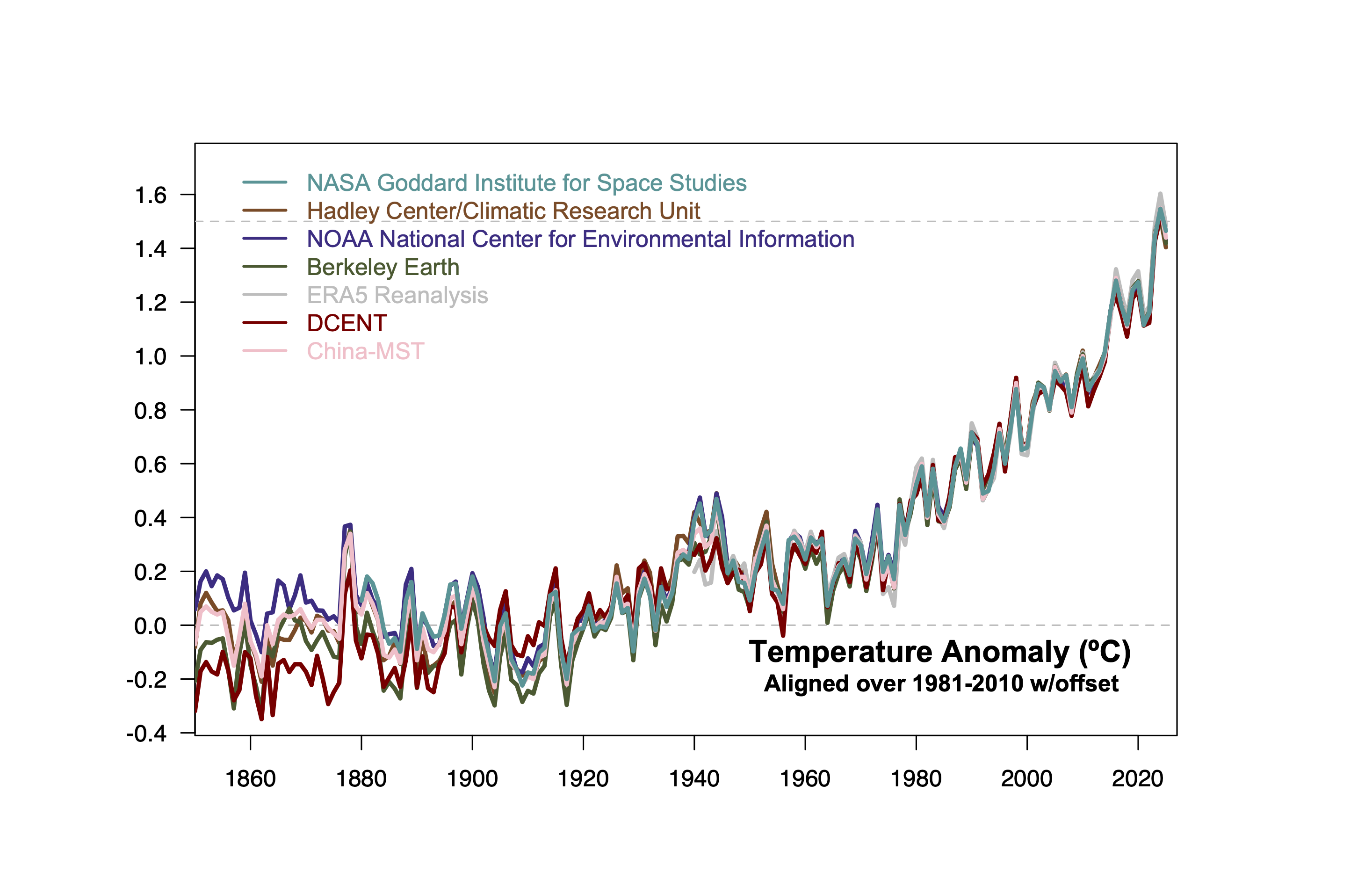
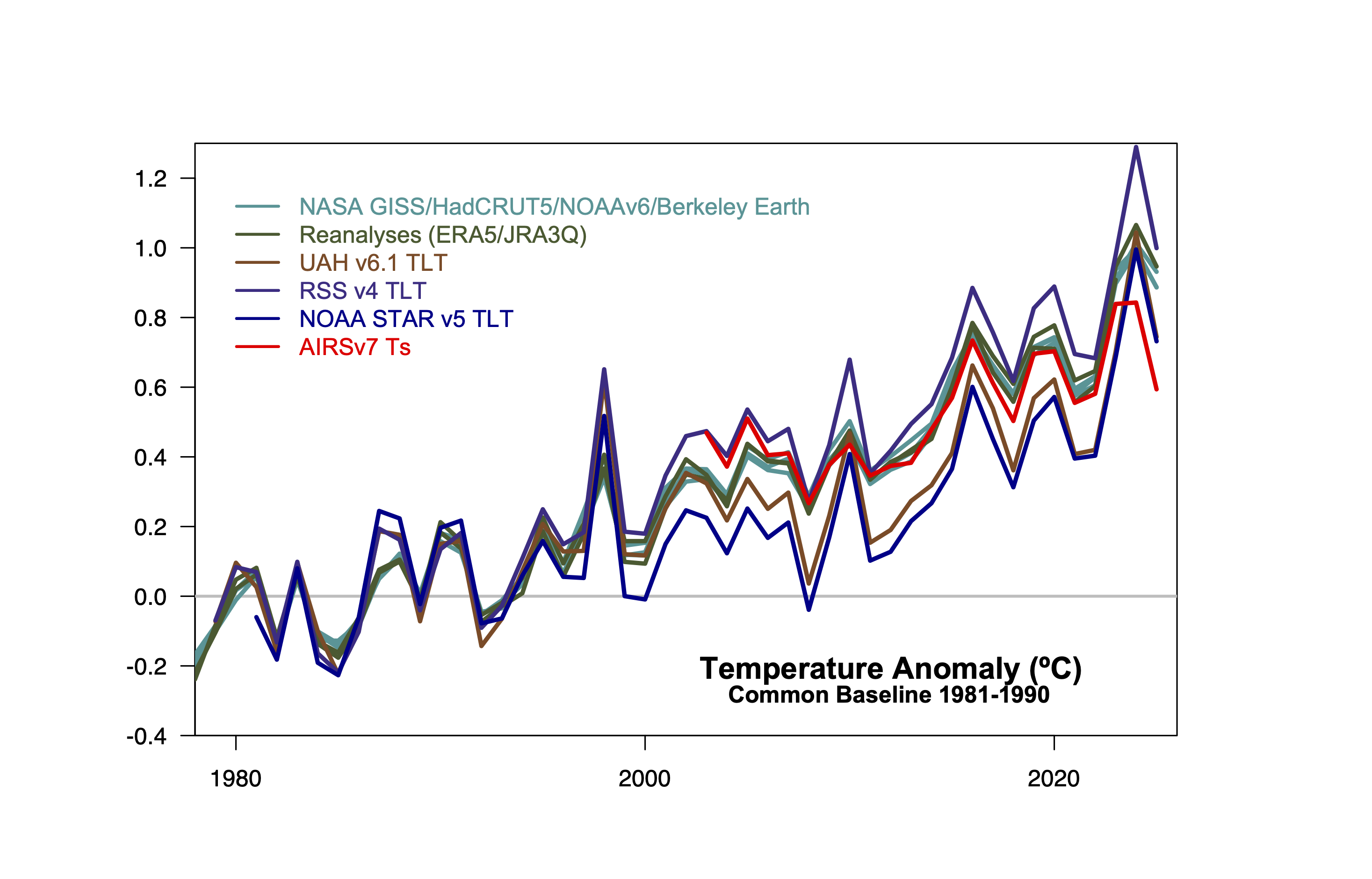
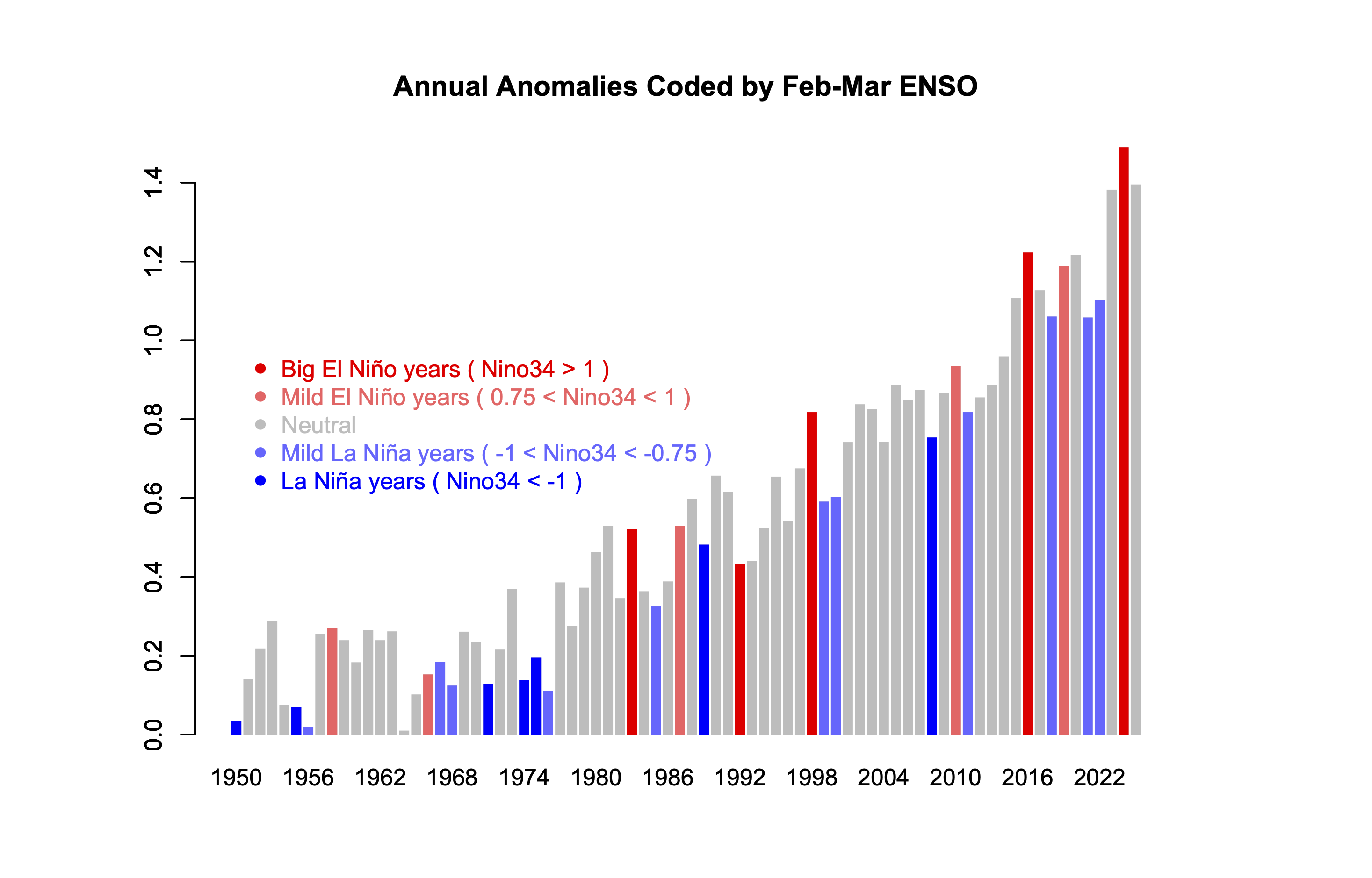
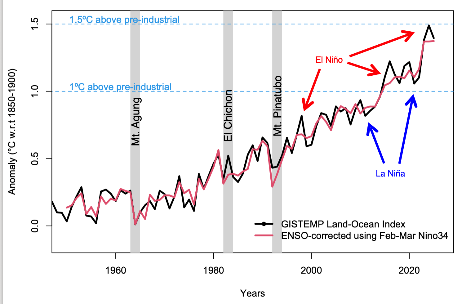
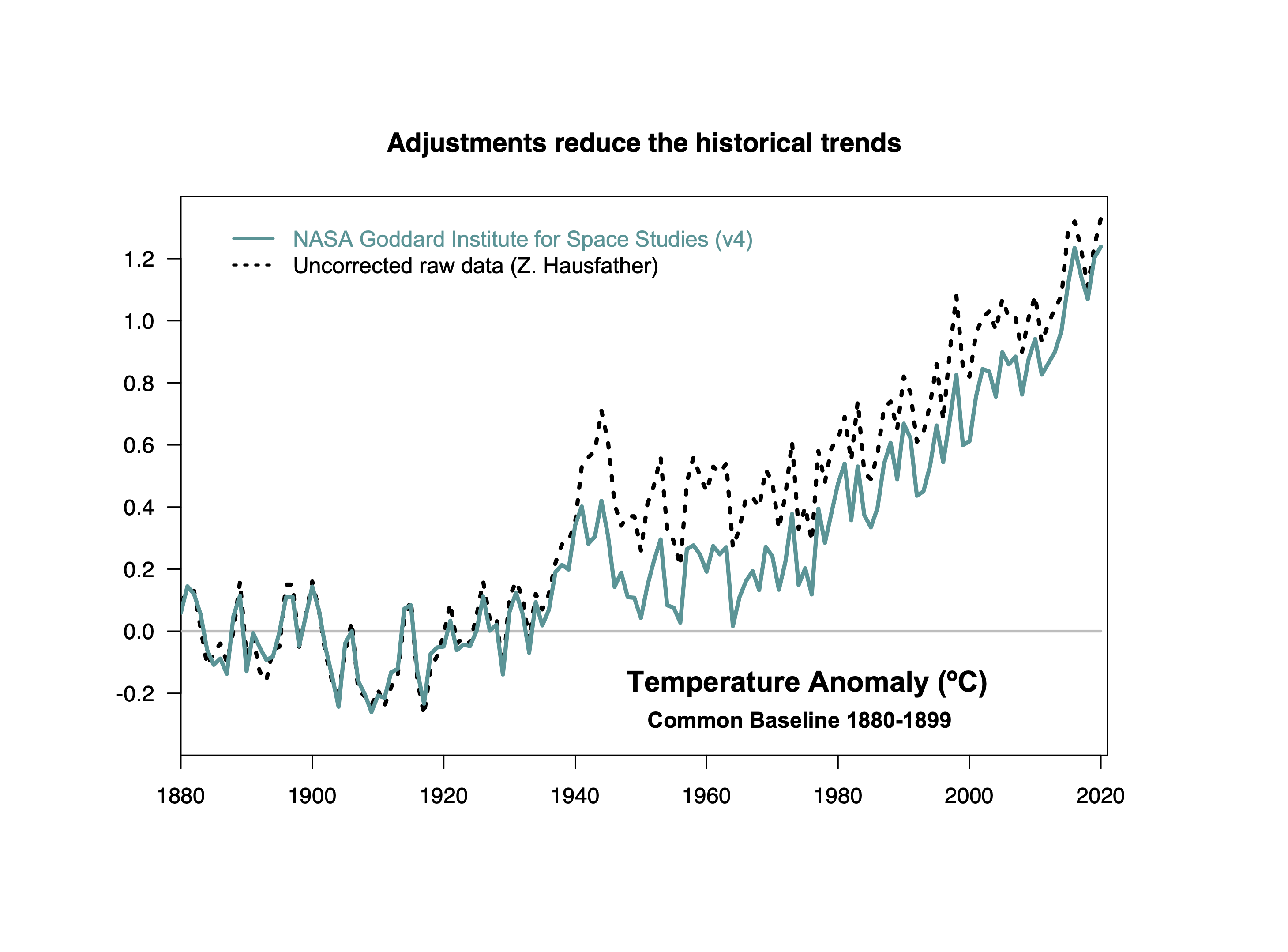
This page is a repository of graphs we’ve made related to the surface (and near surface) temperature records, along with some description of what was done. Graphs will be updated as time goes by, and as datasets undergo revisions, or as new datasets are produced. This is not comprehensive, but it does comprise of graphs that we’ve found useful to come back to over the years. As with all graphics here, you can use these anywhere as long as there is credit and a link back here.

Comparison of four instrumental records which all coherently show warming since 1880.
Multiple independent global surface temperature products show a very coherent pattern of change over time. While there is overlap in the weather station inputs and ocean data, the methods for the correcting for missing data, inhomogeneities, spatial sampling etc. are independent. [Last discussed. Updated: Jan 2025]
There are now multiple surface and near-surface temperature products. Those that are based on in situ weather stations (as above in the previous graph) are the most commonly shown, but there are also reanalyses (ERA5 and JRA-3Q) that assimilate real time data from a range of sources, and direct satellite retrievals of either ground temperature anomalies (AIRS) or the tropospheric lower temperature (TLT) (from RSS/UAH/NOAA STAR). While all products show a clear warming since 1979 (or 2003 for AIRS), there are structural issues that can cause a spread in the trends, more so for the satellites than the in situ records. [Last Discussion, updated: Jan 2025].
The most important source of interannual variability in the surface temperature record relates to the El Niño/Southern Oscillation (ENSO). Most (but not all) warm records are associated with a positive phase (El Niño). This graph codes each calendar year anomaly by the state of ENSO in Feb/Mar of that year. ENSO index is the Nino34 (Last discussed, Updated Jan 2025).
The impact of ENSO can be (usually!) removed statistically which more clearly reveals the impacts of the three biggest recent volcanoes and the long term trends. The ENSO corrected index is the residual after removing the statistical impact of the Feb/Mar ENSO index from the Nino34 (Last discussed, Updated Jan 2024).
Comparison of global temperature estimates using raw (unadjusted) data and the data adjusted for non-climatic factors. The trends just using the raw data are larger.
There are multiple inhomogeneities in the ocean and weather station records – due to instrument or practice changes, station moves, time of observaiton bias etc. The net effect of these adjustments is to reduce the long term trends in the global mean (which is dominated by the shifts in ocean temperature measurement practices. ‘Raw data’-based reconstruction from Zeke Hausfather.

Primary Sidebar

Search

Search for:

Email Notification

get new posts sent to you automatically (free)
Loading

Recent Posts

  • High-resolution ‘fingerprint’ images reveal a weakening Atlantic Ocean circulation (AMOC)
  • Unforced variations: Oct 2025
  • “But you said the ice was going to disappear in 10 years!”
  • Time and Tide Gauges wait for no Voortman
  • Lil’ NAS Express
  • DOE CWG Report “Moot”?

Our Books

Book covers
This list of books since 2005 (in reverse chronological order) that we have been involved in, accompanied by the publisher’s official description, and some comments of independent reviewers of the work.
All Books >>

Recent Comments

  • Keith Woollard on High-resolution ‘fingerprint’ images reveal a weakening Atlantic Ocean circulation (AMOC)
  • b fagan on High-resolution ‘fingerprint’ images reveal a weakening Atlantic Ocean circulation (AMOC)
  • Mo Yunus on High-resolution ‘fingerprint’ images reveal a weakening Atlantic Ocean circulation (AMOC)
  • Geoff Miell on High-resolution ‘fingerprint’ images reveal a weakening Atlantic Ocean circulation (AMOC)
  • David on Unforced variations: Oct 2025
  • Tomáš Kalisz on High-resolution ‘fingerprint’ images reveal a weakening Atlantic Ocean circulation (AMOC)
  • David on High-resolution ‘fingerprint’ images reveal a weakening Atlantic Ocean circulation (AMOC)
  • Nigelj on Unforced variations: Oct 2025
  • Atomsk’s Sanakan on “But you said the ice was going to disappear in 10 years!”
  • Barry E Finch on Unforced variations: Oct 2025
  • Ray Ladbury on High-resolution ‘fingerprint’ images reveal a weakening Atlantic Ocean circulation (AMOC)
  • Ray Ladbury on Unforced variations: Oct 2025
  • Paul Pukite (@whut) on “But you said the ice was going to disappear in 10 years!”
  • MA Rodger on Unforced variations: Oct 2025
  • Mal Adapted on “But you said the ice was going to disappear in 10 years!”
  • Susan Anderson on “But you said the ice was going to disappear in 10 years!”
  • Susan Anderson on Unforced variations: Oct 2025
  • Mal Adapted on “But you said the ice was going to disappear in 10 years!”
  • Mal Adapted on “But you said the ice was going to disappear in 10 years!”
  • Mo Yunus on Unforced variations: Oct 2025
  • Mo Yunus on High-resolution ‘fingerprint’ images reveal a weakening Atlantic Ocean circulation (AMOC)
  • Thomas Fuller on “But you said the ice was going to disappear in 10 years!”
  • Keith Woollard on High-resolution ‘fingerprint’ images reveal a weakening Atlantic Ocean circulation (AMOC)
  • Killian on Unforced variations: Oct 2025
  • Scott Nudds on Unforced variations: Oct 2025
  • Mo Yunus on High-resolution ‘fingerprint’ images reveal a weakening Atlantic Ocean circulation (AMOC)
  • Ray Ladbury on High-resolution ‘fingerprint’ images reveal a weakening Atlantic Ocean circulation (AMOC)
  • Ray Ladbury on Unforced variations: Oct 2025
  • patrick o twentyseven on “But you said the ice was going to disappear in 10 years!”
  • Piotr on High-resolution ‘fingerprint’ images reveal a weakening Atlantic Ocean circulation (AMOC)

Footer

ABOUT

  • About
  • Translations
  • Privacy Policy
  • Contact Page
  • Login

DATA AND GRAPHICS

  • Data Sources
  • Model-Observation Comparisons
  • Surface temperature graphics
  • Miscellaneous Climate Graphics

INDEX

  • Acronym index
  • Index
  • Archives
  • Contributors

Realclimate Stats

1,384 posts

11 pages

247,700 comments

Copyright © 2025 · RealClimate is a commentary site on climate science by working climate scientists for the interested public and journalists.