The climate system is complex, and a complete description of its state would require huge amounts of data. However, it is possible to keep track of its conditions through summary statistics.
There are some nice resources which give an overview of a number for climate indicators. Some examples include NASA and The Climate Reality Project.
The most common indicator is the atmospheric background CO2 concentration, the global mean temperature, the global mean sea level, and the area with snow or Arctic sea ice. Other indicators include rainfall statistics, drought indices, or other hydrological aspects. The EPA provides some examples.
One challenge has been that the state of the hydrological cycle is not as easily summarised by one single index in the same way as the global mean temperature or the global mean sea level height. However, Giorgi et al. (2011) suggested a measure of hydro-climatic intensity (HY-INT) which is an integrated metric that captures the precipitation intensity as well as dry spell length.
There are also global datasets of indices representing the more extreme aspects of climate called CLIMDEX, providing a list of 27 core climate extremes indices (so-called the ‘ETCCDI’ indices, referring to the ‘CCl/CLIVAR/JCOMM Expert Team on Climate Change Detection and Indices’).
In addition, there is a website hosted by the NOAA that presents various U.S. Climate Extremes Index (CEI) in an interactive way.
So there are quite a few indicators for various aspects of the climate. One question we should ask, however, is whether they capture all the important and relevant aspects of the climate. I think that they don’t, and that there are still some gaps.
Perhaps there is room for more indicators inspired by the “big picture physics”, such as the planetary energy balance and the outgoing long-wave radiation (OLR). An increased greenhouse effect means that the atmosphere becomes more opaque for infra-red radiation (IR), while the visible light that heats the surface is unaffected.
The heat loss from a planet happens through IR radiation, since space is virtually a vacuum where energy is only transmitted though electromagnetic waves. If one could see the IR light, an opaque atmosphere would make the pattern of emitted IR diffuse since only the IR from the upper levels of the atmosphere escape to space after it has been absorbed and re-emitted by the greenhouse gases (this of course depends on the wavelength of the IR and the absorption spectrum, but we can use this assumption for heat loss integrated over the whole IR spectrum).
The figure below shows the mean IR estimated from the 2-meter temperature according to  (upper), the OLR measured by satellites (middle), and their difference.
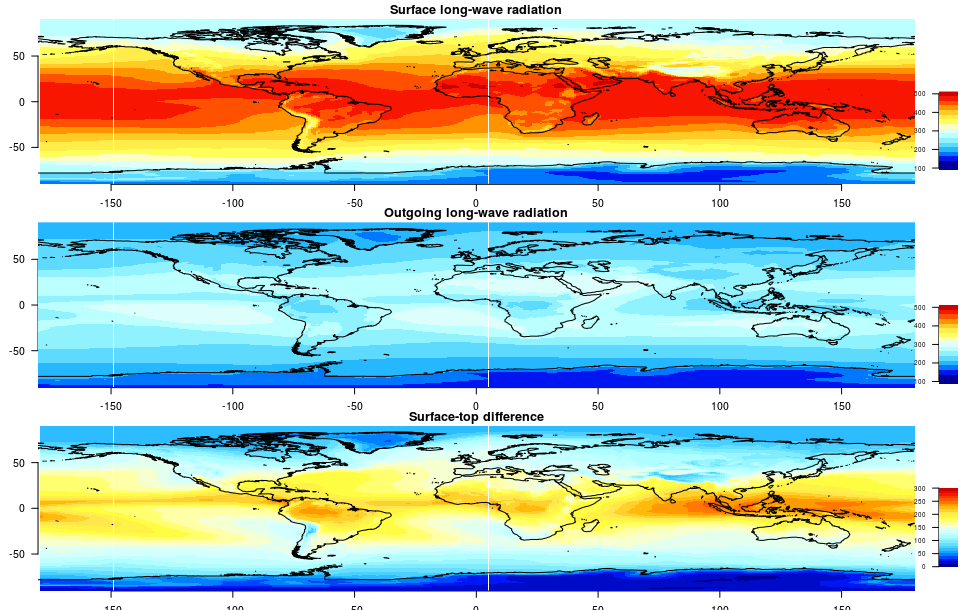
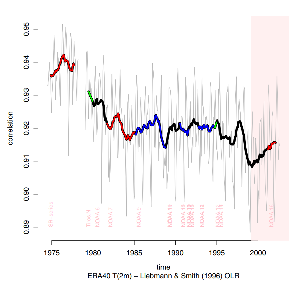
Hence, we would expect to see increasing differences in the spatial OLR structure compared to that of the heat emission from the surface, as the greenhouse effect is increased. One index capturing this could be the correlation between the spatial patterns in OLR and the surface IR flux over time (figure below taken from Benestad (2016)).
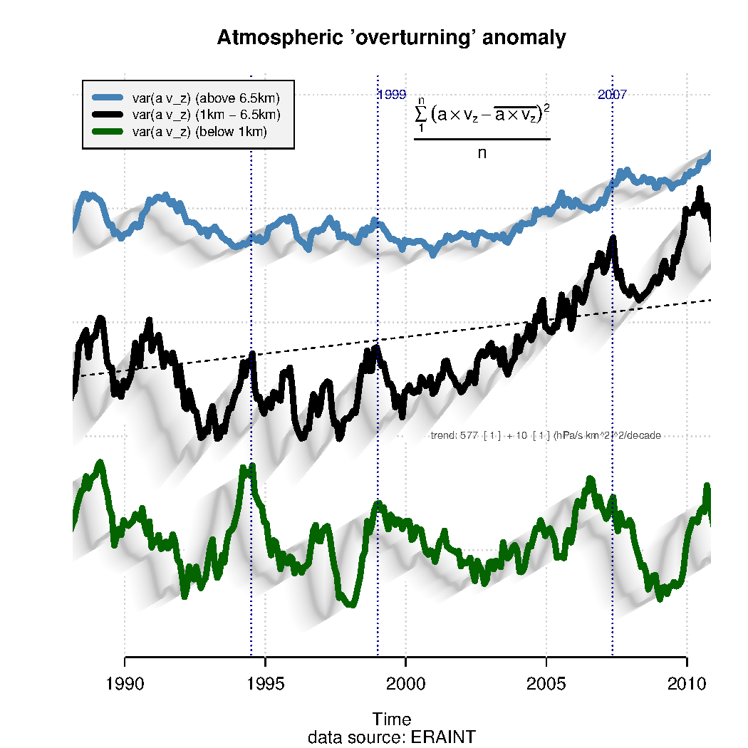
Another index for the state of the climate and the hydrological cycle could be an metric for the global atmospheric overturning: how much air ascends and descends.
The vertical motion in the atmospheric plays a role in moving heat and moisture to greater heights, and influences both rain patterns and the OLR. One indicator could be variance in the vertical velocity  over space estimated over
  grid-boxes, each with area
  :
: 
 is labelled as
  in the figure (Source: Benestad (2016),PDF)
We can estimate the atmospheric overturning  from reanalyses which provide data on the flow over a range of vertical levels and on a global scale. According to the figure above, there has been an increase in the global overturning indicator for the middle atmosphere (between 1 and 6.5 km above the surface).
The overturning indicator for the lower boundary layer, characterised by turbulence, shows a different trend to that in the middle troposphere. There is also less pronounced vertical motions in the upper part of the troposphere.
Another indicator could be the height of the region where the temperature is 254K (the 254K isotherm), which can be taken as a crude proxy for the average depth of the atmosphere from which the average heat escapes (Benestad (2016)).
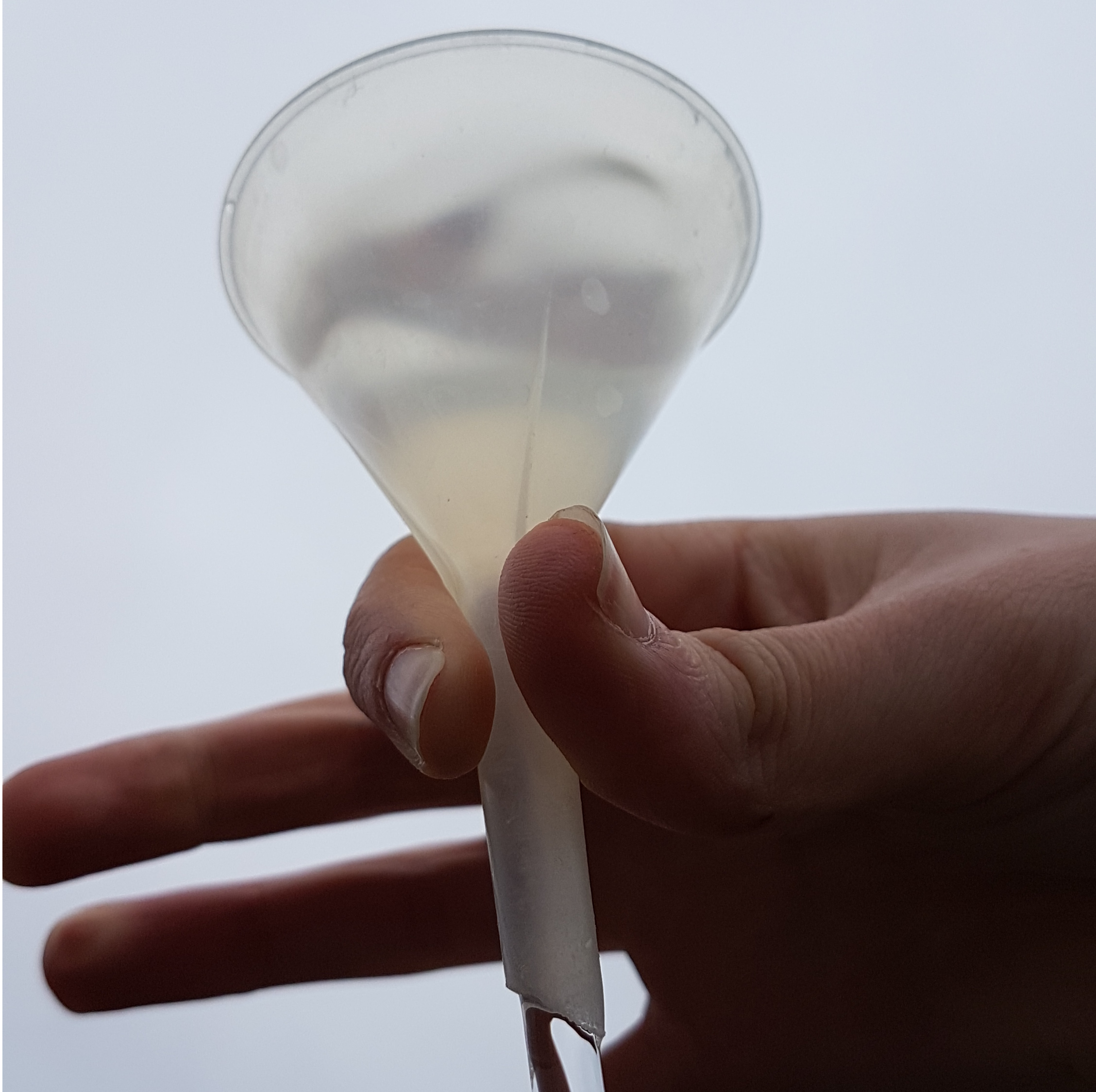
A neglected indicator, which I think should be an obvious one, is the daily precipitation area  . This indicator has a profound meaning for the hydrological cycle and is relevant for the question of flood risk and droughts.
The mean precipitation taken over area with precipitation for any given day can be considered as the wet-day mean precipitation and provides an indicator for the mean precipitation intensity.
The mean precipitation intensity is related to the mean evaporation and is proportional to the ratio of the areas of evaporation and rainfall: 
There is a kind of a “funnel effect” since the evaporated water over a large area has to come down as precipitation over a significantly smaller area. This is a bit like the action of a funnel (see figure below) where the water moves more slowly at the top where the cross-section area is greater than at the bottom with a small cross-section.
 is returned a smaller , then the mean intensity is amplified by the factor of
  .
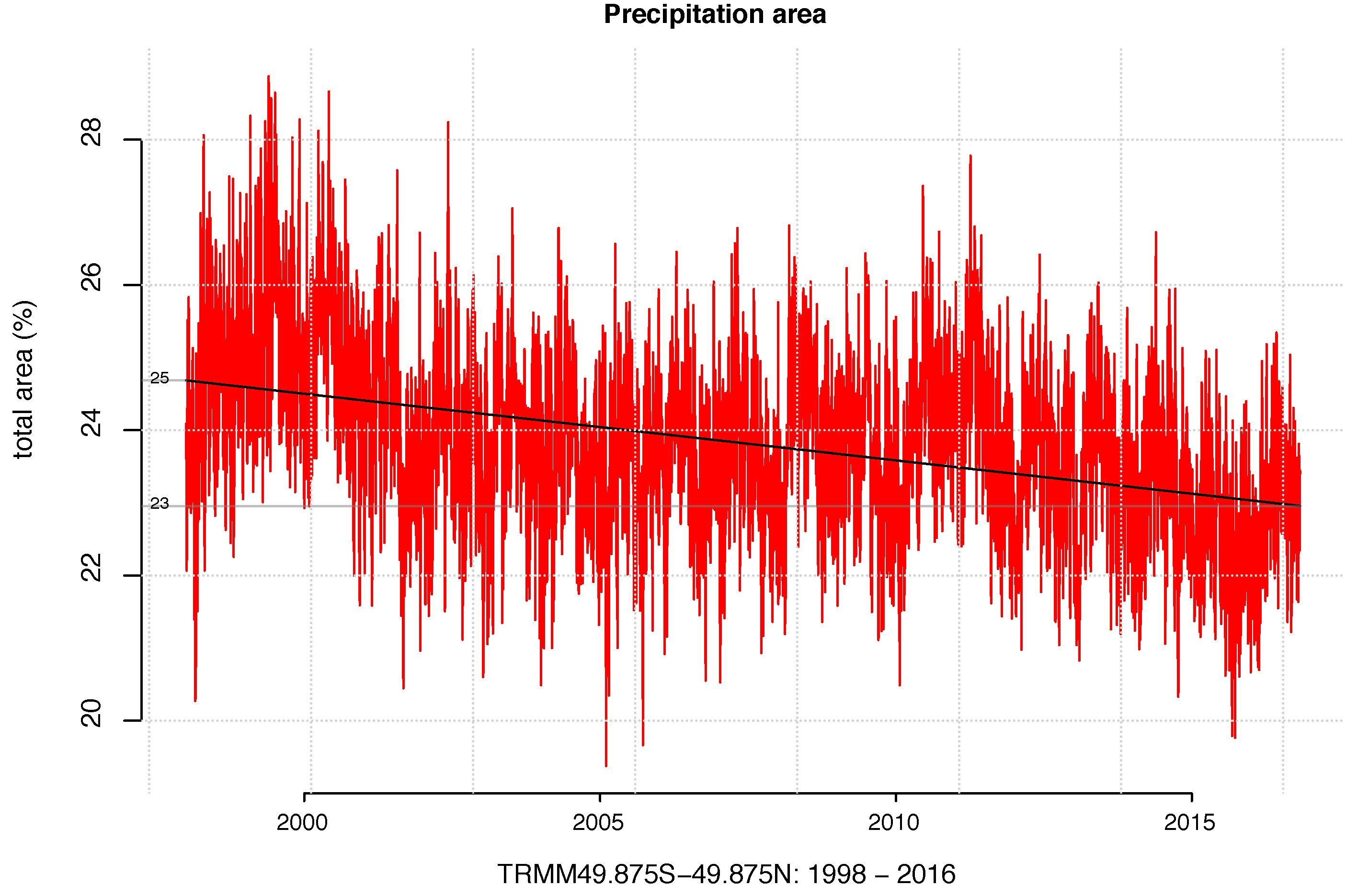
.It is possible to get an estimate of the semi-global precipitation area from satellite observations (Benestad, 2018). The figure below indicates that the area with daily rain between 50S-50N has decreased by 7% since 1998, which implies that the rain has become more intense and concentrated over a smaller region.
There may be other climate indicators that I have missed. Nevertheless, I hope there will be more discussions about climate indicators and more resources in the future that can offer up-to-date information about the state of the climate, based on these. Such sites could offer both graphical presentations and the actual numbers.
References
- F. Giorgi, E. Im, E. Coppola, N.S. Diffenbaugh, X.J. Gao, L. Mariotti, and Y. Shi, "Higher Hydroclimatic Intensity with Global Warming", Journal of Climate, vol. 24, pp. 5309-5324, 2011. http://dx.doi.org/10.1175/2011JCLI3979.1
- R.E. Benestad, "A mental picture of the greenhouse effect", Theoretical and Applied Climatology, vol. 128, pp. 679-688, 2016. http://dx.doi.org/10.1007/s00704-016-1732-y
- R.E. Benestad, "Implications of a decrease in the precipitation area for the past and the future", Environmental Research Letters, vol. 13, pp. 044022, 2018. http://dx.doi.org/10.1088/1748-9326/aab375
Jan 1880 – Dec 2017 Monthly Global Temperature Jazz
https://www.youtube.com/watch?v=amXQMGdWWwo
Sehr gut, Hr Benestad, I am going to look quite more carefully at this.
In the meantime, we have the snows due to showeling of the same by the community in the shadows, but at the same time we have Salix caprea L, Acer platanoides L, and Betula pubescens L.
The trees and the forest blossoms tell more. Then Rasmus Benestad is aware of Tussilago farfara L, Anemone hepatica L, and Anemone nemorosa L.
The ice- freight and industries = the wealth of southern Norway, the Ski- jumps and the ice bridges “Vinterbro…” and its histories tell a lot, where you can Control by old photography.
We also have litterature, Isen på Mjøsa / Isa på Mjøsen, in late April, a dubious story. (the Loch Ness is nothing compared to Mjøsa!)
That is not more so, and what broke and settled the situation was a Steamboat, the fameous hhhp Skibladner, as the horses were swimming allready. The worlds oldest paddle steamer “Skibladner”, (still afloat and running) came to rescue them in the ices at the end of April.
That was 120 years ago. Today that is not more so.
And Gardening. Tomatoes, Prunus persica, Vitis vinifera, and sunflowers. Beans and Aspargus & the history of the same.
“How many gentle flowers grow in an English country garden,…”
I have looked after and we have them all. They are traditional and Our best indicators, instructed by Public school.
But today there are New sorts that confuse the system.
Benestad, tell them when Halvdan Svarte went through the ices and drowned in Røykenviken Randsfjorden With horses and men in the warm mideival period and thus decided the SAGA. Today, that is hardly more possible. Randsfjorden is hardly frozen anymore.
Tycho de Brahe on Ven, Court astrologist for Cristian IV, was more reliable.
Tycho kept journal and wrote when it froze, and when i thawed again, DATVM.
Then we have Johan Daniel Berlin in Trondheim, who observed and wrote the same.
The Swedes went over the ices and took the Danes from behind with horses and men and heavy guns in the little ice age.
That is also true story.
Today, that is no problem anymore.
Zero celsius, eventually salted, is a reality.
I set on that and tell it to the Swedes.
Then they obey.
We have Frühlingsrauschen on Youtube by Christian Sinding, Worth listening to.That is reality.
And “Jeg vælger mig April..” of Bjørnstjerne Bjørnson, is solid historical recognition of climatic reality..
Springtime is quite dramatic in Norway and further in the ices.
Yes, it’s a complex system, but in terms of the ability of the ecosphere to support the current stock of living beings, I think the system is pretty simple and can easily be monitored through observations of a single measure: the concentration of CO2 in the atmosphere.
As long as that goes up, the sixth great extinction builds momentum and speed. Our species has advanced enough to comprehend and codify things like crimes against humanity (geneva conventions, convention against torture, etc.), but we have been largely unsuccessful at expanding constraints to prevent crimes against nature, crimes against the planet. This legal battle is pushed by ideas like asserting the rights of nature – here’s a story about that: https://www.scientificamerican.com/article/rivers-get-human-rights-they-can-sue-to-protect-themselves/
I understand that scientists are pretty deep in the weeds of how planetary climate works/develops, and the science in those weeds must be fascinating and intellectually rewarding, but you have to stick your head up above the weeds on a regular basis and check on how we are doing at protecting the ability of the planet to support living things, and when you do that, the facts are pretty bleak.
One number tells the story: CO2 sats. How are we doing?
April CO2 sat level: 410.31 ppm
Slappy a Gina Haspel smiley face on that number if you can.
Warm regards
Mike
Defining indicators to “capture all the important and relevant aspects of the climate” hinges on what those indicators are important and relevant to. I believe plant growth and agriculture are a very special ‘what’ with respect to which more indicators are needed. I believe plants and agriculture depend on relatively stable predictable weather, what I might call the short time-frame ‘smoothness’ of the weather. Certain events in the life cycle of plants are severely affected by weather events. For example late freeze can kill sprouting plants, kill new growth, destroy flowers, or a heavy rain can tear growing sprouts out of the ground. I believe the ongoing climate change affects the ‘smoothness’ of the weather and I’m not sure which, if any, of the existing indicators measure smoothness.
Thanks for an interesting set of indices (and proposals).
It was interesting to see the high-frequency variation in the temperature-OLR correlation, as it revealed a strong ENSO effect. But then, OLR is a long-studied aspect of ENSO variation, so I suppose that shouldn’t be a surprise, exactly. It would be interesting to see an update of that graph!
But the bit that posed the most questions for me was this:
There’s certainly consilience with what seems to be an increase in so-called ‘rain bombs.’ (Here in South Carolina–just as an aside on impacts–a new round of funding was just announced for folks who lost their homes in the October 2015 ‘rain bomb’ flooding. So recovery is incomplete, even if, for the most part, it’s not highly visible anymore.)
But the statement seems to presume that precipitation ‘between 50S-50N’ has remained nearly constant over time. Do we know that’s true? Clearly, Earth’s gross water supply is nearly constant over relevant time scales, so that can be assumed to be ‘conserved.’ But what about total global precipitation? As the hydrological cycle intensifies, both evaporation and precipitation should increase in balance with one another, right? (If that were true, then the intensity increase in precipitation would be larger than if only the ‘funnel effect’ were driving the change.) And what about the areas poleward of 50 degrees? Could, for example, their share of global precipitation be increasing relative to the area in the broad temperate/tropic belt? What’s known about such issues?
There is more details about the precipitation in the cited paper, which is open access
Thinking about indicators is vital for communication to elected officials and the general public about environmental change. While the indicators themselves are important to derive, equally important for successful use of indicators is the derivation of benchmarks for evaluation. I spent many years working with colleagues to develop indicators of ecological health for San Francisco Bay, and it is the comparison of the indicators to benchmarks that engages the media and the public.
The CO2 problem in 6 easy steps
Current forcings (1.6 W/m2) x 0.75 ºC/(W/m2) imply 1.2 ºC that would occur at equilibrium. Because the oceans take time to warm up, we are not yet there (so far we have experienced 0.7ºC), and so the remaining 0.5 ºC is ‘in the pipeline’. We can estimate this independently using the changes in ocean heat content over the last decade or so (roughly equal to the current radiative imbalance) of ~0.7 W/m2, implying that this ‘unrealised’ forcing will lead to another 0.7×0.75 ºC – i.e. 0.5 ºC.
The long-wave radiation estimated for surface temperatures is pretty clear that forcing is occuring near the equator and since the ocean in this region is acccumulating heat that will eventually re-emerge the deeper it can be sequestered the better. It can also be converted to productive energy. Since the delta T between the surace and the depths at 1000 meters is about 20C, about 7 percent of the heat can be converted in a single cycle.
Heat rises. Munk estimates at rate about 1 cm/day so in 250 years it is back at the surface. At which time it can be driven down again through a heat pipe and a turbine to convert another tranche of heat until such time as everything in the pipeline has been converted to useful energy. This should take about 3,250 years and produce 25 terawatts of power annually.
Instead of simply looking at these models from the top down, we should be looking at what is happening below.
Thanks… should have thought to check the bibliography, of course!
Answering my questions, with the aid of Benestad (2018), as pointed to above.
The two main data sources for Benestad (2018) are TRMM and the ERA-Interim reanalysis, with future projections from CMIP5 RCP 4.5 runs. All CMIP5 models show increasing global precip from 2000-2100, ranging between about 1-10%, and small increases are visible in both TRMM and ERA-I totals. So global precipitation seems to be increasing, and is expected to continue doing so.
As it says in the paper: “The consequence of more precipitation, higher convective energy transport, and decreasing precipitation area is an increase in mean precipitation intensity…”
TRMM only covers 50S-50N, but according to the reanalysis data, precip rates for the study area for the TRMM study area were about 6x that of the poleward areas, averaged over 1979-2016. So the stated conclusions are likely broadly correct, as there is not much room for a strong effect on the non-TRMM precipitation to vary enough to ‘move the needle’ too much.
Did you mention the ocean’s volume integrated heat content (as a function of time)? This surely is the most obvious climate indicator, since the ocean is where 93% of the extra heat that the planet receives resides.
In the supplementary, Benestad(2018) exhibits data that shows precip area over ocean declining much more than over land. Could this be a consequence of flat ocean top allowing larger “funnel mouth” compared to land ?
More intriguing, there is another graf in the supplementary exhibiting total precip over ocean significantly increasing. Is this because in the past with average precip area larger, precipitating systems that were mostly oceanic dumped some larger fraction of rain over land, but with precip areas shrinking this is no longer the case ?
sidd
I was able to find 920 NASA figures for global mean sea level from 1993 to 2017, using satellite altimetry. I took annual means and got this:
Year millimeters
1993 -33.82
1994 -30.10
1995 -27.45
1996 -25.04
1997 -23.50
1998 -21.53
1999 -20.26
2000 -17.29
2001 -12.15
2002 -9.32
2003 -6.19
2004 -4.35
2005 0.10
2006 1.10
2007 1.75
2008 4.11
2009 8.98
2010 9.09
2011 10.12
2012 19.73
2013 21.97
2014 25.27
2015 35.60
2016 38.28
2017 39.38
Does anyone have figures further back? I understand GMSL is available to 1880, but I have yet to find tabular data.
The US government sites Rasmus linked are good, especially the EPA’s. The Climate Reality Project site seems to choke my browser (up-to-date Google Chrome with Adblock Plus, on linux).
3 mike
Where I live a man did get charged with “crimes against nature”. He did “something” to his pet rock. He was later acquitted on a clear case of jury nullification.
Dan DaSilva,
Such a tease! Where’s the link? The synopsis? Inquiring rockheads want to know what their relative had to endure!
Another invitation to recreational typing.
Please get a blog.
Okay, I obtained Church and White’s time series for global mean sea level (GMSL) from 1880 to 2013 (N = 134). I regressed it on CO2 for the same period. R^2 was 92.1% and p was < 9.37 x 10^-75. So Victor's contention that CO2 has no effect on sea level is highly unlikely.
When I get the chance, I'll run this through Cochrane-Orcutt iteration to account for residual autocorrelation.
For what it’s worth, with a quadratic fit, I get R^2 = 96.5%, p < 3.45 x 10^-96. Sign is positive for CO2 and negative for CO2 squared. Interesting.
Hank Roberts,
“Recreational typing”, maybe but Mike’s concept of “expanding constraints to prevent crimes against nature, crimes against the planet” struck me as so wrong that the only response was the absurd.
By the way, my suggestion to you to “do the right thing” was in no way trolling as has been suggested.
Hank,: please get a blog
AB: Would you read it? If not, then WTF would I take your “suggestion” that I reduce my audience? Open your mind with regard to motivation, dude. My goal is to save your ass, not to pleasure you. Given that I’m dying, my patience with fools is reduced.
I only have a bit of time to fulfill my obligation to humanity.
It would seem that night temperatures (average? max? min? ) would be more more of an indication of increasing GHGs than just daily average temperatures. However, I did not see a data source for that.
Is there such a data source?
AIC @22
See this paper discussing such. Data sources cited.
Diurnal asymmetry to the observed global warming
Richard Davy Igor Esau Alexander Chernokulsky Stephen Outten Sergej Zilitinkevich
First published: 24 February 2016
https://rmets.onlinelibrary.wiley.com/doi/full/10.1002/joc.4688
The 2018 paper by Benestad shows that simulations demonstrate that precipitation area is expected to increase with global warming. See Figure 4.
The World Meteorological Organization has seven key global climate indicators they use as the foundation for the annual state of the climate assessment. https://public.wmo.int/en/programmes/global-climate-observing-system/global-climate-indicators
Mauri Pelto, thank you for the link to the WMO key climate indicators. A very streamlined and common-sense summary at the level of an elevator pitch, or just a touch deeper. I’m chagrined that I have not seen those before.
Greetings,
There are some specific climate indicators that Mauri Pelto has mentioned, but in my opinion these indices are vary and depend on many other factors, so the limitations and ranges of the indices should reasonably change.
In my opinion one of the nice climate indices are extreme value of weather variables of the case study, such as max temperature, and min temperature.
Regards,
Nasrin Salehnia
Verily I say unto you, Inasmuch as ye have done it unto one of the least of these my brethren, ye have done it unto me.
On judgement day ,Allah will say ” had you ministered to the sick, fed the hungry, or provided drink to the thirsty, you would have found Me with him.”
Your house should be open wide, and you should make the poor members of your household.
The ten meritorious deeds begin with Charity, Morality, Mental culture, Reverence or respect, and Service in helping others.
That having been said, perhaps an accounting of the people killed, injured, and financially harmed by increasing drought, flood, windstorms, heatwaves, and other detrimental effects of AGW should be kept, along with a record of which economic quintile the victims occupy. It will rain on the just and unjust, and the rich and poor, but that rain will adversely affect the poor more than the wealthy.
What part of society suffers the most when heat wavescause “11,000 excess deaths from nonaccidental causes” (Epidemiology. 2014 May; 25(3): 359–364. Published online 2014 Mar 4. doi:10.1097/EDE.0000000000000090PMCID: PMC3984022) or “Death toll exceeded 70,000 in Europe” (C R Biol. 2008 Feb;331(2):171-8. doi:10.1016/j.crvi.2007.12.001. Epub 2007 Dec 31.)???
What are the economic demographics of zika (Zika virus: history of a newly emerging arbovirus, Lancet Infect Dis. 2016 Jun 6. pii: S1473-3099(16)30010-X. doi:10.1016/S1473-3099(16)30010-X. [Epub ahead of print])???
What is the distribution of net worth of the people who lost their homes, or their lives, in Sandy, Harvey, Haiyan, Patricia and Maria (https://fxb.harvard.edu/2018/05/29/study-estimates-prolonged-increase-in-puerto-rican-death-rate-after-hurricane-maria/ https://www.census.gov/quickfacts/PR https://www.realtor.com/news/trends/hurricanes-harvey-and-irma/)
Climatology intersects with demographics, public policy/politics, and, if religion is to be believed, morality and ethics.
#20 Dan DaSilva > Mike’s concept…struck me as so wrong that the only response was the absurd.
Change your pet image (#15) from a rock to a dog, and everything changes: be it conscience, moral sentiment, or law–from the natural to the civil.
One may say that the rights of non-human life differ from rights ascribed to humans, but not that non-human life has no rights.