The sea level rise numbers published in the new IPCC report (the Fourth Assessment Report, AR4) have already caused considerable confusion. Many media articles and weblogs suggested there is good news on the sea level issue, with future sea level rise expected to be a lot less compared to the previous IPCC report (the Third Assessment Report, TAR). Some articles reported that IPCC had reduced its sea level projection from 88 cm to 59 cm (35 inches to 23 inches) , some even said it was reduced from 88 cm to 43 cm (17 inches), and there were several other versions as well (see “Broad Irony”). These statements are not correct and the new range up to 59 cm is not the full story. Here I will try to clarify what IPCC actually said and how these numbers were derived. (But if you want to skip the details, you can go straight to the critique or the bottom line).
What does IPCC say?
The Summary for Policy Makers (SPM) released last month provides the following table of sea level rise projections:
| Sea Level Rise (m at 2090-2099 relative to 1980-1999) |
|
| Case | Model-based range excluding future rapid dynamical changes in ice flow |
| B1 scenario | 0.18 – 0.38 |
| A1T scenario | 0.20 – 0.45 |
| B2 scenario | 0.20 – 0.43 |
| A1B scenario | 0.21 – 0.48 |
| A2 scenario | 0.23 – 0.51 |
| A1FI scenario | 0.26 – 0.59 |
It is this table on which the often-cited range of 18 to 59 cm is based. The accompanying text reads:
• Model-based projections of global average sea level rise at the end of the 21st century (2090-2099) are shown in Table SPM-3. For each scenario, the midpoint of the range in Table SPM-3 is within 10% of the TAR model average for 2090-2099. The ranges are narrower than in the TAR mainly because of improved information about some uncertainties in the projected contributions15. {10.6}.
Footnote 15: TAR projections were made for 2100, whereas projections in this Report are for 2090-2099. The TAR would have had similar ranges to those in Table SPM-3 if it had treated the uncertainties in the same way.
• Models used to date do not include uncertainties in climate-carbon cycle feedback nor do they include the full effects of changes in ice sheet flow, because a basis in published literature is lacking. The projections include a contribution due to increased ice flow from Greenland and Antarctica at the rates observed for 1993-2003, but these flow rates could increase or decrease in the future. For example, if this contribution were to grow linearly with global average temperature change, the upper ranges of sea level rise for SRES scenarios shown in Table SPM-3 would increase by 0.1 m to 0.2 m. Larger values cannot be excluded, but understanding of these effects is too limited to assess their likelihood or provide a best estimate or an upper bound for sea level rise. {10.6}
• If radiative forcing were to be stabilized in 2100 at A1B levels, thermal expansion alone would lead to 0.3 to 0.8 m of sea level rise by 2300 (relative to 1980–1999). Thermal expansion would continue for many centuries, due to the time required to transport heat into the deep ocean. {10.7}
• Contraction of the Greenland ice sheet is projected to continue to contribute to sea level rise after 2100. Current models suggest ice mass losses increase with temperature more rapidly than gains due to precipitation and that the surface mass balance becomes negative at a global average warming (relative to pre-industrial values) in excess of 1.9 to 4.6°C. If a negative surface mass balance were sustained for millennia, that would lead to virtually complete elimination of the Greenland ice sheet and a resulting contribution to sea level rise of about 7 m. The corresponding future temperatures in Greenland are comparable to those inferred for the last interglacial period 125,000 years ago, when paleoclimatic information suggests reductions of polar land ice extent and 4 to 6 m of sea level rise. {6.4, 10.7}
• Dynamical processes related to ice flow not included in current models but suggested by recent observations could increase the vulnerability of the ice sheets to warming, increasing future sea level rise. Understanding of these processes is limited and there is no consensus on their magnitude. {4.6, 10.7}
• Current global model studies project that the Antarctic ice sheet will remain too cold for widespread surface melting and is expected to gain in mass due to increased snowfall. However, net loss of ice mass could occur if dynamical ice discharge dominates the ice sheet mass balance. {10.7}
• Both past and future anthropogenic carbon dioxide emissions will continue to contribute to warming and sea level rise for more than a millennium, due to the timescales required for removal of this gas from the atmosphere. {7.3, 10.3}
(The above quotes document everything the SPM says about future sea level rise. The numbers in wavy brackets refer to the chapters of the full report, to be released in May.)
What is included in these sea level numbers?
Let us have a look at how these numbers were derived. They are made up of four components: thermal expansion, glaciers and ice caps (those exclude the Greenland and Antarctic ice sheets), ice sheet surface mass balance, and ice sheet dynamical imbalance.
1. Thermal expansion (warmer ocean water takes up more space) is computed from coupled climate models. These include ocean circulation models and can thus estimate where and how fast the surface warming penetrates into the ocean depths.
2. The contribution from glaciers and ice caps (not including Greenland and Antarctica), on the other hand, is computed from a simple empirical formula linking global mean temperature to mass loss (equivalent to a rate of sea level rise), based on observed data from 1963 to 2003. This takes into account that glaciers slowly disappear and therefore stop contributing – the total amount of glacier ice left is actually only enough to raise sea level by 15-37 cm.
3. The contribution from the two major ice sheets is split into two parts. What is called surface mass balance refers simply to snowfall minus surface ablation (ablation is melting plus sublimation). This is computed from an ice sheet surface mass balance model, with the snowfall amounts and temperatures derived from a high-resolution atmospheric circulation model. This is not the same as the coupled models used for the IPCC temperature projections, so results from this model are scaled to mimic different coupled models and different climate scenarios. (A fine point: this surface mass balance does include some “slow” changes in ice flow, but this is a minor contribution.)
4. Finally, there is another way how ice sheets can contribute to sea level rise: rather than melting at the surface, they can start to flow more rapidly. This is in fact increasingly observed around the edges of Greenland and Antarctica in recent years: outlet glaciers and ice streams that drain the ice sheets have greatly accelerated their flow. Numerous processes contribute to this, including the removal of buttressing ice shelves (i.e., ice tongues floating on water but in places anchored on islands or underwater rocks) or the lubrication of the ice sheet base by meltwater trickling down from the surface through cracks. These processes cannot yet be properly modelled, but observations suggest that they have contributed 0 – 0.7 mm/year to sea level rise during the period 1993-2003. The projections in the table given above assume that this contribution simply remains constant until the end of this century.
As an example, take the A1FI scenario – this is the warmest and therefore defines the upper limits of the sea level range. The “best” estimates for this scenario are 28 cm for thermal expansion, 12 cm for glaciers and -3 cm for the ice sheet mass balance – note the IPCC still assumes that Antarctica gains more mass in this manner than Greenland loses. Added to this is a term according to (4) simply based on the assumption that the accelerated ice flow observed 1993-2003 remains constant ever after, adding another 3 cm by the year 2095. In total, this adds up to 40 cm, with an ice sheet contribution of zero. (Another fine point: This is slightly less than the central estimate of 43 cm for the A1FI scenario that was reported in the media, taken from earlier drafts of the SPM, because those 43 cm was not the sum of the individual best estimates for the different contributing factors, but rather it was the mid-point of the uncertainty range, which is slightly higher as some uncertainties are skewed towards high values.)
How do the new numbers compare to the previous report?
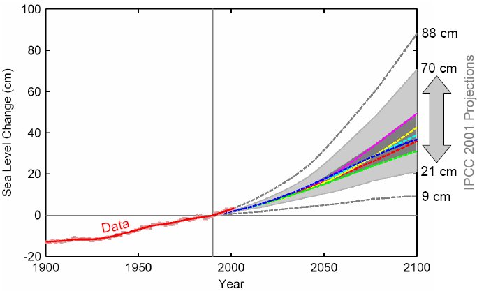
Sea level rise as observed (from Church and White 2006) shown in red up to the year 2001, together with the IPCC (2001) scenarios for 1990-2100. See second figure below for a zoom into the period of overlap.
The TAR showed sea level rise curves for a range of emission scenarios (shown in the Figure above together with the new observational record of Church and White 2006). The range was based on simulations with a simple model (the MAGICC model) tuned to mimic the behaviour of a range of different complex climate models (e.g. in terms of different climate sensitivities ranging from 1.7 to 4.2 ºC), combined with simple equations for the glacier and ice sheet mass balances (“degree-days scheme”). This model-based range is shown as the grey band (labelled “Several models all SRES envelope” in the original Figure 5 of the TAR SPM) and ranged from 21 to 70 cm, while the central estimate for each emission scenario is shown as a coloured dashed line. The largest central estimate of sea level rise is for the A1FI scenario (purple, 49 cm).
In addition, the dashed grey lines indicate additional uncertainty in ice sheet behaviour. These lines were labelled “All SRES envelope including land ice uncertainty” in the TAR SPM and extended the range up to 88 cm, adding 18 cm at the top end. One has to delve deeply into the appendix of Chapter 11 of the TAR to find out what these extra 18 cm entail: they include a “mass balance uncertainty” and an “ice dynamic uncertainty”, where the latter is simply assumed to be 10% of the total computed mass loss of the Greenland ice sheet. Note that such an ice dynamic uncertainty was only included for Greenland but not for Antarctica; instability of the West Antarctic Ice Sheet, a scenario considered “very unlikely” in the TAR, was explicitly not included in the upper limit of 88 cm.
As we mentioned in our post on the release of the SPM, it is apples and oranges to say that IPCC reduced the upper sea level limit from 88 cm to 59 cm, as the former included “ice dynamic uncertainty” (albeit only for Greenland, as rapid ice flow changes in Antarctica were considered too unlikely to bother at the time), while the latter discusses this ice flow uncertainty separately in the text, stating it could add 10 cm, 20 cm or even more to the 59 cm in the table.
So is it better to compare the model-based range 21 – 70 cm from the TAR to the 18 – 59 cm from the AR4? Even that is apples and oranges. For one, TAR cites the rise up to the year 2100, the AR4 up to the period 2090-2099, thus missing the last 5 years (or 5.5 years, but let’s not get too pedantic) of sea level rise. For 2095, the TAR projection reduces from 70 cm to 65 cm (the central estimate for A1FI reduces from 49 cm to 46 cm). Also, the TAR range is a 95% confidence interval, the AR4 range a narrower 90% confidence interval. Giving the TAR numbers also as 90% ranges shaves another 3 cm off the top end.
Sounds complicated? There are some more technical differences… but I will spare you those. The Paris IPCC meeting actually discussed the request from some delegates to provide a direct comparison of the AR4 and TAR numbers, but declined to do this in detail for being too complicated. The result was the two statements:
The TAR would have had similar ranges to those in Table SPM-3 if it had treated the uncertainties in the same way.
and
For each scenario, the midpoint of the range in Table SPM-3 is within 10% of the TAR model average for 2090-2099.
(In fact delegates were told by the IPCC authors in Paris that with the new AR4 models, the central estimate for each scenario is slightly higher that with the old models, if numbers are reported in a comparable manner.)
The bottom line is thus that the methods have significantly improved (which is the reason behind all those methodological changes), but the expectation of how much sea level will rise in the coming century has not significantly changed. The biggest change is that ice sheet dynamics look more uncertain now than at the time of the TAR, which is why this uncertainty is not included any more in the cited range but discussed separately in the text.
Critique – Could these numbers underestimate future sea level rise?
There’s a number of issues worth discussing about these sea level numbers.
The first is the treatment of potential rapid changes in ice flow (item 4 on the list above). The AR4 notes that the ice sheets have been losing mass recently (the analysis period is 1993-2003). Greenland has contributed +0.14 to +0.28 mm/year of sea level rise over this period, while for Antarctica the uncertainty range is -0.14 to +0.55 mm/year. It is noted that the mass loss of Antarctica is mostly or entirely due to recent changes in ice flow. The question then is: how much will this process contribute to future sea level rise? The honest answer is: we don’t know. As the SPM states, by the year 2095 it could be 10 cm. Or 20 cm. Or more. Or less.
The IPCC included one guess into the “model-based range” provided in the table: it took half of the Greenland mass loss and the whole Antarctic mass loss for 1993-2003, and assumed this would remain constant ever after until 2100. This assumption in my view has no scientific basis, as the ice-flow is almost certainly highly variable in time. The report itself states that this ice loss is due to a recent acceleration of flow, and that in 2005 it was already higher, and that in future the numbers could be several times higher – or they could be lower. Adding such an ill-founded number into the “model-based” range degrades the much more reliable estimates for thermal expansion, mountain glaciers and mass balance. Even worse: to numbers with error estimates, it adds a number without proper error estimate (the observational uncertainty for 1993-2003 is included, but who would claim this is an error estimation for future ice flow changes?). And then it presents only the combined error margins – you will notice that no central estimate is provided in the above table. If I had presented this as an error calculation in a first-semester physics assignment, I doubt I would have gotten away with it. The German delegation in Paris (of which I was a member) therefore suggested taking this ice-flow estimate out of the tabulated range. The numbers would have become slightly lower, but this approach would not have mixed up very different levels of uncertainty, and it would have been clear what is included in the table and what is not (namely ice flow changes), rather than attempting to partially include ice flow changes. The ice flow changes could have been discussed in the text – stating there that at the 1993-2003 rate, this term would contribute 3 cm by 2095, but it is bound to change and could turn out to be 10 cm or 20 cm or more. However, we found no support for this proposal, which would not have changed the science in any way but improved the clarity of presentation.
As it is now, because of the complex and opaque way of combining the errors, even I could not tell you by how much the upper limit of 59 cm would be reduced if the questionable ice flow estimate was taken out, and one of the reasons provided by the IPCC authors for not adopting our proposal was that the numbers could not be calculated quickly.
A second problem with the above range is that the models used to derive this projection significantly underestimate past sea level rise. We tried in vain to get this mentioned in the SPM, so you have to go to the main report to find this information. The AR4 states that for the period 1961-2003, the models on average give a rise of 1.2 mm/year, while the data show 1.8 mm/year, i.e. a 50% faster rise. This is despite using observed ice sheet mass loss (0.19 mm/year) in the “modelled” number in this comparison, otherwise the discrepancy would be even larger – the ice sheet models predict that the ice sheets gain mass due to global warming. The comparison looks somewhat better for the period 1993-2003, where the “models” give a rise of 2.6 mm/year while the data give 3.1 mm/year. But again the “models” estimate includes an observed ice sheet mass loss term of 0.41 mm/year whereas ice sheet models give a mass gain of 0.1 mm/year for this period; considering this, observed rise is again 50% faster than the best model estimate for this period. This underestimation carries over from the TAR models (see Rahmstorf et al. 2007 and the Figure below) – this is not surprising, since the new models give essentially the same results as the old models, as discussed above.
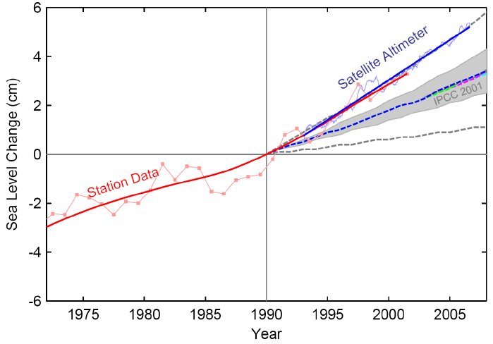
Comparison of the 2001 IPCC sea-level scenarios (starting in 1990) and observed data: the Church and White (2006) data based primarily on tide gauges (annual, red) and the satellite altimeter data (updated from Cazenave and Nerem 2004, 3-month data spacing, blue, up to mid-2006) are shown with their trend lines. Note that the observed sea level rise tends to follow the uppermost dashed line of the IPCC scenarios, namely the one “including land ice uncertainty”, see first Figure.
We therefore see that sea level appears to be rising about 50% faster than models suggest – consistently for the 1961-2003 and the 1993-2003 periods, and for the TAR models and the AR4 models. This could have a number of different reasons, and the discrepancy could be considered not significant given the error ranges of observations and models. It is no proof that models underestimate future sea level rise. But it is at least a plausible possibility that the models may underestimate future rise.
A third issue worth mentioning is that of carbon cycle feedback. The temperature projections provided in table SPM-3 of the Summary for Policy Makers range from 1.1 to 6.4 ºC warming and include carbon cycle feedback. The sea level range, however, is based on scenarios that exclude this feedback and thus only range up to 4.5 5.2 ºC. This could easily be misunderstood, as in table SPM-3 the temperature ranges including carbon cycle feedback are shown right next to the sea level ranges, but the latter actually apply to a smaller temperature range. As a rough estimate, I suggest that for a 6.4 ºC warming scenario, of the order of 20 15 cm would have to be added to the 59 cm defining the upper end of the sea level range.
A final point is the regional aspects. Planners of coastal defences need to be aware that sea level rise will not be the same everywhere. The AR4 shows a map of regional sea level changes, which shows that e.g. European coasts can expect a rise by 5-15 cm more than the global mean rise – that is a model average, not including an uncertainty range. The pattern in this map is remarkably similar to that expected from a slowdown in thermohaline circulation (see Levermann et al. 2005) so probably it is dominated by this effect. In addition, some land areas are rising and some are subsiding in response to the end of the last Ice Age or due to local anthropogenic processes (e.g. groundwater withdrawal), which local planners need to account for.
The main conclusion of this analysis is that sea level uncertainty is not smaller now than it was at the time of the TAR, and that quoting the 18-59 cm range of sea level rise, as many media articles have done, is not telling the full story. 59 cm is unfortunately not the “worst case”. It does not include the full ice sheet uncertainty, which could add 20 cm or even more. It does not cover the full “likely” temperature range given in the AR4 (up to 6.4 ºC) – correcting for that could again roughly add 20 15 cm. It does not account for the fact that past sea level rise is underestimated by the models for reasons that are unclear. Considering these issues, a sea level rise exceeding one metre can in my view by no means ruled out. In a completely different analysis, based only on a simple correlation of observed sea level rise and temperature, I came to a similar conclusion. As stated in that paper, my point here is not that I predict that sea level rise will be higher than IPCC suggests, or that the IPCC estimates for sea level are wrong in any way. My point is that in terms of a risk assessment, the uncertainty range that one needs to consider is in my view substantially larger than 18-59 cm.
A final thought: this discussion has all been about sea level rise until the year 2095. Sea level rise does not end there, as the quotes from the SPM at the beginning of this article show. Over several centuries, without serious mitigation efforts we may expect several meters of sea level rise. The Advisory Council on Global Change of the German government (disclosure: I’m a member of this body) in its recent special report on the oceans has proposed to limit long-term sea level rise to a maximum of one meter, as a guard-rail to guide climate policy. But that’s another story.
Update: I was just informed by one of the IPCC authors that the temperature scenarios without carbon cycle feedback range up to 5.2 ºC, not 4.5 ºC as I had assumed. This number is not found in the IPCC report; I had tried to interpret it from a graph, but not accurately enough. My apologies! The numbers in the text above that had to be corrected are marked by strikethrough font. -stefan
O aumento do nível do mar publicado no novo relatório do IPCC (o Quarto Relatório de Avaliação, AR4) já tem causado confusão considerável. Muitos artigos da mídia sugerem que há boas notícias sobre a questão do nível do mar, com previsões muito menores de aumento do nível do mar comparadas às previsões do relatório anterior do IPCC (o Terceiro Relatório de Avaliação, TAR). Alguns artigos reportam que o IPCC reduziu a projeção para o aumento do nível do mar de 88 para 59 cm, enquanto outros dizem que tal projeção teria sido reduzida de 88 para 43 cm, e existem muitas outras versões também (veja “Ampla Ironia”). Tais declarações são incorretas dado que o novo valor de até 59 cm não representa sequer toda a estória. Aqui tentarei clarear o que o IPCC de fato quer dizer e como esses números são derivados. (Mas caso prefira pular os detalhes, vá direto para a crítica ou a última linha).
O que o IPCC diz?
O Sumário para Tomadores de Decisão (SPM) lançado no ultimo mês fornece a seguinte tabela de projeções para o aumento do nível do mar:
| Aumento do Nível do Mar (em metros para 2090-2099 relativo a 1980-1999) |
|
| Caso | Intervalo baseado em modelo excetuando-se rápidas mudanças futuras no fluxo de gelo |
| Cenário B1 | 0.18 – 0.38 |
| Cenário A1T | 0.20 – 0.45 |
| Cenário B2 | 0.20 – 0.43 |
| Cenário A1B | 0.21 – 0.48 |
| Cenário A2 | 0.23 – 0.51 |
| Cenário A1FI | 0.26 – 0.59 |
É desta tabela que sai o usualmente citado intervalo de 18 a 59 cm. O texto que acompanha a tabela diz:
•
Projeções baseadas em modelos da elevação do nível do mar no final do século XXI (2090-2099) são mostradas na Tabela SPM-3. Para cada cenário, o ponto médio do intervalo na Tabela SPM-3 situa-se dentro de 10% da média do modelo do TAR para 2090-2099. Os intervalos são mais estreitos que no TAR principalmente devido às melhorias na informação sobre algumas incertezas nas contribuições projetadas15. {10.6}.nota de rodapé
15: As pojeções no TAR foram feitas para 2100, enquanto que as projeções desse relatório são para 2090-2099. O TAR deveria apresentar intervalos similares aos da Tabela SPM-3 se as incertezas tivessem sido tratadas da mesma maneira.• Os modelos atuais não incluem incertezas do feedback climático do ciclo do carbono e tão pouco incluem efeitos completos das mudanças dos fluxos das placas de gelo, dado que ainda faltam fundamentos publicados na literatura. As projeções incluem uma contribuição devido ao aumento do fluxo de gelo da Groenlândia e Antártica em taxas observadas para 1993-2003, mas tais taxas de fluxo poderiam aumentar ou diminuir no futuro. Por exemplo, se essa contribuição crescer linearmente com a mudança da temperatura média global, os intervalos superiores da elevação do nível do mar nos cenários SRES (Relatório Especial dos Cenários de Emissão do IPCC) mostrados na Tabela SPM-3 deveriam aumentar em 0.1 m a 0.2 m. Valores maiores não podem ser excluídos, mas o conhecimento desses efeitos é muito limitado para avaliar suas probabilidades ou fornecer uma melhor estimativa ou um limite superior para o aumento do nível do mar. {10.6}
• Se a forçante radiativa fosse estabilizar em 2100 em níveis estimados no cenário A1B, a expansão térmica somente levaria a um aumento do nível do mar de 0.3 a 0.8 m em 2300 (relativo a 1980–1999). A expansão térmica continuaria por muitos séculos, devido ao tempo requerido para transportar calor para o oceano profundo. {10.7}
• A contração da camada de gelo da Groenlândia é projetada a continuar contribuindo para o aumento do nível o mar após 2100. Os modelos atuais sugerem que um aumento da perda de massa de gelo com a temperatura seria mais rápido do que um ganho de massa de gelo com a precipitação, e que o balanço de massa da superfície tornaria-se negativo sob um aquecimento global médio (relativo aos valores pré-industriais) excedendo 1.9 a 4.6°C. Se um balanço negativo de massa da superfície fosse sutentado por milênios, isso levaria a uma eliminação virtualmente completa da cobertura de gelo da Groenlândia e uma contribuição resultante do aumento do nível do mar ao redor de 7 m. As temperaturas futuras correspondentes na Groenlândia são comparáveis àquelas inferidas para o último período interglacial há 125 mil anos atrás, quando as informações paleoclimáticas sugerem uma redução da extensão de gelo polar e um aumento do nível do mar de 4 a 6 m. {6.4, 10.7}
• Processos dinâmicos relacionados o fluxo de gelo não incluídos nos modelos atuais mas sugeridos por recentes observações poderia aumentar a vulnerabilidade das placas de gelo ao aquecimento, aumentando a elevação do nível do mar no futuro. A compreensão desses processos é limitada e não há consenso sobre sua magnitude. {4.6, 10.7}
• Estudos atuais de modelos globais projetam que a camada de gelo Antártica pode permanecer muito fria para um amplo derretimento superficial e espera-se um ganho de massa devido a um aumento de queda de neve. Contudo, uma perda líquida de gelo poderia ocorrer se uma descarga dinâmica de gelo dominar o balanço de massa da camada de gelo. {10.7}
• Ambas as emissões antropogênicas passadas e futuras de dióxido de carbono deverão continuar a contribuir no aquecimento e na elevação do nível do mar por mais de um milênio, por conta da escala de tempo requerida para a remoção desse gás da atmosfera. {7.3, 10.3}
(Os itens acima documentam tudo que o SPM diz sobre o futuro da elevação do nível do mar. Os números entre chaves refem-se aos capítulos do relatório completo a ser divulgado em maio.)
O que está incluso nesses números de nível do mar?
Vamos olhar como esses números são derivados. Eles são constituídos de quatro componentes: expansão térmica, geleiras e camadas de gelo (excetuando-se as capas de gelo da Groenlândia e Antártica), balanço de massa de placas de gelo superficiais, e o desbalanço dinâmico das placas de gelo.
1. Expansão térmica (água oceânica mais quente ocupa maior espaço) é computada de modelos climáticos acoplados. Esses incluem modelos de circulação oceânica e podem assim estimar onde e quão rápido o aquecimento superficial penetra nos oceanos profundos.
2. A contribuição de geleiras e camadas de gelo (não incluindo Groenlândia e Antártica), por sua vez, é computada de uma simples formulação empírica que liga a temperatura média global à perda de massa (equivalente a uma taxa de elevação do nível do mar), baseada em dados observados entre 1963 e 2003. Tal formulação considera que as geleiras desaparecem vagarosamente e conseqüentemente param de contribuir – a quantidade total de geleiras remanecente seria suficiente para elevar o nível do mar em 15-37 cm.
3. A contribuição das duas maiores coberturas de gelo é dividida em duas partes. O que é chamado de balanço de massa superficial se refere simplesmente a queda de neve menos a ablação de gelo superficial (que é o derretimento somado à sublimação). Este é computado por um modelo de balanço de massa de placa de gelo superficial, com as quantidades de queda de neve e temperaturas derivados de um modelo de alta resolução da circulação atmosférica. Este cálculo não é o mesmo dos modelos acoplados usados nas projeções de temperatura do IPCC, de modo que os resultados desse modelo são ajustados para mimetizar diferentes modelos acoplados e diferentes cenários climáticos. (Um importante detalhe: esse balanço de massa superficial inclui algumas mudanças “morosas” no fluxo de gelo, mas essa é uma pequena contribuição.)
4. Finalmente, existe um outro modo pelo qual as placas de gelo podem contribuir para a elevação do nível do mar: ao invés de derreterem na superfície, podem começar a fluir mais rapidamente. Isso vem sendo observado com freqüência ao redor das bordas da Groenlândia e Antártica em anos recentes: saídas de geleiras e rios de gelo que drenam as placas de gelo têm aumentado suas vazões. Numerosos processos contribuem para isso, incluindo a remoção de conchas de gelo (i.e., gelos que flutuam sobre a água ancoradas em ilhas ou rochas submersas) ou a erosão da base da placa de gelo por água líquida fluindo pela superfície através de falhas no gelo. Tais processos não podem ainda ser adequadamente modelados, mas as observações sugerem que eles têm contribuído com 0 – 0.7 mm/ano para a elevação do nível do mar no período 1993-2003. As projeções na dada tabela assumem que tal contribuição simplesmente se mantém constante até o fim deste século.
Por exemplo, tome o cenário A1FI – este é o mais quente e por isso define os limites superiores do intervalo do nível do mar. A “melhor” estimativa desse cenário é 28 cm para a expansão térmica, 12 cm para as geleiras e -3 cm para o balanço de massa das placas de gelo – note que o IPCC ainda assume que a Antártica ganha mais massa através desse modo do que a Groenlândia perde. Adicionado a isso há um termo de acordo com (4) simplesmente baseado na premissa de que o acelerado fluxo de gelo observado em 1993-2003 se mantém sempre constante, adicionando outros 3 cm em 2095. No total, isso totaliza até 40 cm, com uma contribuição nula das placas de gelo. (Outro ponto importante: Isso representa um pouco menos do que a estimativa central de 43 cm para o cenário A1FI que foi divulgado na mídia, tirado dos primeiros rascunhos do SPM, pois estes 43 cm não eram a soma das melhores estimativas individuais para os diferentes fatores contribuintes, mas, ao contrário, era um ponto médio do intervalo das incertezas, o qual é um pouco maior quando algumas incertezas são tomadas com valores mais altos.)
Como esses números se comparam com o relatório anterior?

Elevação do nível do mar como verificado em Church e White 2006 mostrado em vermelho até o ano de 2001, junto com os cenários do IPCC (2001) para 1990-2100. Veja a segunda figura abaixo para um zoom no período de sobreposição.
O TAR mostrou curvas de elevação de nível do mar para uma gama de cenários de emissão (mostrada na Figura acima junto com novos dados obervacionais de Church e White 2006). Essa gama foi baseada em simulações com um modelo simples (o modelo MAGICC) ajustado para mimetizar o comportamento de uma gama de diferentes modelos climáticos complexos (por exemplo em termos de diferentes sensibilidades climáticas variando de 1.7 a 4.2 ºC), combinado com equações simples para um glacial e balanços de massa de placa de gelo (“esquema graus-dias”). Este intervalo baseado em modelo é mostrado como uma banda verde (legendada como “Several models all SRES envelope” na Figura 5 original do TAR SPM) e variou de 21 a 70 cm, enquanto que a estimativa central para cada cenário de emissão é mostrada como uma linha tracejada colorida. A maior estimativa central da elevação do nível do mar foi para o cenário A1FI (cor púrpura, 49 cm).
Ainda mais, as curvas tracejadas em cinza indicam incertezas adicionais no comportamento das placas de gelo. Tais linhas foram legendadas como “All SRES envelope including land ice uncertainty” no TAR SPM e ampliou o intervalo até 88 cm, adicionando 18 cm no limite superior. É preciso procurar minuciosamente no apêndice do Capítulo 11 do TAR para encontrar o que esses 18 cm extras representam: eles incluem uma “incerteza no balanço de massa” e uma “incerteza de dinâmica de gelo”, onde o último é meramente assumido como 10% da perda de massa total computada para a placa de gelo da Groenlândia. Note que tal incerteza na dinâmica de gelo foi somente incluída para a Groenlândia mas não para a Antártica; instabilidade da Placa de Gelo Oeste da Antártica, um cenário considerado “muito improvável” no TAR, foi explicitamente não incluído no limite superior de 88 cm.
Como mencionamos em nossa postagem sobre a divulgação do SPM, seria comparar maçãs e laranjas ao dizer que o IPCC reduziu o limite superior do nível do mar de 88 cm para 59 cm, a medida em que o primeiro incluiu “a incerteza da dinâmica do gelo” (muito embora somente para a Groenlândia, pois mudanças rápidas do fluxo de gelo na Antártica foram consideradas muito improváveis para preocupar naquele tempo), enquanto que o segundo discute essa incerteza do fluxo de gelo separadamente no texo, declarando que isso poderia adicionar 10 cm, 20 cm ou ainda mais aos 59 cm da tabela.
Assim seria melhor comparar o intervalo baseado em modelo de 21 – 70 cm do TAR com o 18 – 59 cm do AR4? Mesmo isso seria comparar maçãs com laranjas. Para um, o TAR cita a elevação até o ano 2100, o AR4 até o período 2090-2099, assim faltam os últimos cinco anos (ou 5.5 anos, mas não sejamos pedantes) da elevação do nível do mar. Para 2095, a projeção do TAR reduz de 70 cm para 65 cm (a estimativa central para o cenário A1FI reduz de 49 cm para 46 cm). Também, o intervalo do TAR é um intervalo de 95% de confiança, já o intervalo AR4 é mais estreito para um intervalo de confiança de 90%. Dados os números do TAR também como intervalos de 90% remove outros 3 cm do limite superior final.
Parece complicado? Existem outras diferenças mais técnicas… mas irei poupar-lhes disso. A reunião de Paris do IPCC já discutiu o pedido de alguns delegados de fornecer uma comparação direta dos números do AR4 e do TAR, mas desistiram de fazer isso detalhadamente por ser muito complicado. O resultado foi duas declarações:
O TAR deveria ter intervalos similares aos da Tabela SPM-3 se ele tivesse tratado as incertezas da mesma maneira.
e
Para cada cenário, o ponto médio do intervalo na Tabela SPM-3 está dentro de 10% da média do modelo TAR para 2090-2099.
(Na verdade, foi dito aos delegados pelos autores do IPCC em Paris que com os novos modelos AR4, as estimativas centrais de cada cenário seriam um pouco maiores que aquelas dos velhos modelos, se os números são reportados de forma comparável.)
A última linha mostra então que os métodos têm sido significativamente melhorados (razão por detrás de todos essas mudanças metodológicas), mas a expectativa de quanto o nível do mar irá subir no século que virá não mudou muito. A maior mudança é que a dinâmica das placas de gelo parecem mais incertas agora que no tempo do TAR, que é a razão para que esta incerteza não seja mais inclusa nos intervalos citados, mas sim discutida separadamente no texto.
Crítica – Poderiam esses números subestimar a futura elevação do nível do mar?
Existem várias discussões importantes sobre os números do nível do mar.
O primeiro é o tratamento das mudanças rápidas potenciais no fluxo de gelo (item 4 da lista acima). O AR4 aponta que as placas de gelo têm recentemente perdido massa (o período de análise é 1993-2003). A Groenlândia tem contribuído com +0.14 a +0.28 mm/ano para a elevação do nível do mar sobre esse período, enquanto que para a Antártica a incerteza varia de -0.14 a +0.55 mm/ano. É observado que a perda de massa da Antártica é predominante ou inteiramente devido às recentes mudanças do fluxo de gelo. A questão então é: Quanto esse processo irá contribuir para o futuro da elevação do nível do mar? A resposta honesta é: nós não sabemos. Como o SPM declara, pelo ano 2095 poderia ser 10 cm. Ou 20 cm. Ou mais. Ou menos.
O IPCC incluiu uma suposição no ‘intervalo baseado em modelo’ dado na tabela: tal suposição toma metade da perda de massa da Groenlândia e toda a perda de massa Antártica para 1993-2003, e assume que as perdas se manteriam sempre constantes até 2100. Essa permissa na minha visão não tem embasamento científico, pois o fluxo de gelo é quase que certamente muito variável no tempo. O relatório por si só declara que tal perda de gelo seja devida a uma aceleração recente do fluxo, e que em 2005 já era bastante alta, e no futuro os números poderiam ser várias vezes maior – ou poderiam ser menores. Incluindo um número fundamentalmente deficiente no intervalo ‘baseado em modelo’ degrada estimativas muito mais confiáveis para a expansão térmica, geleiras de montanhas e balanço de massa. Ainda pior: para os números com estimativas de erro, é adicionado um número sem uma estimativa apropriada de erro (a incerteza observada para 1993-2003 é incluída, mas quem asseguraria que esta seja válida para futuras mudanças no fluxo de gelo?). E então são apresentadas somente as margens de erro combinadas – você pode notar que nenhuma estimativa central é fornecida na tabela acima. Se eu tivesse apresentado isso como um erro de cálculo numa lição de casa no primeiro semestre de física, duvido que eu conseguiria escapar disso. A delegação alemã em Paris (da qual sou membro) então sugeriu tirar a estimativa do fluxo de gelo do intervalo tabulado. Os números se tornariam um pouco menores, mas esta abordagem não mesclaria níveis muito diferentes de incerteza, e ficaria claro o que estaria incluso na tabela e o que não estaria (as mudanças de fluxo de gelo), ao invés de tentar incluir parcialmente mudanças nos fluxos de gelo. Tais mudanças teriam sido discutidas no texto – dizendo que nas taxas de 1993-2003, tal termo poderia contribuir com 3 cm em 2095, mas esse valor poderia mudar para 10 cm ou 20 cm ou mais. Todavia, não encotramos nenhum suporte para esta proposta, a qual não teria mudado a Ciència de maneira alguma, mas melhorado a claridade da apresentação.
Como está agora, devido à forma complexa e obscura da combinação dos erros, até mesmo eu não poderia dizer por quanto o limite superior de 59 cm seria reduzido se a questionável estimativa fosse removida, e uma das razões para que os autores do IPCC não adotassem nossa proposta foi a de que os números não poderiam ser calculados rapidamente.
Um segundo problema com o intervalo acima é que os modelos usados para derivar as projeções subestimam significativamente a elevação do nível do mar em tempos pretéritos. Tentamos em vão fazer isso ser mencionado no SPM, de modo que você teria que ir ao relatório principal para encontrar essa informação. O AR4 declara que para o período 1961-2003, os modelos sobre as médias fornece uma elevação de 1.2 mm/ano, enquanto que os dados mostram 1.8 mm/ano, i.e. um crescimento 50% mais rápido. E isto sem considerar a taxa de perda de placa de gelo (0.19 mm/ano) nos números ‘modelados’ nesta comparação. Se assim fosse, a discrepância seria ainda maior – os modelos de placa de gelo prevèm que as placas de gelo ganhariam massa em função do aquecimento global. A comparação parece um pouco melhor no período de 1993-2003, para o qual os modelos fornecem uma elevação de 2.6 mm/ano enquanto os dados fornecem 3.1 mm/ano. Mas de novo as estimativas de ‘modelos’ incluem uma observada perda de massa de gelo de 0.41 mm/ano enquanto os modelos de placas de gelo fornecem um ganho de massa de 0.1 mm/ano para esse período; considerando isso, a elevação observada é de novo 50% mais rápida do que as melhores estimativas de modelos para esse período. Esta subestimativa persiste dos modelos do TAR (veja Rahmstorf et al. 2007 e Figura abaixo) – isso não é uma surpresa, desde que os novos modelos dão essencialmente os mesmos resultados dos modelos antigos, como discutido acima.

Comparação dos cenários do nível do mar do IPCC 2001 (com início em 1990) e dados observados: os dados de Church e White (2006) baseiam-se primariamente em estações de medição de maré (anual em vermelho) e dados de satélite altímetro (atualizado de Cazenave e Nerem 2004, dados espaçados de 3 meses, em azul, até meados de 2006) são mostrados com suas linhas de tendência. Note que a tendência de elevação do nível do mar segue a linha tracejada mais superior dos cenários do IPCC, exatamente aquela nomeada “incluindo a incerteza de gelo terrestre”, veja a primeira figura.
Nós então vemos que o nível do mar parece estar subindo cerca de 50% mais rápido que os modelos sugerem – consistentemente para os períodos de 1961-2003 e 1993-2003, e para os modelos TAR e AR4. Isso pode ter diversas razões, e a discrepância poderia ser considerada insignificante dados os intervalos de erros das obervações e modelos. Não há provas de que os modelos subestimam a elevação o nível do mar. Mas há no mínimo uma possibilidade plausível de que os modelos possam subestimar a elevação futura.
Uma terceira questão de importância diz respeito ao feedback do ciclo do carbono. As projeções de temperatura fornecidas na tabela SPM-3 do Sumário para Tomadores de Decisão variam de 1.1 a 6.4 ºC de aquecimento e inclui o feedback do ciclo do carbono. A variação do nível do mar, contudo, é baseada em cenários que excluem esse feedback e assim variam somente até 4.5 5.2 ºC. Isso poderia facilmente ser mal interpretado, pois na tabela SPM-3 os intervalos de temperatura que incluem o feedback do ciclo do carbono são mostrados ao lado dos intervalos do nível do mar, mas esses últimos na verdade aplicam-se a um menor intervalo de temperatura. Como uma estimativa grosseira, sugiro que para um cenário de aquecimento de 6.4 ºC, da ordem de 20 15 cm deveria ser adicionado aos 59 cm para definir o limite superior do intervalo de elevação do nível do mar.
Um ponto final seria os aspectos regionais. Gerentes de planejamento de zonas costeiras precisam ter conciência que a elevação do nível do mar não será a mesma em todos os lugares. O AR4 mostra um mapa de mudanças regionais do nível do mar, o qual mostra que por exemplo a costa européia pode esperar uma elevação de 5-15 cm a mais que a média global de elevação – isso é uma média de modelo, não incluindo a incerteza do intervalo. O padrão nesse mapa é marcadamente similar ao que seria esperado de uma desaceleração da na circulação termohalina (veja Levermann et al. 2005) de modo que provavelmente a elevação seja dominada por esse efeito. Além disso, algumas áreas terrestres estão surgindo e outras desaparecendo em resposta ao final da última era glacial ou devido à processos antropogênicos locais (como o uso de águas subterrâneas), os quais os gerentes e tomadores de decisão devem também considerar.
A principal conclusão dessa análise é que a incerteza do nível do mar não é menor agora que na época do TAR, e citar o intervalo de 18-59 cm para a elevação do nível do mar, como muitos artigos da mídia têm feito, não representa toda a estória. 59 cm não é infortunadamente o “pior caso”. Ele não inclui toda a incerteza das placas de gelo, a qual deveria adicionar 20 cm ou mais. Ele não cobre totalmente o ‘provável’ intervalo de temperatura dado no AR4 (até 6.4 ºC) – correções nesse sentido poderiam adicionar novamente cerca de 20 15 cm. Ele não considera o fato de que a elevação passada do nível do mar seja subestimada pelos modelos por razões que são pouco claras. Considerando essas questões, uma elevação do nível do mar que exceda um metro pode, no meu ponto de vista, de modo algum ser descartada. Numa análise muito diferente, baseada somente numa simples correlação da elevação do nível do mar e temperatura, eu cheguei a uma conclusão similar. Como citado nesse paper, meu ponto aqui não é que eu tenha previsto que o nível do mar será maior que o IPCC sugere, ou que as estimativas do IPCC para a elevação do nível do mar não estejam corretas. Meu ponto é que em termos de análise de risco, o intervalo de incerteza que alguém precisa considerar é na minha visão substancialmente maior que os 18-59 cm.
Um pensamento final: esta discussão tem sido sobre a elevação do nível do mar até o ano de 2095. E tal elevação não termina nesse ano, como mostra a citação do SPM no início desse artigo. Ao longo de muitos séculos, sem esforços sérios de mitigação podemos esperar muitos metros de elevação dos oceanos. O Conselho Consultivo em Mudança Global do governo alemão (elucidando: sou membro desse conselho) em seu recente relatório especial sobre oceanos tem proposto limitar a elevação do nível do mar a um máximo de um metro, como sendo uma meta a guiar a política climática. Mas isso é uma outra estória.
Atualização: Fui recém informado por um dos autores do IPCC que os cenários de intervalo de temperatura sem o feedback do ciclo do carbono varia até to 5.2 ºC, e não 4.5 ºC como pensava. Este número não é encontrado no relatório do IPCC; tentei interpretá-lo de um gráfico, mas não exato o suficiente. Minhas desculpas! Os números no texto acima devem ser corrigidos e estão marcados. -stefan
traduzido por Ivan B. T. Lima e Fernando M. Ramos
So you had this huge, unstable ice mass almost collapsing under its own weight, which melted very rapidly when changes in orbital parameters caused some warming. I do not think it is valid to extrapolate its melting rate to the situation in the 21st century.
The carbon dioxide forcing today is occurring orders of magnitude faster than natural Milankovitch forcing. If anything, ice sheet melting will be faster, and we have historical proxy records to back that reasoning up.
More FUD, anyone?
re 199.
My answer to Q5: From what I’ve read, heard and saw (Explorer Will Steger’s presentation on the collpse of the Larsen B ice shelf), scientists were taken by surprise and had not thought that such a thing would happen so quickly?
A bit off topic, but this might be of interest:
Climatologists Secure Funding To Breed Glaciers In Captivity
March 30, 2007 | Issue 43â?¢13
FAIRBANKS, AKâ??Researchers from the National Oceanic and Atmospheric Administration received a $42 million federal grant for a captive-glacier breeding project that will attempt to spawn three to five of the massive, slow-moving bodies of land-carving ice by 2020…
http://www.theonion.com/content/news_briefs/climatologists_secure
Re 205 Oops! Wrong thread…sorry!
Glaciers breed like tribbles too, but my understanding of the situation is that President Al Gore stopped them cold, at the Canadian border, thus preserving the American way of life yet again. Sorry, couldn’t resist.
#104 & #118 The question was what role, if any, economists should play in climate change analysis. Here are two papers which clarify, I hope, why economists are vital to the climate change debate
http://nordhaus.econ.yale.edu/SternReviewD2.pdf
http://www.econ.cam.ac.uk/faculty/dasgupta/STERN.pdf
Re #204: Thomas, the net Milankovitch forcing is close to zero. However, as I pointed out, the local, seasonal forcing (where the ice is actually located) can be more than 10 times that expected from greenhouse gas emissions. See this paper in Science.
I would also like to add, in response to the original Q1, that a special condition of the near future is the West Antarctic ice sheet which largely rests on land below sea level. A combination of warming and rising sea level could cause a rapid partial collapse. This may have happened during the previous Eemian interglacial, but we have no idea how rapid it happened, if at all.
RE #164, “something kick started the temperature jump [after past ice ages], which led to the co2 rise…”
As I’ve pointed out before, the fact that CO2 increases have followed warming trends in the past just lends more support to the positive feedback idea, and that we could be triggering a really whopping heating trend, maybe the greatest in all of Earth’s history, since the GW we humans are causing is (I believe) more rapid than any time in history. And we are at a sort of thermal maximum as it is, not in the valley of some deep ice age; so from the high launch pad we increase the heat even further, then nature releases GHGs, which cause more warming, which causes more releases, which cause more warming, and so on.
It really behooves us to reduce our GHGs ASAP. Time for action. Or we may not be able to avoid hysteresis & the die off of a large chunk of earth’s biota, including humans.
It’s like we’re pulling the trigger on our own children and grandchildren…but we’re claiming that it’s the gun that’s killing them, not we, the ones pulling the trigger.
“… we increase the heat even further, then nature releases GHGs … ”
Methane anybody? Currently paused because the Asian mires have dried (hope these never catch fire, but … Pesumably residence time in the atmosphere is longer over the pole? Yet warmer winter? What happens to the vertical temperature atmospheric profile and the stratospheric feedback over N Atlantic?
Re #206: [Here are two papers which clarify, I hope, why economists are vital to the climate change debate…]
While I’m not by any means an economist, both those reviews are quibbling about one factor in the Stern Report – the appropriate value of the social discount weight, which measures the relative importance of the well-being of future generations – while basing their analyses on the assumption that well-being is a linear function of consumption.
That assumption seems to have remarkably obvious flaws. The change in one’s well-being between for instance an annual income of $0 and one of $20K is far greater than that between $20K and $40K, with each successive increment having less and less effect. Then too, there are a considerable number of goods where the supply is fixed, and increasing consumption either drives prices exponentially higher, or degrades the resource to where it is simply no longer available at any price.
Unless economists are willing to change their models to include such factors, their input is going to remain marginal, rather than vital.
What puzzles me in the second graph of Stefan’s presentation is the discrepancy between the observed 1990-2000 sea level and what the IPCC 2001 models say.
How comes the models can’t even correctly account for PAST temperatures ?
Re #211: Because what they are trying to model is very complex. I would be suspicious if they got it exactly right. An honest model uses the best information available, and honest researchers publish the actual results. There are deficiencies in the models, which need more research to figure out. That is how science works.
Re 211, Demesure–you need to read the text as well as look at the pictures–the observed trend does in fact follow the upper limit of the IPCC predictions taking into account “land ice uncertainties”. This merely reinforces the impression that IPCC is being quite conservative in its analysis.
[edit]
West Antarctica sits on land that resides BELOW SEA LEVEL. We are forcing climate an order of magnitude or more beyond any previous known natural climate forcing, and we have ample recent evidence (Meltwater Pulse 1a) of many meters of sea level rise per century, and clearly the atmosphere and the oceans are warming, ice shelves are disintegrating, and sea level is rising at almost twice the rate previously thought. Yet Blair continues to claim that ‘nature is too complex’, using a supercomputer to post on a global high speed network. Anybody can use the googles to google Blair, just as anyone can use the googles to google me, or google nature, or google science.
[edit]
Has sea level ever fallen since the end of the ice age? Or has it continuously risen at a very low level (1 mm to 3 mm per year)?
Re: 210 – James: “The change in one’s well-being between for instance an annual income of $0 and one of $20K is far greater than that between $20K and $40K, with each successive increment having less and less effect.”
That is certainly true, and is generally taken into account in economic analysis of GW policy. It is one reason that the presently poor in India and China are likely to prefer cheap energy now, and with growing incomes will later be willing to forego that cheap energy.
Re #214: I was trying to defend the climate modelers. I did not claim nature is “too complex” to model, rather that we should not dismiss modeling results because they are not perfect. Climate modeling is an important and useful activity, but we must understand the limitations of the models.
West Antarctica is indeed very interesting. Not only is a large part of it grounded below sea level, but the ground slopes down from edge of the glacier towards inland. This means the more it melts the less stable it gets. See this recent article in Science, or look at this image.
But note that the ice is about 2 km thick, with half of it below sea level. Compare that with about 5 meters we might get from substantial melting in Greenland, and it is less than half a percent. I don’t think sea level will have much effect.
There is another rather interesting Science paper that claims the ice sheet has been retreating for centuries, and will continue to do so no matter what. I would like some informed comment on this:
http://globalwarmingart.com/wiki/Image:Holocene_Sea_Level_png
The error bars are fairly wide here, but there may have been a slight depression right around the rise of widespread agriculture and civilization. But overall it looks like a slow rise and then flattening off. I mean, it looks flat to me. Clearly the tide gauge data shows flat, with a gentle rise at the onset of the industrial era.
Overall, the holocene was great run, was it not? Agriculture, civilization, astronomy, industry, technology, information, and now, tourism! Ah … the good old days. Too bad the holocene is over now.
RE #210, I agree, there are lots of problems with (neo)classical economics that reduces all to money. There are problems with “overconsumption” such as diseases of the rich. And even holding prices steady, we need a variety of materials things to survive. There are qualitative aspects that make the abtract quantitative calculations ridiculous. For one small instance, we need a variety of nutrients and vitamins. If global warming harms our ability to meet our biological needs, then what’s the use of all the diamonds and gold in the world (which, BTW, are not harmed by GW). We need a more use-value economics, or a quality of life or “green” economics. Classical econ is only a good tool in a world that is environmentally healthy.
I just saw on TV how bees are dying off in the U.S. They do a lot of free eco-services, pollinating food crops & trees. But they aren’t even accounted for in economics. Only when we lose something, do we realize its value….but sometimes there is no feasible replacement.
I wonder what A. Einstein had to say about bees?
Certainly nothing that would approach alarmism, I hope.
Re: #20 (sea-level rise in Texas) & economics
SEA LEVEL & STATES
States differ in their planning for the future.
In California, we don’t have hurricanes, but we have earthquakes, floods, droughts, forest fires, and mudslides … which makes even governments try to plan ahead for disasters (because there’s lots of practice), and sue Federal government on occasion :-)
In any case, CA state folks take sea level rise seriously, see for example:
http://www.energy.ca.gov/2005publications/CEC-500-2005-202/CEC-500-2005-202-SF.PDF
Section 6.0, page 45 talks about impacts on SanFrancisco Bay and the Delta (of which a lot is at or below sea level): http://en.wikipedia.org/wiki/Sacramento_River_Delta.
Also, there are issues with sewage plants, airports (San Francisco’s is at 8 feet, Oakland’s at 9 feet, and both stick out in the bay).
Of course, along with the Pacific Northwest (RC March 20), we depend heavily on snowpack for water, only worse, because most precipitation in most of CA is limited to half the year. When it’s warmer, more rain and less snow fall, and then the snow melts faster, which creates water spikes (floods, levee breaks), and then later, droughts. Floods aren’t helped by rising sea levels,and there the easiest places for dams … already have dams.
CA grows about 50% of the fruit & vegetables in the US, and is a major wine and dairy producer, none of which are helped by water and temperature problems.
Minor by comparison, CA ski resorts take this seriously:
http://www.sfgate.com/cgi-bin/article.cgi?f=/c/a/2006/10/27/SKI.TMP
CA had $50B net deficit of payments with the US Government, about 20% of the total such deficit (a few years ago, probably worse now), so CA matters to the US economy:
http://www.ppinys.org/nybalpayments.htm
ECONOMICS
I think economists have a very important role to play (i.e., helping figure out tradeoffs and priorities), but I worry if:
a) They are accounting for potential really bad non-linear effects, wit hreally high costs.
b) They are accounting for the extra wars over water and migration pressures.
c) They are expecting to get “richer,” i.e., under NPV calculations, do nothing.
But:
– We’ve been getting a “cheap ride” on fossil fuels, and I wouldn’t expect that to continue forever.
– Anyone on the coasts is going to have to spend serious $$ on mitigation, and that’s an extra cost just to stay even.
– In CA, there is going to have to be serious $$ spent on the water system.
– There will be dislocations in agriculture, so I’d expect food to get more expensive.
[Can anybody summarize how much of the above they are accounting for?]
I’m not an economist, but none of this makes me feel good about assuming rising average *real* incomes for people, because mitigation = $$$ in taxes. CA (and the Bay Area) are rich, but we’re going to spending a lot of money just to stay even…
so I’m not sure who’s going to be paying to make sure New Orleans is still there in 2100 (between floods, hurricanes, and Mississippi jumping track, i.e., as in John McPhee’s fine book “Control of Nature”.)
Anyway, a lot of people and local/state governments here take all this quite seriously.
Lynn: actually, bees are accounted for in North American economics, since you have trucks with beehives going back and forth for fertilization. Honeybees are non-native european imports. So if they die off, the natural ecosystems should still be fine with butterflies and other pollinators… though we might not have sufficient pollinator density for our “artificial” food crops.
(I do agree with your general point that the value of many goods are not well captured by market forces)
Albert Einstein supposedly predicted mankind would last just 4 years past the end of bees on earth.
#221,John I’m glad CA is taking AGW seriously (that’s my original state, and it makes me proud). I also think CA was party to the MA suit against the EPA, which they recently won. TX, OTOH, submitted a brief on the side of the EPA (& Bush), denouncing the right of states to make laws re GHG emissions.
Re the mitigation costs, I believe how it would work from the gov’s POV is that the gov, say, taxes GHGs in some way. Then the price of emitting goes up. (Of course, simply taking away the subsidies & tax-breaks to coal & oil would also do the trick – & I wouldn’t have to feel like a schmuck April 15th paying for other people to emit GHGs.) Then people start thinking that “this costs too much, how can I use less gas or electricity.” Then they supposedly reduce, maybe buying energy efficient products — so there’s an upfront cost, that in most cases pays for itself within a certain timeframe.
However, the gov has collected those taxes, and it can, say, plow them into war, or give them back to the people in the form of subsidies for their energy efficiency — to help offset the upfront costs or solar water heaters, etc. So, actually the mitigation money doesn’t disappear, it’s just shifted around.
You wrote, “So I’m not sure who’s going to be paying to make sure New Orleans is still there in 2100.” I was just thinking something similar to this. I’ve figured out the official U.S. gov strategy GW (there’s probably some classified papers on this) is to make our country so poor (with war costs, & a do-nothing approach to mitigating GW now — which could actually help our pocketbooks & strengthen our economy) that we won’t even be able to help the poor nations of the world (who are least responsible for GW) mitigate.
I guess that’s one way to get us off the hook of responsibility.
RE #222, if we’re counting on butterflies, we’re headed for problems. I understand they are dying off too (maybe in part due to GW, but also due to other environmental problems, such as pesticides, habitat loss, & GMO corn that has the pesticide built in). Biologists, feel free to jump in here, since I don’t know what I’m talking about.
Yes, the TV program did show bee keepers supplying bees, but these were also dying off, and they didn’t know why exactly. There was some mention of mites….but it seems to me that lower immunity due to stress would allow mites to infest.
If this isn’t due to GW, then it’s probably due to other human-caused harms.
Any, we do need a holistic, big picture of all this, going beyond sea rise and even the myriad of GW harms.
William F. Buckley weighs in:
” … There is, now and then, offsetting good news. The next report from the Intergovernmental Panel on Climate Change (IPCC), we have learned, will be less pessimistic than earlier reports. It will predict, e.g., a sea-level increase of up to 23 inches by the end of the century, substantially better than earlier IPCC predictions of 29 inches — and light-years away from the 20 feet predicted by former Vice President Al Gore. …”
http://www.realclearpolitics.com/articles/2007/04/business_of_global_warming_fee.html
Re: #224, Lynn’s comment.
I’d certainly agree with GHG taxes or equivalents, to help change behavior, but every credible source I’ve seen says that there’s so much momentum in the climate system it’s going to get somewhat hotter no matter what we do, for a while.
That leaves us with the real issues:
a) How fast does it get hotter? [the faster, the more expensive to deal with, and the harder it is for ecosystems to adapt]
b) How hot does it get before it flattens off? [discomfort level]
c) How long does it stay there before it starts coming down? This will certainly affect how much of Greenland and WAIS melt.
and of course, in the really long term (thousands of years]:
d) Assuming human civilization is around as long as it has been, can humans gain enough control of the climate’s thermostats to keep the temperature range comfortable [as it has been in the Holocene], i.e., neither the “too hot” likely to be seen in the next few centuries, nor the “too cold” that has Toronto and Stockholm under kilometers of ice.
Ruddiman’s book has nice discussions of all this [Chapters 16 & 17].
Regarding mitigation money disappearing vs being shifted around:
I *know* CA will have to spend more $$ than before on mitigation, because some warming is already locked in, and mitigation is like maintenance on a house: you must do it, but it doesn’t improve the house or make it worth more, it just helps avoid disastrous losses.
CA has already done a lot to get more efficient, and many individual towns are beavering away on energy efficiency and GHG-control [even our 4,500-person town has a serious committee on this]. I’d certainly be happier if more tax money stayed more local, rather than going to Washington DC.
My problem is that I’d much rather spend tax money investing in education, research and improved infrastructure [not just in mitigation efforts to stay even]. Local Silicon Valley venture capital firms are investing like crazy in various green *development* efforts, but we still need to fund the basic science that precedes such (VCs don’t), and mitigation efforts will compete with those uses.
Finally: Texas: I thought Texas claimed last year to have exceeded CA’s windpower capacity (2,370 megawatts versus CA’s 2,323), so there’s hope yet. Hopefully, as an ex-CAer, you’re at least located in Austin, which as UT friends of my have said: “Austin is not really part of Texas, although it’s surrounded by it.”
Hank, and Thomas(who is real nasty for some reason.)
Not trying to be a pain, but if something lists itself as from NASA I am going to believe it. Hank I am quite intelligent enough to evaluate the source on my own so don’t be so condescending. (Even though you were trying to help.)
The source I gave above referenced this study:
http://www.nasa.gov/centers/goddard/news/topstory/2005/sea_ice.html (I guess these people should not be trusted or something.)
My only mistage was more recent report from NASA using grace that has the opposite conslusion 1 year later. I don’t think that is FUD like Thomas says it is, just out of date. Excuse me! Thomas back off and lower the faith setting some!
Re 192.
Huh?
If the Antartic as a whole is gaining mass, then it is gaining mass. If it is losing mass as a whole then it is losing mass(As stated here many times).
#227, from my own experience, mitigation can be done at least to a one-half or two-thirds reduction of GHGs cost-effectively (see http://www.natcap.org for inspiration — they claim that in some cases it can even be done cost-effectively down to nine-tenths reduction cost-effectively by “plowing through”) — which means there may be a little or a lot of upfront money required, but within a certain time frame (1, 2, 5, or 20 years) the measure will pay for itself and perhaps go on to save money.
Of course, we should go for the cheaper measures with the most payback first. Like low-flow showerheads (with off-on soap-up switch), which can save 1/2 the hot water without any noticeable difference in the shower; that’s a $6 upfront cost that pays for itself in less than a month and goes on to save about $100 a year in water and heating the water — or $2000 over its 20 year lifetime. Other measures also save. (Note that these showerheads reduce GHGs in 2 ways, by reducing water, which needs energy to pump it, and by reducing the energy to heat it.)
Now that money that’s saved can be used to plow into adaptation to GW costs — which really do not save us anything, but only prevent great losses in the future. (It is cheaper to build a high, strong levee before the sea surge that prevents harm, than to rebuild a town, then have to build that same strong levee after the surge anyway.)
I guess even the mitigation savings are also costs, but reduced costs — since we still have a water & energy bill, only that it’s lower. I suppose that’s what you mean.
And, of course, once all these low-hanging fruits are plucked (& we have a very loooong way to go here in the U.S. to pluck all of them), we may have to actually pay more for mitigation in non-cost-effective ways (that will only be cost-effective in avoiding some future harms from GW) — such as higher rates for wind powered electricity. I’m not in Austin, but I do get Green Mountain Energy’s 100% wind-powered electricity for a few dollars more per month. Since I had already reduced our KWHs way down, the extra cost is hardly noticeable. I’m awaiting the plug-in hybrids (which will be far from cost-effective, esp since we are only 2 miles from work & shops), so I can drive on the wind.
#229: we agree violently on good measures to take to save energy. [And sorry for the sloppiness, I sometimes use “mitigation” in the sense of reducing the effects of something, whereas IPCC uses it as reducing CO2, and uses “adaption” for minimizing the bad effects of CO2.]
In our town GHG committee, we’re working hard on mitigation [IPCC-style], to measure what we’re doing, prioritize things to do, figure out how to help education, and when necessary, think about changing town laws. Many of us have already been over the houses with Watts-Up, started using compact fluorescents years ago, use solar heating for pools, PV solar (when possible;, this town adores trees, but they can get in the way :-)), use geothermal, etc, etc. Some people are building new houses that are not only energy neutral in operation, but try to minimize the carbon load from materials and construction.
I would never argue against any of this; many of these have fine ROIs.
My point was that even if everybody on the planet magically did all this tomorrow, the temperature and sealevel will still go up for a while [just slower], and we’ll still have to spend money on adaptation/extra maintenance. For instance, in CA, there will almost certainly have to be some serious engineering works ($, energy), and these will be necessary, but just to avoid worse disasters, and they will cost $$, and they do compete with other uses for the money. It is definitely better to fix levees ahead of time, but it still costs $, and it is still sometimes hard to get people to pay for the bond measures… even in a rich place that usually plans for disasters. I have no idea how well the economists are modeling all this, although I’m certainly sure that some efforts better start earlier rather than later. For instance, we ought to get really serious about where people can build new houses at low altitudes.
Jim, you’re not understanding the paper you’re quoting. I am not intending to be condescending, I am reading this along with you, I have no expertise here, I’m “reading out loud” the same way you are. People who understand this can step in and help.
Let me say how I read it, will you? I’m not _telling_ you how it is, I’m telling you what I read.
What I see there doesn’t match what you’re saying about the abstract. I was guessing you were quoting from something based on some other website’s description; if you found it on your own and just didn’t find the more recent page, no shame there. There are a lot of sites out there misrepresenting the science, and I’ve seen others come here saying the same thing you did, based on misinformation.
So, ok, you found it on your own, nobody misinformed you. Let’s look at what you read.
You say you read it as meaning the ice sheet is gaining mass. ‘
Please look again.
It says: “… the East Antarctic ice-sheet interior north of 81.6°S increased in mass …”
Look at a polar projection map. That latitude isn’t stated as defining the whole ice sheet, just a part of it.
Look further in the abstract: “A gain of this magnitude is enough to slow sea-level rise by 0.12 ± 0.02 millimeters per year.”
That means a reduction in the rate of rising sea level — somewhat less melting because part of the ice cap is accumulating snow. Not enough to _cancel_ or _reverse_ sea level rise, just to slow it.
Then look at the bottom of the page, at the link to papers that came out more recently that make reference to it, for example this one:
http://www.sciencemag.org/cgi/content/abstract/315/5818/1529
“Although the balance between these opposing processes has varied considerably on a regional scale, data show that Antarctica and Greenland are each losing mass overall. ….”
That’s not an absolute proof. That’s the current information, from the new instruments, to date.
Re 224: Lynn V.
Throughout history, settlement sites have been abandoned, whether one is discussing Ur or English medieval villages following the Black Death. Whilst it is tempting to heap further approbium on the Bush Administration for the tortoise-like rebuilding of New Orleans, your point has wider ramifications. It is not impossible to imagine a future time when ‘the West’ will not be able to help other countries hit by natural disasters – not because we are to busy pursuing diplomacy by other means around the world, but because we will no longer have the resources, distracted as we are likely to be by our own climate problems. Katrina was a foretaste of political responsiveness; it is interesting to note that the US also received offers of aid from overseas post-Katrina. With apologies to all from Louisiana, it might be politically expedient to rebuild New Orleans, but the science would suggest it is a futile gesture and that future Americans could very well be telling their grandchildren stories about the lost city in the Gulf.
For botched aid, see http://www.jhu.edu/~gazette/2006/05sep06/05katrin.html amongst many others.
Jim, the antarctic is not gaining mass, get over it. Your continued insistence that Antarctica is gaining mass, in conflict the evidence, including even the paper you quoted, makes you look … irrational.
You guys don’t read well do you? I said I was running off of year old studies. You pointed me to new data. (Thanks BTW) Hell I even said that I was out of date. (Hence I had to correct my thinking.) Come on people, quit looking for an adverary to attack when there is not one.
Jim, when you wrote:
“One year 2005 they say it is growing the nex they say it is losing 2006. Just never can tell these days.”
It read to me as saying that you couldn’t tell [which was better information]. Thus the pointers to the text.
Science writing gets read literally, even more than other text on screen.
It is easy to miss — or misread — irony or humor or sarcasm, and most of us readers here are as Tamino points out trying to get the facts clear not just with each other but for later readers who may be confused by unclear writing. We give each other and the journalists heck. And if I counted the number of times I’ve begged the Contributors to hit the Return key twice to put paragraphs between major ideas instead of running on text ….
Your later posting is clear:
“I was out of date. (Hence I had to correct my thinking.)”
Thanks for clearer writing — and specifying your source. That’s most helpful, especially later (next year there will be new science — and we can find the newer by going to the older pages and tracking cites forward in time).
#232, “It is not impossible to imagine a future time when ‘the West’ will not be able to help other countries hit by natural disasters – not because we are to busy pursuing diplomacy by other means around the world, but because we will no longer have the resources, distracted as we are likely to be by our own climate problems.”
I think that was one of my points in #224, except I implied (jokingly) that perhaps that is our secret official policy — to let GW run rampant, so we will be too impoverished with Katrina-level disasters to help the poor, let alone ourselves (due to our own GW-induced poverty).
I suppose Bush doesn’t really understand what he is doing by fiddling while the world heats. We must give people the benefit of the doubt.
Also, #230, I’m on your same page. I realize even if we totally stop our GHG emissions today, there is plenty of warming & disaster already in the pipes. I’ve even written on RC that I think the scientists can’t really say whether or not we may have already (or shortly will) pass a tipping point, at which the warming we have caused & that yet to happen from our past emissions, may trigger nature to emit GHGs & reduce albedo to the extent the warming spirals much higher than it would have simply from our human emissions (without such positive feedbacks kicking in). We may already be in for many millennia of increasing GW & harm to much of the world’s biota (even if we reduce our GHG emissions to nada). But hopefully not.
OTOH, we must never give up trying our very best to reduce. Even in the most dire of scenarios, a little bit a salve can be very helpful. And even if it makes no material difference in reducing the harm (bec it’s all too late), the fact that we earnestly try to do our best to reverse it means something.
I did my thesis on environmental victimology. Victims can much more easily accept natural harm or unintentional harm than they can intentional harm of the same magnitude.
Since the 1st scientific studies reached 95% confidence on AGW in 1995, I think we can say that the harm caused by our GHG emissions from that time on is intentional, or at least done with some knowledge about what we are doing. I can understand why denialists don’t want to accept that responsibility; it hurts.
http://www.sciencenews.org/articles/20070331/bob9.asp
Week of March 31, 2007; Vol. 171, No. 13 , p. 202
Fits and Starts
What regulates the flow of huge ice streams?
Sid Perkins
RE#215 (George),
See the graphic here http://upload.wikimedia.org/wikipedia/en/1/1d/Post-Glacial_Sea_Level.png – rates used to be much faster.
RE: #221 – With notable exceptions due to peat compaction (Delta) and ground water mining induced local subsidence (Alviso) the main problem, historically, has tended to actually be maintainence of navigability. The combination of siltation and tectonic emergence has tended to continuously push the low tide line versus fixed geodetic reference points in an offshore / estuary mouth direction. I would be curious to see if, assuming it is consistent, global rise of MSL would counter these trends, or even significantly slow them.
Antarctica froze over about 35 to 45 million years ago. It is not going to melt. CO2 levels at the time are estimated to be as much as 1,000 ppm, nearly 3 times today’s level.
http://en.wikipedia.org/wiki/Geologic_temperature_record
http://earth.geology.yale.edu/~mp364/index.cgi?page-selection=2
In fact, if you follow the CO2 estimates over geologic time, the best estimate you can get for the temperature sensitivity of CO2 per doubling is 1.0C.
http://en.wikipedia.org/wiki/Image:Phanerozoic_Carbon_Dioxide.png
George, where in Rhode’s picture do you find a climate sensitivity of one degree? Are you deriving it somehow, or just asserting it?
A different conclusion here:
http://fermiparadox.wordpress.com/2007/03/30/greenhouse-gas-effect-consistent-over-420-million-years/
Antarctica froze over about 35 to 45 million years ago. It is not going to melt.
Incredibly naive and simplistic. You’ll have to research it yourself, because apparently you haven’t yet.
CO2 levels at the time are estimated to be as much as 1,000 ppm, nearly 3 times today’s level.
At 2 to 3 ppm/year, and a carbon reservoir that is an order of magnitude greater than what we have yet tapped, we’ll run by that easliy. Antarctica is most definitely going to melt unless we reverse the trend. Physics demands it.
In fact, if you follow the CO2 estimates over geologic time, the best estimate you can get for the temperature sensitivity of CO2 per doubling is 1.0C.
Well, since we’re driving CO2 an order of magnitude faster than the Paleocene Eocene Thermal Maximum, physics says otherwise. The models say otherwise. Antarctica is most definitely going to melt. To claim that it isn’t is like claiming an asteroid will never strike the Earth. Antarctica is surrounded by a southern ocean that is not disconnected from the rest of the world. Once those waters warm, and the oceans overturn, it’s all over. Good thing it’s dry land, because it will make a nice refuge for the weary at that point.
Re #240:
It is already melting.
Your statement needs two qualifiers: It is not all going to melt quickly.
(But some apparently is.)
Both present and previous IPCC reports are based on model predictions. If warming is there ice will melt and sea will rise. Is it going to happen or not? What are the thresholds? are the real questions. Try to understand those by real research.
Re #240: [Antarctica froze over about 35 to 45 million years ago. It is not going to melt.]
But it doesn’t have to actually melt to contribute to sea level rise. You’ve got much of the continent covered with a mile or two of ice, and ice flows under pressure, no? So if you break off and/or melt bits around the edges, there’s less pressure holding back the ice flow. Ice flows more quickly to the coast, breaks off as icebergs, and floats north to where the water’s warm enough to melt it. So what you could plausibly wind up with is an Antarctica that’s still frozen, but with an ice cap that’s much thinner than now.
Just read re AR4 of IPCC, “scientists angrily confronted government negotiators who they feared were watering down their findings”
I’m really hoping that RC addresses all the things that were taken out or watered down by heel-dragging governments (like mine). We need to know. Enquiring minds want to know. I’d like to see what was cut out and what was changed. I’m an adult. I can take it, and think for myself. I’ll understand it’s not “official.”
And I’m really glad Stefan shared his understandings about the IPCC’s statements on sea rise with us.
The news story also said some scientists quit bec of gov changing stuff too much.
I think there will be lots of RC contributions on this report & the processes & the stuff surrounding and reverberating out of it.
RE #244, I think you may be satisfied, Sajith, with the new IPCC report. The newsstory also said:
“There was little doubt about the science, which was based on 29,000 sets of data, much of it collected in the last five years. ‘For the first time we are not just arm-waving with models,’ Martin Perry, who conducted the grueling negotiations, told reporters.”
Thanks for illuminating some of the reasons for the difference between the previous estimates of sea level increases and current estimates.
It seemed odd that the spread in temp. estimates would be on the order of 6x, while the seas level estimates would be 3x. It would in fact sugest that temp could be more accurately projected from sea level rather than the other way round. Anyways, I am hoping you can help me understand the various SRES, as they seem to drive the largest component in the error estimates of temp. That is, the temp estimates vary between 1.1 and 6.4 C ( correct me if I’m wrong) but these estimates are driven by economic models that don’t seem to be tied to climate models at ALL!
In the AIB scenario, we see a warming of like 2-3C and a global GDP of 550 Trillion. The B1 scenario is approx. 1 C cooler, but has a global economy of 350 Trillion. That would seem to imply that hotter is richer and better. From a modelling perspective what it implies is that the climiate models are decoupled from the economic models. Yet, we know this isnt true. We know rising sea levels and changing climate will impact economics, yet the modelling suggests some of the richest futures are hotter ones.
Explain
RE #248, I think these projection scenarios include both climate sensitivity and emission scenarios. And maybe (I’m hoping) some positive feedback scenarios, like nature releasing carbon in response to the warming (if that’s not include we may be in for really nasty surprises). And then, if there’s mention of econ figures, there must be some mention of effects from GW.
Now all of these have error margins or confidence intervals. And some of these intervals probably overlap, so I can see how a high econ harm estimate in a low warming scenario might project greater econ harm than a low econ estimate in a high warming scenario.
At least I think that might be why there are discrepancies and seeming contradictions.
At any rate the prudent policy is to reduce GHGs as much as possible ASAP in the face of all these unknowns and error bars. We need to keep our sights trained on the high end & on, oops they forgot to account for xxxxxx, which could jump up the warming or econ harms even higher.
And of course econ figures don’t assure us there will be food left on earth. It might only be $trillions in gold or diamonds.
RE 249
“RE #248, I think these projection scenarios include both climate sensitivity and emission scenarios. And maybe (I’m hoping) some positive feedback scenarios, like nature releasing carbon in response to the warming (if that’s not include we may be in for really nasty surprises). And then, if there’s mention of econ figures, there must be some mention of effects from GW.”
Actually, no. I think if you look through the various SRES you will see that they are decoupled from the Global Warming Models. They are stories. (http://www.grida.no/climate/ipcc/emission/025.htm).
In order to Drive the Climate science predictions ( the real science) “scenarios” or stories about the future were “selected.”
I don’t think any of these stories allowed mitigation strategies. At one end of the spectrum you have a story about economic developent and population. This is a “low emission story” . In this story the world warms about 1.5 degree C ( +-.5) At the high end you have another “story” ( their word not mine) In this story, you have different economic assumptions, different populations, and different emmissions. In this high end story, you’ll see temp increasing 6 C ( +-.5)
The issue is this. GIVEN a projection about emissions, the models predict a temp increase with an error band that is fairly consistent. The low end scenario about 1.5 C +- .5… the middle emmsion scenarios.. 2 C +-.5.. the high end, scenarios… 6C +-.5. What you should note is this. The variability in projections ( 1-6 C) is NOT due to variability in the climate science models! It is due to variability in the SRES. The input models! that is, the variability is due to Stories about the future, not climate science. The climate science models give errors in +-.5C range. The range explodes when you drive these models with wildly divergent economic and population models.
The climate science is straight forward. Only nuts deny the science. The stories about the future, on the other hand, The SRES, are frankly and admittedly, stories. It COULD BE MUCH WORSE. Or not so bad. In looking through the data sets for the SRES, I found no feedback between Climate and economics. The datasets appear to be decoupled from the models. I can understand why they would do this. But it harms the validity of the projections. Fairy tales in. fairy tales Out.
Even though the math and science in the middle is by all measures correct and valid.
You can actually see that they might be decoupled by looking at the predictions for temp increase. If the emission scenarios were coupled to economics, and if being warmer were worse, then you might NOT expect to see the kind of linear increases you see in all the SRES temp projections from current day until 2100. When you look at the projections for all of the SRES, it’s a good guess that the input and output were decoupled. Now, I could be wrong.. but that’s my hunch. That is why I asked for an explaination.
I will have to recheck the data sets ( they are public domain), but Since these datasets ( assumptions for 100 years) are INPUTS to the models, then it’s hard to see how the models modify the data set, especialy since there were about 20 models run. But That’s why I asked. You have 20 models or so being run from a given dataset; and you know the output of the model SHOULD change the characteristics of the input dataset.. well how was this handled? Just curious.
So, that is what I am asking. I’m asking if the OUTPUT of the climate models modify the data input into them?? ( my guess is not).They should because we all know flooding will impact economic activity which will impact C02. All of this means the following. The climate science is wonderful and nice and neat. But if the output of your climate model ( temp, and sea level) SHOULD modify your INPUT ( economics and emissions) BUT it does not, then your model needs a tweak or two.
Basically, the SRES scenarios ( the high emmission ones) make assumptions that are silly. Namely, imagine that everyone acts like the USA for the next 100 years; and that we see the world getting hotter decade after decade, and do NOTHING. basically the High emmission SRES are just scare tactics and they don’t serve science. They may serve Policy, but I think people can be rational. The only reason to scare people into the correct economic decision is if you believe they are too stupid to see reason. And if you believe they are too stupid to see reason, then you are a fascist of sorts.
Let me put this another way. The higher emission scenarios make assumptions about economic growth ( 3% ) that the climate models would argue cannot be sustained because of damage to the enviroment.
Put another way. We cant afford to get that hot, so we won’t. Behavior will change, or people are not rational. And I refuse to be a fascist and bleive that people are not rational.
You further wrote:
“At any rate the prudent policy is to reduce GHGs as much as possible ASAP in the face of all these unknowns and error bars. We need to keep our sights trained on the high end & on, oops they forgot to account for xxxxxx, which could jump up the warming or econ harms even higher.”
I’m not sure what the “prudent” thing to do is because of the error bars. The issue is not personal risk. You are not figuring the probability of dying from a disease by having unprotected sex. You are looking at imposing a cost on yourself for the benefit of future generations. Kinda religious and creepy if you ask me.
But back to the question of PRUDENCE.
Let’s take something simple like the SCC. ( social cost of carbon)
Today the IPCC documented that the SCC of C02 could vary between
13 dollars a TON and 130 dollars a ton. at the lower end I can buy carbon credits for my car at 100 bucks a year. At the high end it’s 1000 bucks a year. Nobody with any sense argues with climate science.
Long wave raditation, shortwave,water vapor, evaporation, sea temp. ice cores, tree rings, coral, cow farts, huricanes, etc etc.. the science.
Climate economics, however, is a different matter. Now, If I am going to pay 1000 a year extra to drive my car, I want to know this: Is sea level in Malibu Colony, going to go up 20 CM or 60 CM? and I want to know that people living there are taking precautions and pulling their weight. Over the past 100 years the sea level has gone up about 20CM. Pretty much a straight line. Vegas would bet, that over the next 100 years it will go up another 20 CM. If, you think otherwise, THEN SHORT SELL COASTAL REAL ESTATE . That is really my test of whether or not somebody believes in a sea level projection or projectin from an SRES.
Finally you wrote:
“And of course econ figures don’t assure us there will be food left on earth. It might only be $trillions in gold or diamonds.”
OK, I see you are not serious. One of the biggest factors in Emissions is Population and economic activity. Simply put, when people are more well off, they buy things that burn gas, and consume electricity. That is why we americans spew out so many greenhouse gases. As other nations modernize ( build stuff, make stuff) they tend to emit more greenhouse gases per captia. Making cemet emits gases. making electricty. burnng trees. driving cars. In fact, one could say that increasng your emissions is POSITIVELY CORRELATED with wealth. The rich spew more gas.
( no I am not slamming gore and his heated pool, somebody has to continue the good life).
Now, making people spew less gas will not impact most people. I can buy a carbon indulgence for 100 bucks a year, but if the cost is 1000 a year, then you can bet economic activity will be impacted. Less activity, less C02. This should be clear to you, Any question that the richest nation ( the US) has the most emissions.
My vote is that people on the coasts of the country should pay more to abate carbon emissions. That seems fair.
So, Climate science is fine. Economics is the issue.