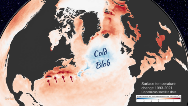
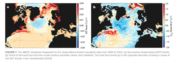
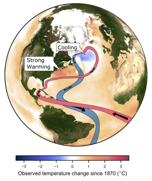
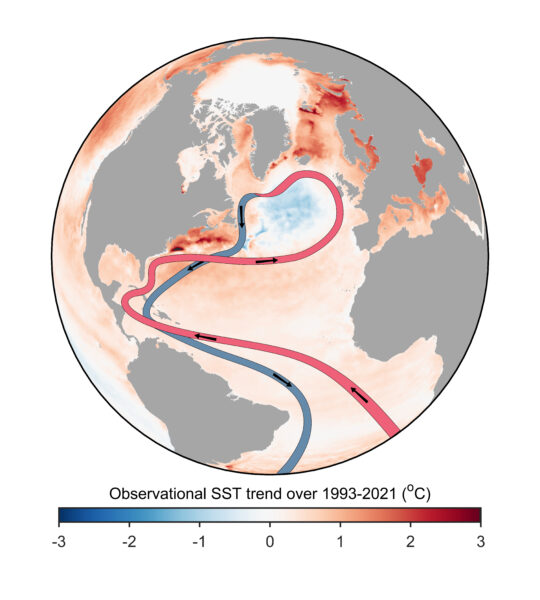
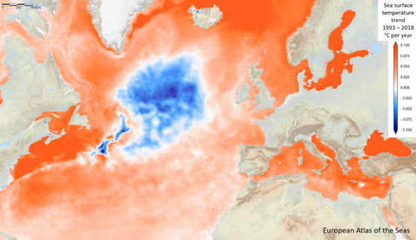
• Skip to primary navigation
  • Skip to main content
  • Skip to primary sidebar
  • Skip to footer

RealClimate

Climate science from climate scientists...

  • Home
  • Start here
  • Contributors
  • Archives
You are here: Home / Archives for Stefan

Stefan

Avatar photo

About Stefan

The AMOC: tipping this century, or not?

25 Aug 2023 by Stefan 107 Comments

A few weeks ago, a study by Copenhagen University researchers Peter and Susanne Ditlevsen concluded that the Atlantic Meridional Overturning Circulation (AMOC) is likely to pass a tipping point already this century, most probably around mid-century. Given the catastrophic consequences of an AMOC breakdown, the study made quite a few headlines but also met some skepticism. Now that the dust has settled, here some thoughts on the criticisms that have been raised about this study.

I’ve seen two main arguments there.

1. Do the data used really describe changes in AMOC?

We have direct AMOC measurements only since 2004, a time span too short for this type of study. So the Ditlevsens used sea surface temperatures (SST) in a region between the tip of Greenland and Britain as an indicator, based on Caesar et al. 2018 (PDF; I’m a coauthor on that paper). The basic idea starts with the observation that this region is far warmer than what is normal for that latitude, because the AMOC delivers a huge amount of heat into the area. The following chart which I made 25 years ago illustrates this.

Temperature deviation relative to the average along each latitude circle (i.e. the zonal mean). The northern Atlantic region air temperature is a lot too warm for its latitude, which (in models) largely goes away when the AMOC is stopped. From Rahmstorf and Ganopolski 1999.

If the AMOC weakens, this region will cool. And in fact it is cooling – it’s the only region on Earth which has cooled since preindustrial times. This is commonly referred to as ‘warming hole’ or ‘cold blob’.

We argued in Caesar et al. that the sea surface temperature there in winter is a good index of AMOC strength, based on a high-resolution climate model. (Not in summer when the ocean is covered by a shallow surface mixed layer heated by the sun and highly dependent on weather conditions.) We checked this across other climate models and found that our AMOC index (i.e. based on SST in the ‘cold blob’ region) and the actual AMOC slowdown correlated highly there (correlation coefficient R=0.95).

There are some other indicators, either using measured ocean salinities or using various types of proxy data from sediment cores, e.g. sediment grain sizes at the ocean bottom as indicators of flow speed of the deep southward AMOC branch. The key point to me is: these different indicators provide rather consistent AMOC reconstructions, as we showed in Caesar et al. 2021. The sediment data go back further in time but are likely not as reliable and don’t reach up to the present.

For recent decades there are potentially better approaches like ocean state estimates, and those are also consistent with the SST fingerprint – but these don’t go back far enough in time for the Ditlevsen type of study. The next graph shows a comparison of different reconstructions for the relevant time period used in the Ditlevsen study.

A comparison of direct observational AMOC data (RAPID) and two recent reconstructions to both the SST-based AMOC index (blue, used by the Ditlevsens) and two paleo-proxies that extend into the twenty-first century: the sortable-silt data and the marine productivity data. From Caesar et al. 2022.

Reconstructions based on salinity may also be good but they depend on precipitation, a notoriously variable quantity so it is rather doubtful whether analysing variance of salinity is doing any better than the SST signal.

The argument has been made that the ‘cold blob’ might not be caused by an AMOC decline but by heat loss at the ocean surface. That’s easy to check: if that were the case, then cooling in the area would be linked to increased heat loss at the surface. But if the AMOC is the culprit, then less heat should be lost, as a cooler ocean surface due to reduced ocean heat transport will lose less heat. The reanalysis data show the latter is the case.

This was shown by Halldór Björnsson of the Icelandic weather service and presented at the Arctic Circle conference 2016. I discussed this here in 2016 and also in my 2018 RealClimate article “If you doubt that the AMOC has weakened, read this”, together with possible other alternative explanations of the ‘cold blob’. We have recently repeated Halldór’s analysis at PIK and got the same results.

My conclusion: for the past century or so the SST data are probably the best AMOC indicator we have, and I don’t see concrete evidence suggesting that it’s unreliable.

2. The Ditlevsen study assumes that the AMOC follows a quadratic curve when approaching the tipping point.

That’s a more technical criticism. Their assumption follows from Stommel’s 1961 simple model of the AMOC tipping point. It results from the basic idea that (a) AMOC changes are proportional to density changes, and (b) the density change results from a balance between freshwater input and AMOC salt transport to the deep water formation (i.e. ‘cold blob’) region. Combined, these two assumptions lead to a quadratic equation.

These are very plausible basic assumptions, albeit using a linear equation of state, but we all know you can linearize things around a given point to get a first-order estimate. The argument that this is “too simple” doesn’t mean it’s wrong; rather this is correct at least to first order.

In a 1996 study I compared the results of a quadratic box model response to a fully-fledged 3D primitive equation ocean circulation model with nonlinear equation of state, the MOM model of the Geophysical Fluid Dynamics Lab in Princeton. It looks like this.

The AMOC strength (vertical axis) is shown as it depends on freshwater input (rain, meltwater) into the northern Atlantic. The box model equilibrium is shown as dotted parabola, the tipping point is S. By global warming we move from a past equilibrium toward the right – the box model run is the dashed line, the global ocean circulation model run is the solid line. Relevant is the upper branch, moving towards the right approaching the tipping point. From Rahmstorf (1996, PDF).

You can’t get a much better fit than that. A similar quadratic shape has also been found by Henk Dijkstra’s group at Utrecht University in a state-of-the-art global climate model, the CESM model (yet to be published). I have not seen any concrete evidence by the critics suggesting the shape may not be quadratic; that seems to be a purely hypothetical possibility. Also, if it is not exactly quadratic, the stated uncertainty range will be larger but it doesn’t fundamentally change the result.

What does it all mean?

An AMOC collapse would be a massive, planetary-scale disaster. Some of the consequences: Cooling and increased storminess in northwestern Europe, major additional sea level rise especially along the American Atlantic coast, a southward shift of tropical rainfall belts (causing drought in some regions and flooding in others), reduced ocean carbon dioxide uptake, greatly reduced oxygen supply to the deep ocean, likely ecosystem collapse in the northern Atlantic, and others. Check out the OECD report Climate Tipping Points which is well worth reading, and the maps below. You really want to prevent this from happening.

A figure from the recent OECD report Climate Tipping Points, showing how an AMOC shutdown after 2.5 °C global warming would change temperature (left) and precipitation (right) around the world.

We know from paleoclimatic data that there have been a number of drastic, rapid climate changes with focal point in the North Atlantic due to abrupt AMOC changes, apparently after the AMOC passed a tipping point. They are known as Heinrich events and Dansgaard-Oeschger events, see my review in Nature (pdf).

The point: it is a risk we should keep to an absolute minimum.

In other words: we are talking about risk analysis and disaster prevention. This is not about being 100% sure that the AMOC will pass its tipping point this century; it is that we’d like to be 100% sure that it won’t. Even if there were just (say) a 40% chance that the Ditlevsen study is correct in the tipping point being reached between 2025 and 2095, that’s a major change to the previous IPCC assessment that the risk is less than 10%. Even a <10% chance as of IPCC (for which there is only “medium confidence” that it’s so small) is in my view a massive concern. That concern has increased greatly with the Ditlevsen study – that is the point, and not whether it’s 100% correct and certain.

Would you live in a village below a dammed lake if you’re told there is a one in ten chance that one day the dam will break and much of the village will be washed away? Would you say: “Not to worry, that’s 90 % chance it won’t happen?” Or would you demand action by the authorities to reduce the risk? What if a new study appears, experienced scientists, reputable journal, that says it is nearly certain that the dam will break, the question is only when? Would you demand immediate attention to mitigate this danger, or would you say: “Oh well, some have questioned whether the assumptions of this study are entirely correct. Let’s just assume it is wrong”?

For the AMOC (and other climate tipping points), the only action we can take to minimise the risk is to get out of fossil fuels and stop deforestation as fast as possible. One major assumption of the Ditlevsen study is that global warming continues as in past decades. That is in our hands – or more precisely, that of our governments and powerful corporations. In 2022, the G20 governments alone subsidised fossil fuel use with 1.4 trillion dollars, up by 475% above the previous year. They aren’t trying to end fossil fuels.

Yet, as soon as we reach zero emissions, global warming will stop within years, and the sooner this happens the smaller the risk of passing tipping points. It also minimises lots of other losses, damages and human suffering from “regular” global warming impacts, which are already happening all around us even without passing major climate tipping points.

Links

For more on this, see my long TwiX thread with many images from relevant studies.

What is happening in the Atlantic Ocean to the AMOC?

If you doubt that the AMOC has weakened, read this

AMOC slowdown: Connecting the dots

And for even more, just enter “AMOC” into the search field of this blog!

Filed Under: Climate Science, Featured Story Tagged With: AMOC, climate change

What is happening in the Atlantic Ocean to the AMOC?

24 Jul 2023 by Stefan

For various reasons I’m motivated to provide an update on my current thinking regarding the slowdown and tipping point of the Atlantic Meridional Overturning Circulation (AMOC). I attended a two-day AMOC session at the IUGG Conference the week before last, there’s been interesting new papers, and in the light of that I have been changing my views somewhat. Here’s ten points, starting from the very basics, so you can easily jump to the aspects that interest you.

Figure 1. A very rough schematic of the AMOC: warm northward flow near the surface, deep-water formation, deep southward return flow in 2000 – 3000 meters depth. In the background the observed sea surface temperature (SST) trend since 1993 from the Copernicus satellite service, showing the ‘cold blob’ in the northern Atlantic west of the British Isles discussed below. Graph by Ruijian Gou.

1. The AMOC is a big deal for climate. The Atlantic meridional overturning circulation (AMOC) is a large-scale overturning motion of the entire Atlantic, from the Southern Ocean to the high north. It moves around 15 million cubic meters of water per second (i.e. 15 Sverdrup). The AMOC water passes through the Gulf Stream along a part of its much longer journey, but contributes only the smaller part of its total flow of around 90 Sverdrup. The AMOC is driven by density differences and is a deep reaching vertical overturning of the Atlantic; the Gulf Stream is a near-surface current near the US Atlantic coast and mostly driven by winds. The AMOC however moves the bulk of the heat into the northern Atlantic so is highly relevant for climate, because the southward return flow is very cold and deep (heat transport is the flow multiplied by the temperature difference between northward and southward flow). The wind-driven part of the Gulf Stream contributes much less to the net northward heat transport, because that water returns to the south at the surface in the eastern Atlantic at a temperature not much colder than the northward flow, so it leaves little heat behind in the north. So for climate impact, the AMOC is the big deal, not the Gulf Stream.

2. The AMOC has repeatedly shown major instabilities in recent Earth history, for example during the Last Ice Age, prompting concerns about its stability under future global warming, see e.g. Broecker 1987 who warned about “unpleasant surprises in the greenhouse”. Major abrupt past climate changes are linked to AMOC instabilities, including Dansgaard-Oeschger-Events and Heinrich Events. For more on this see my Review Paper in Nature.

3. The AMOC has weakened over the past hundred years. We don’t have direct measurements over such a long time (only since 2004 from the RAPID project), but various indirect indications. We have used the time evolution of the ‘cold blob’ shown above, using SST observations since 1870, to reconstruct the AMOC in Caesar et al. 2018. In that article we also discuss a ‘fingerprint’ of an AMOC slowdown which also includes excessive warming along the North American coast, also seen in Figure 1. That this fingerprint is correlated with the AMOC in historic runs with CMIP6 models has recently been shown by Latif et al. 2022, see Figure 2.

Figure 2. Correlation of SST variations (left) with AMOC variations (right) in historic runs with CMIP6 models, from Latif et al. 2022.

Others have used changes in the Florida Current since 1909, or changes in South Atlantic salinity, to reconstruct past AMOC changes – for details check out my last AMOC article here at RealClimate.

4. The AMOC is now weaker than any time in the past millennium. Several groups of paleoclimatologists have used a variety of methods to reconstruct the AMOC over longer time spans. We compiled the AMOC reconstructions we could find in Caesar et al. 2021, see Figure 3. In case you’re wondering how the proxy data reconstructions compare with other methods for the recent variability since 1950, that is shown in Caesar et al. 2022 (my take: quite well).

Figure 3. A compilation of 9 different proxy series for the AMOC evolution. Data locations are shown in the inset map, from Caesar et al. 2021.

5. The long-term weakening trend is anthropogenic. For one, it is basically what climate models predict as a response to global warming, though I’d argue they underestimate it (see point 8 below). A recent study by Qasmi 2023 has combined observations and models to isolate the role of different drivers and concludes for the ‘cold blob’ region: “Consistent with the observations, an anthropogenic cooling is diagnosed by the method over the last decades (1951–2021) compared to the preindustrial period.”

In addition there appear to be decadal oscillations particularly after the mid-20th Century. They may be natural variability, or an oscillatory response to modern warming, given there is a delayed negative feedback in the system (weak AMOC makes the ‘cold blob’ region cool down, that increases the water density there, which strengthens the AMOC). Increasing oscillation amplitude may also be an early warning sign of the AMOC losing stability, see point 10 below.

The very short term SST variability (seasonal, interannual) in the cold blob region is likely just dominated by the weather, i.e. surface heating and cooling, and not indicative of changes in ocean currents.

6. The AMOC has a tipping point, but it is highly uncertain where it is. This tipping point was first described by Stommel 1961 in a highly simple model which captures a fundamental feedback. The region in the northern Atlantic where the AMOC waters sink down is rather salty, because the AMOC brings salty water from the subtropics to this region. If it becomes less salty by an inflow of freshwater (rain or meltwater from melting ice), the water becomes less dense (less “heavy”), sinks down less, the AMOC slows down. Thus it brings less salt to the region, which slows the AMOC further. It is called the salt advection feedback. Beyond a critical threshold this becomes a self-amplifying “vicious circle” and the AMOC grinds to a halt. That threshold is the AMOC tipping point. Stommel wrote: “The system is inherently frought with possibilities for speculation about climatic change.”

That this tipping point exists has been confirmed in numerous models since Stommel’s 1961 paper, including sophisticated 3-dimensional ocean circulation models as well as fully fledged coupled climate models. We published an early model comparison about this in 2005. The big uncertainty, however, is in how far the present climate is from this tipping point. Models greatly differ in this regard, the location appears to be sensitively dependent on the finer details of the density distribution of the Atlantic waters. I have compared the situation to sailing with a ship into uncharted waters, where you know there are dangerous rocks hidden below the surface that could seriously damage your ship, but you don’t know where they are.

7. Standard climate models have suggested the risk is relatively small during this century. Take the IPCC reports: For example, the Special Report on the Ocean and Cryosphere concluded:

The AMOC is projected to weaken in the 21st century under all RCPs (very likely), although a collapse is very unlikely (medium confidence). Based on CMIP5 projections, by 2300, an AMOC collapse is about
as likely as not for high emissions scenarios and very unlikely for lower ones (medium confidence).

It has long been my opinion that “very unlikely”, meaning less than 10% in the calibrated IPCC uncertainty jargon, is not at all reassuring for a risk we really should rule out with 99.9 % probability, given the devastating consequences should a collapse occur.

8. But: Standard climate models probably underestimate the risk. There are two reasons for that. They largely ignore Greenland ice loss and the resulting freshwater input to the northern Atlantic which contributes to weakening the AMOC. And their AMOC is likely too stable. There is a diagnostic for AMOC stability, namely the overturning freshwater transport, which I introduced in a paper in 1996 based on Stommel’s 1961 model. Basically, if the AMOC exports freshwater out of the Atlantic, then an AMOC weakening would lead to a fresher (less salty) Atlantic, which would weaken the AMOC further. Data suggest that the real AMOC exports freshwater, in most models it imports freshwater. This is still the case and was also discussed at the IUGG conference.

Here a quote from Liu et al. 2014, which nicely sums up the problem and gives some references:

Using oceanic freshwater transport associated with the overturning circulation as an indicator of the AMOC bistability (Rahmstorf 1996), analyses of present-day observations also indicate a bistable AMOC (Weijer et al. 1999; Huisman et al. 2010; Hawkins et al. 2011a,b; Bryden et al. 2011; Garzoli et al. 2012). These observational studies suggest a potentially bistable AMOC in the real world. In contrast, sensitivity experiments in CGCMs tend to show a monostable AMOC (Stouffer et al. 2006), indicating a model bias toward a monostable AMOC. This monostable bias of the AMOC in CGCMs, as first pointed out by Weber et al. (2007) and later confirmed by Drijfhout et al. (2011), could be related to a bias in the northward freshwater transport in the South Atlantic by the meridional overturning circulation.

9. Standard climate models get the observed ‘cold blob’, but only later. Here is some graphs from the current IPCC report, AR6.

Figure 4. Observed vs simulated historic warming (normalised to 1 °C). At this stage the ‘cold blob’ is not yet seen in the model average. Source: IPCC AR6
Figure 5. Simulated warming by the end of this century. Now the ‘cold blob’ appears in the CMIP6 models.

10. There are possible Early Warning Signals (EWS). New methods from nonlinear dynamics search for those warning signals when approaching tipping points in observational data, from cosmology to quantum systems. They use the critical slowing down, increasing variance or increasing autocorrelation in the variability of the system. There is the paper by my PIK colleague Niklas Boers (2021), which used 8 different data series (Figure 6) and concluded there is “strong evidence that the AMOC is indeed approaching a critical, bifurcation-induced transition.”

Figure 6. Early warning signals in four temperature and four salinity based AMOC reconstructions. Note that the tipping point is reached when the lines reach a lambda value of zero. From Boers 2021.

Another study, this time using 312 paleoclimatic proxy data series going back a millennium, is Michel et al. 2022. They argue to have found a “robust estimate, as it is based on sufficiently long observations, that the Atlantic Multidecadal Variability may now be approaching a tipping point after which the Atlantic current system might undergo a critical transition.”

And today (update!) a third comparable study by Danish colleagues has been published, Ditlevsen & Ditlevsen 2023, which expects the tipping point already around 2050, with a 95% uncertainty range for the years 2025-2095. Individual studies always have weaknesses and limitations, but when several studies with different data and methods point to a tipping point that is already quite close, I think this risk should be taken very seriously.

Conclusion

Timing of the critical AMOC transition is still highly uncertain, but increasingly the evidence points to the risk being far greater than 10 % during this century – even rather worrying for the next few decades. The conservative IPCC estimate, based on climate models which are too stable and don’t get the full freshwater forcing, is in my view outdated now. I side with the recent Climate Tipping Points report by the OECD, which advised:

Yet, the current scientific evidence unequivocally supports unprecedented, urgent and ambitious climate action to tackle the risks of climate system tipping points.

If you like to know more about this topic, you can either watch my short talk from the Exeter Tipping Points conference last autumn (where also Peter Ditlevsen first presented the study which was just published), or the longer video of my EPA Climate Lecture in Dublin Mansion House last April.

Filed Under: Climate impacts, Climate Science, Featured Story, heatwaves, Instrumental Record, Oceans Tagged With: AMOC, North Atlantic

The water south of Greenland has been cooling, so what causes that?

17 Dec 2022 by Stefan

Sea surface temperature trend 1993 – 2018, from European Atlas of the Seas

Let’s compare two possibilities by a back-of-envelope calculation.

(1) Is it due to a reduced heat transport of the Atlantic Meridional Overturning Circulation (AMOC)?

(2) Or is it simply due to the influx of cold meltwater as the Greenland Ice Sheet is losing ice?

The latter is often suggested. The meltwater also contributes indirectly to slowing the AMOC, but not because it is cold but because it is freshwater (not saline), which contributes to the first option (i.e. AMOC decline).

AMOC heat transport

For that we take the AMOC flow rate times the temperature difference of 15 °C between the northward upper branch and southward deep return flow to obtain the heat transport.

17,000,000 m3/s x 15 K x 1025 kg/m3 x 4 kJ/kgK = 1 PW (1)

(Here, 1 PW = 1015 Watt and 4 kJ/kgK is the heat capacity of water.)

An AMOC weakening by 15 % thus cools the region at a rate of 0.15 PW = 1.5 x 10¹⁴ W and according to model simulations can fully explain the observed cooling trend (2). Of course, this slowdown is not only due to Greenland meltwater – other factors like increasing precipitation probably play a larger role, but the impact of Greenland melting is not negligible, as we argue in (3).

Greenland ice melt

Here we start by taking the Greenland mass loss rate into the ocean, times the temperature difference between the meltwater and the water it replaces. Note we are interested in the longer-term temperature trend over decades over the region with the meltwater properly mixed in, not at some temporary patches of meltwater floating locally at the surface.

Total Greenland mass loss has been on average 270 Gt/year for the last two decades (4).

Most of that evaporates though, and what ends up in the ocean of this, according to a recent study by Jason Box (5), is around 100 Gt/year, about 30% of which in form of ice and 70% in form of meltwater.

100 Gt/year = 3000 tons/second – that sounds a lot but the AMOC flow is more than 5000 times larger.

Assuming the ice and meltwater runoff occurs at 0 °C and replaces water that is 10 °C (a very high assumption corresponding to summer conditions and not the long-term average), the cooling rate is:

3,000,000 kg/s x 10 K x 4 kJ/kgK = 1.2 x 10¹¹ W

So in comparison, the cooling effect of a 15 % AMOC slowdown is over 1,000 times larger than the direct cooling effect of the Greenland meltwater.

For the part entering the ocean as ice, we must also consider that to melt ice requires energy. The heat of fusion of water is 334 kJ/kg so that adds 900 tons/s x 334 kJ/kg = 3 x 10¹¹ W.

So it turns out that those suggesting that ‘cold’ meltwater might cause the cold blob in the northern Atlantic are doubly wrong: if we talk about the direct impact of stuff coming off Greenland, than ice is the dominant factor and the energy that’s required to melt the ice. But both the direct effect of meltwater and of icebergs entering the ocean are completely dwarfed by the weakening of the AMOC (regardless of whether we take the numbers of Box et al. or other estimates). And Greenland’s contribution to that is not because the meltwater is ‘cold’, but because it is fresh – it contains no salt and dilutes the saltiness of the ocean water, thereby reducing its density.

As an additional observation: the cooling patch shown above often vanishes in summer, covered up by a warm surface layer – just when the Greenland melt season is on – only to resurface when deeper mixing starts in autumn. Which again supports the idea that it is not due to a direct effect of cold meltwater influx. Also compare the temperature change directly at the Greenland coast, where the meltwater enters, in the image above.

Finally, some have suggested that the cold blob south of Greenland has been caused by increased heat loss to the atmosphere. That of course is relevant for short-term weather variability – if a cold wind blows over the ocean it will of course cool the surface – but I do not think it can explain the long-term trend, as we discussed earlier here at Realclimate.

References

1.            Trenberth, K. E. & Fasullo, J. T. (2017) Atlantic meridional heat transports computed from balancing Earth’s energy locally, Geophys. Res. Let. 44: 1919-1927.

2.            Caesar, L., Rahmstorf, S., Robinson, A., Feulner, G., & Saba, V. (2018) Observed fingerprint of a weakening Atlantic Ocean overturning circulation, Nature 556: 191-196.

3.            Rahmstorf, S., J.E. Box, G. Feulner, M.E. Mann, A. Robinson, S. Rutherford, and E.J. Schaffernicht, 2015: Exceptional twentieth-century slowdown in Atlantic Ocean overturning circulation. Nature Climate Change, 5, 475–480, doi:10.1038/nclimate2554.

4.            NASA Vital Signs, https://climate.nasa.gov/vital-signs/ice-sheets/

5.            Box, J. E., et al. (2022), Greenland ice sheet climate disequilibrium and committed sea-level rise, Nature Clim. Change, 12(9), 808-813, doi: 10.1038/s41558-022-01

Filed Under: Climate Science

Sea level in the IPCC 6th assessment report (AR6)

13 Aug 2021 by Stefan

My top 3 impressions up-front:

  • The sea level projections for the year 2100 have been adjusted upwards again.
  • The IPCC has introduced a new high-end risk scenario, stating that a global rise “approaching 2 m by 2100 and 5 m by 2150 under a very high greenhouse gas emissions scenario cannot be ruled out due to deep uncertainty in ice sheet processes.”
  • The IPCC gives more consideration to the large long-term sea-level rise beyond the year 2100.

And here is the key sea-level graphic from the Summary for Policy Makers:

Source: IPCC AR6, Figure SPM.8

This is a pretty clear illustration of how sea level starts to rise slowly; but in the long run, sea-level rise caused by fossil-fuel burning and deforestation in our generation could literally go off the chart and inundate many coastal cities and wipe entire island nations off the map. But first things first.

Observed Past Rise

Let’s dive a little deeper into the full report and start with the observed sea level change. Since 1901 sea level has risen by 20 cm, a rise unprecedented in at least 3,000 years (disclosure: I co-authored some of the research behind the latter conclusion).

Source: IPCC AR6 Fig. 2.28b

Since 1900 the rise has greatly accelerated. During the most recent period analyzed, 2006-2018, it’s been rising at a rate of 3.7 mm/year – nearly three times as fast as during 1901-1971 (1.3 mm/year). The IPCC calls this a “robust acceleration (high confidence) of global mean sea level rise over the 20th century”, as did the SROCC in 2019.

The finding of sea-level acceleration is not new. The AR4 already concluded in 2007: “There is high confidence that the rate of sea level rise has increased between the mid-19th and the mid-20th centuries.” And the AR5 found in 2013 that “there is high confidence that the rate of sea level rise has increased during the last two centuries, and it is likely that global mean sea level has accelerated since the early 1900’s.” (Which has not stopped “climate skeptics” from repeatedly claiming a lack of acceleration.)

Source: IPCC AR6 Fig. 2.28c

The reason for earlier hedged wording by the IPCC was the possibility of natural decadal variability affecting the trend estimates, but the AR6 now concludes “that the main driver of the observed global mean sea-level rise since at least 1970 is very likely anthropogenic forcing”. That is the result of so-called “attribution studies” – attempts to differentiate with the help of a combination of data, models, pattern detection and statistics between all possible human-caused and natural factors in the observed changes. However, on the level of basic physical reasoning, it is of course a no-brainer that warming will cause land-ice to melt (and melt faster as it gets hotter) and ocean waters to expand, so sea-level rise is the inevitable result.

And there is this:

New observational evidence leads to an assessed sea level rise over the period 1901 to 2018 that is consistent with the sum of individual components contributing to sea level rise, including expansion due to ocean warming and melting of glaciers and ice sheets (high confidence).

IPCC AR6

That’s an important consistency check; the independent data add up to the overall observed rise.

The Future Until 2100

It is virtually certain that global mean sea level will continue to rise over the 21st century in response to continued warming of the climate system.

IPCC AR6

By how much? That depends on our emissions and is shown in the following figure. The take-away message is: for high emissions we’d likely get close to a meter, sticking to the Paris agreement would cut that down to half a meter.

Source: IPCC AR6, Figure SPM.8

And how does that compare to the recent previous reports? Here is the comparison the IPCC shows:

Projections of global mean sea level for 2050 (left) and 2100 (right). The different colours and boxes represent three emissions scenarios: RCP8.5/SSP5-8.5 (red), RCP4.5/SSP2-4.5 (light blue/yellow) and RCP2.6/SSP1-2.6 (dark blue). Projections are given for AR6, SROCC, AR5, a survey of 106 experts (Survey), structured expert judgment (SEJ), models including marine ice cliff instability (MICI) and projections including only medium-confidence processes (MED). Source: IPCC (2021) Figure 9.25.

If you look at the 2100 projections for the last three reports (AR5, SROCC, AR6) you can see that the numbers have increased each time – and remember that the AR5 numbers had already increased by ~60% compared to the AR4. This illustrates the fact that IPCC has been too “cautious” in the past (which is not a virtue in risk assessment), having to correct itself upward again and again (all the while “climate skeptics” try to paint the IPCC as “alarmist”, for want of any better arguments to play down the climate crisis).

Related to that are notable changes in grappling with uncertainty and risk. The IPCC is now showing very likely (5-95 percentile) as well as likely (17-83 percentile) ranges. In the AR5, it had made the rather ad-hoc argument that “global mean sea level rise is likely (medium confidence) to be in the 5 to 95% range of projections from proces-based models”. So their likely range was actually the modelled very likely range.

The IPCC now splits the uncertainty into two types, hence the two different shadings in the uncertainty bars, in an attempt to also cover uncertainty in processes which we still cannot confidently model. They write:

Importantly, likely range projections do not include those ice-sheet-related processes whose quantification is highly uncertain or that are characterized by deep uncertainty. Higher amounts of global mean sea level rise before 2100 could be caused by earlier-than-projected disintegration of marine ice shelves, the abrupt, widespread onset of Marine Ice Sheet Instability (MISI) and Marine Ice Cliff Instability (MICI) around Antarctica, and faster-than-projected changes in the surface mass balance and dynamical ice loss from Greenland. In a low-likelihood, high-impact storyline and a high CO2 emissions scenario, such processes could in combination contribute more than one additional meter of sea level rise by 2100.

Note that this uncertainty goes to one side: up. For estimating this uncertainty they use an expert survey as well as a smaller but more detailed structured expert judgement. I co-authored the survey (see also 7-minute video about it) with Ben Horton and others, as well as a predecessor survey published in 2014, and I am happy to see that the IPCC now includes this type of expert judgement to assess risks that can’t yet be modelled reliably, but cannot be just ignored either. In dealing with the climate crisis, it simply is not enough to consider what is likely to happen – it is even more important to understand what the risks are.

Think about it: If someone builds a nuclear facility near to your house, would you be satisfied with knowing that it is “likely” to work well (say, 83% certain)? Or would you like to know about a few percent chance that it could blow up like Chernobyl in your lifetime?

With the high-end risk scenarios, the IPCC is catching up with other assessments such as the US National Climate Assessment of 2017, which already showed a “high” scenario of 2 meters and an “extreme” scenario of 2.5 meters of rise by 2100.

The Long Term Future

One of the headline statements of the AR6 is:

Many changes due to past and future greenhouse gas emissions are irreversible for centuries to millennia, especially changes in the ocean, ice sheets and global sea level.

IPCC AR6

That’s because huge ice sheets take a long time to melt in a warmer climate, and the ocean waters take a long time to warm up as you go further down, away from the surface. So by what we are doing now in the next couple of decades we determine the rate and amount of sea-level rise for millennia to come, condemning many generations to continually changing coastlines and forcing them to abandon many coastal cities, large and small. That we cannot turn this back is the reason why the precautionary principle should be applied to the climate crisis.

Just look at the ranges expected by the year 2300, in the right-hand panel of the first image above. Even in the blue mitigation scenario, which limits warming to well below 2 °C, our descendants may well have to deal with 2-3 meters of sea-level rise, which would be catastrophic for the people living at the world’s coastlines. Not only would it be extremely hard and costly – if possible at all – to defend cities like New York during a storm surge with a so much higher sea level. We would see massive coastal erosion happening all around. And remember that “nuisance flooding” is already causing real problems after just 20 cm of sea-level rise, for example along the eastern seaboard of the US!

At least with this Paris scenario and a good portion of sheer luck, we may get away with less than a meter rise. But with further unmitigated increase in emissions, a desastrous 2 meter rise is about as likely as an utterly devastating 7 meter rise. What would our descendants think we were doing?

Filed Under: Climate Science

Two graphs show the path to 1.5 degrees

21 Apr 2021 by Stefan

In the Paris Agreement, just about all of the world’s nations pledged to “pursue efforts to limit the temperature increase to 1.5 degrees Celsius above pre-industrial levels”. On Saturday, the top climate diplomats from the U.S. and China, John Kerry and Xie Zhenhua, reiterated in a joint statement that they want to step up their climate mitigation efforts to keep that goal “within reach”.

But is that still possible? Here are two graphs.

Global temperature trend (relative to mean 1880-1910, NASA data). The colored curve shows the moving average over 12 months, the black line the linear trend over the last 50 years. Transient warmth following two strong El Niño events in the tropical Pacific is indicated by arrows. If everything continued like this, the 1.5 degree limit would be exceeded around 2040.

The first graph shows the global temperature trend. Warming has progressed essentially linearly for fifty years in response to increasing CO2 emissions. Although the latter accelerate the rise of CO2 in the atmosphere, on the other hand, radiative forcing (which causes warming) increases only with the logarithm of CO2 concentration, and therefore roughly linearly since the 1970s. Any acceleration of warming over the last decade is not a significant trend change. It is linked to two El Niño events in recent years, but that is part of natural variability. Does anyone remember the discussion about the supposed “warming pause” in the early 2000s? It also never was statistically significant, nor did it signify a trend change.

Therefore, if emissions continue to grow, we expect a further roughly linear increase in temperature, which would then exceed 1.5 degrees around 2040. If we lower emissions, the trend will flatten out and become roughly horizontal as we reach zero emissions. Therefore, these observational data do not argue against the possibility to still keep warming below 1.5°C.

Exemplary emission trajectories with CO2 emission budgets that, according to the IPCC, correspond to limiting warming to 1.5 °C with 50% probability (solid) or limiting it to 1.75 °C with 67% probability. The same emissions as in 2019 were assumed as the starting point in 2021, assuming the “corona spike” in 2020 is likely to be temporary.

The second graph shows global CO2 emission trajectories with which we can still limit warming to 1.5 °C, at least with 50:50 probability. This means: given the uncertainties, this could also land us at 1.6 degrees, but with a bit of luck, it could land us a bit below 1.5 degrees. The core conclusions:

  •     It is not yet impossible to keep warming below 1.5 °C.
  •     This requires roughly a halving of global CO2 emissions by 2030 (as already stated in the IPCC 1.5 degree report).
  •     If the world dithers for another ten years before emissions fall, it will no longer be possible (red curve).

It should be noted that I have not assumed net-negative emissions here. Many scenarios assume that we first emit too much and that our children then have to pull CO2 out of the atmosphere after mid-century – I think this is not very realistic and also ethically questionable. I think we will probably not be able to achieve more than reducing global emissions to net zero. Even that would require CO2 sinks to compensate for unavoidable residual emissions, e.g. from agriculture.

Conclusion: The limitation to 1.5 degrees is still possible and from my point of view also urgently advised to avert catastrophic risks, but it requires immediate decisive measures. I am curious to see what the climate summit scheduled by US President Joe Biden will bring in the coming days!

Link

Fact check by Climate Analytics to the claim that we can no longer limit warming to 1.5°C.

This article originally appeared in German at KlimaLounge.

Filed Under: Climate Science

New studies confirm weakening of the Gulf Stream circulation (AMOC)

17 Sep 2020 by Stefan

Many of the earlier predictions of climate research have now become reality. The world is getting warmer, sea levels are rising faster and faster, and more frequent heat waves, extreme rainfall, devastating wildfires and more severe tropical storms are affecting many millions of people. Now there is growing evidence that another climate forecast is already coming true: the Gulf Stream system in the Atlantic is apparently weakening, with consequences for Europe too.

[Read more…] about New studies confirm weakening of the Gulf Stream circulation (AMOC)

Filed Under: Climate Science

How much CO2 your country can still emit, in three simple steps

6 Aug 2019 by Stefan

Everyone is talking about emissions budgets – what are they and what do they mean for your country?

Our CO2 emissions are causing global heating. If we want to stop global warming at a given temperature level, we can emit only a limited amount of CO2. That’s our emissions budget. I explained it here at RealClimate a couple of years ago:

First of all – what the heck is an “emissions budget” for CO2? Behind this concept is the fact that the amount of global warming that is reached before temperatures stabilise depends (to good approximation) on the cumulative emissions of CO2, i.e. the grand total that humanity has emitted. That is because any additional amount of CO2 in the atmosphere will remain there for a very long time (to the extent that our emissions this century will like prevent the next Ice Age due to begin 50 000 years from now). That is quite different from many atmospheric pollutants that we are used to, for example smog. When you put filters on dirty power stations, the smog will disappear. When you do this ten years later, you just have to stand the smog for a further ten years before it goes away. Not so with CO2 and global warming. If you keep emitting CO2 for another ten years, CO2 levels in the atmosphere will increase further for another ten years, and then stay higher for centuries to come. Limiting global warming to a given level (like 1.5 °C) will require more and more rapid (and thus costly) emissions reductions with every year of delay, and simply become unattainable at some point.

In her recent speech at the French National Assembly, Greta Thunberg rightly made the emissions budget her central issue.

So let’s look at how the emissions budget concept can be used to guide policy on future emissions trajectories for countries.

[Read more…] about How much CO2 your country can still emit, in three simple steps

Filed Under: Climate Science Tagged With: budget, co2, emissions

Can planting trees save our climate?

16 Jul 2019 by Stefan

In recent weeks, a new study by researchers at ETH Zurich has hit the headlines worldwide (Bastin et al. 2019). It is about trees. The researchers asked themselves the question: how much carbon could we store if we planted trees everywhere in the world where the land is not already used for agriculture or cities? Since the leaves of trees extract carbon in the form of carbon dioxide – CO2 – from the air and then release the oxygen – O2 – again, this is a great climate protection measure. The researchers estimated 200 billion tons of carbon could be stored in this way – provided we plant over a trillion trees.

The media impact of the new study was mainly based on the statement in the ETH press release that planting trees could offset two thirds of the man-made CO2 increase in the atmosphere to date. To be able to largely compensate for the consequences of more than two centuries of industrial development with such a simple and hardly controversial measure – that sounds like a dream! And it was immediately welcomed by those who still dream of climate mitigation that doesn’t hurt anyone.

[Read more…] about Can planting trees save our climate?

Filed Under: Climate Science

First successful model simulation of the past 3 million years of climate change

3 Apr 2019 by Stefan

Guest post by Matteo Willeit, Potsdam Institute for Climate Impact Research

A new study published in Science Advances shows that the main features of natural climate variability over the last 3 million years can be reproduced with an efficient model of the Earth system.

The Quaternary is the most recent geological Period, covering the past ~2.6 million years. It is defined by the presence of glacial-interglacial cycles associated with the cyclic growth and decay of continental ice sheets in the Northern Hemisphere. Climate variations during the Quaternary are best seen in oxygen isotopes measured in deep-sea sediment cores, which represent variations in global ice volume and ocean temperature. These data show clearly that there has been a general trend towards larger ice sheets and cooler temperatures over the last 3 million years, accompanied by an increase in the amplitude of glacial-interglacial variations and a transition from mostly symmetry cycles with a periodicity of 40,000 years to strongly asymmetric 100,000-year cycles at around 1 million years ago.  However, the ultimate causes of these transitions in glacial cycle dynamics remain debated.

[Read more…] about First successful model simulation of the past 3 million years of climate change

Filed Under: Carbon cycle, Climate modelling, Climate Science, Paleoclimate

What the 2018 climate assessments say about the Gulf Stream System slowdown

28 Jan 2019 by Stefan

Last year, twenty thousand peer reviewed studies on ‘climate change’ were published. No single person can keep track of all those – you’d have to read 55 papers every single day. (And, by the way, that huge mass of publications is why climate deniers will always find something to cherry-pick that suits their agenda.) That is why climate assessments are so important, where a lot of scientists pool their expertise and discuss and assess and summarize the state of the art.

So let us have a quick look what last year’s climate assessments say about the much-discussed topic of whether the Atlantic Meridional Overturning Circulation (AMOC, a.k.a. Gulf Stream System) has already slowed down, as predicted by climate models in response to global warming.

[Read more…] about What the 2018 climate assessments say about the Gulf Stream System slowdown

Filed Under: Climate Science Tagged With: AMOC, Gulf Stream, IPCC

  • Go to page 1
  • Go to page 2
  • Go to page 3
  • Interim pages omitted …
  • Go to page 10
  • Go to Next Page »

Primary Sidebar

Email Notification

get new posts sent to you automatically (free)
Loading

Recent Posts

  • Old habits
  • The Scafetta Saga
  • As Soon as Possible
  • Unforced variations: Sep 2023
  • The AMOC: tipping this century, or not?
  • Unforced Variations: Aug 2023

Our Books

Book covers
This list of books since 2005 (in reverse chronological order) that we have been involved in, accompanied by the publisher’s official description, and some comments of independent reviewers of the work.
All Books >>

Recent Comments

  • MA Rodger on As Soon as Possible
  • Radge Havers on Old habits
  • Piotr on Unforced variations: Sep 2023
  • Piotr on Unforced variations: Sep 2023
  • Piotr on Unforced variations: Sep 2023
  • Edward Burke on The AMOC: tipping this century, or not?
  • Carbomontanus on The Scafetta Saga
  • Carbomontanus on As Soon as Possible
  • Carbomontanus on Unforced variations: Sep 2023
  • prl on Unforced variations: Sep 2023
  • De Niles on As Soon as Possible
  • Robert Cutler on Unforced variations: Sep 2023

Footer

ABOUT

  • About
  • Translations
  • Privacy Policy
  • Contact Page
  • Login

DATA AND GRAPHICS

  • Data Sources
  • Climate model projections compared to observations
  • Surface temperature graphics
  • Miscellaneous Climate Graphics

INDEX

  • Acronym index
  • Index

Realclimate Stats

1,314 posts

10 pages

232,727 comments

Copyright © 2023 · RealClimate is a commentary site on climate science by working climate scientists for the interested public and journalists.