Confirmation bias and a profound lack of curiosity mark the latest ABC (Anything But Carbon) contrapalooza in DC this week and a decade-old albedo error trips them up.
[Read more…] about A reflection on reflectionCommunicating Climate
Spencer’s Shenanigans: Part II
We previously highlighted Roy Spencer’s poor practices in comparing models with observations, but we’ve now dug down a little deeper, and it’s not pretty.
[Read more…] about Spencer’s Shenanigans: Part IIThe Climate Science reference they don’t want Judges to read
For the first time, the Federal Judicial Center (FJC) commissioned a chapter on climate science for the manual they put out (with the NASEM) for judges, the Reference on Scientific Evidence (4th Edition). This week, a month after it was published, they pulled the chapter out after being pressured by 27 Republican Attorneys General. You can nonetheless read it here.
[Read more…] about The Climate Science reference they don’t want Judges to readKoonin’s Continuing Calumnies
At a public event debating the DOE CWG report, Steve Koonin embarrasses himself further.
[Read more…] about Koonin’s Continuing CalumniesA peek behind the curtain…
New email releases from the EDF/UCS lawsuit against the DOE provide a rarely-seen behind the curtain look at how the climate contrarians work.
[Read more…] about A peek behind the curtain…Who should pay?
Climate risk scores on real estate listings are having an impact on prices and realtors are complaining. But who should pay for these losses?
[Read more…] about Who should pay?Raising Climate Literacy
Climate change has become “that” topic – like evolution of species, plate tectonics, or AI where the public has heard so much about it that many think they know everything they need to know. Such confidence can be both a good and bad thing.
The upside is that the biggest global societal problem of our time, climate change, has become a part of the broader culture. The vast majority of the world agrees that something must be done to mitigate global warming – 69% of the world population is willing to contribute 1% of their income to climate mitigation, and 89% demand climate action from their governments and politicians. 62% of Americans feel a personal duty to reduce the effects of climate change. However, the downside is that most lack a sufficient foundation in the science of climate change which creates misconceptions, a lack of ability to discern pseudoscience, and an ill-founded surety about the realities of global warming. Misconceptions get in the way of understanding the science behind the predictions of climate change to the point where mitigation efforts are derailed or stalled. The consequence is that anthropogenic climate change, a phrase used to describe the change in climate attributable to human activity, becomes a political “belief” rather than accepted as scientific discourse.
The U.S. is among the most politically divided countries about anthropogenic climate change. Despite 61% of Americans regarding the scientific evidence supporting a warming Earth as solid, the current administration has successfully and systematically defunded most of its institutions providing the most scientifically sound information and educational materials about climate change. The damage to NASA, NOAA, NIH, and EPA is profound and is threatening the exalted status of the U.S. as a global leader in scientific research. Such misguidedness stems in part from “The vast majority of the world” (the tendency of individuals to underestimate the willingness of others to want to mitigate climate change), and in greater part from “climate modeling ignorance.”
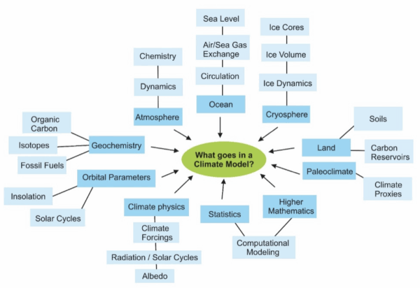
One of the most pernicious misconceptions about climate change is the idea that climate models make projections for the next 100 years by simply extrapolating the globally averaged changes in weather patterns over the last 40 – 50 years into the future. This is an important misconception to correct because it goes to the core of the credibility of climate models in the mind of lay people who make political decisions about mitigating hazards of anthropogenic climate change. This misconception is an outgrowth from another one – that weather and climate are the same thing. Many lay people do not realize that both regional and global climate is determined by many factors beyond atmospheric chemistry and dynamics, including (but not limited to) ocean circulation, the thermal properties of both seawater and ice, the extent and volume of ice cover as well as Earth’s orbital parameters – are all part and parcel of climate models:
For example, “will it snow tomorrow?” is a ‘weather’ question, while “how do El Niño events in the tropical Pacific Ocean affect winters in West Michigan?” is a climate question. This distinction matters for making decisions about mitigating climate change because it fosters the understanding that teleconnections affect both global and regional climate, and that a persistent change related to global warming in the natural cyclicity of a distant interaction between ocean and atmosphere (El Niño in the tropical Pacific) can change what to expect in West Michigan in the next 50 or 100 years.
Another pervasive misconception is the confusion of Environmental Science with Climate Science. Two big questions arise: “what can a climatologist do that an environmental scientist cannot?” and “why does developing Climate Science programs in colleges distinct from environmental science matter for the lay person, the broader public?”
Nationally, while both Environmental Science and Climate Science programs are broadly
multidisciplinary and interrelated, they have important differences. Climate Science is a physical science focusing on the causes, direct effects, and changes in climate through all of Earth’s history including the Anthropocene (the “Human Era”) through computational models involving the chemistry and physics of climate change; while Environmental Science is a natural science broadly involving ecology, microbiology, soil science, conservation, restoration, natural resource management, entomology, pollution, water quality, and similar.
For example, pollution of a river system is a massive environmental problem. So is recycling waste. But neither are problems directly related to climate change. Similarly, availability of food or clean water is a sustainability question related more to human population growth, economics, politics, and environmental change than climate change; though of course the greater the human population, the greater the amount of greenhouse gasses emitted to the atmosphere which leads to climate warming. So, climate change affects and informs environmental change and sustainability but is only one aspect of those fields. The change in duration of the annual growth season or warmer temperatures shifting to higher latitudes will affect availability of food and water – these are sustainability issues.
Unfortunately, only a handful of colleges and universities across the United States have developed college majors specifically in Climate Science, most recently Grand Valley State University. However, academic programs specifically dedicated to Climate System Science are a new national trend – so new in fact that it is difficult to find information about the number of students enrolled or graduates produced annually nationwide.
What has this got to do with “climate modeling ignorance”?
Creating academic programs specifically focused on Climate System Science with a bend toward climate modeling is crucial at these times of swift and dangerous climate change. Lay people (the voting public) need to better understand the scientific basis for the causes and predictions related to anthropogenic climate change so humanity can make better informed decisions about mitigation efforts.
Not everyone can dedicate resources and time to majoring in Climate Science but growing a population of well-educated climate scientists will help create a more climate literate public. Individuals specialized in climate system science who understand the strengths and uncertainties associated with climate modeling can inform the broader public about anthropogenic climate change and more effective ways of countering and preventing its hazardous effects.
A Communications major minoring in Climate Science may pursue a career as a climate journalist or spokesperson. In essence, a student minoring or majoring in Climate Science becomes a person who fosters climate literacy in their communities. According to the Bureau of Labor Statistics, the average salary for climatologists is $94,570 annually, there were 10,500 people employed as climatologists in 2020, and the projected growth rate for climatologist jobs between 2020 and 2030 is 8%. According to ZipRecruiter, the average earnings for a climate scientist or climate change specialist is $111,343.
In summary, degrees in Climate Science and Environmental Science are distinct from one another by content and by job prospects they offer. The job prospects for climate scientists are numerous and varied because climatologists are urgently needed in a world where climate is changing fast and often times unpredictably.
References
- M.S. McCaffrey, and S.M. Buhr, "Clarifying Climate Confusion: Addressing Systemic Holes, Cognitive Gaps, and Misconceptions Through Climate Literacy", Physical Geography, vol. 29, pp. 512-528, 2008. http://dx.doi.org/10.2747/0272-3646.29.6.512
- P. Andre, T. Boneva, F. Chopra, and A. Falk, "Globally representative evidence on the actual and perceived support for climate action", Nature Climate Change, vol. 14, pp. 253-259, 2024. http://dx.doi.org/10.1038/s41558-024-01925-3
- A. Ziegler, "Political orientation, environmental values, and climate change beliefs and attitudes: An empirical cross country analysis", Energy Economics, vol. 63, pp. 144-153, 2017. http://dx.doi.org/10.1016/j.eneco.2017.01.022
- F. Lehner, and T.F. Stocker, "From local perception to global perspective", Nature Climate Change, vol. 5, pp. 731-734, 2015. http://dx.doi.org/10.1038/nclimate2660
- M. Maslin, and P. Austin, "Climate models at their limit?", Nature, vol. 486, pp. 183-184, 2012. http://dx.doi.org/10.1038/486183a
- D. Lombardi, and G.M. Sinatra, "College Students’ Perceptions About the Plausibility of Human-Induced Climate Change", Research in Science Education, vol. 42, pp. 201-217, 2010. http://dx.doi.org/10.1007/s11165-010-9196-z
- W. Fleming, A.L. Hayes, K.M. Crosman, and A. Bostrom, "Indiscriminate, Irrelevant, and Sometimes Wrong: Causal Misconceptions about Climate Change", Risk Analysis, vol. 41, pp. 157-178, 2020. http://dx.doi.org/10.1111/risa.13587
Time and Tide Gauges wait for no Voortman
Here we go again. An obscure, methodologically poor, paper published with little to no review makes a convenient point and gets elevated into supposedly ‘blockbusting’ science by the merchants of bullshit, sorry, doubt. Actual scientists drop everything to respond, but not before the (convenient) nonsense has spread widely. Rebuttals are written and submitted, but by the time they are published everyone has moved on.
Critiques of the ‘Critical Review’
The first somewhat comprehensive reviews of the DOE critical review are now coming online.
[Read more…] about Critiques of the ‘Critical Review’The Endangerment of the Endangerment Finding?
The EPA, along with the “Climate Working Group” (CWG) of usual suspects (plus Judith Curry and Ross McKitrick) at DOE, have just put out a document for public comment their attempt to rescind the 2009 Endangerment Finding for greenhouse gas emissions.
[Read more…] about The Endangerment of the Endangerment Finding?