Confusion has continued regarding trends in global temperatures. The misconception ‘the global warming has stopped’ still lives on in some minds. We have already discussed why this argument is flawed. So why have we failed to convince ;-) ?
Una traduzione in italiano è disponibile qui.
The confused argument hinges on one data set – the HadCRUT 3V – which is only one of several estimates, and it is the global temperature record that exhibits the least change over the last decade. Other temperature analyses suggest greater change (warming). Thus, one could argue that the HadCRUT 3V represents the lower estimate, if a warming could be defined for such a short interval.
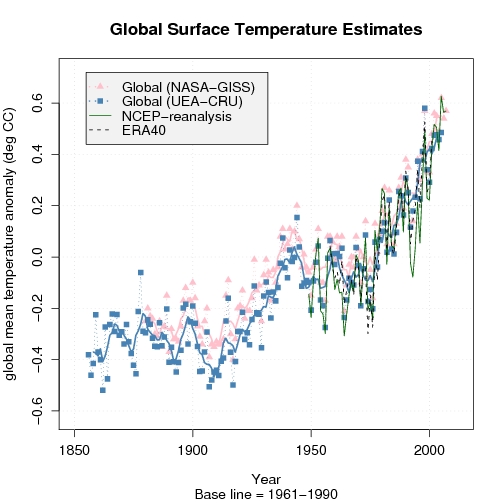
A comparison with other temperature analyses, such as the NASA/GISS (pink in the figure on the left), reveals differences. We can also compare with model-generated data (re-analyses), keeping in mind that one must be very careful with these data since they are not appropriate for studying long-term climate change (they give a misrepresentation of trends – at least on a local scale). Nevertheless, information from independent data suggest an increase in global mean temperatures even over the last decade.
All scientific questions involve some degree of uncertainties (error bars), and these can only be reduced if one can prove that they are influenced by an external factor (‘contamination’) or if some of the data are not representative for the study. Hence, if some of the data are incorrect, then it’s fair to exclude these to reduce the error bars. But this requires solid and convincing evidence of misrepresentation, and one cannot just pick the low values and claim that these describe the upper limit without proving that all the data with higher values are wrong. In other words, arguing that a lower limit is the upper bound is utter nonsense (even some who claim they are ‘statisticians’ have made this mistake!).
Another issue is that some of the data – i.e. the data from the Climate Research Unit (CRU) – have incomplete coverage, with large gaps in the Arctic where other data suggest the greatest increases in temperature. The figure below reveals the holes in the data knowledge. The figure compares the HadCRUT 3V data with the NCEP re-analysis.
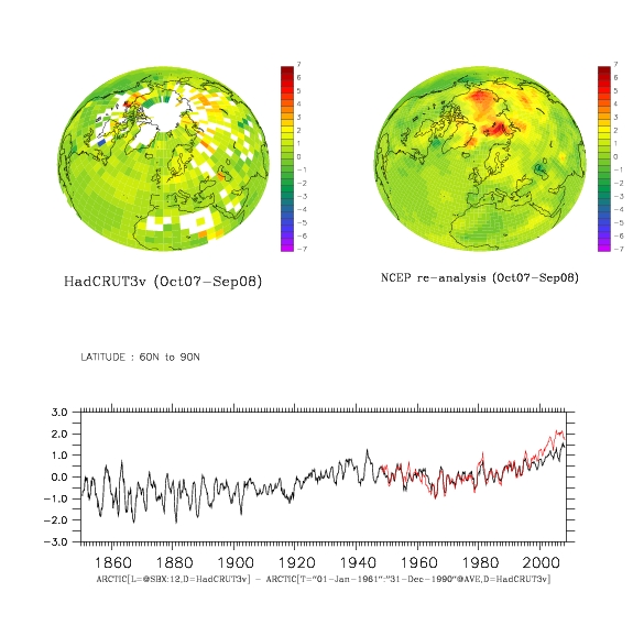
Figure caption: The difference between Oct. 2007 – Sep. 2008 temperature average and the 1961-1990 mean temperature for HadCRUT 3V (upper left) and NCEP re-analysis (upper right). Below is a comparison between the 12-month 60N-90N mean temperature evolution (red=NCEP, black = HadCRUT 3v)). (click on figures for PDF-version)
Re-analysis data are results from atmospheric models where observed data have been fed into the models and used to correct the simulation in order to try to get a best possible description of the real atmosphere. But it’s important to note that the NCEP re-analysis and other re-analyses (e.g. ERA40) are not regarded as being appropriate for trend studies due to changes in observational systems (new satellites coming in etc). Nevertheless, a comparison between the re-analyses and observations can highlight differences, which may suggest where to look for problems.

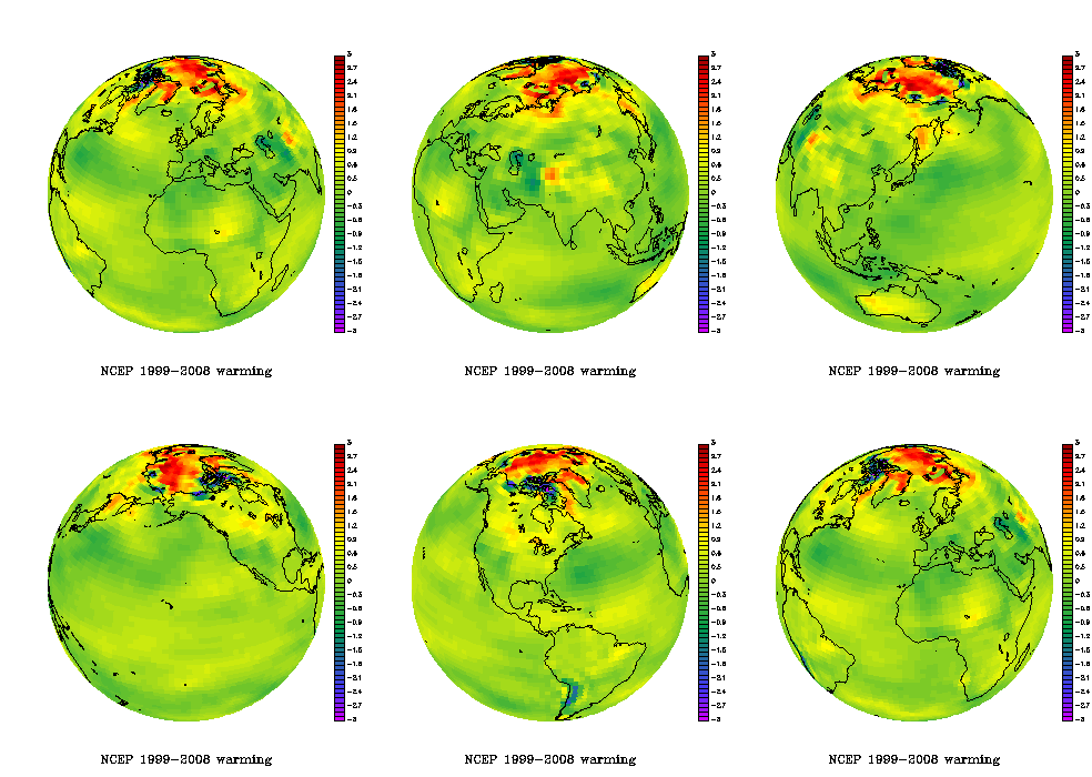
The animated figure shows the temperature difference between the two 5-year periods 1999-2003 and 2004-2008. Such results do not show the long-term trends, but it’s a fact that there have been high temperatures in the Arctic during the recent years.
The recent Arctic warming is visible in the animated plot on the right showing the NCEP re-analysis mean temperature difference between the periods 2004-2008 and 1999-2003.
The NOAA report card on the Arctic was based on the CRUTEM 3v data set (see figure below) which excludes temperatures over the ocean – thus showing an even less complete picture of the Arctic temperatures. The numbers I get suggest that more than 80% of the grid-boxes north of 60N contain missing values over the most recent decade.
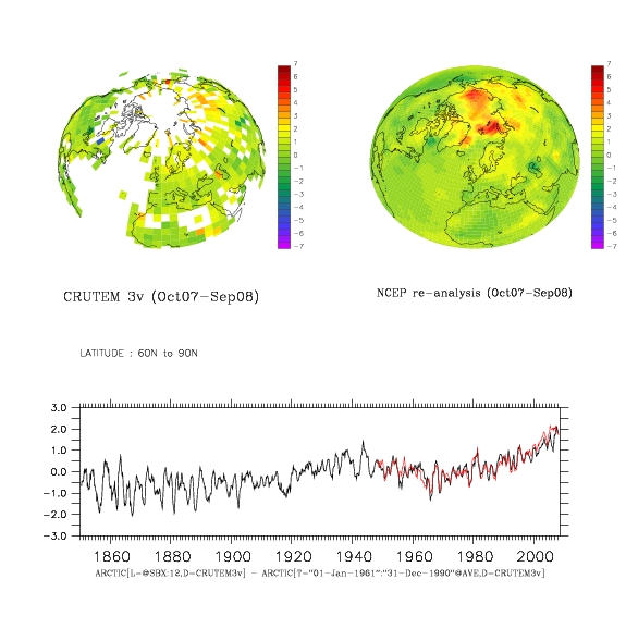
Figure caption: The difference between Nov. 2007 – Oct. 2008 temperature average and the 1961-1990 mean temperature for CRUTEM 3v (upper left) and NCEP re-analysis (upper right). Below is a comparison between the 12-month 60N-90N mean temperature evolution. (click on figures for PDF-version)
The funny thing, however, is that the last decade of the Arctic CRUTEM 3v temperatures are closer to the corresponding estimates from NCEP re-analysis than the more complete HadCRUT 3v data. This may be a coincidence. The re-analyses use additional data to fill in the voids – e.g. satellite measurements and predictions based on the laws of physics. Thus, the temperature in areas with no observations is in principle physically consistent with surrounding temperatures and the state of the atmosphere (circulation).
Below is a figure showing a similar comparison between HadCRUT 3v and GISTEMP (from NASA/GISS). The latter provides a more complete representation of the Arctic by taking spatial correlation into account through an extrapolating/interpolating in space. But GISTEMP does not really have a better empirical basis in the Arctic, but the effect from the extrapolation (the filling in of values where there is missing data) gives the recent high Arctic temperatures more weight.
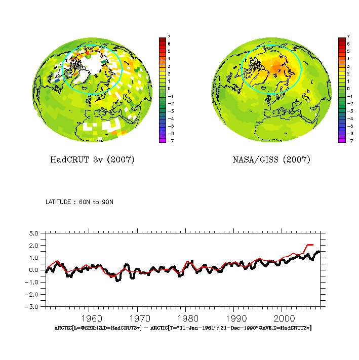
Figure caption: The 2007 mean temperature anomaly wrt to 1961-90: (upper left) HadCRUT 3V, (upper right) GISTEMP, and (lower) temperature evolution for the Arctic (red=GISTEMP, black = HadCRUT 3v).
A comparison between temperatures over the most recent available 30-year period (1978-2007) shows high temperatures over parts of Russia (Figure below – upper left panel), and the difference between the GISTEMP and HadCRUT 3v shows a good agreement apart from around the Arctic rim and in some maritime sectors (upper right panel). The time evolution of the Northern Hemisphere mean for the two data sets is shown in the lower panel, showing a good agreement over most of the record, but with slightly higher GISTEMP estimates over the last 10 years (the global mean was not shown because my computer didn’t have sufficient memory for the complete analysis, but the two data sets also show similar evolution in e.g. the IPCC AR4).
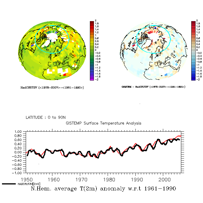
Figure caption: (upper left) HadCRUT 3V mean T(2m) anomaly over 1976-2005 (wrt to 1950-1980) ; (upper right) The GISS – HadCRUT 3V difference in mean T(2m) over 1976-2005; and (lower) the Northern Hemisphere mean temperature variations (red=GISTEMP, black=HadCRUT 3v).
Note, the low Arctic sea-ice extent over the last summers are independent evidence of high Arctic temperatures.
The insufficient observational coverage has also been noted by the IPCC AR4 and by Gillett et al. (Nature Geoscience, 2008), who argue that the observed warming in the Arctic and Antarctic are not consistent with internal climate variability and natural forcings alone, but are directly attributable to increased GHG levels.
They also suggested that the polar warming is likely to have discernable impacts on ecology and society (e.g.).
In their study, there are at least 15 grid boxes with valid data (usually representing one measurement) over 1900-2008 period. Furthermore, the only valid observations they used from the Northern Hemisphere were from the Arctic rim, as opposed to in the high Arctic itself. The situation is slightly better for the Antarctic (with one observation near the South Pole). Nevertheless, the title ‘Attribution of polar warming to human influence’ [my emphasis] is a bit misleading. Parts of the high-latitudes yes, polar no.
The attribution study was based on series of 5-yr-mean temperatures and spatial averages of 90 degree sectors (i.e. to four different sectors), where sectors and periods with no valid data were excluded.
There are some caveats with their study: The global climate models (GCMs) do not reproduce the 1930-1940 Arctic warm event very well, and the geographical differences in a limited number of grid-boxes in the observations and the GCMs may have been erased through taking the average value over the 90-degree sectors.
The 1930-1940 Arctic warming was probably not externally forced, but one could also argue that the models do not capture all of the internal variations because few reproduce similar features. Furthermore, the present GCMs have problems reproducing the Arctic sea-ice characteristics (which tends to be too extensive), ocean heat content, and fail to capture the ongoing decrease in Arctic sea-ice area. Most of these problems are seen in the gap with no CRUTEM 3v data, but there are also some uncertainties associated with the lack of data in the Polar regions.
The optimal fingerprint analysis hinges on the assumption that control simulations with the GCMs realistically reproduce the climate noise. I think that the GCMs do a good job for most of the planet, but independent work suggest local problems in the Arctic associated with a misrepresentation of the sea-ice extent. This may not have affected the analysis much, if the problem is limited to the high Arctic. Furthermore, the results suggested a one-to-one correspondence in trends between simulations and observations, but the analysis also gave a regression coefficient of 2-4 for natural forcings. The latter suggests to me that there may be some problems with the analysis or the GCMs.
Thus, this is probably not the final word on the matter. At least, I’m not convinced about the attribution yet. The whole boils down to insufficient amounts of empirical data (i.e. observations), GCM limitations at the high-latitudes, and too large data gaps. But the pronounced changes in the Arctic are consistent with AGW. The irony seems to be that the real world shows signs of more dramatic changes than the GCMs project, especially if you look at the sea-ice extent.
The lack of data in the polar region is a problem, and the ongoing International Polar Year (IPY) campaign is a huge concerted international effort to improve the data. Data is irreplaceable, regardless of the modelling capability, as science requires the theory to be tested against independent empirical data. The re-analyses provide a physically consistent description of the atmosphere – suggesting high temperatures in the Arctic – but we can only be sure about this when we actually have been there and made the real measurements (some can be done by satellites too)
A glimpse into the technical details
More technically, the complicated analysis involved a technique called ‘optimal fingerprinting‘ or ‘optimal detection’, looking for best signal in the noisy data and puts emphasis on regions where the GCMs give most realistic description of the climate variations. Basically, the optimal fingerprint techniques involved linear least-squares regression, which is familiar to many analysts.
The analysis of Gillett et al. involved ‘time-space’ orthogonal empirical functions (EOF) with truncation of 28 (and up to 78 modes for the Arctic, where the maximum truncation was the number of sectors multiplied with the number of 5-yr means – see supplementary material Fig. S3). These come into the equation through the estimation of the noise (covariance matrix), i.e. the internal variations and their magnitude. The clever thing is that they let each EOFs describe a set of 20 maps of 5-year-mean temperatures, thus representing both the spatial features as well as their chronology.
For the mathematically inclined, EOFs are similar to eigenvectors, and are mainly used to prepare data before further analysis. The purpose of using EOFs is often either to (i) compress the information or (ii) to make the data more ‘well-behaved’ (in mathematical terms: orthogonal). While one typically only use a few of the first EOFs, Gillett et al. experimented with just one up to the whole set because they took advantage of their orthogonal properties to allow the calculation of the inverse of the noise co-variance matrix. This is a neat mathematical trick. But this doesn’t help if the GCMs do not provide a good description of the internal variations.
Re I85 On denialism. A quote from a half page article in my (today’s) daily paper “…much ‘global warming’ has been ‘assisted’ by downright fraud and alarmist claims…There are scores of papers in peer-reviewed journals challenging the hypothesis that anthropegenic actions, and in particular the burning of fossil fuels, are causing dangerous levels of global warming.”
You do get sick of reading such trash. This isn’t skepticism, its outright,falsifying,denialism.
The author is arguing against an emissions trading scheme for New Zealand, and is keen to point out that carbon credit trading was invented by Enron. Right! It must be bad then- QED!
Simon Abingdon, #240. Gee, you seem to have completely forgotten my point #4–that we understand extremely well the way greenhouse gasses like CO2 warm the planet. The fact that there is no evidence of qualitative change in that mechanism when the concentration goes above 280 ppmv–that’s where anthropogenic causation becomes an inescapable consequence. Don’t like the conclusion. Fine. Come up with a climate model that explains things at least as well as the consensus view has CO2 magically stop behaving like a greenhouse gas at 280 ppmv. Simple, huh. Go ahead, we’ll wait.
Re cloud coverage:
http://www.agci.org/publications/eoc94/EOC1/EOC1-25.html
Stephen Warren
Department of Atmospheric Sciences
University of Washington
“Surface weather observations from stations on land and ships in the ocean are used to obtain the global distribution, at 5° x5° latitude-longitude resolution, of total cloud cover and the average amounts of the different cloud types: cumulus, cumulonimbus, stratus, stratocumulus, nimbostratus, altostratus, altocumulus, cirrus, cirrostratus, cirrocumulus, and fog. Diurnal and seasonal variations are derived, as well as interannual variations and multi-year trends. …
The average cloud cover for 1982-1991 is found to be 54% for northern hemisphere land, 53% for southern hemisphere land, 66% for northern hemisphere ocean, and 70% for southern hemisphere ocean, giving a global average of 64%. The global average for daytime is 64.6% and for nighttime, 63.3%.
The 1982-1991 data have not yet been analyzed for cloud types. …”
Rasmus:
Indeed. In particular, look at the CRUTEM 3v grid box containing Svalbard, which has been discussed here before. There aren’t all that many fixed surface thermometers in this part of the world. The only active GISS station in this block is Svalbard Luft (the airport met station).
My own (granted rather crude) analysis of the Luft record puts it at +4.0°C for Oct’07-Sep’08 vs 1960-90 (a trend-based estimate – the station only opened in 1977). The CRUTEM 3v plot for the same interval has it between +2.5 and +3°C; fair enough. And the NCEP re-analysis has it hotter, nearer my number. But HADCRUT 3v puts it at just +1.0 to +1.5°C; a long, long way from +4°C.
So what gives? Is the Luft thermometer really just in a localised hot spot, correctly smoothed out with the maritime data in the HADCRUT? That seems pretty unlikely to be valid (particularly in all seasons). This is a relatively exposed coastal station in a windy part of the world. Sure, it’s just one data point, but my inclination is begin to have just a hint of doubt about the HADCRUT near-polar analysis – in the opposite direction to what the denyosphere might like!
Maybe that is Rasmus’s (cautiously understated) point?
[Incidentally, the pdf click-through link on the first comparison figure above is incorrect.]
In world news — get ready for ….
http://www.nytimes.com/2008/11/25/world/europe/25klaus.html?hp
P chem, Ray, it is all explained by P chem, the effects of gases. The data collected from NASA, NOAA, Princeton AOS, Harvard, and others, explains very well how the CO2 contributes in lieu of environmental dynamics.
Indicators of global warming
You note that low Arctic sea-ice extent are independent indicators of global warming.
http://arctic.atmos.uiuc.edu/cryosphere/IMAGES/sea.ice.anomaly.timeseries.jpg
Following that big-picture chart – kinda reminds me of my late mum’s final days. That desperate desire that she (mother earth) will somehow return to normal, the bursts of already-broken-hope with each temporary turn for the better, all tempered by the gut-wrenching certainty that in fact she never will get well again, and the end will be very sad indeed.
Hank, #250. Yup. The piccy there looks like a lot less than 50% of the planet is covered.
As to the cicada and locusts, watch some David Attenborough or other nature program.
#250–
Interesting article, Hank, thanks. “Argument is down the hall.”–I presume none of us came here to be insulted, then? ;-)
While all you up there continue to waste your time arguing with sceptics, I’ll concentrate my time with bringing you what’s actually happening. Case in point..University of Chicago researchers have concluded a 8 year study with 24518 data collection points ar various layers of the ocean in the temperate latitudes where most of the world’s fish stocks reside. Conclusion ocean acidification is increasing 10 times faster than previously thought (Not 10 years…..’10 TIMES’). Studies were also done on the affect of invertebrates in those latitudes….a marked decrease in large mollusks (mussels and barnacles)but an increase in number in those regions of the small shelled species and non-calciferous algae. In an earlier post I mentioned that I wasn’t sure which would die first, now it seems that because of the surface area / biomass ratio it favours the small crustations over the large ..less body mass per area of calciferous coverage…that’s actually a good thing (good for the food chain/web), not so good for your fettuccini mariana.
What’s your take on this research?
Re 257
Or, we could look at global sea ice extent which doesn’t display near as clear an indicator with 2008 on the plus side.
http://arctic.atmos.uiuc.edu/cryosphere/IMAGES/global.daily.ice.area.withtrend.jpg
The problem of looking at the Arctic sea ice is that is affected by more than AGW.
http://www.sciencedaily.com/releases/2007/11/071113200545.htm
Which leads back to my problem with the rotating globe. The big red spot is probably at least in part explained by something other than AGW. And what’s more, the rest of the globe looks to be pretty much a wash as to whether warming or cooling is occurring.
Mark #247 You’re forgiven.
Mark writes:
Actually, he’s about right on that. Estimates of mean global cloud cover range from 47.2% (Hart 1978) to 69.5% (Jin and Rossow 1994), and most early estimates clustered around 50%. I can send you a table if you’re interested.
Re: @261 (Jim Cross)
You may have “looked” at global sea ice extent, but clearly you haven’t analyzed it. Then downward trend in global extent is just as clear as that in northern-hemisphere extent; not just statistically significant, but undeniably so. Unless of course you’re a denialist.
re 262–Witty, Simon, but have you considered yet the knowledge around the well-established properties of CO2, as Ray pointed you to? Because the IPCC AR4 SPM assesses these factors as follows:
-The combined radiative forcing due to increases in
carbon dioxide, methane, and nitrous oxide is +2.30
[+2.07 to +2.53] W m–2, and its rate of increase
during the industrial era is very likely to have been
unprecedented in more than 10,000 years. The carbon dioxide radiative
forcing increased by 20% from 1995 to 2005, the
largest change for any decade in at least the last 200
years.
-Anthropogenic contributions to aerosols (primarily
sulphate, organic carbon, black carbon, nitrate and
dust) together produce a cooling effect, with a total
direct radiative forcing of –0.5 [–0.9 to –0.1] W m–2
and an indirect cloud albedo forcing of –0.7 [–1.8 to
–0.3] W m–2. These forcings are now better understood
than at the time of the TAR due to improved in situ,
satellite and ground-based measurements and more
comprehensive modelling, but remain the dominant
uncertainty in radiative forcing. Aerosols also influence
cloud lifetime and precipitation.
So, “whither AGW?” Probably toward increasingly robust quantification of these latter effects. But that won’t result in a startling change of the big picture painted in AR4. Can you see that big picture?
Mark, listen to Barton and learn from Tamino.
“Looking” doesn’t serve. You have to check.
That’s just as important for enthusiasts supporting action as for those saying there’s no need for action.
It’s also a good habit because it serves as one precaution against people who pretend to be “on a side” they oppose and make claims they can’t support as a tactic.
It’s not about you, it’s about the habit of checking every day before asserting what we learned or thought.
Tamino – I am confused. Are you saying that the downward trend in global sea ice extent is undeniably statistically significant or that it is not statistically significant but undeniable nonetheless. Your wording is confusing.
Gap “with whom?” is today’s question:
The NCDC updated their temp data sets. ftp://ftp.ncdc.noaa.gov/pub/data/anomalies/monthly.land_and_ocean.90S.90N.df_1901-2000mean.dat
New and old for 2007/8 by month
yyyy mm oldano newano
2007 1 0.4671 0.8442
2007 2 0.4762 0.5968
2007 3 0.4108 0.6055
2007 4 0.4114 0.6857
2007 5 0.3701 0.5016
2007 6 0.4343 0.4884
2007 7 0.3945 0.4631
2007 8 0.3487 0.467
2007 9 0.3801 0.525
2007 10 0.3411 0.4966
2007 11 0.2532 0.4558
2007 12 0.2519 0.4211
2008 1 0.2481 0.1959
2008 2 0.2929 0.3695
2008 3 0.3100 0.7179
2008 4 0.3273 0.4296
2008 5 0.3555 0.4402
2008 6 0.3944 0.4829
2008 7 0.4261 0.5066
2008 8 0.4268 0.4658
2008 9 0.4205 0.4438
2008 10 0.4522 0.6307
The only front page note found there is:
Downloaded Tuesday, 25-Nov-2008 11:44:01 EST
Certainly from being separated by ~0.1C over HadCRUT3v, back in 1979, they’re now practically on top of them. Are they now in bed with each other?
I’m wondering who feeds who with data and what these near 0.4C adjustments are in some months. Certainly screwed up my plots… did they maybe change baseline? The file did not change name and still refers to 1900-2000.
I probably shouldn’t speak for Tamino, but “not just statistically significant, but undeniably so,” seems intended to say that the trend is emphatically statistically significant.
I made a switch in the title columns of my previous post (once the public gets to see it). The last 2 should be newano(maly) oldano(maly)
What is the concensus correct number for the amount of sea ice, global temperature, sea level and CO2 in the atomosphere? By correct I mean what should the values be if mankind was not in the process of destroying the planet?
Re: #267 (Bob North)
The downward trend in global sea ice extent is undeniably statistically significant.
Lawrence, can you cite the U. Chicago study you refer to, on ocean pH? or point to a secondary source with more info? When and where published?
> University of Chicago researchers have concluded
> a 8 year study with 24518 data collection points
I didn’t turn it up with quick searches.
john (271) — Without anthropogenic influences, CO2 in the atmosphere would be less than 260 ppm and the global temperature colder than during LIA. This follows directly from orbital forcing and the paleoclimate records of the ice ages.
#264 Tamino
I’ll take your word for it that the downtrend is statistically significant, but the real question is what does it mean? Since this is global data, it includes Arctic sea ice which is subject to variability not caused by AGW.
My main point is that Arctic sea ice may be a leading indicator of climate change but it is not necessarily a useful proxy for AGW.
#274 David
Please provide the values for what the Co2 level would be this year without anthropogenic influences as well as the temperature and sea ice extent and sea level.
Also, as I understand your comment, without the increases in co2, the earth would be experiencing another little ice age at this time? Is that correct?
thanks
Hank – The study was in this month’s PNAS. I could only read the abstract.
PNAS article
A summary can be found here – Science Daily
Unfortunately, neither provide much information
Mark wrote (25 November 2008 at 5:43 AM)
> Hank, #250. Yup. The piccy there looks like a lot
> less than 50% of the planet is covered.
Mark, I suggested you read the _numbers_ in the article.
http://www.astrobio.net/news/article2683.html
Thanks Bob.
Yeek!
——————-
“… Our results indicate that pH decline is proceeding at a more rapid rate than previously predicted in some areas, and that this decline has ecological consequences for near shore benthic ecosystems.”
Not surprising; CO2 dissolves in some areas (temperature, waves, wind) so there will be swirls of water with more CO2 and lower pH near the surface where they will impact organisms there, before the process of mixing evens out the amount even within the upper ocean, let alone throughout.
Note the “supporting information” file is available:
http://www.pnas.org/content/suppl/2008/11/24/0810079105.DCSupplemental/0810079105SI.pdf
The usual helpful links at the article page are worthwhile for anyone who wants to follow this into the future as more work is done:
# Alert me when this article is cited
# Alert me if a correction is posted
# Similar articles in this journal
Ike,
ENSO is almost as predictable as the solar cycle. When solar activity drops the ENSO also drops. As solar activity approaches
minimum and GCRs have increased the cloud cover over western Pacific to cool the ocean sufficiently, the tradewinds weakens and the warm pool begins it’s journey accross the pacific. Soon there is enough water vapor produced and the thermostat, the clouds, kick in again and the ocean cools despite the rising solar activity. After that the ENSO remains mainly positive until solar activity drops again.
Because of this thermostat effect the tropics will never warm much, variating around the level set by the climate shift around 1977, and we will not see the ‘real’ temperature variation over a solar cycle because there will usually be one strong El-Nino around solar minimum. The thermostat also kicks in as result of volcano cooling and those are a bit harder to predict.
http://virakkraft.com/GCR-ENSO.ppt
john (276) — Nobody can state precisely what the CO2 concentration would be, but yes, the globe would be experiencing something rather cooler than the little ice age. The expert here is W.F. Ruddiman; visit his web site and read his (easily accessible) papers. At least one offers more details than I can provide. He has done a guest thread here on RealClimate and has a popular book, “Plows, Plagues and Petroleum” that you may well find of interest.
Sea ice? Dunno, but I would suppse that sea ice extent would be growing, not shrinking.
#280–
The fact that the lower graph is mirror-reversed (left-right) doesn’t inspire much confidence, nor make it very easy to read.
#282
It’s mirrored (up-down) because GCR is the key, not TSI, and that is the ‘right’ way when comparing to temperature.
#280-more
…And what are the downward-sloping lines on the top graph? Apparently not regression lines, because the ENSO indicies for 1975-1987 and 1986-1997 would surely regress to an uptrend!
I heard James Hansen at the UK Environment Agency conference on Monday. He was, of course, very impressive and gave a quick but convincing tour of ancient climate history. He pointed out the gap between the science of climate change and what the political establishment knew.
I asked the question on recent methane emissions. If I remember correctly, he referred to them as “another feedback”, which suggested to me he felt they were important but not THAT important.
But I’m still concerned that the danger of methane feedbacks may be underestimated by “mainstream” science. George Mombiot was forthright on this yesterday: http://www.guardian.co.uk/commentisfree/2008/nov/25/climate-change-carbon-emissions
I did ask very relevant people about government briefings on this topic … still no sign of any.
re 280: “As solar activity approaches minimum and GCRs have increased the cloud cover”
Why has the GCR increased without being spotted? Why would GCR’s increase when solar activity approaches minimum and how much extra cloud cover would an undetectable increase in GCR create? Heck, how much cloud cover would GCR’s create per increased flux?
Hansen is talking in front of the HoC Environmental Audit Committee right now:
http://www.parliamentlive.tv/Main/VideoPlayer.aspx?meetingId=2908&rel=ok
You really want to encourage repetition of that GRC stuff yet again?
And ask for it repeated where it’s off topic here?
Why ask for those claims to be retyped again, when you can read the same claims — and the criticism — by looking them up? They have been repeated many times before. What’s lacking is the evidence. But you don’t get evidence by challenging people posting their faith.
Consider what it is you want to encourage, and whether this is the way to do it.
Maybe it is. But think about what you’re trying to accomplish.
I’m afraid I agree with Hank. The GCR issue has been positively fileted. There is zero evidence that GCR fluxes are increasing (modula the solar cycle, of course)–so there’s no cause. Add to that the fact that there’s really no mechanism that could turn this into the observed temperature increase, and it’s a measure of the desperation of denialists that this one still clings to life in their arsenal of stupidity.
Thanks Khebab,
Just missed him but I’m trying to make the “Watch this again” button work. But good link.
Comments abound on the PRI program; this lists several and some public presentations.
I don’t always agree with this stuff, but it’s important to keep track of:
http://scienceblogs.com/framing-science/2008/11/is_name_calling_an_effective_c.php
A Scientific American article speaks directly to the question raised in this thread — why people look at pictures like the recent temperature chart and believe they can detect a pattern in them that isn’t detectable statistically.
http://www.sciam.com/article.cfm?id=patternicity-finding-meaningful-patterns
______excerpt_follows________
… The problem is that we are very poor at estimating such probabilities, so the cost of believing that the rustle in the grass is a dangerous predator when it is just the wind is relatively low compared with the opposite. Thus, there would have been a beneficial selection for believing that most patterns are real.
Through a series of complex formulas that include additional stimuli (wind in the trees) and prior events (past experience with predators and wind), the authors conclude that “the inability of individuals—human or otherwise—to assign causal probabilities to all sets of events that occur around them will often force them to lump causal associations with non-causal ones. From here, the evolutionary rationale for superstition is clear: natural selection will favour strategies that make many incorrect causal associations in order to establish those that are essential for survival and reproduction.”
re 166 Cynic Where to live? Climatology predictions about good future locales are too dependent on political choices to give a useful range of outcomes. Buy a sailboat with a (bio)diesel auxiliary; you can join me fishing the Northwest passage in the summertime, wintering in the balmy North Carolina sounds, and sailing the Maine coast in November for the fall colors. &;>) Or going wherever & whenever adaptation to the weather drives us.
Gavin et al, Hank, and Ray.
Thanksgiving in the U.S. is a special opportunity to express our gratitude to those who positively affect our lives. Thank you Gavin and the other Real Climate scientists, for performing the inquiry to expand the understanding of climate science, and for the sacraficial commitment of time and attention which allows you to provide us with Real Climate. Thank you Hank Roberts, for tirelessly showing those of us less informed how to navigate the information the scientists generate, so we can evaluate claims for ourselves. And not least, thank you Ray Ladbury, for not suffering fools. Know that your efforts are appreciated.
[Response: Thanks. It’s good to hear this every once in a while. – gavin]
I’ll second the thanks to Gavin and the gang for their tremendous efforts maintaining RealClimate. As a blogger myself, I know how much work is involved, and it’s a lot. You guys have the best climate blog on the net; 2nd place isn’t even close.
And I’ll also second the thanks to Ray, for not suffering fools.
Ditto 294 and 295.
I too offer thanks. And heartily endorse everything said in both #295 and #296.
Ray (219), “…any intelligent lifeforms simply haven’t seen anything promising enough…” is why they haven’t shown themselves??? I would think that we look rather tasty! :-P
Richard and Tamino, Thanks. I have learned a lot from this site and over at Open Mind. It is gratifying to know that I can in some way support the worthwhile efforts of such sites. Keep it up.
I think we also owe a debt of gratitude to Hank Roberts, who shows us again and again that it *is* possible to find sources, and that it’s worthwhile to do so.