Confusion has continued regarding trends in global temperatures. The misconception ‘the global warming has stopped’ still lives on in some minds. We have already discussed why this argument is flawed. So why have we failed to convince ;-) ?
Una traduzione in italiano è disponibile qui.
The confused argument hinges on one data set – the HadCRUT 3V – which is only one of several estimates, and it is the global temperature record that exhibits the least change over the last decade. Other temperature analyses suggest greater change (warming). Thus, one could argue that the HadCRUT 3V represents the lower estimate, if a warming could be defined for such a short interval.
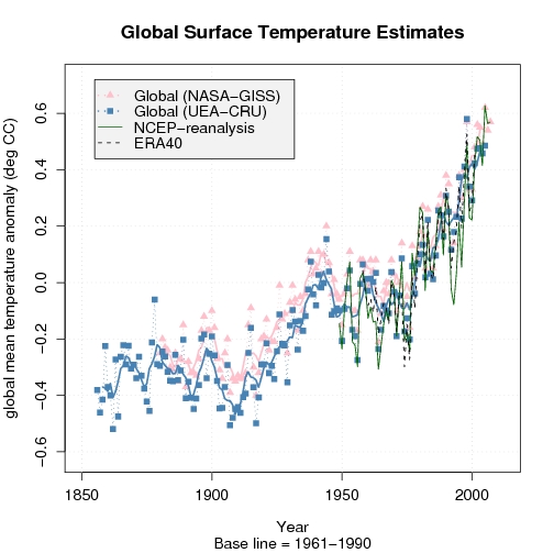
A comparison with other temperature analyses, such as the NASA/GISS (pink in the figure on the left), reveals differences. We can also compare with model-generated data (re-analyses), keeping in mind that one must be very careful with these data since they are not appropriate for studying long-term climate change (they give a misrepresentation of trends – at least on a local scale). Nevertheless, information from independent data suggest an increase in global mean temperatures even over the last decade.
All scientific questions involve some degree of uncertainties (error bars), and these can only be reduced if one can prove that they are influenced by an external factor (‘contamination’) or if some of the data are not representative for the study. Hence, if some of the data are incorrect, then it’s fair to exclude these to reduce the error bars. But this requires solid and convincing evidence of misrepresentation, and one cannot just pick the low values and claim that these describe the upper limit without proving that all the data with higher values are wrong. In other words, arguing that a lower limit is the upper bound is utter nonsense (even some who claim they are ‘statisticians’ have made this mistake!).
Another issue is that some of the data – i.e. the data from the Climate Research Unit (CRU) – have incomplete coverage, with large gaps in the Arctic where other data suggest the greatest increases in temperature. The figure below reveals the holes in the data knowledge. The figure compares the HadCRUT 3V data with the NCEP re-analysis.
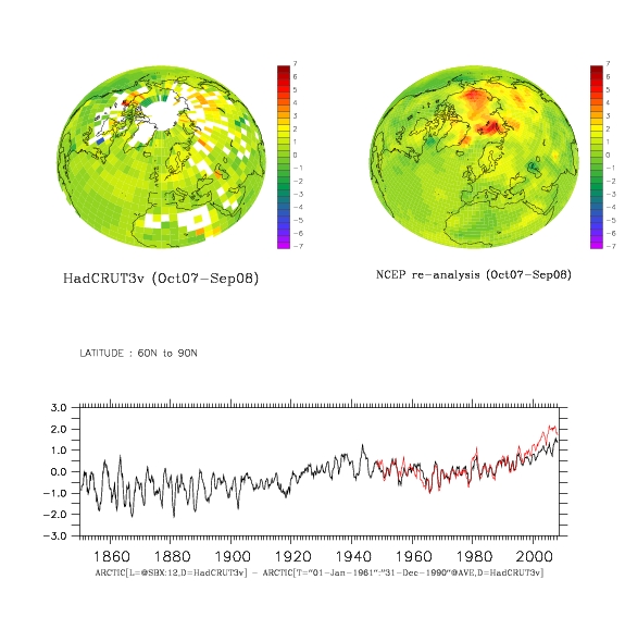
Figure caption: The difference between Oct. 2007 – Sep. 2008 temperature average and the 1961-1990 mean temperature for HadCRUT 3V (upper left) and NCEP re-analysis (upper right). Below is a comparison between the 12-month 60N-90N mean temperature evolution (red=NCEP, black = HadCRUT 3v)). (click on figures for PDF-version)
Re-analysis data are results from atmospheric models where observed data have been fed into the models and used to correct the simulation in order to try to get a best possible description of the real atmosphere. But it’s important to note that the NCEP re-analysis and other re-analyses (e.g. ERA40) are not regarded as being appropriate for trend studies due to changes in observational systems (new satellites coming in etc). Nevertheless, a comparison between the re-analyses and observations can highlight differences, which may suggest where to look for problems.

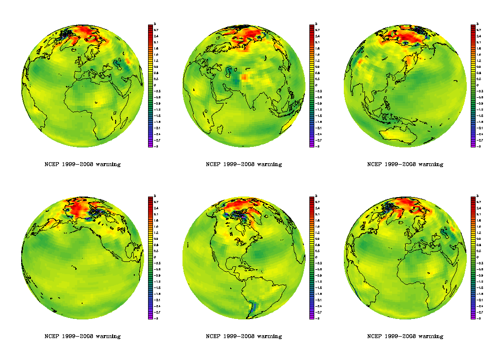
The animated figure shows the temperature difference between the two 5-year periods 1999-2003 and 2004-2008. Such results do not show the long-term trends, but it’s a fact that there have been high temperatures in the Arctic during the recent years.
The recent Arctic warming is visible in the animated plot on the right showing the NCEP re-analysis mean temperature difference between the periods 2004-2008 and 1999-2003.
The NOAA report card on the Arctic was based on the CRUTEM 3v data set (see figure below) which excludes temperatures over the ocean – thus showing an even less complete picture of the Arctic temperatures. The numbers I get suggest that more than 80% of the grid-boxes north of 60N contain missing values over the most recent decade.
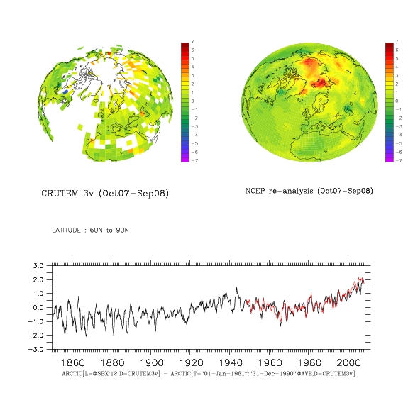
Figure caption: The difference between Nov. 2007 – Oct. 2008 temperature average and the 1961-1990 mean temperature for CRUTEM 3v (upper left) and NCEP re-analysis (upper right). Below is a comparison between the 12-month 60N-90N mean temperature evolution. (click on figures for PDF-version)
The funny thing, however, is that the last decade of the Arctic CRUTEM 3v temperatures are closer to the corresponding estimates from NCEP re-analysis than the more complete HadCRUT 3v data. This may be a coincidence. The re-analyses use additional data to fill in the voids – e.g. satellite measurements and predictions based on the laws of physics. Thus, the temperature in areas with no observations is in principle physically consistent with surrounding temperatures and the state of the atmosphere (circulation).
Below is a figure showing a similar comparison between HadCRUT 3v and GISTEMP (from NASA/GISS). The latter provides a more complete representation of the Arctic by taking spatial correlation into account through an extrapolating/interpolating in space. But GISTEMP does not really have a better empirical basis in the Arctic, but the effect from the extrapolation (the filling in of values where there is missing data) gives the recent high Arctic temperatures more weight.
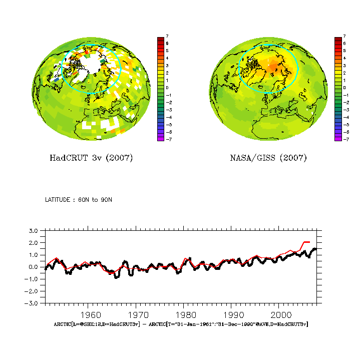
Figure caption: The 2007 mean temperature anomaly wrt to 1961-90: (upper left) HadCRUT 3V, (upper right) GISTEMP, and (lower) temperature evolution for the Arctic (red=GISTEMP, black = HadCRUT 3v).
A comparison between temperatures over the most recent available 30-year period (1978-2007) shows high temperatures over parts of Russia (Figure below – upper left panel), and the difference between the GISTEMP and HadCRUT 3v shows a good agreement apart from around the Arctic rim and in some maritime sectors (upper right panel). The time evolution of the Northern Hemisphere mean for the two data sets is shown in the lower panel, showing a good agreement over most of the record, but with slightly higher GISTEMP estimates over the last 10 years (the global mean was not shown because my computer didn’t have sufficient memory for the complete analysis, but the two data sets also show similar evolution in e.g. the IPCC AR4).
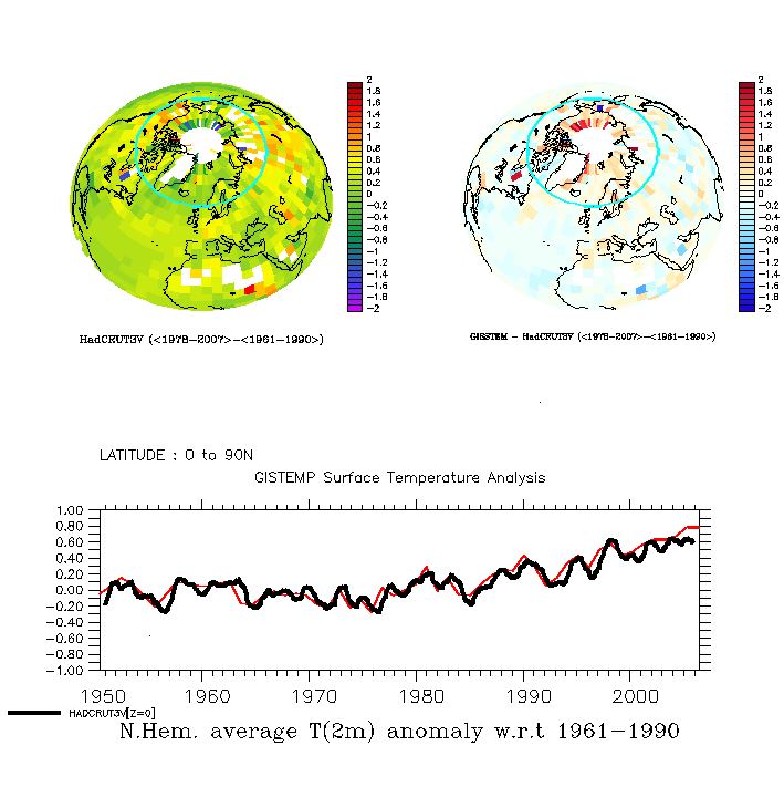
Figure caption: (upper left) HadCRUT 3V mean T(2m) anomaly over 1976-2005 (wrt to 1950-1980) ; (upper right) The GISS – HadCRUT 3V difference in mean T(2m) over 1976-2005; and (lower) the Northern Hemisphere mean temperature variations (red=GISTEMP, black=HadCRUT 3v).
Note, the low Arctic sea-ice extent over the last summers are independent evidence of high Arctic temperatures.
The insufficient observational coverage has also been noted by the IPCC AR4 and by Gillett et al. (Nature Geoscience, 2008), who argue that the observed warming in the Arctic and Antarctic are not consistent with internal climate variability and natural forcings alone, but are directly attributable to increased GHG levels.
They also suggested that the polar warming is likely to have discernable impacts on ecology and society (e.g.).
In their study, there are at least 15 grid boxes with valid data (usually representing one measurement) over 1900-2008 period. Furthermore, the only valid observations they used from the Northern Hemisphere were from the Arctic rim, as opposed to in the high Arctic itself. The situation is slightly better for the Antarctic (with one observation near the South Pole). Nevertheless, the title ‘Attribution of polar warming to human influence’ [my emphasis] is a bit misleading. Parts of the high-latitudes yes, polar no.
The attribution study was based on series of 5-yr-mean temperatures and spatial averages of 90 degree sectors (i.e. to four different sectors), where sectors and periods with no valid data were excluded.
There are some caveats with their study: The global climate models (GCMs) do not reproduce the 1930-1940 Arctic warm event very well, and the geographical differences in a limited number of grid-boxes in the observations and the GCMs may have been erased through taking the average value over the 90-degree sectors.
The 1930-1940 Arctic warming was probably not externally forced, but one could also argue that the models do not capture all of the internal variations because few reproduce similar features. Furthermore, the present GCMs have problems reproducing the Arctic sea-ice characteristics (which tends to be too extensive), ocean heat content, and fail to capture the ongoing decrease in Arctic sea-ice area. Most of these problems are seen in the gap with no CRUTEM 3v data, but there are also some uncertainties associated with the lack of data in the Polar regions.
The optimal fingerprint analysis hinges on the assumption that control simulations with the GCMs realistically reproduce the climate noise. I think that the GCMs do a good job for most of the planet, but independent work suggest local problems in the Arctic associated with a misrepresentation of the sea-ice extent. This may not have affected the analysis much, if the problem is limited to the high Arctic. Furthermore, the results suggested a one-to-one correspondence in trends between simulations and observations, but the analysis also gave a regression coefficient of 2-4 for natural forcings. The latter suggests to me that there may be some problems with the analysis or the GCMs.
Thus, this is probably not the final word on the matter. At least, I’m not convinced about the attribution yet. The whole boils down to insufficient amounts of empirical data (i.e. observations), GCM limitations at the high-latitudes, and too large data gaps. But the pronounced changes in the Arctic are consistent with AGW. The irony seems to be that the real world shows signs of more dramatic changes than the GCMs project, especially if you look at the sea-ice extent.
The lack of data in the polar region is a problem, and the ongoing International Polar Year (IPY) campaign is a huge concerted international effort to improve the data. Data is irreplaceable, regardless of the modelling capability, as science requires the theory to be tested against independent empirical data. The re-analyses provide a physically consistent description of the atmosphere – suggesting high temperatures in the Arctic – but we can only be sure about this when we actually have been there and made the real measurements (some can be done by satellites too)
A glimpse into the technical details
More technically, the complicated analysis involved a technique called ‘optimal fingerprinting‘ or ‘optimal detection’, looking for best signal in the noisy data and puts emphasis on regions where the GCMs give most realistic description of the climate variations. Basically, the optimal fingerprint techniques involved linear least-squares regression, which is familiar to many analysts.
The analysis of Gillett et al. involved ‘time-space’ orthogonal empirical functions (EOF) with truncation of 28 (and up to 78 modes for the Arctic, where the maximum truncation was the number of sectors multiplied with the number of 5-yr means – see supplementary material Fig. S3). These come into the equation through the estimation of the noise (covariance matrix), i.e. the internal variations and their magnitude. The clever thing is that they let each EOFs describe a set of 20 maps of 5-year-mean temperatures, thus representing both the spatial features as well as their chronology.
For the mathematically inclined, EOFs are similar to eigenvectors, and are mainly used to prepare data before further analysis. The purpose of using EOFs is often either to (i) compress the information or (ii) to make the data more ‘well-behaved’ (in mathematical terms: orthogonal). While one typically only use a few of the first EOFs, Gillett et al. experimented with just one up to the whole set because they took advantage of their orthogonal properties to allow the calculation of the inverse of the noise co-variance matrix. This is a neat mathematical trick. But this doesn’t help if the GCMs do not provide a good description of the internal variations.
FCH, Yes, I am aware of the cost curves. However, in my day job, I also encounter the tendency to go with the “lowest bidder”. Right now, we are at a crossroads wrt energy. We need to find alternatives to the resources that are in decline (e.g. petroleum and to a lesser extent natural gas). This will involve a huge expenditure on new infrastructure, and that infrastructure will tie us to whatever solution we choose. On paper in the near term, coal may well be the lowest bidder. There are also entrenched interests who have a lot to gain from increased reliance on coal. Less so, renewables, since they are more conducive to distributed, small-scale generation. On a global scale, we have greatly increased energy demand from developing countries. In general, even relatively simple renewables technology is difficult to implement in some of these places (and yes, I do know this from first hand experience. I built solar thermosiphon water heaters in West Africa.). If we adopt renewables, we can help ease the developing world into a renewable future as well (and profit from it). If we go with coal, so will they. We need to ensure that the “bid” includes all the costs, and not just those on the short horizon. Our decision will be binding for at least 50 years.
FCH is a combination of domestic and foreign trade issues in addition to resistance from the current industries, though you make a point in remarking on Picken’s ambitious plans, that is only a small aspect of the national issues which span globally.
Emails I just received regarding economic issues:
Dear Reader,
This week we look at the disastrous impact of the credit crisis on savings. They shrivelled as a result of asset-price falls, and fear means people are taking their money out of equities and corporate bonds and putting it in cash and government bonds. That is bad for both business, which will find it harder to raise capital, and individuals, who will reap lower returns over the long run. And in our Asia edition, our cover story examines the king’s role in the current chaos in Thailand.
Here are some other pieces from this week’s issue you might also be interested in. You can click straight through to each one and read it online at Economist.com using the links below.
John Micklethwait
Editor in Chief
Subscribe now
THIS WEEK’S HIGHLIGHTS:
See the Reality behind “clean coal.”
Dear Jacob,
It’s everywhere — advertising from companies claiming that coal is clean. The stark reality is that there is literally no such thing as clean coal electricity in the United States today — not one American home today is powered by a coal-burning plant that captures and stores its carbon pollution. And coal plants are responsible for a full third of America’s carbon dioxide pollution — the chief cause of global warming.
As Barack Obama and Congress begin to chart a new course on energy, we feel it’s crucial to help shatter the false illusion the coal industry is promoting. Let’s be clear: until U.S. coal power plants capture and store their carbon dioxide emissions, they cannot be considered “clean.” And right now, none of them do. So today, in partnership with several prominent environmental organizations, the Alliance for Climate Protection is launching a major campaign we’re calling, quite simply, Reality.
To see the great ad the Reality Coalition is launching today and to help out, just go to:
http://www.ThisIsReality.org
Dear All
The question of the noise content of the temperature record is an interesting one.
One man’s noise could be anothers signal.
Actually not. Noise is noise.
There will be noise in the record if only from the errors in its determination.
There will be noise in the climate itself but how much is a matter of opinion but also a matter of attribution.
A decent theory will allow signals to be identified and a proportion of the variance attributed to a particular temperature function or effect.
The most obvious and the one for which there is both good evidence and a strong theory is the WM-GHG signal.
Now this can be calculated, modelled, or otherwise estimated and a signal can be subtracted from the record and the remaining variance decreases. Is this residue just noise. Probably not.
We may not be able predict the future course of ENSO but we can put a measure to it. The measures are based on regional data and given a suitable model we can identify a corresponding signal in the global temperature record. Provided we can convince ourselves that the current ENSO Indices are independent from our existing signals or in this case just the WM-GHG signal we can remove this signal from the record. Obviously the confidence with which we can do this is dependent on the quality of the model we use to turn and ENSO Index into a global temperature signal but progress can be made.
The inability to predict the exact course of ENSO is not an issue in attempts to remove the variance that can be attributed to it from the temperature record.
A similar case can be made for volcanoes, we have an index, (the tau values), so given our best model we can identify a signal in the temperature record and remove it. The case for volcanoes is quite clear unless one believes that there is a causal link in either direction between volcanoes and WM-GHG concentrations or the ENSO.
Repeat for a solar index of your choice and the original record is much cleaner e.g. has a lot less variance.
What you are left with may or may not be noise. It is a matter of opinion. Those that believe that there are real decadal and multi-decadal signals would say that further attributions could be made.
Certainly deriving a global signal from a PDO index or simply fitting a ~60year sinusoidal oscillation to the data would remove a worthwhile proportion of the remaining variance. The snag is that a PDO index may not be separable from the other signals that have already been subtracted. In fact given that it requires data from a significant proportion of the earth surface it might be a surprise if it was independent of the other signals. That said, its removal is very tempting and I suspect that many people are beavering away trying establish whether it is an independent effect or not.
If one does remove all of the above signals the temperature record is not particularly noisy. Maybe around +/- .1C (instantaneous) or less if you are looking at RMS values. Also it may not be very persistent, (not very red in colour). If all the above is the case then small unattributed variations lasting a decade or only a few years would be of interest.
Now I think that it is quite plausible that the temperature record is having a bit of a lazy period. If it has then that is of interest. If the next decade is not around .2C warmer than the current decade, that will be of interest. If there is a continuing ~60year cycle it might even be quite likely.
Now here is an important point. ENSO is cyclic and if it is independent of WM-GHG concentrations it makes no net contribution to the general rise in temperatures, the same is true any multi-decadal oscillations. The clue is that it is an oscillation not a trend. Providing volcanoes continue to erupt in much the same way that they have, they will have a net effect but will not effect the long term trend.
Something that would alter our estimation of the long term trend is of we have incorrectly attribute some proportion of the temperature variation to the long term trend. If we experience a decade without increasing temperatures that will not make the long term trend go away but it might require some reconsideration of the slope of the long term trend.
Best Wishes
Alexander Harvey
Ray,
I’m well aware of limitations to deploying new technologies, and particularly of the problems of deploying such technologies in parts of Africa.
In the case of electricity, a functioning electric grid requires a functioning electric grid — see the problem of black starting an electric system. This is a major advantage of distributed generation — all that’s required is a frequency source and distributed generators will synchronize to it. This is the opposite of the scheme used in the States where base load generation relies on Physics and frequency regulation generators — which are usually far less efficient — to maintaining stable voltage and frequency. Moving from centralized to distributed generation can provide savings that aren’t possible with large base load generators and gigawatt transmission schemes.
So, in the case of remote or undeveloped parts of the world, distributed generation is the only practical approach to reliable power. One colleague of mine lives in the Caribbean, where much of the power is from diesel generators. They have both unreliable and expensive power.
Re: #404 (Alexander Harvey)
You might be interested in this post.
tamino,
Yes, I am interested in your discussion in that post.
For what it is worth, I have used similar data but included the Lean insolation data. I may be more bullish than you are but I am aware of the dangers of multiple regression but it does represent a reasonability test, in my opinion.
In my case I did use a simplified model, a two level ocean, ~30 metres of WML above a diffusive ocean .000013 m^2/sec (I think I have remembered the correct number of noughts). Which happens to give respectable values for ocean heat anomalies for last few decades when forced by ocean temperatures. I did not use a time lag as, I suspect the model earth I used did this for me (additional lags/leads did not improve the fit).
The big question was “Can PDO data be regarded as a legitimate forcing”? I do not know but it was very tempting but there is a big risk that it is an alias for the temperature record.
[Response: The answer is actually quite simple: No. The “PDO” cannot possibly be defined as a ‘forcing’ of climate. It is a diagnostic of the climate itself, and likely includes both internal and forced contributions to its variability. – mike]
One think that I wished to get across but may have failed is that whatever happens in the next decade would only give different emphasis to the different vectors. It will not make the long term trend go away.
I say this because I think that there is a real risk that temperatures will diverge from the long term trend in the next ten years. Not from noise but from cyclic trends. The key is the cyclic bit. If there is a long term cycle it will make the next ten or so years below trend but then catch up in the next thirty or so years.
My only argument with others is that would not be due to noise but to a signal that is not yet fully understood and whose variance is yet to be fully attributed.
Best Wishes
Alexander Harvey
http://www.npr.org/templates/story/story.php?storyId=97848775
Climate Change From Poland To The Poles
Audio for this story will be available at approx. 6:00 p.m. ET
Talk of the Nation, December 5, 2008 · Representative from nearly 200 countries are gathered in Poland for the U.N. conference on climate change. Elliot Diringer, of the Pew Center on Global Climate Change, shares the latest from the meeting. Also: researchers see new changes at the poles — from slippery ice sheets to mysterious gasses.
Guests:
Elliot Diringer, vice president for international strategies, Pew Center on Global Climate Change, Arlington, Va.
Robin Bell, director, ADVANCE Program at the Earth Institute, PGI senior research scientist, Lamont-Doherty Earth Observatory of Columbia University, Palisades, N.Y.
Torben Christensen, professor, GeoBiosphere Science Centre, Lund University, Lund, Sweden
tamino and all,
By the way, I refered to a model with a diffusive ocean; there is a reasonably simply method (can be performed in Excel) for estimating the heat uptake of a diffusive ocean given monthly surface temperatures for periods that do not invalidate a semi-infinite approximation (less than 500 years or so). If this is unknown to any of you (it was to me) I can provide it.
It is not without criticism (insolation heats the ocean at depth and is not a surface forcing but IR forcing does).
Best Wishes
Alexander Harvey
mike,
Thank you for your response.
I would like to request a little clarification just in case I have used the wrong terminology.
Given my doubts I said that there is a big risk that it is an alias but you say,
“It is a diagnostic of the climate itself, and likely includes both internal and forced contributions to its variability”,
so I only wish to make sure I have this right.
Upto your first comma that is my stated concern, and I accept that, but your “internal … contribution”, may just hint at a genuine oscillation that is a global signal independent of the long term trend.
Please do not get me wrong. I am niether a “total” fool nor am I an apologist for anyone who denies the long term trend. But if their is an “internal” oscillation that is independent of the long term trend then it may have a signal in the global temperature record that needs to be understood and some a correct attribution of some part of the records variance needs to be made.
Have I simply used the word forcing when I should perhaps have said contributing factor, or are you saying the this oscillation has no likelyhood of have nothing more than an apparent cyclic nature.
Best Wishes
Alexander Harvey
Alexander Harvey (410) — There is a small regular oscillation with a period of 3.6 years which shows up in El Nino indicies, temperatures and even the Keeling curve of atmospheric carbon dioxide. I suspect this is due to the North Pacific being a resonate basin of Rossby waves; the details are worked out in some of the comments at this link:
http://tamino.wordpress.com/2008/11/12/co2-blip/
I find this of interest since it is, other than annual variations, AFAIK almost the only thing about ‘climate’ which is so regular. (The others are longer period variations in Atlantic SST at much lower amplitude).
Alexander, problem with using “contributing factor” is that TIME is a contributing factor.
“contributing factor” is far too vague to ask a question that can be answered and therefore should not be use in a skeptical argument, since a skeptic WANTS answers. A denialist would happily use it, but we don’t want to be grouped among them, do we.
So please be accurate and specific.
Dear Mark,
I shall do my best, and thank you for responding.
Analysis of the temperature record can be attempted in a way that tries to attribute the variance to signals as opposed to noise. Starting with that which we are most sure of and working down, we have WM-GHGs, Insolation, ENSO, and volcanoes. One can have some confidence that each of these is reasonably well understood in the way that it should affect the temperature record.
One can do what one can to attribute variance to each of these and having done so the residual noise and unattributed variance contains a candidate signal (~0.2C peak-peak) with a period of ~60 years (with two completed cycles) that has roughly the same phase as the PDO.
The question is whether this candidate signal represents a signal that can be extrapolated (will produce another cycle) or not? Is it causal (perhaps owing to a resonance) or coincidental?
If it can be extrapolated it currently sits close to its maximum negative gradient which would be sufficient to produce a period of about 15 years during which there might be stable or declining global temperatures. Followed by around 30 years with temperatures increasing at around 0.35C/decade. All other things (like volcanoes) being equal.
If the 60 year cycle persists then we may have a long hard wait for the long yerm trend to once again become dominant.
Now if this cycle is repeating then everyone can be very relaxed about the long term temperature trend even if global temperatures dip definitively. It is just a cycle.
It could, of course, be just noise and other signals that have conspired to produce a ~60 year cycle.
Now if there is strong evidence that would take the PDO or a global temerature signal with a period of around 60 years back a few more cycles it would add strength to the proposition that it will repeat again.
At this moment we have a bit of luck that could end any day, if we have not had a major volcanic erruption for about 15 years. Hopefully this will continue as it simplifies things enormously.
Best Wishes
Alexander Harvey
Dear David B.Benson,
Thank you for the link.
For the benfit of all I should like to quote a full paragraph as it is pertinent to my #413:
“A few comments about forecasting are in order. In order to extrapolate patterns into the future (as I have done) reliably, one must establish that the patterns truly indicate not only what the data have done, but the physical process underlying the time evolution. This doesn’t mean we have to understand, or explain, the physical mechanism at work, but it does mean we must establish the statistical significance, and persistence, of the pattern beyond doubt. In fact, extrapolating patterns which represent faithfully what the data did but not what they will do, is one of the most common pitfalls of prediction.”
I will add an additional comment:
In certain circumstances, ENSO and volcanoes are examples, even though we lack the wit to be able to predict the future course of such events; provided we are reasonably sure that they affect the global temperature record we can attribute some of the records variance to them and so clean up the record.
Thanks again and Best Wishes
Alexander Harvey
The simplest and clearest answer to 413 is you look at the changes and see if there are comensurate changes in some other feature that could cause it.
So, NOA oscillates at whatever. Climate changes at the same oscillation. Attributed.
After all the known natural oscillations are taken into account, we’re left with something left over.
It isn’t Milankivich cycles because that is going down and the temps are going up.
It isn’t the Sun because that isn’t changing fast enough (oscillation period too low from the Sun).
However, we have been accellerating our production of CO2.
So there is a correlation.
Now you need to check causation. That’s what the climate MODELS do: see whether it can be adequately explained by CO2 changes or whether there is yet another product that needs to be caught too.
And so far, along with all the other knowns, CO2 fits and causes more than 2/3 of the temperature increase.
That is, just like NAO/PDO, an attribution. If you’re going to query CO2 attribution you’ll need to explain what’s doing it instead, what’s countering CO2’s effect and then attribute properly with the same methods as CO2 has been attributed. THEN open that up to full scientific investigation, just like CO2 is.
Dear Mark,
Just briefly,
You wrote: “If you’re going to query CO2 attribution you’ll need to explain what’s doing it instead,…”
I have not queried the effect of CO2 (the most significant of the WM-GHGs), they have been first each time I have listed the well known and well understood effects and they have indeed the largest effect. I think you misunderstand me almost completely. Even if I write it all out again with more detail I fear you may continue to do the same. That said, if you wish it, I will do what I can. For now if you haven’t done so I suggest you read all the posts on this thread under my name. I will be surprised if you do not find how guarded I am about a 60 year signal.
If you are hunting a contrary squirrel, you are barking up the wrong tree.
Best Wishes
Alexander Harvey
Why has the scientific community failed to convince so many people? Because those people (at least the ones that I argue with) believe science to be a tool of government and therefore untrustworthy. It doesn’t matter how convincing the science is to these people. They are (pretty successfully) muddying the waters.
To counter this line of argument, I have found real life examples of the practical effects of climate change to be a more effective approach. Evidence of melting glaciers and of Spanish wine-makers having to relocate their vineyards because it is getting too warm in their current location seem to be harder for the science haters to refute (though I always seem to get the “but not all glaciers are in retreat” counter-argument). But the vineyards example usually results in the end of the argument, at least with the folks that I argue with.
A few more examples of current practical effects of warming on businesses might convince some of these business-can-do-no-wrong types. But the Spanish vineyards is all I can find in this vein. Is anyone keeping a list of current effects of warming on businesses?
> warming on business
Have a look at some of the results from this search:
http://www.google.com/search?q=EOS+rivers+acidification+shellfish
> a candidate signal (~0.2C peak-peak) with a period of ~60 years
> (with two completed cycles) that has roughly the same phase
> as the PDO.
Published? Where?