This is Hansen et al’s end of year summary for 2009 (with a couple of minor edits). Update: A final version of this text is available here.
If It’s That Warm, How Come It’s So Damned Cold?
by James Hansen, Reto Ruedy, Makiko Sato, and Ken Lo
The past year, 2009, tied as the second warmest year in the 130 years of global instrumental temperature records, in the surface temperature analysis of the NASA Goddard Institute for Space Studies (GISS). The Southern Hemisphere set a record as the warmest year for that half of the world. Global mean temperature, as shown in Figure 1a, was 0.57°C (1.0°F) warmer than climatology (the 1951-1980 base period). Southern Hemisphere mean temperature, as shown in Figure 1b, was 0.49°C (0.88°F) warmer than in the period of climatology.
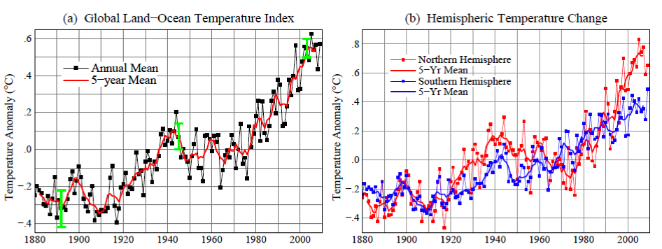
Figure 1. (a) GISS analysis of global surface temperature change. Green vertical bar is estimated 95 percent confidence range (two standard deviations) for annual temperature change. (b) Hemispheric temperature change in GISS analysis. (Base period is 1951-1980. This base period is fixed consistently in GISS temperature analysis papers – see References. Base period 1961-1990 is used for comparison with published HadCRUT analyses in Figures 3 and 4.)
The global record warm year, in the period of near-global instrumental measurements (since the late 1800s), was 2005. Sometimes it is asserted that 1998 was the warmest year. The origin of this confusion is discussed below. There is a high degree of interannual (year‐to‐year) and decadal variability in both global and hemispheric temperatures. Underlying this variability, however, is a long‐term warming trend that has become strong and persistent over the past three decades. The long‐term trends are more apparent when temperature is averaged over several years. The 60‐month (5‐year) and 132 month (11‐year) running mean temperatures are shown in Figure 2 for the globe and the hemispheres. The 5‐year mean is sufficient to reduce the effect of the El Niño – La Niña cycles of tropical climate. The 11‐year mean minimizes the effect of solar variability – the brightness of the sun varies by a measurable amount over the sunspot cycle, which is typically of 10‐12 year duration.
C’est le résumé pour 2009 de Hansen et collaborateurs’, (avec quelques modifications mineures).
“Si ça se réchauffe tant, bon sang, pourquoi fait-il si froid?”
par James Hansen, Reto Ruedy, Makiko Sato, and Ken Lo (Traduction par Xavier Pétillon)
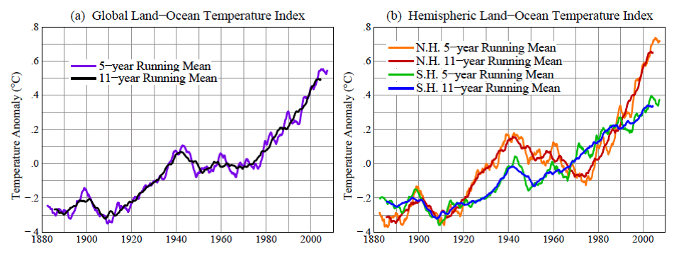
Figure 2. 60‐month (5‐year) and 132 month (11‐year) running mean temperatures in the GISS analysis of (a) global and (b) hemispheric surface temperature change. (Base period is 1951‐1980.)
There is a contradiction between the observed continued warming trend and popular perceptions about climate trends. Frequent statements include: “There has been global cooling over the past decade.” “Global warming stopped in 1998.” “1998 is the warmest year in the record.” Such statements have been repeated so often that most of the public seems to accept them as being true. However, based on our data, such statements are not correct. The origin of this contradiction probably lies in part in differences between the GISS and HadCRUT temperature analyses (HadCRUT is the joint Hadley Centre/University of East Anglia Climatic Research Unit temperature analysis). Indeed, HadCRUT finds 1998 to be the warmest year in their record. In addition, popular belief that the world is cooling is reinforced by cold weather anomalies in the United States in the summer of 2009 and cold anomalies in much of the Northern Hemisphere in December 2009. Here we first show the main reason for the difference between the GISS and HadCRUT analyses. Then we examine the 2009 regional temperature anomalies in the context of global temperatures.
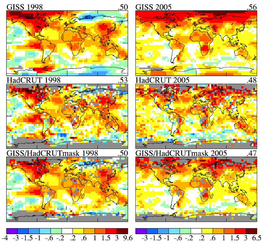
Figure 3. Temperature anomalies in 1998 (left column) and 2005 (right column). Top row is GISS analysis, middle row is HadCRUT analysis, and bottom row is the GISS analysis masked to the same area and resolution as the HadCRUT analysis. [Base period is 1961‐1990.]
Figure 3 shows maps of GISS and HadCRUT 1998 and 2005 temperature anomalies relative to base period 1961‐1990 (the base period used by HadCRUT). The temperature anomalies are at a 5 degree‐by‐5 degree resolution for the GISS data to match that in the HadCRUT analysis. In the lower two maps we display the GISS data masked to the same area and resolution as the HadCRUT analysis. The “masked” GISS data let us quantify the extent to which the difference between the GISS and HadCRUT analyses is due to the data interpolation and extrapolation that occurs in the GISS analysis. The GISS analysis assigns a temperature anomaly to many gridboxes that do not contain measurement data, specifically all gridboxes located within 1200 km of one or more stations that do have defined temperature anomalies.
The rationale for this aspect of the GISS analysis is based on the fact that temperature anomaly patterns tend to be large scale. For example, if it is an unusually cold winter in New York, it is probably unusually cold in Philadelphia too. This fact suggests that it may be better to assign a temperature anomaly based on the nearest stations for a gridbox that contains no observing stations, rather than excluding that gridbox from the global analysis. Tests of this assumption are described in our papers referenced below.
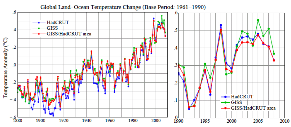
Figure 4. Global surface temperature anomalies relative to 1961‐1990 base period for three cases: HadCRUT, GISS, and GISS anomalies limited to the HadCRUT area. [To obtain consistent time series for the HadCRUT and GISS global means, monthly results were averaged over regions with defined temperature anomalies within four latitude zones (90N‐25N, 25N‐Equator, Equator‐25S, 25S‐90S); the global average then weights these zones by the true area of the full zones, and the annual means are based on those monthly global means.]
Figure 4 shows time series of global temperature for the GISS and HadCRUT analyses, as well as for the GISS analysis masked to the HadCRUT data region. This figure reveals that the differences that have developed between the GISS and HadCRUT global temperatures during the past few decades are due primarily to the extension of the GISS analysis into regions that are excluded from the HadCRUT analysis. The GISS and HadCRUT results are similar during this period, when the analyses are limited to exactly the same area. The GISS analysis also finds 1998 as the warmest year, if analysis is limited to the masked area. The question then becomes: how valid are the extrapolations and interpolation in the GISS analysis? If the temperature anomaly scale is adjusted such that the global mean anomaly is zero, the patterns of warm and cool regions have realistic‐looking meteorological patterns, providing qualitative support for the data extensions. However, we would like a quantitative measure of the uncertainty in our estimate of the global temperature anomaly caused by the fact that the spatial distribution of measurements is incomplete. One way to estimate that uncertainty, or possible error, can be obtained via use of the complete time series of global surface temperature data generated by a global climate model that has been demonstrated to have realistic spatial and temporal variability of surface temperature. We can sample this data set at only the locations where measurement stations exist, use this sub‐sample of data to estimate global temperature change with the GISS analysis method, and compare the result with the “perfect” knowledge of global temperature provided by the data at all gridpoints.
| 1880‐1900 | 1900‐1950 | 1960‐2008 | |
|---|---|---|---|
| Meteorological Stations | 0.2 | 0.15 | 0.08 |
| Land‐Ocean Index | 0.08 | 0.05 | 0.05 |
Table 1. Two‐sigma error estimate versus period for meteorological stations and land‐ocean index.
Table 1 shows the derived error due to incomplete coverage of stations. As expected, the error was larger at early dates when station coverage was poorer. Also the error is much larger when data are available only from meteorological stations, without ship or satellite measurements for ocean areas. In recent decades the 2‐sigma uncertainty (95 percent confidence of being within that range, ~2‐3 percent chance of being outside that range in a specific direction) has been about 0.05°C. The incomplete coverage of stations is the primary cause of uncertainty in comparing nearby years, for which the effect of more systematic errors such as urban warming is small.
Additional sources of error become important when comparing temperature anomalies separated by longer periods. The most well‐known source of long‐term error is “urban warming”, human‐made local warming caused by energy use and alterations of the natural environment. Various other errors affecting the estimates of long‐term temperature change are described comprehensively in a large number of papers by Tom Karl and his associates at the NOAA National Climate Data Center. The GISS temperature analysis corrects for urban effects by adjusting the long‐term trends of urban stations to be consistent with the trends at nearby rural stations, with urban locations identified either by population or satellite‐observed night lights. In a paper in preparation we demonstrate that the population and night light approaches yield similar results on global average. The additional error caused by factors other than incomplete spatial coverage is estimated to be of the order of 0.1°C on time scales of several decades to a century, this estimate necessarily being partly subjective. The estimated total uncertainty in global mean temperature anomaly with land and ocean data included thus is similar to the error estimate in the first line of Table 1, i.e., the error due to limited spatial coverage when only meteorological stations are included.
Now let’s consider whether we can specify a rank among the recent global annual temperatures, i.e., which year is warmest, second warmest, etc. Figure 1a shows 2009 as the second warmest year, but it is so close to 1998, 2002, 2003, 2006, and 2007 that we must declare these years as being in a virtual tie as the second warmest year. The maximum difference among these in the GISS analysis is ~0.03°C (2009 being the warmest among those years and 2006 the coolest). This range is approximately equal to our 1‐sigma uncertainty of ~0.025°C, which is the reason for stating that these five years are tied for second warmest.
The year 2005 is 0.061°C warmer than 1998 in our analysis. So how certain are we that 2005 was warmer than 1998? Given the standard deviation of ~0.025°C for the estimated error, we can estimate the probability that 1998 was warmer than 2005 as follows. The chance that 1998 is 0.025°C warmer than our estimated value is about (1 – 0.68)/2 = 0.16. The chance that 2005 is 0.025°C cooler than our estimate is also 0.16. The probability of both of these is ~0.03 (3 percent). Integrating over the tail of the distribution and accounting for the 2005‐1998 temperature difference being 0.61°C alters the estimate in opposite directions. For the moment let us just say that the chance that 1998 is warmer than 2005, given our temperature analysis, is at most no more than about 10 percent. Therefore, we can say with a reasonable degree of confidence that 2005 is the warmest year in the period of instrumental data.
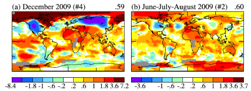
Figure 5. (a) global map of December 2009 anomaly, (b) global map of Jun‐Jul‐Aug 2009 anomaly. #4 and #2 indicate that December 2009 and JJA are the 4th and 2nd warmest globally for those periods.
What about the claim that the Earth’s surface has been cooling over the past decade? That issue can be addressed with a far higher degree of confidence, because the error due to incomplete spatial coverage of measurements becomes much smaller when averaged over several years. The 2‐sigma error in the 5‐year running‐mean temperature anomaly shown in Figure 2, is about a factor of two smaller than the annual mean uncertainty, thus 0.02‐0.03°C. Given that the change of 5‐year‐mean global temperature anomaly is about 0.2°C over the past decade, we can conclude that the world has become warmer over the past decade, not cooler.
Why are some people so readily convinced of a false conclusion, that the world is really experiencing a cooling trend? That gullibility probably has a lot to do with regional short‐term temperature fluctuations, which are an order of magnitude larger than global average annual anomalies. Yet many lay people do understand the distinction between regional short‐term anomalies and global trends. For example, here is comment posted by “frogbandit” at 8:38p.m. 1/6/2010 on City Bright blog:
“I wonder about the people who use cold weather to say that the globe is cooling. It forgets that global warming has a global component and that its a trend, not an everyday thing. I hear people down in the lower 48 say its really cold this winter. That ain’t true so far up here in Alaska. Bethel, Alaska, had a brown Christmas. Here in Anchorage, the temperature today is 31[ºF]. I can’t say based on the fact Anchorage and Bethel are warm so far this winter that we have global warming. That would be a really dumb argument to think my weather pattern is being experienced even in the rest of the United States, much less globally.”
What frogbandit is saying is illustrated by the global map of temperature anomalies in December 2009 (Figure 5a). There were strong negative temperature anomalies at middle latitudes in the Northern Hemisphere, as great as ‐8°C in Siberia, averaged over the month. But the temperature anomaly in the Arctic was as great as +7°C. The cold December perhaps reaffirmed an impression gained by Americans from the unusually cool 2009 summer. There was a large region in the United States and Canada in June‐July‐August with a negative temperature anomaly greater than 1°C, the largest negative anomaly on the planet.
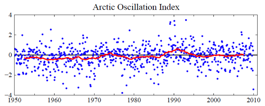
Figure 6. Arctic Oscillation (AO) Index. Positive values of the AO index indicate high low pressure in the polar region and thus a tendency for strong zonal winds that minimize cold air outbreaks to middle latitudes. Blue dots are monthly means and the red curve is the 60‐month (5‐year) running mean.
How do these large regional temperature anomalies stack up against an expectation of, and the reality of, global warming? How unusual are these regional negative fluctuations? Do they have any relationship to global warming? Do they contradict global warming?
It is obvious that in December 2009 there was an unusual exchange of polar and mid‐latitude air in the Northern Hemisphere. Arctic air rushed into both North America and Eurasia, and, of course, it was replaced in the polar region by air from middle latitudes. The degree to which Arctic air penetrates into middle latitudes is related to the Arctic Oscillation (AO) index, which is defined by surface atmospheric pressure patterns and is plotted in Figure 6. When the AO index is positive surface pressure is high low in the polar region. This helps the middle latitude jet stream to blow strongly and consistently from west to east, thus keeping cold Arctic air locked in the polar region. When the AO index is negative there tends to be low high pressure in the polar region, weaker zonal winds, and greater movement of frigid polar air into middle latitudes.
Figure 6 shows that December 2009 was the most extreme negative Arctic Oscillation since the 1970s. Although there were ten cases between the early 1960s and mid 1980s with an AO index more extreme than ‐2.5, there were no such extreme cases since then until last month. It is no wonder that the public has become accustomed to the absence of extreme blasts of cold air.
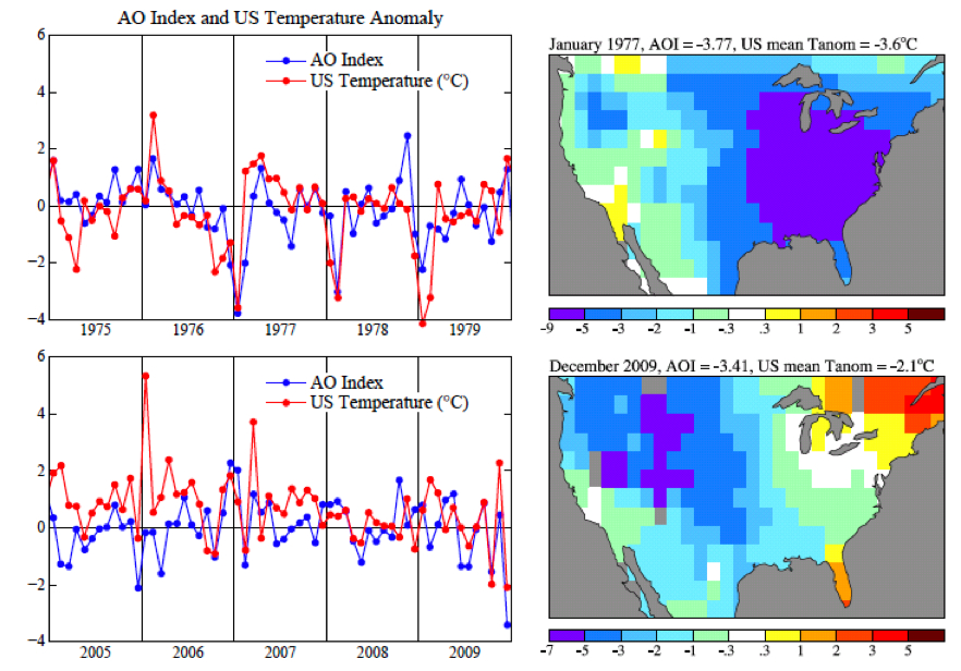
Figure 7. Temperature anomaly from GISS analysis and AO index from NOAA National Weather Service Climate Prediction Center. United States mean refers to the 48 contiguous states.
Figure 7 shows the AO index with greater temporal resolution for two 5‐year periods. It is obvious that there is a high degree of correlation of the AO index with temperature in the United States, with any possible lag between index and temperature anomaly less than the monthly temporal resolution. Large negative anomalies, when they occur, are usually in a winter month. Note that the January 1977 temperature anomaly, mainly located in the Eastern United States, was considerably stronger than the December 2009 anomaly. [There is nothing magic about a 31 day window that coincides with a calendar month, and it could be misleading. It may be more informative to look at a 30‐day running mean and at the Dec‐Jan‐Feb means for the AO index and temperature anomalies.]
The AO index is not so much an explanation for climate anomaly patterns as it is a simple statement of the situation. However, John (Mike) Wallace and colleagues have been able to use the AO description to aid consideration of how the patterns may change as greenhouse gases increase. A number of papers, by Wallace, David Thompson, and others, as well as by Drew Shindell and others at GISS, have pointed out that increasing carbon dioxide causes the stratosphere to cool, in turn causing on average a stronger jet stream and thus a tendency for a more positive Arctic Oscillation. Overall, Figure 6 shows a tendency in the expected sense. The AO is not the only factor that might alter the frequency of Arctic cold air outbreaks. For example, what is the effect of reduced Arctic sea ice on weather patterns? There is not enough empirical evidence since the rapid ice melt of 2007. We conclude only that December 2009 was a highly anomalous month and that its unusual AO can be described as the “cause” of the extreme December weather.
We do not find a basis for expecting frequent repeat occurrences. On the contrary. Figure 6 does show that month‐to‐month fluctuations of the AO are much larger than its long term trend. But temperature change can be caused by greenhouse gases and global warming independent of Arctic Oscillation dynamical effects.
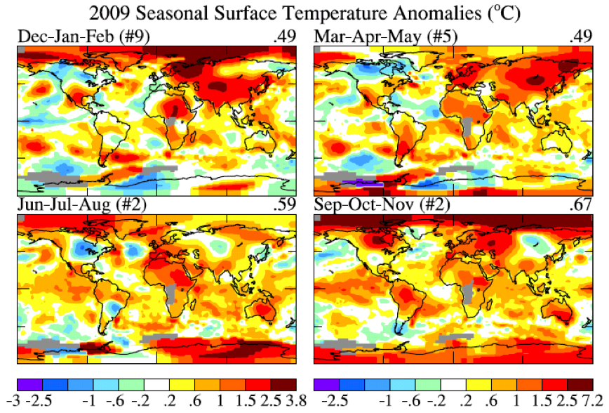
Figure 8. Global maps 4 season temperature anomalies for ~2009. (Note that Dec is December 2008. Base period is 1951‐1980.)
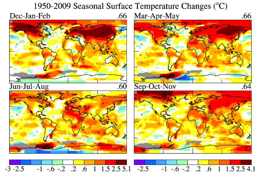
Figure 9. Global maps 4 season temperature anomaly trends for period 1950‐2009.
So let’s look at recent regional temperature anomalies and temperature trends. Figure 8 shows seasonal temperature anomalies for the past year and Figure 9 shows seasonal temperature change since 1950 based on local linear trends. The temperature scales are identical in Figures 8 and 9. The outstanding characteristic in comparing these two figures is that the magnitude of the 60 year change is similar to the magnitude of seasonal anomalies. What this is telling us is that the climate dice are already strongly loaded. The perceptive person who has been around since the 1950s should be able to notice that seasonal mean temperatures are usually greater than they were in the 1950s, although there are still occasional cold seasons.
The magnitude of monthly temperature anomalies is typically 1.5 to 2 times greater than the magnitude of seasonal anomalies. So it is not yet quite so easy to see global warming if one’s figure of merit is monthly mean temperature. And, of course, daily weather fluctuations are much larger than the impact of the global warming trend. The bottom line is this: there is no global cooling trend. For the time being, until humanity brings its greenhouse gas emissions under control, we can expect each decade to be warmer than the preceding one. Weather fluctuations certainly exceed local temperature changes over the past half century. But the perceptive person should be able to see that climate is warming on decadal time scales.
This information needs to be combined with the conclusion that global warming of 1‐2°C has enormous implications for humanity. But that discussion is beyond the scope of this note.
References:
Hansen, J.E., and S. Lebedeff, 1987: Global trends of measured surface air temperature. J. Geophys. Res., 92, 13345‐13372.
Hansen, J., R. Ruedy, J. Glascoe, and Mki. Sato, 1999: GISS analysis of surface temperature change. J. Geophys. Res., 104, 30997‐31022.
Hansen, J.E., R. Ruedy, Mki. Sato, M. Imhoff, W. Lawrence, D. Easterling, T. Peterson, and T. Karl, 2001: A closer look at United States and global surface temperature change. J. Geophys. Res., 106, 23947‐23963.
Hansen, J., Mki. Sato, R. Ruedy, K. Lo, D.W. Lea, and M. Medina‐Elizade, 2006: Global temperature change. Proc. Natl. Acad. Sci., 103, 14288‐14293.
L’année passée, 2009, passe pour être la seconde année la plus chaude depuis 130 ans d’enregistrements instrumentaux de la température globale, dans l’analyse de température de surface par l’Institut Goddard pour les études spatiales de la NASA (GISS). L’hémisphère sud bat un record comme le plus chaud pour cette moitié du monde. La température globale moyenne, comme montré dans l’illustration 1a, fut plus chaude de 0,57°C (1°F) que la période climatologique (période de base 1951-1980). L’hémisphère sud, comme montré dans l’illustration 1b, fut plus chaud de 0,49°C (0,88°F) que la période climatologique.

Illustration 1: (a) analyse du GISS pour les changements de la température globale de surface. La barre verticale verte est l’estimation à l’intervalle de confiance de 95% (deux écarts-type) pour le changement annuel de température. (b) Changement des
températures des hémisphères dans l’analyse du GISS. (Période de base 1951-1980. Cette période de base est est systématiquement fixée pour tous les articles du GISS concernant l’analyse de la température – voir les références. La période de base 1961-1990 est utilisée pour les comparaisons avec les analyses publiées du HadCRUT dans les illustrations 3 et 4).
L’enregistrement de l’année globalement la plus chaude, dans la période d’utilisation des mesures instrumentales globales (depuis la fin du XIXème siècle) était 2005. Il est quelques fois avancé que 1998 était la plus chaude. L’origine de cette confusion est discutée ci-après. Il y a un fort degré de variabilité interannuelle (année par année) et décénnale à la fois dans les températures globales et hémisphériques. Sous-tendant cette variabilité, néanmoins, on trouve une tendance au réchauffement de long terme qui devient plus fort et persistant [tenace] au cours des trois dernières décennies. Les tendances de long terme sont plus apparentes quand les températures sont moyennées sur plusieurs années. Les températures en moyennes mobiles sur 60 mois (5 ans) et 132 mois (11 ans) sont montrées dans la figure 2 pour le globe et les hémisphères. La moyenne sur 5 ans est suffisante pour réduire l’effet du cycle climatique tropical El Niño-El Niña. La moyenne sur 11 ans minimise l’effet de la variabilité solaire – la luminosité solaire varie significativement pendant le cycle de tâches solaires, qui est généralement d’une durée de l’ordre de 10-12 ans.

Illustration 2: Températures en moyennes mobiles sur 60 (5 ans) et 132 (11 ans) mois dans l’analyse du GISS pour les changements de température de surface (a) globale et (b) des hémisphères.(période de base 1951-1980).
Il y a une contradiction entre la tendance observée et continue au réchauffement et la perception populaire des tendances climatiques. Ce type de perception inclut fréquemment ces assertions « Il y a eu un refroidissement global ces dernières 10 années. » « Le réchauffement global s’est arrêté en 1998. » « 1998 est l’année la plus chaude jamais enregistrée. » De telles déclarations ont été répétées si souvent que la plupart des gens les acceptent comme vraies. Néanmoins, selon nos données, ces déclarations ne sont pas correctes.
L’origine de la contradiction se trouve probablement pour partie dans la différence entre les analyses du GISS et du HadCRUT (HadCRUT est une association entre le centre Hadley et l’unité de recherche sur l’analyse de température de l’université de East-Anglia). En effet, le HadCRUT a trouvé que 1998 était l’année la plus chaude enregistrée. De plus, les croyances populaires en un refroidissement sont renforcées par des anomalies froides aux USA à l’été 2009 et dans l’hémisphère nord en décembre 2009.
Nous montrerons d’abord les principales raisons des différences entre les analyses du GISS et du HadCRUT. Nous examinerons ensuite les anomalies régionales de 2009 dans le contexte des températures globales.

Illustration 3: Anomalies de températures en 1998 (colonne de gauche) et 2005 (colonne de droite). Le rang du haut est l’analyse du GISS, celui du milieu est l’analyse du HadCRUT et le rang du bas est l’analyse du GISS masquée [ndt : calée] sur les mêmes zones et résolution que l’analyse du HadCRUT. (La période de base est 1961-1990.)
L’illustration 3 montre les cartes des anomalies de températures du GISS et HadCRUT en 1998 et 2005 relativement à la période 1961-1990 (la période de base usuelle du HadCRUT). Les anomalies de températures sont dans une résolution de 5 en 5 degrés géographiques pour les données du GISS afin qu’elles correspondent à celles de l’analyse du HadCRUT. Dans les deux cartes du bas, nous montrons les données du GISS sous le même masque en termes de répartition géographique et de résolution que celui du HadCRUT. Les données du GISS « sous masque » nous permettent de quantifier la manière dont les différences entre les analyses du GISS et du HadCRUT sont dues à l’interpolation et l’extrapolation des données utilisées dans l’analyse du GISS. Cette analyse affecte
à de nombreuses cases [des modèles] une anomalie de température qui ne contiennent pas de données mesurées, spécifiquement dans des cases qui se trouvent à moins de 1200 km d’une ou plusieurs stations qui ont défini une anomalie de température.
La raison de cet aspect de l’analyse du GISS est basée sur le fait que le schéma d’une anomalie de température tend à se produire à grande échelle. Par exemple, s’il y a un hiver anormalement froid à New-York, il est probablement anormalement froid à Philadelphie aussi. Ce fait suggère qu’il peut être préférable d’affecter une anomalie de température basée sur les stations les plus proches de la case qui n’a aucune observation que d’exclure la case de l’analyse globale. Des tests de cette assertion sont décrits dans nos articles référencés plus bas.

Illustration 4: Anomalies de la température de surface globale relativement à la période de base 1961-1990 pour trois cas : HadCRUT, GISS et anomalies du GISS limitées à l’aire HadCRUT. [Pour obtenir des séries temporelles cohérentes pour les moyennes globales du HadCRUT et du GISS, les résultats mensuels ont été moyennés par régions avec des anomalies de températures définies à l’intérieur de 4 zones de latitudes (90N-25N, 25N-équateur, équateur-25S, 25S-90S) ; la moyenne globale pondère ainsi ces zones en fonction de la vraie surface de ces zones entières, et les moyennes annuelles sont basées sur ces moyennes mensuelles globales.]
L’illustration 4 montre des séries temporelles de température globale pour les analyses du GISS et du HadCRUT, aussi bien que pour l’analyse du GISS masquée sur les régions de données du HadCRUT. Cette illustration révèle que les différences qui se sont développées entre les températures globales du GISS et du HadCRUT ces dernières décennies sont principalement dues à l’extension de l’analyse du GISS à des régions exclues de l’analyse du HadCRUT. Les résultats du GISS et de HadCRUT sont similaires durant
cette période quand les analyses sont circonscrites exactement aux mêmes aires. L’analyse du GISS trouve aussi 1998 comme année la plus chaude, si l’analyse est limité aux données sous le même masque. La question devient alors : quelle est la valeur des interpolations et des extrapolations dans l’analyse du GISS ? Si l’échelle des anomalies de température est ajustée telle que l’anomalie de la moyenne globale est de zéro, alors les schémas des régions chaudes et froides ont un aspect cohérent avec les schémas météorologiques, apportant ainsi un support qualitatif pour l’extension des données. Néanmoins, nous aimerions une mesure quantitative sur l’incertitude de notre estimation pour l’anomalie de la température globale causée par le fait d’une distribution spatiale des mesures incomplète.
Une manière d’estimer cette incertitude, ou possible erreur, peut être d’utiliser les séries temporelles complètes générées par un modèle de climat global ayant déjà fait ses preuves d’une variabilité spatiale et temporelle des températures de surface réaliste. Nous pouvons échantillonner ce jeu de données seulement aux endroits où des stations de mesure existent, et utiliser ce sous-ensemble de données pour estimer le changement de la température globale avec l’analyse du GISS, puis comparer le résultat avec la connaissance « parfaite » de la température globale que nous avons avec les données de chacune des cases.
| 1880-1900 | 1900-1950 | 1960-2008 | |
|---|---|---|---|
| Stations météorologiques | 0.2 | 0.15 | 0.08 |
| Index « Land-Ocean » | 0.08 | 0.05 | 0.05 |
Tableau 1. Estimation de l’erreur à deux écart-type par période pour les stations météorologiques et l’index « Land-ocean ».
Le tableau 1 montre l’erreur dérivée due à la couverture incomplète des stations. Comme attendu, l’erreur est plus importante aux dates anciennes quand la couverture en stations était plus pauvre. Mais aussi, l’erreur est plus grande quand les données sont disponibles seulement depuis les stations météorologiques, sans mesure depuis des bateaux ou satellites pour les aires océaniques. Dans les décennies récentes, l’incertitude à 2 écarts-type (intervalle de confiance à 95% d’être à l’intérieur de ces valeurs, 2 à 3 % d’être en dehors d’un côté ou de l’autre) a été de 0,05°C. La couverture incomplètes des stations est la première cause d’incertitude pour les années récentes, pour lesquelles les erreurs plus systématiques sont petites, comme le réchauffement urbain.
Des sources additionnelles d’erreurs deviennent importantes quand on compare des anomalies de températures séparées par des périodes plus longues. La source d’erreur de long terme la plus connue est « le réchauffement urbain », un réchauffement local d’origine humaine causé par l’utilisation de l’énergie et les altérations de l’environnement naturel. D’autres erreurs variées, qui affectent les estimations des changements de températures sur le long terme, sont décrites de manière complète dans un grand
nombre d’articles par Tom Karl et ses associés du Centre national de données sur le climat (NCDC) de la NOAA. L’analyse du GISS pour la température corrige l’effet urbain en ajustant les tendances de long terme des stations urbaines de manière cohérente avec les stations rurales des alentours, et en identifiant les densités urbaines par leur population ou par l’observation par les satellites des lumières nocturnes. Dans un article en préparation, nous démontrons que les approches par la population et par les lumières nocturnes donne des résultats similaires sur la moyenne globale. Les erreurs additionnelles causées par des facteurs autres que
la couverture spatiale incomplète est estimée comme étant de l’ordre de 0,1°C sur des échelles de temps de plusieurs décennies à un siècle, cette estimation étant nécessairement partiellement subjective. L’incertitude totale dans les anomalies de température globale moyenne, avec les données « terre et océans » ainsi incluses, est équivalente à l’erreur estimée dans la première ligne du
tableau 1, i.e. l’erreur due à une couverture spatiale limitée quand seules les stations météorologiques sont incluses.
Maintenant, voyons voir si nous pouvons préciser un rang entre les températures annuelles globales récentes, i.e. quelle année est la plus chaude, la seconde plus chaude, etc. L’illustration 1a montre l’année 2009 comme la seconde plus chaude, mais si proche de 1998, 2002, 2003 et 2007 que nous devons considérer toutes ces années comme étant virtuellement la seconde année la plus chaude. La différence maximale entre elles dans l’analyse du GISS est de ~0,03°C (2009 étant la plus chaude et 2003 la plus froide). Cet écart est approximativement égal à notre incertitude à un écart-type de ~0,025°C, ce qui est la raison pour établir que ces années sont toutes la seconde année la plus chaude.
L’année 2005 est plus chaude de 0,061°C que 1998 dans notre analyse. Donc, comment sommes-nous certains que 2005 est plus chaude que 1998 ? Étant donné l’écart-type de ~0,025°C pour l’erreur estimée, nous pouvons estimer la probabilité que 1998 était plus chaude que 2005 comme suit. La chance que 1998 soit 0,025°C plus chaude que notre valeur estimée est d’environ (1-0,68)/2=0,16. La chance que 2005 soit 0,025°C plus froide que notre estimation est aussi de 0,16. La probabilité que ces deux évènements se produisent ensemble est de ~0,03 (3 pourcent). Intégrer la queue de distribution et compter une différence de température entre 2005 et 1998 de 0,61°C change l’estimation dans des directions opposées. Pour le moment, disons juste que la chance pour que 1998 soit plus chaude que 2005, étant donnée notre analyse des températures, est au plus de l’ordre de 10 pourcent. Par conséquent, nous pouvons dire avec un degré raisonnable de confiance que 2005 est l’année la plus chaude dans la période de mesures instrumentales.

Illustration 5. (a) Carte globale de l’anomalie de décembre 2009, (b) carte globale de l’anomalie de juin-juillet-août 2009. #4 et #2 indiquent que décembre 2009 en juin-juillet-août sont les quatrième et deuxième périodes globalement plus chaudes de ce laps de temps.
Que dire à propos de la déclaration comme quoi la surface de la Terre se rafraîchit depuis 10 ans ? Cette question peut être traitée avec beaucoup de confiance, car l’erreur due à une couverture spatiale insuffisante des mesures devient encore plus faible quand on moyenne sur plusieurs années. L’incertitude à deux écarts-type dans la moyenne sur 5 ans de l’anomalie de température montrée dans l’illustration 2, est plus petite d’un facteur 2 que l’incertitude moyenne annuelle, ainsi 0,02-0,03°C. Étant donné que le changement d’une moyenne sur 5 ans de l’anomalie de température est d’environ 0,2°C sur la dernière décennie, nous pouvons conclure que le monde est devenu plus chaud, et non plus froid, depuis la dernière décennie.
Pourquoi des gens sont-ils convaincus d’une conclusion erronée, que le monde est vraiment en train de se refroidir ? Cette naïveté a certainement beaucoup à voir avec les variations régionales de court terme de la température, qui sont d’un plus grand ordre de grandeur que les anomalies annuelles des températures. Même des personnes non averties sont capables de comprendre la différence entre les anomalies locales [ndt : régionales] de court terme et la tendance globale. Par exemple, voici un commentaire posté par « frogbandit » à 20h38 le 6 janvier 2010 le blog de City Bright :
« Je m’étonne de ces gens qui utilisent une météo quotidienne froide pour dire que la Terre se refroidit. On oublie que le réchauffement global a des composantes globales et que c’est une tendance, pas une chose quotidienne. J’entends des gens, au sud que la latitude 48, dire qu’il fait vraiment froid cet hiver. Ce n’est pas si vrai que ça, ici, en Alaska. Bethel, en Alaska, a eu un Noël brun. Ici, à Anchorage, la température d’aujourd’hui est de 31°F [ndt : soient 3°C]. En me basant sur le fait que Bethel et Anchorage sont si chauds cet hiver, je ne peux pas dire que nous avons un réchauffement climatique. Ce serait vraiment un argument idiot de penser que mon schéma de température est répété dans le reste des Etats-Unis, plus ou moins globalement. »
Ce que ‘frogbandit’ dit est illustré par la carte globale des anomalies de températures en décembre 2009 (illustration 5a). Il y a eu de forte anomalies négatives de températures dans les latitudes moyennes de l’hémisphère nord, pas moins de 8°C en Sibérie, moyenné sur le mois. Mais l’anomalie de température en Arctique était, elle, aussi forte que +7°C.
Le décembre froid confirme peut-être une impression acquise par les américains depuis l’été inhabituellement froid de 2009. Il y avait des régions étendues des USA et du Canada en juin-juillet-août avec une anomalie négative de température supérieure à 1°C, la plus grande anomalie sur la planète.

Illustration 6. L’index de l’Oscillation Arctique (AO). Les valeurs positives de l’Index AO indiquent une zone de haute pression sur les régions polaires et ainsi, une tendance à de forts vents zonaux qui minimisent la circulation d’air froid aux latitudes moyennes. Les point bleus sont des moyennes mensuelles et la courbe rouge est la moyenne mobile sur 60 mois (5 ans).
Comment ces larges anomalies régionales de températures se confrontent-elles aux attentes et à la réalité du réchauffement climatique? Ces fluctuations négatives régionales sont-elles inhabituelles? Sont-elles liées avec le réchauffement climatique? Le contredisent-elles?
Il est évident qu’il y a eu en décembre 2009 un échange inhabituel d’air entre le pôle et les latitudes moyennes de l’hémisphère nord. L’air arctique s’est engouffré à la fois sur l’Amérique du nord et l’Eurasie, et, bien sûr, a été remplacé dans ces régions polaires par l’air des latitudes moyennes. La force avec laquelle l’air arctique a pénétré dans les latitudes moyennes est relié avec l’index AO, défini par des schémas de pression atmosphérique de surface et représenté dans l’illustration 6. Quand l’index AO est positif, la pression de surface est élevée dans les régions polaires. Cela permet au jet stream des latitudes moyennes de souffler fortement et constamment d’ouest en est, bloquant ainsi l’air froid au pôle. Quand l’index AO est négatif, il y a une tendance aux basses pressions dans les régions polaires, un vent zonal plus faible, et de plus grands mouvements d’air glacé vers les latitudes moyennes.
L’illustration 6 montre que décembre 2009 a vu la valeur de l’index AO la plus extrêmement négative depuis les années 70. Malgré le fait qu’il y ait eu une dizaine de cas d’index AO aussi extrêmes que -2,5 entre les années 60 et les années 80, il n’y a rien eu d’aussi extrême que le mois dernier. Ce n’est pas étonnant que les gens aient été accoutumés à une absence de ces coups de froid extrêmes.

Illustration 7. Anomalie de températures issu de l’analyse du GISS et Index AO du NWSCPC de la NOAA. La moyenne pour les Etats-Unis fait référence aux 48 états contigus.
L’illustration 7 montre l’index AO avec une résolution temporelle plus grande pour deux périodes de 5 ans. Il est évident qu’il y a un fort degré de corrélation entre l’index AO et les températures des Etats-Unis, avec un décalage possible entre l’index et les anomalies de températures inférieur à la résolution termporelle mensuelle. Les anomalies largement négatives, quand elles arrivent, sont souvent pendant les mois d’hiver. Il faut noter que l’anomalie de températures de janvier 1977, principalement située dans les états de l’est, fut considérablement plus forte que celle de décembre 2009. [cela n’a rien de magique quand une fenêtre de 31 jours coincide avec les jours calendaires du mois, et cela peut être trompeur. Il serait plus informatif de regarder la moyenne mobile sur 30 jours et la moyenne de l’index AO et des températures sur décembre-janvier-février.]
L’index AO n’est pas tant une explication pour ces schémas d’anomalies climatiques qu’un simple état de fait de la situation. Cependant, John (Mike) Wallace et ses collègues ont été capable d’utiliser la description de l’index AO pour aider à comprendre comment ces schémas peuvent changer en cas d’augmentation de gaz à effet de serre. Un certain nombre d’articles, par Wallace, David Thompson et d’autres, aussi bien que par Drew Shindell et d’autres au GISS,
ont montré que l’augmentation de gaz carbonique refroidit la stratosphère, ce qui cause en moyenne un jet stream plus puissant, et ainsi une tendance pour une oscillation arctique (AO) plus positive.
Globalement, l’illustration 6 montre une tendance selon le sens attendu. L’AO n’est pas le seul facteur qui altère la fréquence des épisodes d’air froid de l’Arctique. Par exemple, quel est l’effet d’une glace de mer réduite sur le schéma climatologique? Il n’y a pas assez de preuves empiriques depuis la fonte rapide de la glace de 2007. Nous pouvons seulement conclure que décembre 2009 était un mois hautement anormal et que cette oscillation arctique inhabituelle peut décrire la « cause » du climat extrême de décembre.
Nous n’avons pas trouvé de base pour nous attendre à de fréquentes répétitions de ce phénomène. Tout au contraire. L’illustration 6 montre que les fluctuations mois-par-mois de l’AO sont plus étendues que la tendance de long terme. Mais les changements de températures peuvent être causés par les gaz à effet de serre et le réchauffement global être indépendant des effets dynamiques de l’Oscillation Arctique.

Illustration 8. Carte globale des anomalies de températures pour les 4 saisons pour ~2009. (noter que Dec est décembre 2008. La période de base est 1951-1980.)

Illustration 9. Carte globale des tendances des anomalies de températures pour les 4 saisons pour la période 1950-2009.
Maintenant, regardons les anomalies de températures régionales récentes et les tendances des températures. L’illustration 8 montre les anomalies de températures saisonnières pour l’année passée et l’illustration 9 montre les changements des anomalies de températures depuis 1950 basés sur une tendance linéaire locale. Les échelles de températures sont les mêmes sur les illustrations 8 et 9. La caractéristique remarquable quand on compare ces deux illustrations est que la magnitude des changements sur 60 ans est similaire à la magnitude des anomalies saisonnières. Ce que cela nous raconte, c’est que les dés climatiques sont déjà sérieusement lancés. La personne perspicace qui est là depuis les années 50 sera capable de noter que les températures moyennes saisonnières sont actuellement plus élevées que celles des années 50, bien qu’il y ait encore occasionnellement des saisons froides.
La magnitude des anomalies mensuelles de températures est couramment 1,5 à 2 fois plus grande que la magnitude des anomalies saisonnières. Du coup, ce n’est pas encore si facile de voir le réchauffement global si sa principale illustration est la température moyenne mensuelle. Et, bien sûr, les fluctuations du temps au quotidien sont bien plus importantes que l’impact de la tendance globale du réchauffement.
Les bases sont celles-ci : il n’y a pas de tendance au refroidissement global.
A l’heure actuelle, jusqu’à ce que l’humanité mette ses émissions de gaz à effet de serre sous contrôle, nous pouvons nous attendre à ce que chaque décennie soit plus chaude que la précédente. Les fluctuations du temps qu’il fait excèdent certainement les changements locaux de températures du dernier demi-siècle. Mais la personne perspicace verra bien que le climat se réchauffe à l’échelle des décennies.
Cette information a encore besoin d’être mise en relation avec la conclusion qu’un réchauffement global de 1 à 2°C a d’énormes implications pour l’humanité. Mais cette discussion est au-delà de la portée de cet article.
Références:
Hansen, J.E., and S. Lebedeff, 1987: Global trends of measured surface air temperature. J. Geophys. Res., 92, 13345-13372.
Hansen, J., R. Ruedy, J. Glascoe, and Mki. Sato, 1999: GISS analysis of surface temperature change. J. Geophys. Res., 104, 30997-31022.
Hansen, J.E., R. Ruedy, Mki. Sato, M. Imhoff, W. Lawrence, D. Easterling, T. Peterson, and T. Karl, 2001: A closer look at United States and global surface temperature change. J. Geophys. Res., 106, 23947-23963.
Hansen, J., Mki. Sato, R. Ruedy, K. Lo, D.W. Lea, and M. Medina-Elizade, 2006: Global temperature change. Proc. Natl. Acad. Sci., 103, 14288-14293.
Re: #895
CU,
The IPCC is so yesterday.
That’s the point you have yet to grasp.
Let me correct that: The science in IPCC is first rate. The solutions business side of IPCC and Copenhagen and so forth is a complete [edit]
[Response: The IPCC had/has nothing to do with Copenhagen. Policies may be ineffectual, or incoherent or produce the opposite of what is intended – but whatever it is you wish to convey, I suggest you use more appropriate language. – gavin]
Ron: “As a follow up to my comment about China, in spite of their refusal to commit to reduction targets, ”
Except they did.
They stated that they would reduce CO2 per GDP. Since they make most of the western world’s heavy goods and being cheaper (and without those pesky labour laws that stop people being protected at work at the expense of their shareholder’s Beemer), they didn’t want the west dumping more on them and making China work twice as hard where they have now exported all their CO2 and can happily drive 10 litre hummers.
All that was needed to ensure a real *absolute* reduction was to buy less from China.
That is in the hands of… you.
Re: #896/897
Ron,
I appreciate, greatly, your effort to see my comments in a true light, as free of preconceived bias as possible. Would it only be that others would see the benefit of that effort.
Eventually they will, but the majority of the gang in here serves as a proxy for the larger reality: They don’t want to know.
And because they don’t want to know, guess what? They remain human pinballs, caught between advocates arguing about the science and dug-in politicians and their proxies, who are viciously determined to defend their turf, even at the expense of lying through their teeth.
Acceleration is real, folks.
If we stopped emitting CO2 TODAY, (a) CO2 would continue to rise from natural sources, a process which is accelerating and (b) the chemistry between the atmosphere and the top layer of the world ocean will see to it that levels do not sink in any period of time which matters to this discussion.
Yes, Dr. Hansen may be able to envision an eventual stabilization at 350 ppm, but then he would have to address what the world will look like when that day comes, many many decades from now.
That world will be much more heavily influenced by its own momentum than by anything that man can do.
I know that Dr. Hansen knows that, but for whatever reason, he doesn’t mention it when discussing his reduction scenarios.
An honest statement in that regard would sound something like this:
“We can, through certain measures, reduce atmospheric CO2 over time. However, the planet will continue to warm for some period after that, and changes already underway will have to essentially complete before they can reverse, because of the enormous amounts of energy involved. Therefore, we will lose a lot of ice mass, we can’t say how much, and nations will need to address such consequences. It would benefit them to start soon.”
See how that shifts the focus?
Does that help explain why nobody’s saying it? That view currently fits no popular agenda. It does not fit the denier agenda – what, admit that the planet is warming?, nor does it fit the warmist agenda – what, admit that we can’t stop it?
And here we are.
Re: #859
John,
I apologize for missing that comment.
Of course, you’re right. I was not as clear as I should have been.
See, I am focused on two things: 1) CO2 emissions and 2) acceleration.
See the years you mentioned? 2030, 2050? If I am correct that we are already past the point of no return, then those years are far, far too late.
See above. I assert that acceleration is already unstoppable. I am looking for the specific reference, but I read last night that the scientist for the IPY project to analyze the Greenland ice sheet has determined that it is already lost.
We have no idea about the time scales, of course, not today, and certainly a warmer planet will speed the acceleration, so we should do what we can to limit that warming. No argument.
When I say “the needle hasn’t moved” I mean in the area where it matters: A global agreement to reduce CO2 emissions.
Suppose I’m wrong about the point of no return. How wrong am I? Ten years at most?
Even you don’t predict that we will be reducing CO2 emissions in ten years.
Jim (Dr. Hansen) objects to me calling this a game, perhaps because he believes that it connotes something less than serious.
If Jim cares about understanding my position, then he will have read enough of my posts to know that I am far from frivolous in my views. Completely out of step? Yes, today. But guess what? I am getting much more traction here these days than I did a year ago with essentially the same observations.
Why? Well for one thing, Copnhagen came and went without a binding agreement (Good!) and for another, at least some among you are trying to stay rational and not just pick a leader to follow, no matter what they say.
My two biggest heroes are Gore and Hansen, and look what’s become of them: Gore supports a fraudulent bill, and Dr. Hansen runs from his own empirical conclusions.
Sometimes we have to show the leaders how to lead.
WB: CO2 emissions, for the next couple of decades, will continue to increase… Somewhere in there it will flatten. Ten years? Maybe. Nothing has happened as fast as we would like, so my hedge is that it’s more like 20.
BPL: Then we’re all screwed.
“Acceleration is real, folks.”
Decelleration is real too.
US, UK and much of the western world have reduced CO2 production. One poster stated that the US are down on their 1991 levels.
Acceleration is real and we’re accelerating back, folks.
[Response: US numbers are much higher than their 1991 levels – where did that come from? (2009 was about 6% less than 2008, but 2007 was already 18% ahead of 1991 numbers) – gavin]
Re: #891
Gavin,
I see them as twins, joined at the hip, especially politically.
You cannot deny that IPCC has a political slant (leftward, obviously), as do the people who are trying to sell us on global treaties.
I really don’t know how we can separate them. Would there be climate policy groups without the IPCC findings?
And Gavin, I appreciate the couched language you use. See, I honestly pity you and others in the climate science world. I’m sure an anonymous poll would reveal a strong bias toward the opinion that we have passed the point of destabilization, throwing us into a wild new era of unknowns. I understand the enormous pressure you’re under to keep seeking “solution”. It’s far too political now, and that will only get worse.
Let me ask you a question: Have models been run to identify a destabilization point? Can the question even be framed as something that can be modeled?
If no/yes, would it make sense to see what we can learn there?
Re: #891
Gavin, why did you [edit]
[Response: I do it to prevent conversations taking pointless detours (like this one) about language and tone. This is our forum, run our way. If you want something different, host it yourself. This is not up for discussion. – gavin]
PS Ron, does the statement from here
http://www.desmogblog.com/china-gets-it-future-belongs-low-carbon-industries
sound like it comes from a country that thinks that they have to burn fossil fuels?
“[Response: US numbers are much higher than their 1991 levels – where did that come from?”
It was another poster on this thread. I’ll have to Ctrl-F to find it.
#
#
859
John E. Pearson says:
13 February 2010 at 10:40 AM
…
In 2008 US CO2 production was almost 3% below our 1991 CO2 production.
[Response: Well, it’s not true as the EIA numbers strongly attest. – gavin]
Re: #906
CFU,
Perhaps you misunderstood my use of the word “acceleration”.
I was referring to the natural acceleration of a warming event. Dr. Hansen, for one, believes that we reach a point in a warming where the event must complete itself, in other words, little or no permanent ice.
I agree and I believe we are past that point.
“you now you know I meant reservoirs.”
Exactly what is it that dams form behind them? Virtually everything is dammed and has reservoirs already. You have vast holes in your knowledge of current conditions. You may want to slow down before claiming to know what is to be done as long as it avoids taxes and real solutions.
Re: #912
Mark,
Please avoid sweeping statements.
I’m quite happy to have any of my suggestions improved upon, which would at a minimum require the other person to present me with some information.
With regard to reservoirs, I don’t know why you consider it necessary to associate dams with reservoirs. As you surely know, there are many reservoirs which are not the result of dams.
I never meant to use the word dams at all. It was a complete mistake, an accident.
This is the third time I am saying this and I don’t like to waste everybody’s time doing that, so for the last time:
The U.S. of the future will have less snow but more rain, and snow/glacier-based rivers will run low or run dry. Wet and dry regions will likely also shift, and the wet regions will likely get far more rainfall than they could, today, capture and preserve. Thus, in order to survive in that new world, we need a comprehensive national water management strategy which at a minimum improves on how much rainwater can be captured and preserved but which should also include dumping as little waste water as possible into streams and back out to sea (better to recycle and preserve it) as well as an integrated network to get water from where it falls to where its needed, and to replenish low supplies from over-supplied stocks.
Now, can I make an easy million by betting that much that not you nor Hank nor anybody else can produce evidence that there is even a concerted effort to have that discussion, let alone actually taking steps in that direction?
Re: #907
Gavin,
Did you see my question?:
Have models been run to identify a destabilization point? Can the question even be framed as something that can be modeled?
Re: #905
Bart,
Why are we all screwed?
We can’t learn to adapt?
What choice will we have?
Let me propose this: Some will survive, some won’t. What will be the factors which determine who is who?
I submit that one such factor will be how willing they were to face reality and make the wisest use of available information.
CFU, I’m not sure why you conclude from your link that China feels it does not need to burn fossil fuels. It clearly recognizes that the future is in non-fossil energy sources, but it will burn fossil fuels during the transition of its energy system to the extent necessary to maintain civil order. That is a non-negotiable commitment of the Chinese government, and who could blame them?
> Please direct me to the federal programs which are actively pursuing the above.
Did you yet read any of the links I gave? Walt, I only do homework help with a note from a teacher. You’ve been doing the “nobody but me knows what to do next” routine for many days here and never once commented on any of the things people have pointed to that are already accomplishing the things you seem to think you’re suggesting for the first time. You can look this stuff up if you bother. Then critique the efforts, don’t claim there’s nobody but you who imagines the need for such programs.
One suggestion: Google: transformer energy efficiency DOE lawsuit
Google (and Scholar) each of the suggestions you’ve made. Read what’s being done.
Comment on what’s being done and how it can be improved. You might have a good idea.
906: Gavin said “where did that come from” It came from me misreading. Sorry. We’re not below 1991 levels. 2008 was down 2.8% from 2007 and 2009 was down 6% from 2008, but as Gavin said we’re well above 1991 levels. The 2009 level will rise this year. Still I stand by my prediction that we’ll have 100GW of wind power capacity by the end of 2015. If that works out I still think we have a decent chance to be done with coal by 2050.
http://en.wikipedia.org/wiki/List_of_reservoirs_and_dams_in_the_United_States
“As you surely know, there are many reservoirs which are not the result of dams.”
I’m just a simple fisheries biologist who surveyed a vast area of western national forest watersheds over the last 20 years, but where I come from in Maine, we call those lakes. Are you saying we should dig more lakes? Try to stay in your field, Walt, which according to your blog is avoiding taxes. It sure as hell isn’t watershed science or any other scientific discipline.
Re: #917
Hank,
I got no links.
My email: wbennettjr@yahoo.com
Please stop trying to argue from authority.
You know as well as I do that no such national effort is underway.
Re: #917
Hank,
Doesn’t this:
http://www.earthjustice.org/news/press/2009/distribution-transformers-get-energy-boost-from-u-s-doe.html
make my point?
Lets you and I take a step back and see what we agree on.
We agree that energy efficiency slays more than one dragon, and that there is some low-hanging fruit.
We agree that there are some good ideas out there which unfortunately encounter a lot of resistance.
Now, some things I submit that we could agree on:
There is no national commitment to specific targets for energy effiency.
There is no coordinated national effort to plan for the eventual likely effects of persistent warming.
I won’t ask you to agree with me regarding what time it is; I’ve made my argument, I can provide supporting documentation, we all have to decide what the information means to us.
But my issue is this, sir: My “good idea” is to get us to a point where enough of us agree on what constitutes a “good idea” that we have a chance to get it done.
I see no point in continuing to attempt this on an international scale. It amounts to fiddling while Rome burns. Rome is going to burn anyway, so we have to learn to live with the consequences.
I do not dispute that you can find anecdotal evidence of good-faith efforts to accomplish some of these “green goals”. I would simply ask you to compare that with the ticking clock of AGW. I assume that you are at least as familiar with the science as I am, therefore you know about acceleration and some of what Hansen has said about it. You understand that CO2 will continue to rise, as will temperature, even after man stops adding to the atmospheric levels. You know it will be many decades, no matter how successful we are at reducing CO2 emissions, before AGW “turns around”, and I presume you know that the likelihood is that the even must complete before that can happen.
My hedge against all of that is to plan for the consequences.
“Perhaps you misunderstood my use of the word “acceleration”.”
Probably did, but it was rather open to misunderstanding. You want to keep things short but that means you take out all the words that supply context.
And by your avowed definition, then yes, but this is not news to the AGW science. Because over decade scales, CO2 has a cumulative effect.
We are also out of equilibrium.
Therefore, it has ALWAYS been known by the scientists that your “acceleration” exists.
It’s one reason to start as soon as possible.
“916
Ron Taylor says:
14 February 2010 at 9:17 PM
CFU, I’m not sure why you conclude from your link that China feels it does not need to burn fossil fuels.”
I don’t get how you suggest otherwise.
Unless you’re suggesting China doesn’t want to be a leader in the next stage of the world economic powers.
“Why are we all screwed?”
Because in the case where you asserted we don’t change, we are screwed.
“We can’t learn to adapt?”
Because you put forward the case were you asserted we didn’t adapt (reducing CO2 emissions IS an adaption, or were you thinking of humans evolving gills?)
“What choice will we have?”
What choice do you have?
Last one for Walt B: Sorry if you object to my attribution of “rants” to you. I was using it good-humoredly. And, considering the number and volume of your comments, I thought accurately. I will desist.
I skimmed rather fast over the weekend’s prose, but you were kind enough to pin down the bases of our disagreements at 12 February 2010 at 1:56 PM, with your statement that
“If we are to believe the science, destabilization is already underway and are past the tipping point to prevent further destabilization.”
This statement is unsupported to the point of utterly fatal weakness. It is grossly vague, and can’t have much force until tightened up, expanded upon, and so solidly supported in the peer-reviewed literature that there is hardly any oppostion. You can’t even come within shouting distance of doing that. Don’t even try. You’d have to write (or rather, respected authorities would have to write) an IPCC-style and IPCC-length review to make most of us believe that. Gimme a break. Preposterous, for at least the next several decades, and maybe for centuries. Making pessimistic statements out of your own predilections is one thing, but reading them is getting boring. My engagement with you is over until you contribute a new thought. Have the last word if you wish, be my guest.
Re: #922
CFU,
You wrote: “It’s one reason to start as soon as possible.”
We would have to have a longer discussion about what that sentence implies.
To me it implies that we just haven’t tried hard enough to convince people, that somehow the effort is lacking.
But do you honestly believe that?
I don’t know how long you’ve been involved in the “AGW debate”. For me it’s not that long, 3+ years, but in just that time I’ve had an incredible arc in my reaction to denialist positions.
At first I thought they were just confused. That didn’t last long. I soon found out that they were dug in and that they had some prominent scientists on their side. Warmists were already quite busy attempting to undermine the validity of these scientists.
I’ll gloss over the back and forth; presumably you are quite familiar with it yourself.
Unfortunately, one inescapable conclusion I have reached at this point is that the denialist position is highly adaptable and probably undefeatable, for several reasons:
1. AGW takes a long, long time to kick into a gear that will stir a conscious response;
2. Annual variability means that we will, on a regular basis have unusual “cold” events, which will serve to undermine the message;
3. AGW science is of course a pursuit of knowledge which will never be complete; the denialist camp has become expert at turning this uncertainty and replacing of older information with new into spin which declares: “They just don’t know, and they’re asking us to bet the future on it.”
To that last point you would probably say: “It’s the uncertainty that makes it important to act as soon as possible.”
Which they bat down dismissively. There are more important short term problems to deal with, they say.
The point being: A large chunk of the public responds positively to those messages.
And keep in mind: A lot of people just don’t trust the government. I could give you solid reasons why Dr. Hansens’ favored approach, fee/rebate, could almost certainly never happen in the U.S. Short version: It would be seen by some as another massive government program. There is enough resistance to such things in American politics to, at minimum, stall it for the foreseeable future.
The denialist intent has been to stall. Stalling has always been the enemy of nipping this in the bud.
And that’s where we are, I think you’d have to agree.
By now you know why I stand where I do. I take it that you still disagree, and I have accepted the responsibility to develop my position more thoroughly.
When I have that done I will post it online and let you and others know where to find it.
I don’t want anybody to think that I am simply making wild accusations in order to be “different”.
Nothing could be less true. I had to be pried off of the AGW bandwagon, and it was the evidence that finally did it.
I owe it to the group to present that evidence, and I will, soon.
Re: #924
CFU,
Certainly some of us are screwed. That’s inescapable. There will be disruption. It will mostly be slow, but specific events will lead to mass displacements.
By “slow” I mean: slow enough to adapt to.
But I absolutely do not believe that we are all screwed. I believe there will be survivors, and those people will be highly adaptable. Of course there will be massive loss of life in the interim, not purely from climate but from the wars which will no doubt be necessary to prune the human herd enough to survive on the remaining resources.
But then what will happen? The tundra of the north will prove habitable, opening up new land for development and cultivation. What is now white, then brown will eventually be green, and become a net CO2 sink. Man will be “reborn” after his near-death.
None of it avoidable. If it wasn’t climate change it would be overpopulation, or religious intolerance, or two nations mad enough to hurl nukes at each other.
Small, adept, adaptable beings survive extinction events. Large, high-maintenance, slow-to-adapt creatures perish.
Humans occupy both ends of that spectrum.
Now, we can get weepy and talk about the victims who did nothing wrong, did not leave a large carbon footprint but are left to pay the price.
And do you know why that is? Because they were weak. They lacked the power to form a constituency which could protect their interests.
That, sadly or not, is how life works.
So, framing the AGW debate in terms of “saving the innocent” is, to me, just one more lie. The “innocent” are “the powerless” and they are powerless for a reason.
Now, the next step would be to assert that it is our human duty to look after the powerless.
That’s a discussion worth having.
Re: #925
Ric,
I understand the gauntlet you are throwing down.
I accept.
I believe that recent scientific observations are clear that ice mass loss is accelerating rapidly. There is a certain amount of energy implied in that process. It would take a certain amount of energy to reverse that process. It does not need much more external energy in order to complete itself.
I believe that much of the above can be quantified based on recent observations and assessments.
I also believe there are many previous efforts to determine how ice sheets break up, including by Dr. Hansen, which predicted as much: The process will start slow and pick up speed; past a certain point, the event must complete itself (notwithstanding an enormous offsetting force, which is absolutely unimaginable).
I absolutely believe that a strong case can be made that the acceleration can no longer be stopped.
I intend to make that case.
Re: #925
Ric’s somewhat ad-hom, informationless comment did accomplish one thing that can be put to use:
We get to look at how warmists like to have it both ways.
Ric says that we need to “prove” that we are past the tipping point for unstoppable acceleration of ice mass loss. In other words, visual evidence, something undeniable. He refuses to accept acceleration any other way.
And yet, what about AGW itself? We are told, over and over, that by the time we “see” proof it will be too late to stop it. Ric has no trouble accepting that premise on faith. He accepts, as do I, that waiting until we see and feel the effects at such a level that it is no longer deniable, will be far too late.
Yet he demands visual proof that we are past the tipping point. In this regard, solid science is not enough. In this regard, there is all sorts of room for doubt.
SO, what we’re certain of and uncertain of would seem to depend on what preconceived outcome we prefer.
Food for thought.
As for me, I am checking out of this discussion at this point.
You will hear from me next when I have a detailed presentation ready, at which time I will gladly accept any and all whacks that people may wish to take at it.
Such whacks could only improve the eventual outcome of the process.
I will make it available at http://realskeptic.blogspot.com. I’d like to have something meaningful up by July 1 (I’d like to take a peek at the Oslo conference presentations before finalizing mine).
I’ll announce it in the comments here.
Thanks to any and all who see the benefit in pursuing this line of inquiry, and please feel free to email me at wbennettjr@yahoo.com if you’d like to be part of the creation process.
Scientists especially welcome.
WB: Why are we all screwed? We can’t learn to adapt?
BPL: How do you adapt to a sudden drastic cut in the amount of available food?
Will some people survive the collapse? Sure. But our civilization won’t. I like civilization. I like electricity, warm houses, and indoor plumbing. I like computers and the internet. I like books. I like being able to buy food when I have the money to do so. I don’t want to lose any of those things. The consequences of doing so are not trivial.
WB: Of course there will be massive loss of life in the interim, not purely from climate but from the wars which will no doubt be necessary to prune the human herd enough to survive on the remaining resources.
BPL: What makes you think you’ll be among the survivors and not those who get pruned?