This is Hansen et al’s end of year summary for 2009 (with a couple of minor edits). Update: A final version of this text is available here.
If It’s That Warm, How Come It’s So Damned Cold?
by James Hansen, Reto Ruedy, Makiko Sato, and Ken Lo
The past year, 2009, tied as the second warmest year in the 130 years of global instrumental temperature records, in the surface temperature analysis of the NASA Goddard Institute for Space Studies (GISS). The Southern Hemisphere set a record as the warmest year for that half of the world. Global mean temperature, as shown in Figure 1a, was 0.57°C (1.0°F) warmer than climatology (the 1951-1980 base period). Southern Hemisphere mean temperature, as shown in Figure 1b, was 0.49°C (0.88°F) warmer than in the period of climatology.
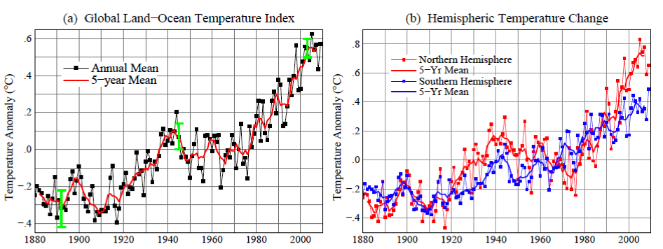
Figure 1. (a) GISS analysis of global surface temperature change. Green vertical bar is estimated 95 percent confidence range (two standard deviations) for annual temperature change. (b) Hemispheric temperature change in GISS analysis. (Base period is 1951-1980. This base period is fixed consistently in GISS temperature analysis papers – see References. Base period 1961-1990 is used for comparison with published HadCRUT analyses in Figures 3 and 4.)
The global record warm year, in the period of near-global instrumental measurements (since the late 1800s), was 2005. Sometimes it is asserted that 1998 was the warmest year. The origin of this confusion is discussed below. There is a high degree of interannual (year‐to‐year) and decadal variability in both global and hemispheric temperatures. Underlying this variability, however, is a long‐term warming trend that has become strong and persistent over the past three decades. The long‐term trends are more apparent when temperature is averaged over several years. The 60‐month (5‐year) and 132 month (11‐year) running mean temperatures are shown in Figure 2 for the globe and the hemispheres. The 5‐year mean is sufficient to reduce the effect of the El Niño – La Niña cycles of tropical climate. The 11‐year mean minimizes the effect of solar variability – the brightness of the sun varies by a measurable amount over the sunspot cycle, which is typically of 10‐12 year duration.
C’est le résumé pour 2009 de Hansen et collaborateurs’, (avec quelques modifications mineures).
“Si ça se réchauffe tant, bon sang, pourquoi fait-il si froid?”
par James Hansen, Reto Ruedy, Makiko Sato, and Ken Lo (Traduction par Xavier Pétillon)
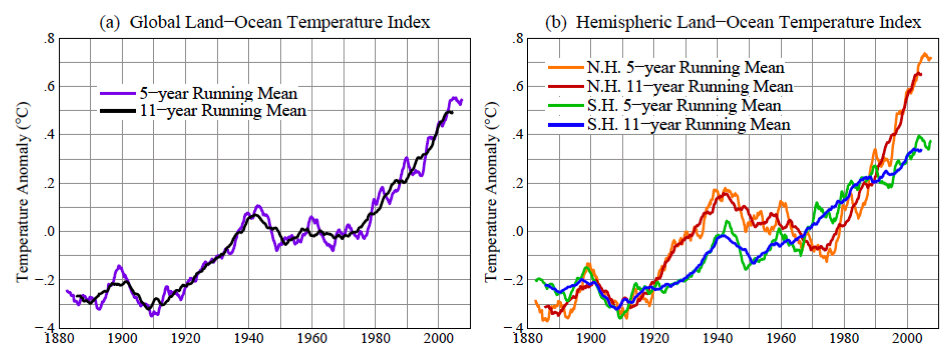
Figure 2. 60‐month (5‐year) and 132 month (11‐year) running mean temperatures in the GISS analysis of (a) global and (b) hemispheric surface temperature change. (Base period is 1951‐1980.)
There is a contradiction between the observed continued warming trend and popular perceptions about climate trends. Frequent statements include: “There has been global cooling over the past decade.” “Global warming stopped in 1998.” “1998 is the warmest year in the record.” Such statements have been repeated so often that most of the public seems to accept them as being true. However, based on our data, such statements are not correct. The origin of this contradiction probably lies in part in differences between the GISS and HadCRUT temperature analyses (HadCRUT is the joint Hadley Centre/University of East Anglia Climatic Research Unit temperature analysis). Indeed, HadCRUT finds 1998 to be the warmest year in their record. In addition, popular belief that the world is cooling is reinforced by cold weather anomalies in the United States in the summer of 2009 and cold anomalies in much of the Northern Hemisphere in December 2009. Here we first show the main reason for the difference between the GISS and HadCRUT analyses. Then we examine the 2009 regional temperature anomalies in the context of global temperatures.
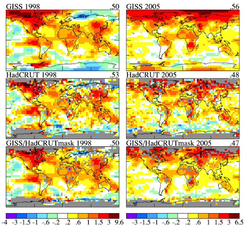
Figure 3. Temperature anomalies in 1998 (left column) and 2005 (right column). Top row is GISS analysis, middle row is HadCRUT analysis, and bottom row is the GISS analysis masked to the same area and resolution as the HadCRUT analysis. [Base period is 1961‐1990.]
Figure 3 shows maps of GISS and HadCRUT 1998 and 2005 temperature anomalies relative to base period 1961‐1990 (the base period used by HadCRUT). The temperature anomalies are at a 5 degree‐by‐5 degree resolution for the GISS data to match that in the HadCRUT analysis. In the lower two maps we display the GISS data masked to the same area and resolution as the HadCRUT analysis. The “masked” GISS data let us quantify the extent to which the difference between the GISS and HadCRUT analyses is due to the data interpolation and extrapolation that occurs in the GISS analysis. The GISS analysis assigns a temperature anomaly to many gridboxes that do not contain measurement data, specifically all gridboxes located within 1200 km of one or more stations that do have defined temperature anomalies.
The rationale for this aspect of the GISS analysis is based on the fact that temperature anomaly patterns tend to be large scale. For example, if it is an unusually cold winter in New York, it is probably unusually cold in Philadelphia too. This fact suggests that it may be better to assign a temperature anomaly based on the nearest stations for a gridbox that contains no observing stations, rather than excluding that gridbox from the global analysis. Tests of this assumption are described in our papers referenced below.
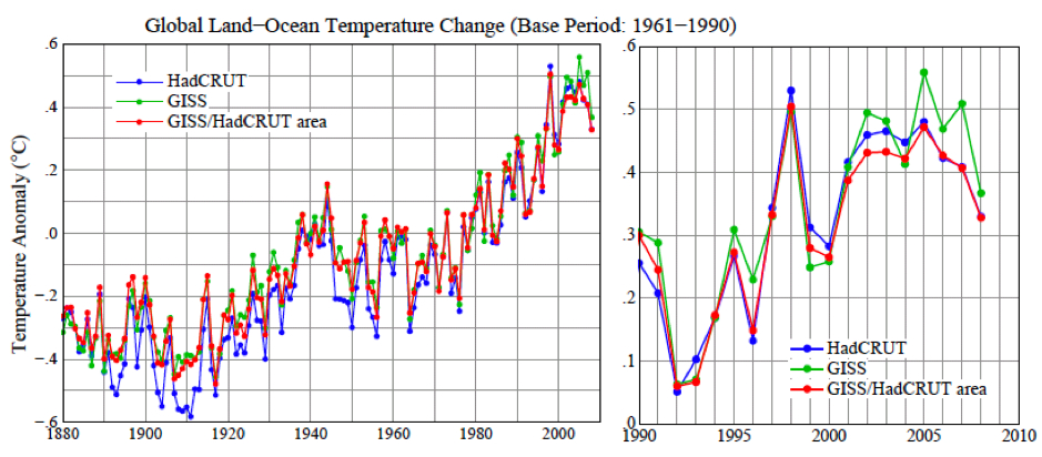
Figure 4. Global surface temperature anomalies relative to 1961‐1990 base period for three cases: HadCRUT, GISS, and GISS anomalies limited to the HadCRUT area. [To obtain consistent time series for the HadCRUT and GISS global means, monthly results were averaged over regions with defined temperature anomalies within four latitude zones (90N‐25N, 25N‐Equator, Equator‐25S, 25S‐90S); the global average then weights these zones by the true area of the full zones, and the annual means are based on those monthly global means.]
Figure 4 shows time series of global temperature for the GISS and HadCRUT analyses, as well as for the GISS analysis masked to the HadCRUT data region. This figure reveals that the differences that have developed between the GISS and HadCRUT global temperatures during the past few decades are due primarily to the extension of the GISS analysis into regions that are excluded from the HadCRUT analysis. The GISS and HadCRUT results are similar during this period, when the analyses are limited to exactly the same area. The GISS analysis also finds 1998 as the warmest year, if analysis is limited to the masked area. The question then becomes: how valid are the extrapolations and interpolation in the GISS analysis? If the temperature anomaly scale is adjusted such that the global mean anomaly is zero, the patterns of warm and cool regions have realistic‐looking meteorological patterns, providing qualitative support for the data extensions. However, we would like a quantitative measure of the uncertainty in our estimate of the global temperature anomaly caused by the fact that the spatial distribution of measurements is incomplete. One way to estimate that uncertainty, or possible error, can be obtained via use of the complete time series of global surface temperature data generated by a global climate model that has been demonstrated to have realistic spatial and temporal variability of surface temperature. We can sample this data set at only the locations where measurement stations exist, use this sub‐sample of data to estimate global temperature change with the GISS analysis method, and compare the result with the “perfect” knowledge of global temperature provided by the data at all gridpoints.
| 1880‐1900 | 1900‐1950 | 1960‐2008 | |
|---|---|---|---|
| Meteorological Stations | 0.2 | 0.15 | 0.08 |
| Land‐Ocean Index | 0.08 | 0.05 | 0.05 |
Table 1. Two‐sigma error estimate versus period for meteorological stations and land‐ocean index.
Table 1 shows the derived error due to incomplete coverage of stations. As expected, the error was larger at early dates when station coverage was poorer. Also the error is much larger when data are available only from meteorological stations, without ship or satellite measurements for ocean areas. In recent decades the 2‐sigma uncertainty (95 percent confidence of being within that range, ~2‐3 percent chance of being outside that range in a specific direction) has been about 0.05°C. The incomplete coverage of stations is the primary cause of uncertainty in comparing nearby years, for which the effect of more systematic errors such as urban warming is small.
Additional sources of error become important when comparing temperature anomalies separated by longer periods. The most well‐known source of long‐term error is “urban warming”, human‐made local warming caused by energy use and alterations of the natural environment. Various other errors affecting the estimates of long‐term temperature change are described comprehensively in a large number of papers by Tom Karl and his associates at the NOAA National Climate Data Center. The GISS temperature analysis corrects for urban effects by adjusting the long‐term trends of urban stations to be consistent with the trends at nearby rural stations, with urban locations identified either by population or satellite‐observed night lights. In a paper in preparation we demonstrate that the population and night light approaches yield similar results on global average. The additional error caused by factors other than incomplete spatial coverage is estimated to be of the order of 0.1°C on time scales of several decades to a century, this estimate necessarily being partly subjective. The estimated total uncertainty in global mean temperature anomaly with land and ocean data included thus is similar to the error estimate in the first line of Table 1, i.e., the error due to limited spatial coverage when only meteorological stations are included.
Now let’s consider whether we can specify a rank among the recent global annual temperatures, i.e., which year is warmest, second warmest, etc. Figure 1a shows 2009 as the second warmest year, but it is so close to 1998, 2002, 2003, 2006, and 2007 that we must declare these years as being in a virtual tie as the second warmest year. The maximum difference among these in the GISS analysis is ~0.03°C (2009 being the warmest among those years and 2006 the coolest). This range is approximately equal to our 1‐sigma uncertainty of ~0.025°C, which is the reason for stating that these five years are tied for second warmest.
The year 2005 is 0.061°C warmer than 1998 in our analysis. So how certain are we that 2005 was warmer than 1998? Given the standard deviation of ~0.025°C for the estimated error, we can estimate the probability that 1998 was warmer than 2005 as follows. The chance that 1998 is 0.025°C warmer than our estimated value is about (1 – 0.68)/2 = 0.16. The chance that 2005 is 0.025°C cooler than our estimate is also 0.16. The probability of both of these is ~0.03 (3 percent). Integrating over the tail of the distribution and accounting for the 2005‐1998 temperature difference being 0.61°C alters the estimate in opposite directions. For the moment let us just say that the chance that 1998 is warmer than 2005, given our temperature analysis, is at most no more than about 10 percent. Therefore, we can say with a reasonable degree of confidence that 2005 is the warmest year in the period of instrumental data.
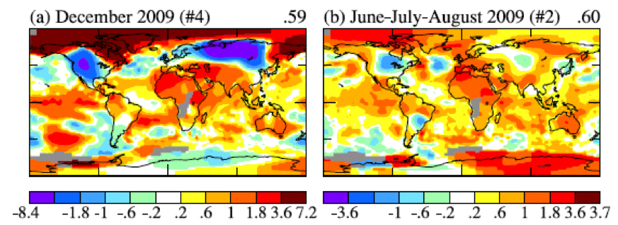
Figure 5. (a) global map of December 2009 anomaly, (b) global map of Jun‐Jul‐Aug 2009 anomaly. #4 and #2 indicate that December 2009 and JJA are the 4th and 2nd warmest globally for those periods.
What about the claim that the Earth’s surface has been cooling over the past decade? That issue can be addressed with a far higher degree of confidence, because the error due to incomplete spatial coverage of measurements becomes much smaller when averaged over several years. The 2‐sigma error in the 5‐year running‐mean temperature anomaly shown in Figure 2, is about a factor of two smaller than the annual mean uncertainty, thus 0.02‐0.03°C. Given that the change of 5‐year‐mean global temperature anomaly is about 0.2°C over the past decade, we can conclude that the world has become warmer over the past decade, not cooler.
Why are some people so readily convinced of a false conclusion, that the world is really experiencing a cooling trend? That gullibility probably has a lot to do with regional short‐term temperature fluctuations, which are an order of magnitude larger than global average annual anomalies. Yet many lay people do understand the distinction between regional short‐term anomalies and global trends. For example, here is comment posted by “frogbandit” at 8:38p.m. 1/6/2010 on City Bright blog:
“I wonder about the people who use cold weather to say that the globe is cooling. It forgets that global warming has a global component and that its a trend, not an everyday thing. I hear people down in the lower 48 say its really cold this winter. That ain’t true so far up here in Alaska. Bethel, Alaska, had a brown Christmas. Here in Anchorage, the temperature today is 31[ºF]. I can’t say based on the fact Anchorage and Bethel are warm so far this winter that we have global warming. That would be a really dumb argument to think my weather pattern is being experienced even in the rest of the United States, much less globally.”
What frogbandit is saying is illustrated by the global map of temperature anomalies in December 2009 (Figure 5a). There were strong negative temperature anomalies at middle latitudes in the Northern Hemisphere, as great as ‐8°C in Siberia, averaged over the month. But the temperature anomaly in the Arctic was as great as +7°C. The cold December perhaps reaffirmed an impression gained by Americans from the unusually cool 2009 summer. There was a large region in the United States and Canada in June‐July‐August with a negative temperature anomaly greater than 1°C, the largest negative anomaly on the planet.
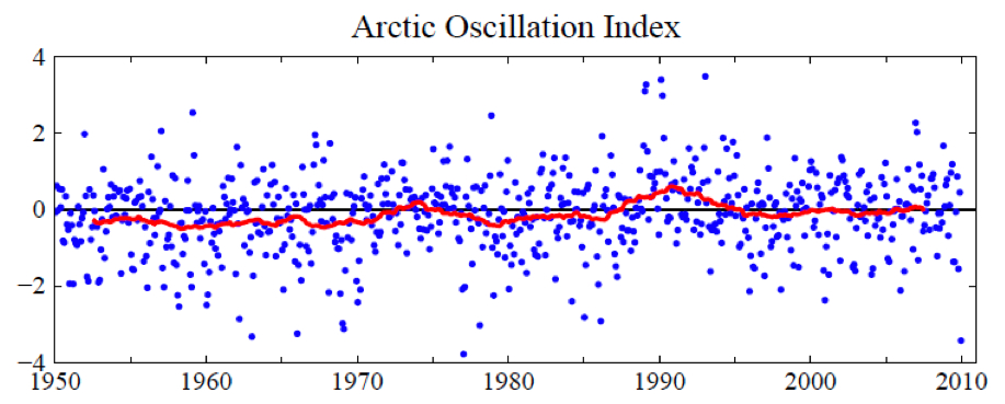
Figure 6. Arctic Oscillation (AO) Index. Positive values of the AO index indicate high low pressure in the polar region and thus a tendency for strong zonal winds that minimize cold air outbreaks to middle latitudes. Blue dots are monthly means and the red curve is the 60‐month (5‐year) running mean.
How do these large regional temperature anomalies stack up against an expectation of, and the reality of, global warming? How unusual are these regional negative fluctuations? Do they have any relationship to global warming? Do they contradict global warming?
It is obvious that in December 2009 there was an unusual exchange of polar and mid‐latitude air in the Northern Hemisphere. Arctic air rushed into both North America and Eurasia, and, of course, it was replaced in the polar region by air from middle latitudes. The degree to which Arctic air penetrates into middle latitudes is related to the Arctic Oscillation (AO) index, which is defined by surface atmospheric pressure patterns and is plotted in Figure 6. When the AO index is positive surface pressure is high low in the polar region. This helps the middle latitude jet stream to blow strongly and consistently from west to east, thus keeping cold Arctic air locked in the polar region. When the AO index is negative there tends to be low high pressure in the polar region, weaker zonal winds, and greater movement of frigid polar air into middle latitudes.
Figure 6 shows that December 2009 was the most extreme negative Arctic Oscillation since the 1970s. Although there were ten cases between the early 1960s and mid 1980s with an AO index more extreme than ‐2.5, there were no such extreme cases since then until last month. It is no wonder that the public has become accustomed to the absence of extreme blasts of cold air.
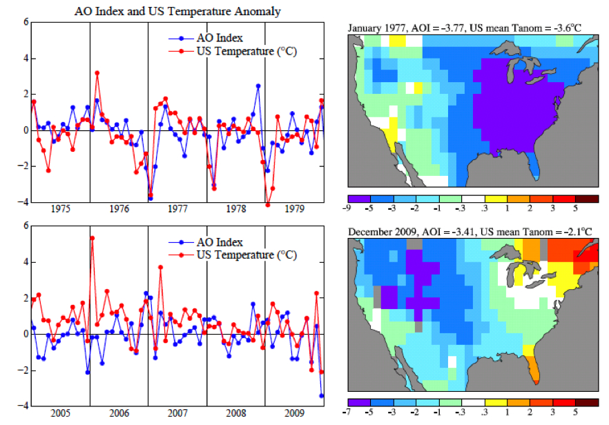
Figure 7. Temperature anomaly from GISS analysis and AO index from NOAA National Weather Service Climate Prediction Center. United States mean refers to the 48 contiguous states.
Figure 7 shows the AO index with greater temporal resolution for two 5‐year periods. It is obvious that there is a high degree of correlation of the AO index with temperature in the United States, with any possible lag between index and temperature anomaly less than the monthly temporal resolution. Large negative anomalies, when they occur, are usually in a winter month. Note that the January 1977 temperature anomaly, mainly located in the Eastern United States, was considerably stronger than the December 2009 anomaly. [There is nothing magic about a 31 day window that coincides with a calendar month, and it could be misleading. It may be more informative to look at a 30‐day running mean and at the Dec‐Jan‐Feb means for the AO index and temperature anomalies.]
The AO index is not so much an explanation for climate anomaly patterns as it is a simple statement of the situation. However, John (Mike) Wallace and colleagues have been able to use the AO description to aid consideration of how the patterns may change as greenhouse gases increase. A number of papers, by Wallace, David Thompson, and others, as well as by Drew Shindell and others at GISS, have pointed out that increasing carbon dioxide causes the stratosphere to cool, in turn causing on average a stronger jet stream and thus a tendency for a more positive Arctic Oscillation. Overall, Figure 6 shows a tendency in the expected sense. The AO is not the only factor that might alter the frequency of Arctic cold air outbreaks. For example, what is the effect of reduced Arctic sea ice on weather patterns? There is not enough empirical evidence since the rapid ice melt of 2007. We conclude only that December 2009 was a highly anomalous month and that its unusual AO can be described as the “cause” of the extreme December weather.
We do not find a basis for expecting frequent repeat occurrences. On the contrary. Figure 6 does show that month‐to‐month fluctuations of the AO are much larger than its long term trend. But temperature change can be caused by greenhouse gases and global warming independent of Arctic Oscillation dynamical effects.
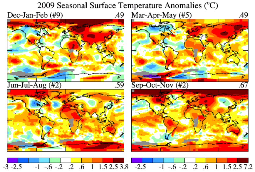
Figure 8. Global maps 4 season temperature anomalies for ~2009. (Note that Dec is December 2008. Base period is 1951‐1980.)
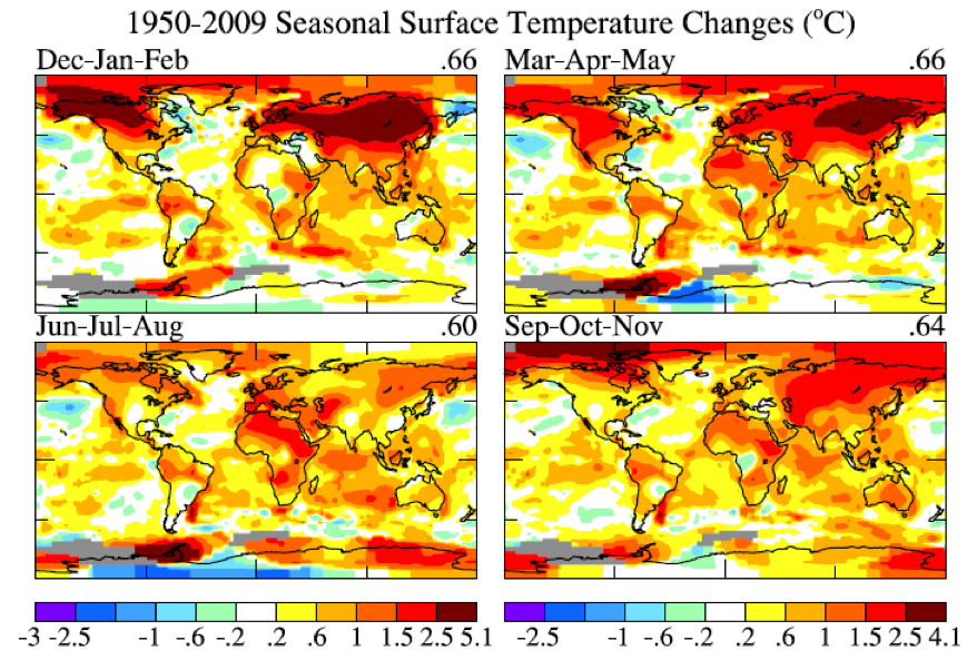
Figure 9. Global maps 4 season temperature anomaly trends for period 1950‐2009.
So let’s look at recent regional temperature anomalies and temperature trends. Figure 8 shows seasonal temperature anomalies for the past year and Figure 9 shows seasonal temperature change since 1950 based on local linear trends. The temperature scales are identical in Figures 8 and 9. The outstanding characteristic in comparing these two figures is that the magnitude of the 60 year change is similar to the magnitude of seasonal anomalies. What this is telling us is that the climate dice are already strongly loaded. The perceptive person who has been around since the 1950s should be able to notice that seasonal mean temperatures are usually greater than they were in the 1950s, although there are still occasional cold seasons.
The magnitude of monthly temperature anomalies is typically 1.5 to 2 times greater than the magnitude of seasonal anomalies. So it is not yet quite so easy to see global warming if one’s figure of merit is monthly mean temperature. And, of course, daily weather fluctuations are much larger than the impact of the global warming trend. The bottom line is this: there is no global cooling trend. For the time being, until humanity brings its greenhouse gas emissions under control, we can expect each decade to be warmer than the preceding one. Weather fluctuations certainly exceed local temperature changes over the past half century. But the perceptive person should be able to see that climate is warming on decadal time scales.
This information needs to be combined with the conclusion that global warming of 1‐2°C has enormous implications for humanity. But that discussion is beyond the scope of this note.
References:
Hansen, J.E., and S. Lebedeff, 1987: Global trends of measured surface air temperature. J. Geophys. Res., 92, 13345‐13372.
Hansen, J., R. Ruedy, J. Glascoe, and Mki. Sato, 1999: GISS analysis of surface temperature change. J. Geophys. Res., 104, 30997‐31022.
Hansen, J.E., R. Ruedy, Mki. Sato, M. Imhoff, W. Lawrence, D. Easterling, T. Peterson, and T. Karl, 2001: A closer look at United States and global surface temperature change. J. Geophys. Res., 106, 23947‐23963.
Hansen, J., Mki. Sato, R. Ruedy, K. Lo, D.W. Lea, and M. Medina‐Elizade, 2006: Global temperature change. Proc. Natl. Acad. Sci., 103, 14288‐14293.
L’année passée, 2009, passe pour être la seconde année la plus chaude depuis 130 ans d’enregistrements instrumentaux de la température globale, dans l’analyse de température de surface par l’Institut Goddard pour les études spatiales de la NASA (GISS). L’hémisphère sud bat un record comme le plus chaud pour cette moitié du monde. La température globale moyenne, comme montré dans l’illustration 1a, fut plus chaude de 0,57°C (1°F) que la période climatologique (période de base 1951-1980). L’hémisphère sud, comme montré dans l’illustration 1b, fut plus chaud de 0,49°C (0,88°F) que la période climatologique.
Illustration 1: (a) analyse du GISS pour les changements de la température globale de surface. La barre verticale verte est l’estimation à l’intervalle de confiance de 95% (deux écarts-type) pour le changement annuel de température. (b) Changement des
températures des hémisphères dans l’analyse du GISS. (Période de base 1951-1980. Cette période de base est est systématiquement fixée pour tous les articles du GISS concernant l’analyse de la température – voir les références. La période de base 1961-1990 est utilisée pour les comparaisons avec les analyses publiées du HadCRUT dans les illustrations 3 et 4).
L’enregistrement de l’année globalement la plus chaude, dans la période d’utilisation des mesures instrumentales globales (depuis la fin du XIXème siècle) était 2005. Il est quelques fois avancé que 1998 était la plus chaude. L’origine de cette confusion est discutée ci-après. Il y a un fort degré de variabilité interannuelle (année par année) et décénnale à la fois dans les températures globales et hémisphériques. Sous-tendant cette variabilité, néanmoins, on trouve une tendance au réchauffement de long terme qui devient plus fort et persistant [tenace] au cours des trois dernières décennies. Les tendances de long terme sont plus apparentes quand les températures sont moyennées sur plusieurs années. Les températures en moyennes mobiles sur 60 mois (5 ans) et 132 mois (11 ans) sont montrées dans la figure 2 pour le globe et les hémisphères. La moyenne sur 5 ans est suffisante pour réduire l’effet du cycle climatique tropical El Niño-El Niña. La moyenne sur 11 ans minimise l’effet de la variabilité solaire – la luminosité solaire varie significativement pendant le cycle de tâches solaires, qui est généralement d’une durée de l’ordre de 10-12 ans.
Illustration 2: Températures en moyennes mobiles sur 60 (5 ans) et 132 (11 ans) mois dans l’analyse du GISS pour les changements de température de surface (a) globale et (b) des hémisphères.(période de base 1951-1980).
Il y a une contradiction entre la tendance observée et continue au réchauffement et la perception populaire des tendances climatiques. Ce type de perception inclut fréquemment ces assertions « Il y a eu un refroidissement global ces dernières 10 années. » « Le réchauffement global s’est arrêté en 1998. » « 1998 est l’année la plus chaude jamais enregistrée. » De telles déclarations ont été répétées si souvent que la plupart des gens les acceptent comme vraies. Néanmoins, selon nos données, ces déclarations ne sont pas correctes.
L’origine de la contradiction se trouve probablement pour partie dans la différence entre les analyses du GISS et du HadCRUT (HadCRUT est une association entre le centre Hadley et l’unité de recherche sur l’analyse de température de l’université de East-Anglia). En effet, le HadCRUT a trouvé que 1998 était l’année la plus chaude enregistrée. De plus, les croyances populaires en un refroidissement sont renforcées par des anomalies froides aux USA à l’été 2009 et dans l’hémisphère nord en décembre 2009.
Nous montrerons d’abord les principales raisons des différences entre les analyses du GISS et du HadCRUT. Nous examinerons ensuite les anomalies régionales de 2009 dans le contexte des températures globales.
Illustration 3: Anomalies de températures en 1998 (colonne de gauche) et 2005 (colonne de droite). Le rang du haut est l’analyse du GISS, celui du milieu est l’analyse du HadCRUT et le rang du bas est l’analyse du GISS masquée [ndt : calée] sur les mêmes zones et résolution que l’analyse du HadCRUT. (La période de base est 1961-1990.)
L’illustration 3 montre les cartes des anomalies de températures du GISS et HadCRUT en 1998 et 2005 relativement à la période 1961-1990 (la période de base usuelle du HadCRUT). Les anomalies de températures sont dans une résolution de 5 en 5 degrés géographiques pour les données du GISS afin qu’elles correspondent à celles de l’analyse du HadCRUT. Dans les deux cartes du bas, nous montrons les données du GISS sous le même masque en termes de répartition géographique et de résolution que celui du HadCRUT. Les données du GISS « sous masque » nous permettent de quantifier la manière dont les différences entre les analyses du GISS et du HadCRUT sont dues à l’interpolation et l’extrapolation des données utilisées dans l’analyse du GISS. Cette analyse affecte
à de nombreuses cases [des modèles] une anomalie de température qui ne contiennent pas de données mesurées, spécifiquement dans des cases qui se trouvent à moins de 1200 km d’une ou plusieurs stations qui ont défini une anomalie de température.
La raison de cet aspect de l’analyse du GISS est basée sur le fait que le schéma d’une anomalie de température tend à se produire à grande échelle. Par exemple, s’il y a un hiver anormalement froid à New-York, il est probablement anormalement froid à Philadelphie aussi. Ce fait suggère qu’il peut être préférable d’affecter une anomalie de température basée sur les stations les plus proches de la case qui n’a aucune observation que d’exclure la case de l’analyse globale. Des tests de cette assertion sont décrits dans nos articles référencés plus bas.

Illustration 4: Anomalies de la température de surface globale relativement à la période de base 1961-1990 pour trois cas : HadCRUT, GISS et anomalies du GISS limitées à l’aire HadCRUT. [Pour obtenir des séries temporelles cohérentes pour les moyennes globales du HadCRUT et du GISS, les résultats mensuels ont été moyennés par régions avec des anomalies de températures définies à l’intérieur de 4 zones de latitudes (90N-25N, 25N-équateur, équateur-25S, 25S-90S) ; la moyenne globale pondère ainsi ces zones en fonction de la vraie surface de ces zones entières, et les moyennes annuelles sont basées sur ces moyennes mensuelles globales.]
L’illustration 4 montre des séries temporelles de température globale pour les analyses du GISS et du HadCRUT, aussi bien que pour l’analyse du GISS masquée sur les régions de données du HadCRUT. Cette illustration révèle que les différences qui se sont développées entre les températures globales du GISS et du HadCRUT ces dernières décennies sont principalement dues à l’extension de l’analyse du GISS à des régions exclues de l’analyse du HadCRUT. Les résultats du GISS et de HadCRUT sont similaires durant
cette période quand les analyses sont circonscrites exactement aux mêmes aires. L’analyse du GISS trouve aussi 1998 comme année la plus chaude, si l’analyse est limité aux données sous le même masque. La question devient alors : quelle est la valeur des interpolations et des extrapolations dans l’analyse du GISS ? Si l’échelle des anomalies de température est ajustée telle que l’anomalie de la moyenne globale est de zéro, alors les schémas des régions chaudes et froides ont un aspect cohérent avec les schémas météorologiques, apportant ainsi un support qualitatif pour l’extension des données. Néanmoins, nous aimerions une mesure quantitative sur l’incertitude de notre estimation pour l’anomalie de la température globale causée par le fait d’une distribution spatiale des mesures incomplète.
Une manière d’estimer cette incertitude, ou possible erreur, peut être d’utiliser les séries temporelles complètes générées par un modèle de climat global ayant déjà fait ses preuves d’une variabilité spatiale et temporelle des températures de surface réaliste. Nous pouvons échantillonner ce jeu de données seulement aux endroits où des stations de mesure existent, et utiliser ce sous-ensemble de données pour estimer le changement de la température globale avec l’analyse du GISS, puis comparer le résultat avec la connaissance « parfaite » de la température globale que nous avons avec les données de chacune des cases.
| 1880-1900 | 1900-1950 | 1960-2008 | |
|---|---|---|---|
| Stations météorologiques | 0.2 | 0.15 | 0.08 |
| Index « Land-Ocean » | 0.08 | 0.05 | 0.05 |
Tableau 1. Estimation de l’erreur à deux écart-type par période pour les stations météorologiques et l’index « Land-ocean ».
Le tableau 1 montre l’erreur dérivée due à la couverture incomplète des stations. Comme attendu, l’erreur est plus importante aux dates anciennes quand la couverture en stations était plus pauvre. Mais aussi, l’erreur est plus grande quand les données sont disponibles seulement depuis les stations météorologiques, sans mesure depuis des bateaux ou satellites pour les aires océaniques. Dans les décennies récentes, l’incertitude à 2 écarts-type (intervalle de confiance à 95% d’être à l’intérieur de ces valeurs, 2 à 3 % d’être en dehors d’un côté ou de l’autre) a été de 0,05°C. La couverture incomplètes des stations est la première cause d’incertitude pour les années récentes, pour lesquelles les erreurs plus systématiques sont petites, comme le réchauffement urbain.
Des sources additionnelles d’erreurs deviennent importantes quand on compare des anomalies de températures séparées par des périodes plus longues. La source d’erreur de long terme la plus connue est « le réchauffement urbain », un réchauffement local d’origine humaine causé par l’utilisation de l’énergie et les altérations de l’environnement naturel. D’autres erreurs variées, qui affectent les estimations des changements de températures sur le long terme, sont décrites de manière complète dans un grand
nombre d’articles par Tom Karl et ses associés du Centre national de données sur le climat (NCDC) de la NOAA. L’analyse du GISS pour la température corrige l’effet urbain en ajustant les tendances de long terme des stations urbaines de manière cohérente avec les stations rurales des alentours, et en identifiant les densités urbaines par leur population ou par l’observation par les satellites des lumières nocturnes. Dans un article en préparation, nous démontrons que les approches par la population et par les lumières nocturnes donne des résultats similaires sur la moyenne globale. Les erreurs additionnelles causées par des facteurs autres que
la couverture spatiale incomplète est estimée comme étant de l’ordre de 0,1°C sur des échelles de temps de plusieurs décennies à un siècle, cette estimation étant nécessairement partiellement subjective. L’incertitude totale dans les anomalies de température globale moyenne, avec les données « terre et océans » ainsi incluses, est équivalente à l’erreur estimée dans la première ligne du
tableau 1, i.e. l’erreur due à une couverture spatiale limitée quand seules les stations météorologiques sont incluses.
Maintenant, voyons voir si nous pouvons préciser un rang entre les températures annuelles globales récentes, i.e. quelle année est la plus chaude, la seconde plus chaude, etc. L’illustration 1a montre l’année 2009 comme la seconde plus chaude, mais si proche de 1998, 2002, 2003 et 2007 que nous devons considérer toutes ces années comme étant virtuellement la seconde année la plus chaude. La différence maximale entre elles dans l’analyse du GISS est de ~0,03°C (2009 étant la plus chaude et 2003 la plus froide). Cet écart est approximativement égal à notre incertitude à un écart-type de ~0,025°C, ce qui est la raison pour établir que ces années sont toutes la seconde année la plus chaude.
L’année 2005 est plus chaude de 0,061°C que 1998 dans notre analyse. Donc, comment sommes-nous certains que 2005 est plus chaude que 1998 ? Étant donné l’écart-type de ~0,025°C pour l’erreur estimée, nous pouvons estimer la probabilité que 1998 était plus chaude que 2005 comme suit. La chance que 1998 soit 0,025°C plus chaude que notre valeur estimée est d’environ (1-0,68)/2=0,16. La chance que 2005 soit 0,025°C plus froide que notre estimation est aussi de 0,16. La probabilité que ces deux évènements se produisent ensemble est de ~0,03 (3 pourcent). Intégrer la queue de distribution et compter une différence de température entre 2005 et 1998 de 0,61°C change l’estimation dans des directions opposées. Pour le moment, disons juste que la chance pour que 1998 soit plus chaude que 2005, étant donnée notre analyse des températures, est au plus de l’ordre de 10 pourcent. Par conséquent, nous pouvons dire avec un degré raisonnable de confiance que 2005 est l’année la plus chaude dans la période de mesures instrumentales.
Illustration 5. (a) Carte globale de l’anomalie de décembre 2009, (b) carte globale de l’anomalie de juin-juillet-août 2009. #4 et #2 indiquent que décembre 2009 en juin-juillet-août sont les quatrième et deuxième périodes globalement plus chaudes de ce laps de temps.
Que dire à propos de la déclaration comme quoi la surface de la Terre se rafraîchit depuis 10 ans ? Cette question peut être traitée avec beaucoup de confiance, car l’erreur due à une couverture spatiale insuffisante des mesures devient encore plus faible quand on moyenne sur plusieurs années. L’incertitude à deux écarts-type dans la moyenne sur 5 ans de l’anomalie de température montrée dans l’illustration 2, est plus petite d’un facteur 2 que l’incertitude moyenne annuelle, ainsi 0,02-0,03°C. Étant donné que le changement d’une moyenne sur 5 ans de l’anomalie de température est d’environ 0,2°C sur la dernière décennie, nous pouvons conclure que le monde est devenu plus chaud, et non plus froid, depuis la dernière décennie.
Pourquoi des gens sont-ils convaincus d’une conclusion erronée, que le monde est vraiment en train de se refroidir ? Cette naïveté a certainement beaucoup à voir avec les variations régionales de court terme de la température, qui sont d’un plus grand ordre de grandeur que les anomalies annuelles des températures. Même des personnes non averties sont capables de comprendre la différence entre les anomalies locales [ndt : régionales] de court terme et la tendance globale. Par exemple, voici un commentaire posté par « frogbandit » à 20h38 le 6 janvier 2010 le blog de City Bright :
« Je m’étonne de ces gens qui utilisent une météo quotidienne froide pour dire que la Terre se refroidit. On oublie que le réchauffement global a des composantes globales et que c’est une tendance, pas une chose quotidienne. J’entends des gens, au sud que la latitude 48, dire qu’il fait vraiment froid cet hiver. Ce n’est pas si vrai que ça, ici, en Alaska. Bethel, en Alaska, a eu un Noël brun. Ici, à Anchorage, la température d’aujourd’hui est de 31°F [ndt : soient 3°C]. En me basant sur le fait que Bethel et Anchorage sont si chauds cet hiver, je ne peux pas dire que nous avons un réchauffement climatique. Ce serait vraiment un argument idiot de penser que mon schéma de température est répété dans le reste des Etats-Unis, plus ou moins globalement. »
Ce que ‘frogbandit’ dit est illustré par la carte globale des anomalies de températures en décembre 2009 (illustration 5a). Il y a eu de forte anomalies négatives de températures dans les latitudes moyennes de l’hémisphère nord, pas moins de 8°C en Sibérie, moyenné sur le mois. Mais l’anomalie de température en Arctique était, elle, aussi forte que +7°C.
Le décembre froid confirme peut-être une impression acquise par les américains depuis l’été inhabituellement froid de 2009. Il y avait des régions étendues des USA et du Canada en juin-juillet-août avec une anomalie négative de température supérieure à 1°C, la plus grande anomalie sur la planète.
Illustration 6. L’index de l’Oscillation Arctique (AO). Les valeurs positives de l’Index AO indiquent une zone de haute pression sur les régions polaires et ainsi, une tendance à de forts vents zonaux qui minimisent la circulation d’air froid aux latitudes moyennes. Les point bleus sont des moyennes mensuelles et la courbe rouge est la moyenne mobile sur 60 mois (5 ans).
Comment ces larges anomalies régionales de températures se confrontent-elles aux attentes et à la réalité du réchauffement climatique? Ces fluctuations négatives régionales sont-elles inhabituelles? Sont-elles liées avec le réchauffement climatique? Le contredisent-elles?
Il est évident qu’il y a eu en décembre 2009 un échange inhabituel d’air entre le pôle et les latitudes moyennes de l’hémisphère nord. L’air arctique s’est engouffré à la fois sur l’Amérique du nord et l’Eurasie, et, bien sûr, a été remplacé dans ces régions polaires par l’air des latitudes moyennes. La force avec laquelle l’air arctique a pénétré dans les latitudes moyennes est relié avec l’index AO, défini par des schémas de pression atmosphérique de surface et représenté dans l’illustration 6. Quand l’index AO est positif, la pression de surface est élevée dans les régions polaires. Cela permet au jet stream des latitudes moyennes de souffler fortement et constamment d’ouest en est, bloquant ainsi l’air froid au pôle. Quand l’index AO est négatif, il y a une tendance aux basses pressions dans les régions polaires, un vent zonal plus faible, et de plus grands mouvements d’air glacé vers les latitudes moyennes.
L’illustration 6 montre que décembre 2009 a vu la valeur de l’index AO la plus extrêmement négative depuis les années 70. Malgré le fait qu’il y ait eu une dizaine de cas d’index AO aussi extrêmes que -2,5 entre les années 60 et les années 80, il n’y a rien eu d’aussi extrême que le mois dernier. Ce n’est pas étonnant que les gens aient été accoutumés à une absence de ces coups de froid extrêmes.
Illustration 7. Anomalie de températures issu de l’analyse du GISS et Index AO du NWSCPC de la NOAA. La moyenne pour les Etats-Unis fait référence aux 48 états contigus.
L’illustration 7 montre l’index AO avec une résolution temporelle plus grande pour deux périodes de 5 ans. Il est évident qu’il y a un fort degré de corrélation entre l’index AO et les températures des Etats-Unis, avec un décalage possible entre l’index et les anomalies de températures inférieur à la résolution termporelle mensuelle. Les anomalies largement négatives, quand elles arrivent, sont souvent pendant les mois d’hiver. Il faut noter que l’anomalie de températures de janvier 1977, principalement située dans les états de l’est, fut considérablement plus forte que celle de décembre 2009. [cela n’a rien de magique quand une fenêtre de 31 jours coincide avec les jours calendaires du mois, et cela peut être trompeur. Il serait plus informatif de regarder la moyenne mobile sur 30 jours et la moyenne de l’index AO et des températures sur décembre-janvier-février.]
L’index AO n’est pas tant une explication pour ces schémas d’anomalies climatiques qu’un simple état de fait de la situation. Cependant, John (Mike) Wallace et ses collègues ont été capable d’utiliser la description de l’index AO pour aider à comprendre comment ces schémas peuvent changer en cas d’augmentation de gaz à effet de serre. Un certain nombre d’articles, par Wallace, David Thompson et d’autres, aussi bien que par Drew Shindell et d’autres au GISS,
ont montré que l’augmentation de gaz carbonique refroidit la stratosphère, ce qui cause en moyenne un jet stream plus puissant, et ainsi une tendance pour une oscillation arctique (AO) plus positive.
Globalement, l’illustration 6 montre une tendance selon le sens attendu. L’AO n’est pas le seul facteur qui altère la fréquence des épisodes d’air froid de l’Arctique. Par exemple, quel est l’effet d’une glace de mer réduite sur le schéma climatologique? Il n’y a pas assez de preuves empiriques depuis la fonte rapide de la glace de 2007. Nous pouvons seulement conclure que décembre 2009 était un mois hautement anormal et que cette oscillation arctique inhabituelle peut décrire la « cause » du climat extrême de décembre.
Nous n’avons pas trouvé de base pour nous attendre à de fréquentes répétitions de ce phénomène. Tout au contraire. L’illustration 6 montre que les fluctuations mois-par-mois de l’AO sont plus étendues que la tendance de long terme. Mais les changements de températures peuvent être causés par les gaz à effet de serre et le réchauffement global être indépendant des effets dynamiques de l’Oscillation Arctique.

Illustration 8. Carte globale des anomalies de températures pour les 4 saisons pour ~2009. (noter que Dec est décembre 2008. La période de base est 1951-1980.)

Illustration 9. Carte globale des tendances des anomalies de températures pour les 4 saisons pour la période 1950-2009.
Maintenant, regardons les anomalies de températures régionales récentes et les tendances des températures. L’illustration 8 montre les anomalies de températures saisonnières pour l’année passée et l’illustration 9 montre les changements des anomalies de températures depuis 1950 basés sur une tendance linéaire locale. Les échelles de températures sont les mêmes sur les illustrations 8 et 9. La caractéristique remarquable quand on compare ces deux illustrations est que la magnitude des changements sur 60 ans est similaire à la magnitude des anomalies saisonnières. Ce que cela nous raconte, c’est que les dés climatiques sont déjà sérieusement lancés. La personne perspicace qui est là depuis les années 50 sera capable de noter que les températures moyennes saisonnières sont actuellement plus élevées que celles des années 50, bien qu’il y ait encore occasionnellement des saisons froides.
La magnitude des anomalies mensuelles de températures est couramment 1,5 à 2 fois plus grande que la magnitude des anomalies saisonnières. Du coup, ce n’est pas encore si facile de voir le réchauffement global si sa principale illustration est la température moyenne mensuelle. Et, bien sûr, les fluctuations du temps au quotidien sont bien plus importantes que l’impact de la tendance globale du réchauffement.
Les bases sont celles-ci : il n’y a pas de tendance au refroidissement global.
A l’heure actuelle, jusqu’à ce que l’humanité mette ses émissions de gaz à effet de serre sous contrôle, nous pouvons nous attendre à ce que chaque décennie soit plus chaude que la précédente. Les fluctuations du temps qu’il fait excèdent certainement les changements locaux de températures du dernier demi-siècle. Mais la personne perspicace verra bien que le climat se réchauffe à l’échelle des décennies.
Cette information a encore besoin d’être mise en relation avec la conclusion qu’un réchauffement global de 1 à 2°C a d’énormes implications pour l’humanité. Mais cette discussion est au-delà de la portée de cet article.
Références:
Hansen, J.E., and S. Lebedeff, 1987: Global trends of measured surface air temperature. J. Geophys. Res., 92, 13345-13372.
Hansen, J., R. Ruedy, J. Glascoe, and Mki. Sato, 1999: GISS analysis of surface temperature change. J. Geophys. Res., 104, 30997-31022.
Hansen, J.E., R. Ruedy, Mki. Sato, M. Imhoff, W. Lawrence, D. Easterling, T. Peterson, and T. Karl, 2001: A closer look at United States and global surface temperature change. J. Geophys. Res., 106, 23947-23963.
Hansen, J., Mki. Sato, R. Ruedy, K. Lo, D.W. Lea, and M. Medina-Elizade, 2006: Global temperature change. Proc. Natl. Acad. Sci., 103, 14288-14293.


I’ve been talking about the qualitative problems that I noticed in the GISS charts in figure 3 above. So I thought that I would try to take a rough shot at quantizing the problem as well. I used the HadCRUT 2005 chart and the GISS 2005 chart to make comparisons. And I wanted to compare the HadCRUT gridcell row that was furthest north to the GISS gridcell row that occupied the same position. First I counted the number of gridcells in a row. There are 72. Then I counted the number of HadCRUT cells that have data in that row. There are 24. This means that the topmost HadCRUT row has 30% coverage. So I added up all of the covered gridcell anomaly values in the row. The total was 43.8. Dividing by 24 I got an average covered gridcell value for the HadCRUT row of 1.85 C. The GISS row obviously had 100% coverage using interpolation and extrapolation. When I added all of the gridcell anomaly values together for the GISS row I came up with 300. Dividing by 72 gave me an average anomaly value of 4.17 C. So the anomaly for the top row of GISS is 2.25 times as large as that of HadCRUT.
It seems to me that this reflect very badly on the GISS interpolation extrapolation algorithm. The other problem is that there are 6 cells in that top row that HadCRUT has negative values for. GISS turns them all to the maximum positive value. The difference is 6.7 C or greater per cell for those 6 cells.
I can only conclude from this that the GISS divergence from the HadCRUT data is an artifact of the GISS processing algorithms and not a reflection of actual temperature variance at the poles.
The exercise was an exercise in eye strain. But I’d love to have someone else repeat my count.
fixible – Speak for yourself. Many of us middle-aged and older folks do care about the future for those who will come after us–and that’s whether or not we have children of our own. After all, we were born as beings well-adapted to the earth as it exists today and, in justice, want no less for those who come after us. I am constantly amazed at the rank selfishness, even of those who already have children and grandchildren (or who expect to) that will only care about AGW if it effects them personally. Of course, one of my pet peeves is that too many of those who are concerned about AGW keep speaking about “saving the earth.” Uhm, the earth will do just fine, no matter what we do. What we are talking about, really, is saving the future of humanity.
I do agree, though, that a very real problem is overpopulation. In addition to AGW, human beings are facing other serious threats from depletion of resources, and I see few solutions to either AGW or that depletion coming in time to avoid a horror show. Not to be a pessimist or anything. Nevertheless, I’ll do my best to make a difference.
“OTOH, considering the real problem is human overpopulation, maybe I’ll root for the planet to shake many/most/all off like a dog shaking fleas – population crashes or even extinction events [stun the creationists!] aren’t necessarily all bad.”
Flxible, you raise some important questions. Unfortunately, population crashes are all bad for those who experience them. The effects you mention could be like the Jewish holocaust times over a thousand. Just as we should do everything we can to avoid a large-scale nuclear war, we should do everything we can to avoid this as well. Doing anything less is morally unconscionable.
Something else that’s morally unconscionable is drawing down the capital of all resources rather than living off the interest of renewable resources. We are really waging a kind of genocide against future generations, who I believe will view us even more harshly than we view slaveowners today.
I’m glad you live frugally and simply, but just having been a member of such a consumptive society as America’s makes one a disproportionate consumer relative to current world or all previous generational averages.
So yes, I think you should support a carbon tax. You have benefitted, as have I and each of us, from our plundering fossil fuels, all minerals and all other resources infinitely more than our fair share.
And the impacts of climate change, peak oil, freshwater pollution, fossil water depletion, and the drawing down of topsoil, trees, fish and all minerals will degrade the life of everyone on Anthro-Earth within some small number of decades.
The cumulative effects of all of these things and others will make it seem like we were a completely ignorant blindfolded person falling from the Empire State Building. Only ignorance could allow one to think that the state of falling could be sustained indefinitely. The impact will come much more slowly and in infinitely more complex ways, but over enough time the effect could be similar.
Using the Titanic as a metaphor, we’ve just hit the iceberg. The captain, ship’s architect and others of the most perceptive and educated officers (climate scientists, those who understand what climate scientists understand) know that we can not and will not continue on our journey. Those in the hull (like those in Tuvalo and soon Bangladesh, etc) also know this. But most are ignorant of our fate and imagine the ship will continue sailing at any time.
Flxible, you seem very thoughtful and caring and so I don’t mean to take this out on you – you just raised the good questions. Please reference Barton Paul Levenson, every comment by Gavin especially his response to #194, and Richard Ordway, especially #184 and #388 here – and I’d love to know how Gavin feels about those comments of Ordways and mine here, if he cares to put on his philosophical hat.
Tilo Reber says: 20 January 2010 at 6:49 PM
I suggest you do it over, using 45 degrees N and S latitude, 0 degrees latitude, where coverage is complete in both.
For real completeness, truncate both models at 60 degrees N and S, do it all again using all cells in between.
I can’t think why you’d try this in a region where coverage is known to be incomplete.
398
Richard Ordway says:
20 January 2010 at 4:15 PM
But seriously according to quite a few sources, India is building an anti-climate change refugee fence with concertina wire around Bangladesh to stop climate change refugees from entering into India.
There is no evidence that the fence India is building is for “climate change refugees.” India is concerned about terrorists hiding in Bangladesh, and about an already prevalent problem with illegal immigration from Bangladesh into India. Most of the linkage of that fence to climate change occurs on climate change blogs.
We are building a fence along our border with Mexico. It is not primarily to prevent “climate change refugees” from Mexico from entering the US.
> future generations
“… each generation inherits substantial climate change caused by CO2 emissions that occurred previously, particularly those of their parents, and shows that current CO2 emissions will contribute significantly to the climate change of future generations. …”
http://www.pnas.org/content/102/31/10832/F1.medium.gif
http://www.pnas.org/content/102/31/10832.full
Gilles, when fossil fuel is no longer being burned in great quantities, the damage will ALREADY HAVE BEEN DONE. Do you think the CO2 will just vanish when we stop burning fuel? I hate to tell you this, but the mean atmospheric lifetime of a pulse of CO2 is 200 years.
Doug: #404
I can’t think why you’d try this in a region where coverage is known to be incomplete.
Obviously because that is where the interpolation and extrapolation algorithms are going to come into play to produce the missing gridcells. And obviously that is where the divergence between HadCRUT and GISS is coming from. I’m not saying that GISS gets materially different results away from the polar areas. I’m saying that GISS gets results at the polar areas that are inconsistent with the known cells from HadCRUT in the polar areas. And I’m saying that the divergence between GISS and HadCRUT is due to the way that the GISS algorithm produces gridcells in the polar area.
A clearer image:
http://www.pnas.org/content/102/31/10832/F1.large.jpg
And this, from a different article, makes the point in words that that chart shows:
“this much is well established: greenhouse gas levels today are far higher than they’re ever been in the last million years, and the difference between pre-industrial and today’s levels is greater than the difference was between glacial and interglacial levels.”
http://spectrum.ieee.org/energywise/energy/environment/three-cultures-of-climate-science
Hat tip to MT at http://initforthegold.blogspot.com/ — this link is from his “Shared Items” list.
by Don Shor “We are building a fence along our border with Mexico. It is not primarily to prevent “climate change refugees” from Mexico from entering the US.”
yeah, right
Mary – I do speak for myself, and for many others, who see humanity as a part of the whole, not the apex of it or the reason for it . . . . as someone who understands that I was very fortunate to have arrived at a time AND in a place of exceptional opportunity, I also realize that we “developed” types are but a small fraction of the biomass on the planet and have greatly abused our welcome, even those of us who try to “make a difference” . . . I do feel very sorry for those who have to deal with the aftermath of our heyday, just like I feel for those poor beings who endured the middle ages, but the facts are the facts, and if Gaia doesn’t continue to provide those wonderful conditions we stumbled into, as you say, the world will do fine without us . . . when it comes to the intelligence of “civilized” humans, on average half the population is – – yes – – below average.
So as I said, Joe average needs to be addressed if anything is to be achieved, and mostly they’re distracted by daily survival, not to mention religious conflicts.
Tilo Reber says: 20 January 2010 at 8:31 PM
“And I’m saying that the divergence between GISS and HadCRUT is due to the way that the GISS algorithm produces gridcells in the polar area.”
If that’s your main assertion, I don’t see how you’re going to support it without doing the whole map. I’m amazed you’re trying to make the claim based on a single raster line.
Print the image and use a bright light, is my suggestion. It’ll be easier on your eyes. Come to think of it, if you can’t source the data in tabular form you might want to write a little program to extract it from the pictures. Or perhaps GIMP has something that would be of assistance? Good luck.
Richard Brenne – as a resident of British Columbia I do pay a carbon tax [on ALL energy], do you? or are we still the only jurisdiction to actually do it? I also live where probably 90% of the electricity comes from hydro power [tolerating the blight on the environment that creates] – I agree with you entirely, except the “morality” of it all is where the problem lies, the way Americans deal with morality is by and large with cash in hand, if not a gun. Humans are first and formost creatures of self-aggrandization [like any other animal really], like it or not.
From the beginning I have been very grateful and appreciative for Gavins effort [and the group] in running this gauntlet, and I think his very presence here, as well as his patient, measured, intelligent inline comments, speaks volumes for his concern. I’m also glad that they have some help from a few commentors who are well versed on the literature. I share Richard Ordways understanding, particularly as a result of the CBC radio piece mentioned above: Climate Wars, which I think puts things in terms more understandable to “average Americans” . . . I never considered “may you live in interesting times” a curse, I hate boredom :)
Flxible (#414):
I’m glad you pay a carbon tax and wish I did too (I live just south of you in Oregon but have a Canadian
wife who would like for us to move up there and join you, if the fence isn’t put in by that time)!
Oregon advertises that our electricity is mostly hydro when it’s 40 per cent at most (this from my friends at the Oregon Department of Energy) so I’d like to see documentation of the 90 per cent hydro figure for BC.
I share your appreciation for the comments of Richard Ordway and, like you, find Gavin amazing and the average American right now a little less so.
I’m obsessed with doing just what you suggest, communicating climate change to the average Joe (Sixpack,
not Romm) and work on an AMS Committee to so, teach a NASA-sponsored Global Climate Change on-line class,
and producing dozens of events about climate change with top climate scientists – more power to us all!
Doug: #413
“I’m amazed you’re trying to make the claim based on a single raster line.”
There are only three gridcell lines that contain almost all the missing gridcells for the Arctic. And there are only 36 rows total. Look at the second line. The GISS interpolation extrapolation contains nothing but 6.5 anomaly and 3 anomaly cells. The second line of HadCrut3 contains many lower anomaly cells. Even some cool anomaly cells. The result will be at least qualitatively the same. The third row and even the fourth row have the same problem, if to a lesser extent. If you like counting and adding pixels, then be my guest. If you can find justification for turning negative anomaly pixels into positive anomaly pixels with a differnce of 6.7 C, even it it were only in a single raster line, which it’s not, I’d like to hear it. What would you hope to show by doing the whole map? The divergence is at the poles. That is exactly what Dr. Hansen is telling you and showing you in his post.
“Print the image and use a bright light, is my suggestion. It’ll be easier on your eyes.”
I blew it up to 400% on a 24 inch, 1920 by 1200 screen. But it’s still a pain. When gridcells of the same color flow together you have to find another row to use as a reference for the count and you have to keep them aligned with a straight edge.
[Response: Why not look at the raw data? Both are available online. – gavin]
BPL : “Gilles, when fossil fuel is no longer being burned in great quantities, the damage will ALREADY HAVE BEEN DONE. Do you think the CO2 will just vanish when we stop burning fuel? I hate to tell you this, but the mean atmospheric lifetime of a pulse of CO2 is 200 years.”
I understand, but when do you think that the peak of absolute consumption of fossiles will happen ? and how many ppm , which CO2 production per capita , and what GDP per capita corresponds to your scenario in 2050 ? in 2100 ? you seem to have rather precise ideas on the future of the world, I’d like to have these numbers. I’m 45 you know, so for me the practical consequences are limited to four decades.
Tilo Reber said (I paraphrase): HADCRUT and GISS are different!
I say: Duh.
The disagreement around the Arctic rim was noticed long, long before you did, Tilo.
This fact doesn’t make one analysis or the other “better”. We derive our knowledge of high Arctic anomalies from other, independent sources, not from interpolation.
Personally, I suspect that this difference around the Arctic is caused by the difference in ocean heat transports where melting ice is involved. The re-analysis (which hopefully includes ice dynamics – but I don’t really know) differs slightly from both analyses in the Arctic, but is probably closer to the GISS result.
Should CRU rush to try to “fix” their Arctic figures? No! Actual scientists are perfectly aware of what the analysis means, and the different analyses complement one another, rather than being meaningless repetition.
But despite the regional differences, the global data track each other very closely.
Save your eyesight, Tilo. Real scientists got to it long before you did. And they used (gasp!) a computer to calculate the differences for all grid cells.
394
Hank Roberts says:
20 January 2010 at 1:26 PM
“Experiments done at WHOI and elsewhere show that in seawater containing high levels of CO2, corals have difficulty making new skeleton and may have existing skeleton dissolve away; many calcifying plankton struggle; mollusks such as oysters and scallops find it harder to build and maintain shells; and juvenile mollusks grow more slowly and have more abnormalities and lower survival rates.”
The problem with this statement Hank is that corals evolve when the co2 concentration in the Earth’s atmosphere was over 2000ppm. There are many forms of calcium carbonate, and some are more tolerant of lower pH than others.
With regard to Oystersm scallops, molluscs (the proper spelling) etc. the result is basically tosh (as Gavin likes to use the word). There is recent research where it has been observed that many mollusc species have actually increased their shell densities in the lower pH environs.
I work for a fisheries agency. I asked on of our mollusc biologists if he has observe any shell thinning in scallops, abalone or other commercial mollusc species. His answer was a resounding NO. There has been no observed changes in survival, growth rate or any other metric that may be attributable to pH change; There is no evidence in nature, at this time, of any pH related thinning of shell in molluscs or crustaceans, at least in Western Australia.
In figs. 5 and 8 there are some gray patches over a part of Africa. Is this missing data?
383
Ray Ladbury says:
20 January 2010 at 11:52 AM
“Now as to CO2 senitivity estimates–actually these would take into account biology, geology and chemistry unless you are assuming that paleoclimatic conditions wrt these variables were utterly different (Try justifying that!)”
Please cite the peer-reviewed studies that actually show that biology, chemistry etc. are taken into that account of climate sensitivity. I want references Ray not your word for it.
“Your assertions wrt acidification and pH betray a truly special ignorance. Just what do you think happens when you dissolve CO2 in water. Ever wonder why soda water tastes sour? See:”
What are you on about? And by the way the solubility of co2 is INVERSELY proportional to temperature. If SSTs in the tropics are increasing then the proportion of co2 dissolved into those waters declines and potentially, outgassing will occur. If I am wrong, please provide a reference to show that I am wrong. As a biologist who has done hundreds of pH measurements in the marine and estuarine environments, I am confident that I know a good deal more about the subject than you imply.
“WRT methane:
http://news.bbc.co.uk/2/hi/science/nature/8437703.stm
What’s your explanation here? Whale farts?”
Again. What are you on about. I asked to be directed to data sites and you give me some crappy BBC article. Proper data sites please. Your appeal to ridicule shows your lack of debating ability.
“OK, now, finally, let’s see if I can overcome that reading program. I said cite works by denialists THAT HAVE INCREASED UNDERSTANDING OF CLIMATE IN THE PAST DECADE!!!!”
I don’t know of any “denialist” science. The scientists I referred to are not denialists (even by your broad definition i.e. anyone who does not ascribe to Anthropogenic GW caused by co2). The have all contributed significantly to the improvement of our knowlege of climate and climate systems. Period. If you cannot admit to that then state your position as one who regards any science that goes against your personal bias as bad or denialist science. You are so sad Ray.
Re. Indian fence to keep out Bangladesh climate change refugees
Re. 405 Don Shor says:
“Most of the linkage of that fence to climate change occurs on climate change blogs, There is no evidence that the fence India is building is for “climate change refugees.”
Don, many legitimate sources (not political “blogs” as you state) write (and sometimes give evidence by on-the-scene reporting) that the fence is being finished with global warming refugees as one of its reasons for existence according to the SFU University, Scientific American, the Seattle Times, the New York Times, The Independent, and the Washington Times.
To say that there is “no evidence” is ludicrous and shows a lack of even taking the time to try to Google for a minute or even read the citations I gave and stongly brings into question your possible political motivations.
These sources are hardly blogs or political “think tanks” which are usually political entities. They also come from two different countries: England and the USA.
Some of “the evidence” that you claim does not exist is being done by multiple on-the scene reporters from different groups/countries who are interviewing the climate change refugees themselves (and cross referencing each other in some cases).
Please, take the time to read the information this time.
One article was in the Washington Times this past April that I gave you before (hardly a blog):
The Washington Times says that the fence between India and Bangladesh is being built to stop “migrants, many displaced by changes in climate.”
Equity’s estimates are more dire than the U.N.-backed Intergovernmental Panel on Climate Change (IPCC), which estimates that 22 million people in Bangladesh will be forced from their homes by 2050 because of climate change.
“India is building a fence along its porous 2,500-mile border with Bangladesh, hoping to stop the flow of migrants, many displaced by changes in climate.”
The SFU university says “The climate-induced migrants are considered “illegal” eco-migrants.”
“Many climate-induced displaced families from the border areas have moved to India, Nepal, often to Burma.”
The Seattle Times also states the phrase “global warming is a reason the fence is being built:”
“Its 150 million people, about half the U.S. population, jam an area the size of Wisconsin, and the low-lying land is prone to devastating floods and typhoons. Scientists also warn that rising sea levels from global warming could force millions from their homes.”
http://74.125.47.132/search?q=cache:SxTN324×5BwJ:www.sfu.ca/cstudies/idfe/climatechange/powerpoint/Zaman_SFU_Climate%2520Chnage_21%2520May09.ppt+india+built+fence+bangladesh+climate+change+refugees&cd=5&hl=en&ct=clnk&gl=us
The New York Times says:
“Climate change didn’t bring this fence, but it is providing a fresh reason for its existence and ongoing expansion.”
“On this side of the fence, rising sea levels caused by climate change are beginning to inundate low-lying Bangladesh. Scientists estimate that by midcentury as many as 15 million people could be displaced.”
Scientific American also brings up climate change in its article on the Bangladesh fence.
“Climate change didn’t bring this fence, but it is providing a fresh reason for its existence and ongoing expansion.”
“In the border village of Harinagar, on the other hand, cross-border climate migration is an everyday cause of stress and concern.”
http://www.scientificamerican.com/article.cfm?id=climage-refugees-national-security
The Independent says: “Floods in the Ganges caused by melting glaciers in the Himalayas are wreaking havoc in Bangladesh leading to a rise in illegal migration to India. This has prompted India to build an immense border fence in attempt to block newcomers.”
http://www.independent.co.uk/environment/water-wars-climate-change-may-spark-conflict-467957.html
http://www.nytimes.com/cwire/2009/03/23/23climatewire-a-global-national-security-issue-lurks-at-ba-10247.html
Re: 351 “We have not developed science well enough to make predictions.”
I’d suggest catching up.
http://en.wikipedia.org/wiki/Prediction#Anticipatory_science_forecasts
Re: 362 …ocean acidification crock. “If you think that the biota cannot adapt to changes in ocean pH then you know nothing.”
I don’t see anything about adaptation in the following. But the predictive power of science is utilized to see what’s going to happen to specific ocean biota. Predictions are used to develop water quality criteria.
Ocean Acidification and Marine pH Water Quality Criteria
http://www.epa.gov/fedrgstr/EPA-WATER/2009/April/Day-15/w8638.htm
(excerpt)
As more CO2 dissolves in the ocean, it reduces ocean pH, which changes the chemistry of the water. These changes present potential risks across a broad spectrum of marine ecosystems.
Biological effects are projected based on models that predict lower pH regimes in marine waters over the next 50-100 years. Using these predictions, reduced pH conditions and/or increased CO2 saturation have been simulated in the lab and have shown the potential to impact marine life. The majority of the effects observed in lab studies have occurred at pH levels beyond the allowed variability of 0.2 units in the CWA 304(a) recommended criteria for marine pH. For instance, ocean acidification related reductions in pH is forecast to
reduce calcification rates in corals and may affect economically
important shellfish species including oysters, scallops, mussels,
clams, sea urchins, crabs, and lobsters. A recent field study on marine plankton described reduced shell weight over time “consistent with reduced calcification today induced by ocean acidification” (Moy et al. 2009). One study demonstrated effects at pH changes of less than 0.2, describing effects on squid metabolism (0.2 is the allowed pH variation from normal conditions under current EPA criteria recommendation) (Portner 2008). Impacts to shellfish and other calcifying organisms that represent the base of the food web may have implications for larger organisms that depend on shellfish and other
calcifying organisms for prey.
Current research indicates the impact of ocean acidification on marine organisms will largely be negative, and the impacts may differ from one life stage to another. There may be interactions between CO2 saturation, temperature, and other stressors which are not fully understood. Preliminary projections indicate that oceans will become more acidic over time and overall, the net effect is likely to disrupt the normal functioning of many marine and coastal ecosystems.
Tilo makes s*t up again: “Obviously because that is where the interpolation and extrapolation algorithms are going to come into play to produce the missing gridcells.”
Well, there’s also the interpolation and extrapolation that makes the point measurements apply to a large surface area.
Do you think that the human body temp is actually a lot off 36C just because we only measure it from one spot?
Don:
“We are building a fence along our border with Mexico. It is not primarily to prevent “climate change refugees” from Mexico from entering the US.”
Not entirely…
So it is intended for that use.
Just that and some others.
Tilo (#401) counted colored dots in fig. 3 and said:
No, even if your count is a valid approach, surely it would only say that GISS and HadCRUT gets different results, which was the point of the original post. It wouldn’t say which one of them better reflects reality.
Has the same test that was done for the GISS analysis in Table 1 above (against model results known with perfect certainty) been done for HadCRUT too, in a way that would allow comparing GISS and HadCRUT? Would it be valid to do a test like that restricted to the Arctic?
I’m sure it wasn’t the intention of the original poster to convince me that HadCRUT is “better” than GISS, but looking at the images side by side that way, and noticing that the GISS pushers keep it up with what looks to be close to a Mercator projection, my faith in GISS is lower today than it was yesterday.
Could someone provide the same data in an equal-area projection?
[Response: Mollweide. (This stuff is easy – download the data in netcdf format from the ‘Maps‘ section at GISTEMP. Then download Panoply, and plot away. – gavin]
423
Tim Jones says:
21 January 2010 at 2:52 AM
“As more CO2 dissolves in the ocean, it reduces ocean pH, which changes the chemistry of the water. These changes present potential risks across a broad spectrum of marine ecosystems.
Biological effects are projected based on models that predict lower pH regimes in marine waters over the next 50-100 years. Using these predictions, reduced pH conditions and/or increased CO2 saturation have been simulated in the lab and have shown the potential to impact marine life. The majority of the effects observed in lab studies have occurred at pH levels beyond the allowed variability of 0.2 units in the CWA 304(a) recommended criteria for marine pH. For instance, ocean acidification related reductions in pH is forecast to
reduce calcification rates in corals and may affect economically
important shellfish species including oysters, scallops, mussels,
clams, sea urchins, crabs, and lobsters.”
Tim please read my response to Hank Roberts (#419). I will take field observation over model projections any day. There has been NO observed reduction in any commercial species of mollusc or crustacean due to pH in the marine environment (particularly Western Australia). Those models and laboratory experiments will be shown to be wrong. Again calcification rates have been shown to increase in some mollusc species under conditions of lowered pH.
Richard Steckis: you fail logic. Again.
How exactly do past observations invalidate future forecasts? And why the obsession with molluscs? And what is your deep-seated objection to providing sources for your claims, instead of “a guy I met down the pub” – oh, forgive me, “on [sic] of our mollusc biologists”?
Personally, I am much, much more worried about the sensitivity of various types of algae to pH. Richard, your mistake is in imagining that the impacts of ocean acidification are even slightly understood. As it is, your claims that the impacts will somehow be “good” are just silly.
I find it particularly amusing that you claim “laboratory experiments will be shown to be wrong”. You have already expressed your disdain for model results, and you have discarded (time and time again) direct observations from the real world. Or… wait…. do the rules change when you find something that fits your agenda? Model results are only good when they match your conclusion, laboratory results are wrong only when you disagree with them, and clearly we can’t measure the real world properly – unless you like the result?
That’s confirmation bias red in tooth and claw. And I’m calling you on it.
This article appeared Canada wide today:
http://www.nationalpost.com/m/story.html?id=2465231&s=Home
Where can I find info to refute the allegations made.
[Response: What nonsense. He can’t even spell Hansen’s name properly, thinks that NOAA is in charge of the Canadian weather records (I’m guessing Environment Canada will not be happy), and, despite his claim, people at GISS did agree to talk to him, but never got a call. Please see the NCDC description of the GHCN dataset to get a better idea about what this data set is. The bottom line is that the Environment Canada only sends out monthly summaries to the WMO for selected stations and not their entire network. Accusing GISS of ‘manipulation’ for this is like blaming your mail delivery person for the fact that your friend didn’t send you a birthday card. – gavin]
Gilles said: “I’m 45 you know, so for me the practical consequences are limited to four decades.”
I really wish you hadn’t said that. In essence it means that you are only interested in yourself, and that you are not even slightly concerned about the future welfare of other people.
I know humanity as a whole is fundamentally selfish – but we don’t usually parade the fact.
RS: “Biological effects are projected based on models that predict lower pH regimes in marine waters over the next 50-100 years”
Well, that would be a requirement to consider what would happen to a lower pH regime, wouldn’t it? Assume that pH reduces?
If you didn’t and assumed pH increases, it wouldn’t change what happens when pH lowers, but it WOULD make it hard to model the magnitude of the effect.
Gavin in #427,
Based on the note to the map coming from your Maps link, the gray patch in Africa is missing data. It seems to go back a few years. And, it seems to affect figs. 5 and 8 above. Here is a link to some weather data in Gabon that might be useful for filling this in: http://www.bbc.co.uk/weather/world/city_guides/results.shtml?tt=TT000220
[Response: The gap is in what is reported to WMO for the monthly summaries. Building an alternative product based on the daily weather reports (which are far more widespread) would be a great citizen-science project and certainly worthwhile, but can’t be done on a casual basis since there are definitely issues in how the means are defined through time and mixing different sources without thinking about it clearly would be a mistake. – gavin]
Re: Panoply — Ooh, cool! (My 9-year-old thinks so, too.) Thanks, NASA.
Didactylos: “I really wish you hadn’t said that. In essence it means that you are only interested in yourself, and that you are not even slightly concerned about the future welfare of other people.”
It also shows that his “I’m scared and I don’t know why :-(” was a load of horse-puckey.
@428
Which species, what percentage of all species (>1?), where, and by whom was this shown?
429
Didactylos says:
21 January 2010 at 8:33 AM
“How exactly do past observations invalidate future forecasts? ”
They don’t. Did I say such?
“And why the obsession with molluscs? And what is your deep-seated objection to providing sources for your claims, instead of “a guy I met down the pub” – oh, forgive me, “on [sic] of our mollusc biologists”?”
Because molluscs and crustaceans will be among the first indicator species of pH change. The rest of your statement is straw man rubbish.
“Personally, I am much, much more worried about the sensitivity of various types of algae to pH. Richard, your mistake is in imagining that the impacts of ocean acidification are even slightly understood. As it is, your claims that the impacts will somehow be “good” are just silly.”
This is more straw man rubbish attributing to me statements that I have never made. Where did I ever say the impact would be good? Or that the impacts of changes in ocean pH are well understood?
“I find it particularly amusing that you claim “laboratory experiments will be shown to be wrong”. You have already expressed your disdain for model results, and you have discarded (time and time again) direct observations from the real world.”
The lab experiments will fail because they cannot simulate the natural world. Even with mesocosms. The second part of the statement is more Didactlylos construction of what I have never said. I do not disdain models I disdain their mis-use. Real world observations discarded? Where?
“Or… wait…. do the rules change when you find something that fits your agenda? ”
Boy, this is really a case of the pot calling the kettle black.
“laboratory results are wrong only when you disagree with them, and clearly we can’t measure the real world properly – unless you like the result?”
No. Lab results are wrong when they are wrong. Let me explain here. By wrong I mean that the results do not accurately reflect the real world. We still have to sample from the real world. Lab studies will give us insights but not accurate answers to the functioning of a particular system. We can do more to measure the real world. Of course we cannot ever measure it in-toto.
Didactylos – Give Gilles a break, aisde from English obviously being his 2nd language, he did specify “practical” consequences, which is really the only thing relevent to promoting action on the part of the population that are onboard concerning the condition of the planet, which likely means in fact they are concerned about the future.
Wildlifer, Steckis is probably referring to this recent paper, which under laboratory conditions it was shown that 10 of 18 mollusk (the correct US spelling) species showed reduced calcification, but 7 showed increased calcification.
In Steckis’s world, you must ignore the 10 and focus exclusively on the 7, and therefore conclude that acidification is not a problem.
Tilo, can you really not see that you are ASSUMING that HADCRUT is always right where there is a divergence with GISS? And given that the overall masked anomaly is the same, you’re rather assuming against the evidence.
By the way, did you realize that the grids are set up differently in GISS and HadCRUT? (GISS uses a scheme of 8000 equal-area grids; HadCRUT, like the NCDC scheme, uses 5 x 5 degree boxes then weights for the unequal areas.) What significance that has for your attempts to do a direct comparison based upon an image that, per map, should run about 100 x 100 pixels, I leave you to ponder.
Steckis @421
The paleoclimate estimates of CO2 sensitivity are global measurements–they show the temperature response to a change in energy. So unless you are claiming that the biology, geology, etc. are very different now than they were then, those effects are all included. No just in case you are claiming such a differenc, we have the response of the climate to volcanic eruptions and the general respons exhibited in the 20th century. Guess what: They all point to 3 degrees per doubling. Occams razor cuts through your Gordian knot. I strongly recommend the review by Knutti and Hegerl in Nature Geo.
Steckis says, “Proper data sites please.”
Ask and ye shall receive:
http://globalchange.mit.edu/files/document/MITJPSPGC_Reprint08-20.pdf
and as usual, Tamino was right on top of it:
http://tamino.wordpress.com/2008/12/26/the-other-anthropogenic-greenhouse-gas/
Steckis: “And by the way the solubility of co2 is INVERSELY proportional to temperature.”
Actually, it depends on the chemical potential, which is temperature dependent. It also depends on atmospheric concentration, and since temperature is rising rougly linearly, while CO2 is rising exponentially…
Steckis: “If SSTs in the tropics are increasing then the proportion of co2 dissolved into those waters declines and potentially, outgassing will occur.”
Oh, that’d be a lot of fun now. Isn’t that one of those tipping points you don’t want to acknowledge. Own goooooooooooooaaaaaaaaaaaalllllllllll!! as they say in Latin America.
Regarding denialist scientists: “The have all contributed significantly to the improvement of our knowlege of climate and climate systems.”
Then isn’t it funny that you can’t cite a single article they’ve published in the past decade that significantly increased understanding of climate science. Hmm. Now even one?
Richard Brenne
I’ve heard about 90% everywhere for some time. The Province says [bottom] 92.8%, Wikipedia says 80%. AFAIK there’s only a couple natural gas fueled back up generators in the system, no public oil fired except isolated northern communities, and no coal used [just mined and exported].
Official figures are confused, here and in Oregon, due to grid inter-dependence, you’ve likely been getting hydro power from here at times in the past, but that’ll be unsure in the future. BC has been IMporting about 10% of it’s power for some years now, population/economic growth outstripping existing supply [varies with seasonal availability/demand], but the Provincial govt has been aiming at public/private “run of river” projects since at least 2002, and that’s moving along
Locally, we’re 100%, the Comox Lake/Puntledge River generating station near me is one of the older ones in the province – I’ve thought about investigating it’s projected useful life as it supplies all power locally, and some of that feeds the grid for the whole Island – when the glacial lake isn’t too low, which has been happening of late in a dry early fall, after years of less snow. :)
436
Wildlifer says:
21 January 2010 at 9:35 AM
“@428
Again calcification rates have been shown to increase in some mollusc species under conditions of lowered pH.
Which species, what percentage of all species (>1?), where, and by whom was this shown?”
See: http://www.whoi.edu/page.do?pid=7545&tid=282&cid=63809&ct=162
And for you Didactlylos a quote from the above site:
“Organisms displaying such improvement also included calcifying red and green algae, limpets and temperate urchins. Mussels showed no effect.”
Richard Steckis, what about a balanced overview of all of the available evidence on ocean acidification, instead of your usual practice of citing what you like and ignoring everything else?
For anyone who is interested, read the report from the Second Symposium on the Ocean in a High-CO2 World, held in 2008 and attanded by 220 scientists from 32 countries.
Yes, sure the problem is complex, there are many uncertainties and more research is needed but after reading this can anyone really say this is “the good old ocean acidification crock”? “NO NO NO it is not happening fast”? “No measurable effects”?
422 Richard Ordway says: Don, many legitimate sources (not political “blogs” as you state) write (and sometimes give evidence by on-the-scene reporting) that the fence is being finished with global warming refugees as one of its reasons for existence according to the SFU University, Scientific American, the Seattle Times, the New York Times, The Independent, and the Washington Times.
To say that there is “no evidence” is ludicrous and shows a lack of even taking the time to try to Google for a minute or even read the citations I gave and stongly brings into question your possible political motivations.
I looked at your links. They were excellent examples of the common tendency to link everything to climate change, no matter how far-fetched. The Indian government started the fence and continues to justify it on the basis of national security. Other people are ascribing climate change as their motive.
I guess all of the folks who moved from New Orleans to Houston and other areas — some 25% of the city’s population, by some estimate — are also “climate refugees” whose displacement was caused by climate change?
I will keep in mind that newspaper reporters are now reliable sources on this blog. They have a sterling track record to date, and are known for their astute and probing analysis of climate change issues.
I have no “political motives.” That is just stupid, but is, of course, an ongoing theme here at realclimate.
Richard Steckis, love that last line from the report on the Woods Hole experiments you cite: ““The bottom line is that we really need to bring down CO2 levels in the atmosphere.”
(And BTW, weren’t you decrying lab experiments a couple of comments back?)
Anyway, here’s another one, worth a look for those interested:
http://www.reinat.com/lpmnm/benthic_reef_environment/lesson5/Kuffner_et_al2007NatureGeo.pdf
441
Ray Ladbury says:
21 January 2010 at 10:12 AM
Ray. Thanks for the reference. But otherwise you are off the mark as usual.
Chemical potential is a red herring. The chemical potential is more dependent on the changes in volume for a given pressure. Temperature is part of the equation for chemical potential but is not the primary dependent for chemical potential. http://www.geol.umd.edu/pages/facilities/lmdr/chmpot.htm
No Ray. Outgassing of co2 is not a tipping point. It is a natural process that goes on all the time with the increase of a temperature of a water body.
goal prevented!!!!!
Regarding denialist scientists. I know of none. I know of lots of sceptical scientists and I have directed you to a listing of over 500 peer reviewed papers by said scientists. Get off this one Ray, You are losing badly.
Richard Steckis said: “The lab experiments will fail because they cannot simulate the natural world.” and then cited a press release for the recent paper by Ries et al, which did just that – lab experiments. So, which way is it? Or are you OK with lab experiments as long as they produce results you like?
Richard Steckis also said: “And for you Didactlylos a quote from the above site:
“Organisms displaying such improvement also included calcifying red and green algae, limpets and temperate urchins. Mussels showed no effect.””
And here is another quote from the same press release for you (in case you missed it):
And the conclusion by Ries:
446
Kevin McKinney says:
21 January 2010 at 10:55 AM
“And BTW, weren’t you decrying lab experiments a couple of comments back?”
Yes and this one is no different. That is why we now have to get out and observe in nature.
Good reference. The only problem is that Kaneohe Bay is a eutrophic environment and not a good place to conduct such an experiment.
“I guess all of the folks who moved from New Orleans to Houston and other areas are also “climate refugees” whose displacement was caused by climate change?”
If the sea level rises a foot, yes.
That one foot difference makes a BIG difference to how badly they will be affected by flooding and storms and mean the evacuation.
At the moment, the people have moved back. And the seas have not risen by enough to definitely cause the area to be uninhabitable.
So they aren’t a climate refugee. *Yet*.