“The greenhouse effect is here.”
– Jim Hansen, 23rd June 1988, Senate Testimony
The first transient climate projections using GCMs are 30 years old this year, and they have stood up remarkably well.
We’ve looked at the skill in the Hansen et al (1988) (pdf) simulations before (back in 2008), and we said at the time that the simulations were skillful and that differences from observations would be clearer with a decade or two’s more data. Well, another decade has passed!
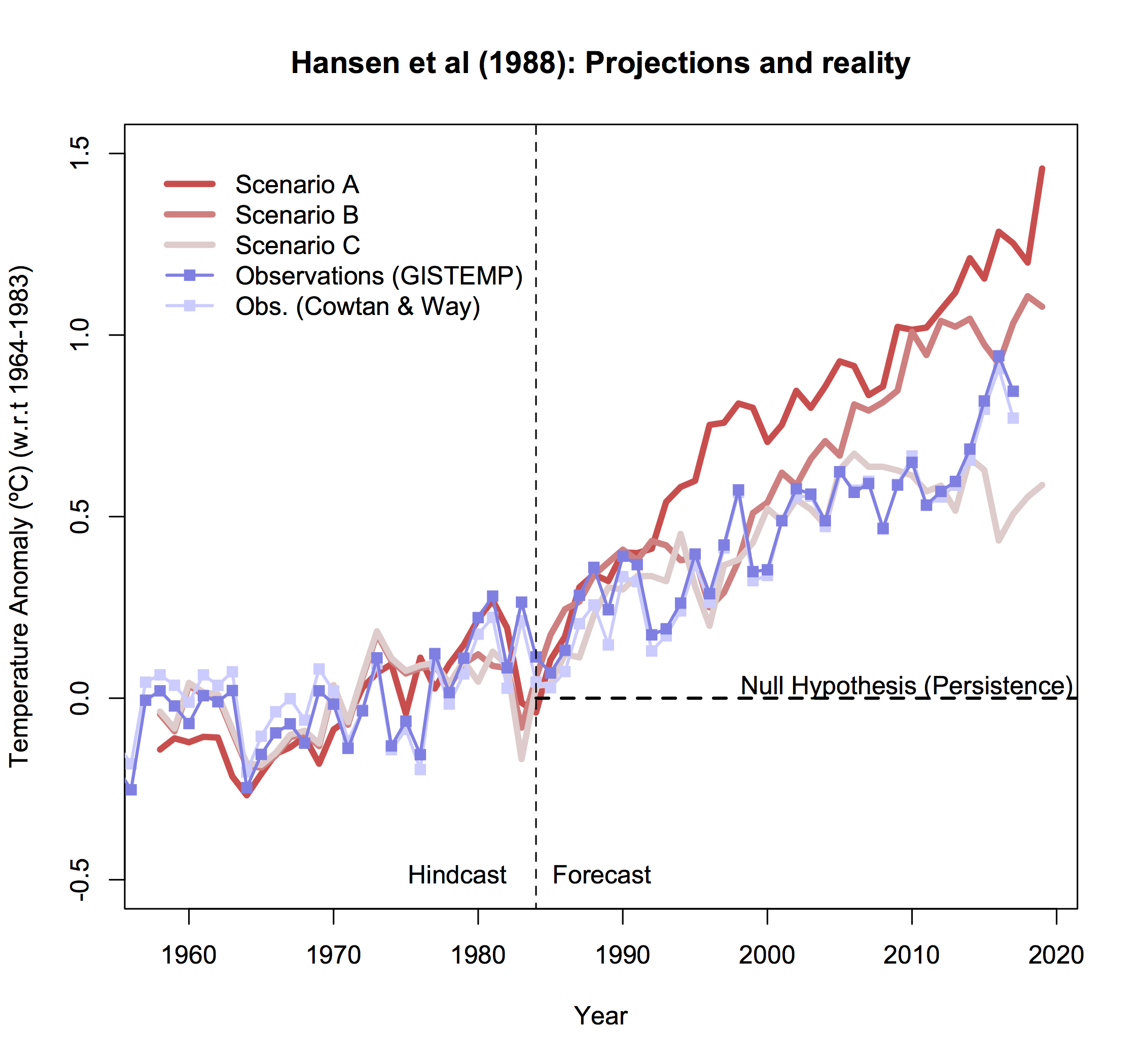
How should we go about assessing past projections? There have been updates to historical data (what we think really happened to concentrations, emissions etc.), none of the future scenarios (A, B, and C) were (of course) an exact match to what happened, and we now understand (and simulate) more of the complex drivers of change which were not included originally.
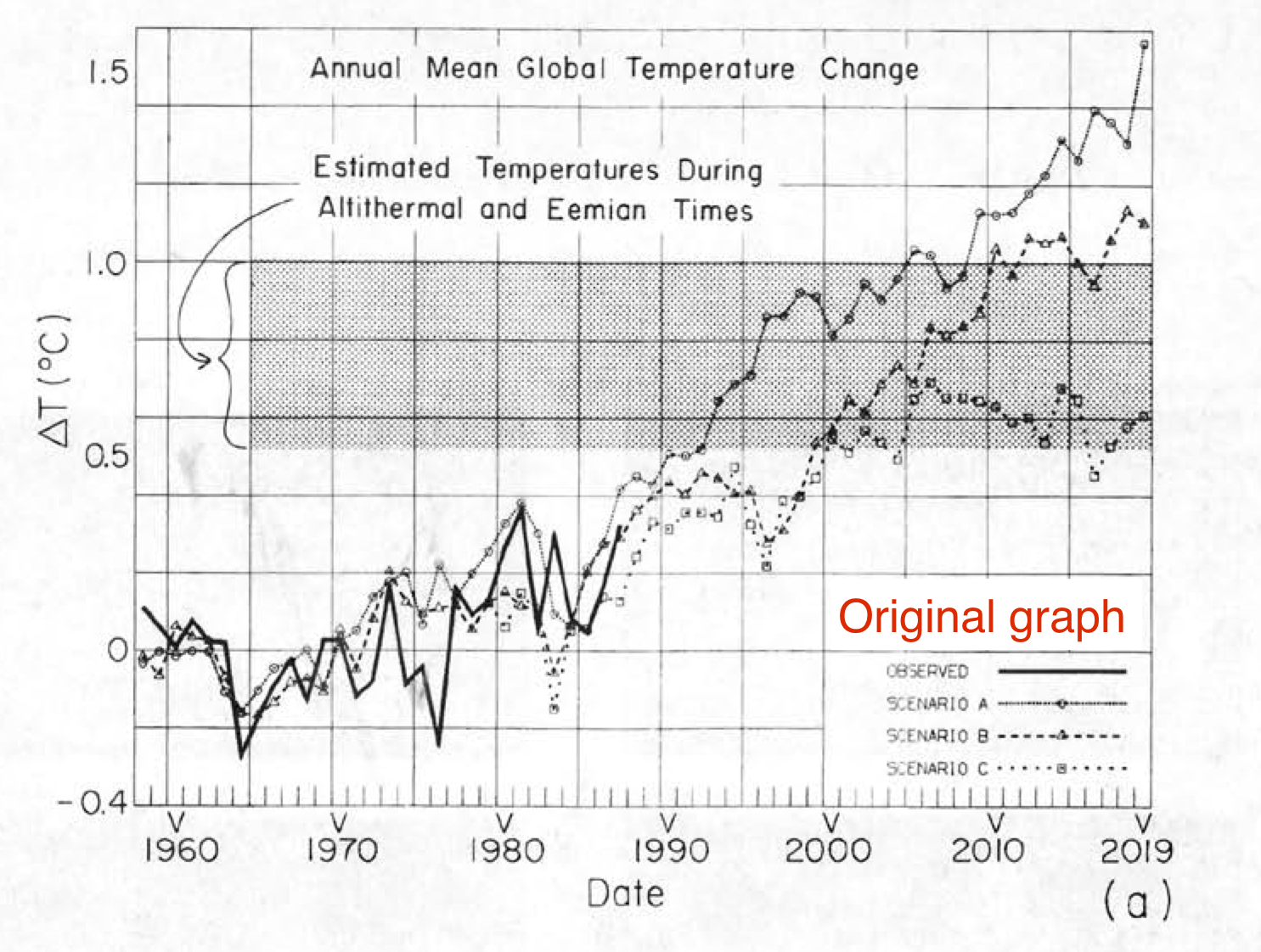
The easiest assessment is the crudest. What were the temperature trends predicted and what were the trends observed? The simulations were run in 1984 or so, and that seems a reasonable beginning date for a trend calculation through to the last full year available, 2017. The modeled changes were as follows:
- Scenario A: 0.33±0.03ºC/decade (95% CI)
- Scenario B: 0.28±0.03ºC/decade (95% CI)
- Scenario C: 0.16±0.03ºC/decade (95% CI)
The observed changes 1984-2017 are 0.19±0.03ºC/decade (GISTEMP), or 0.21±0.03ºC/decade (Cowtan and Way), lying between Scenario B and C, and notably smaller than Scenario A. Compared to 10 years ago, the uncertainties on the trends have halved, and so the different scenarios are more clearly distinguished. By this measure it is clear that the scenarios bracketed the reality (as they were designed to), but did not match it exactly. Can we say more by looking at the details of what was in the scenarios more specifically? Yes, we can.
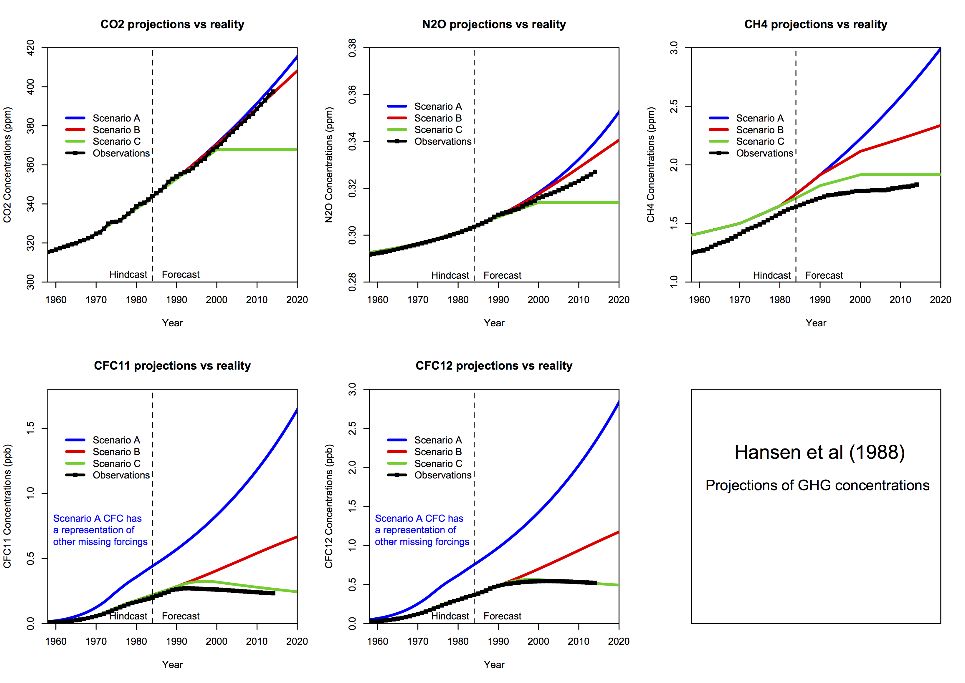
This is what the inputs into the climate model were (CO2, N2O, CH4 and CFC amounts) compared to observations (through to 2014):
Estimates of CO2 growth in Scenarios A and B were quite good, but estimates of N2O and CH4 overshot what happened (estimates of global CH4 have been revised down since the 1980s). CFCs were similarly overestimated (except in scenario C which was surprisingly prescient!). Note that when scenarios were designed and started (in 1983), the Montreal Protocol had yet to be signed, and so anticipated growth in CFCs in Scenarios A and B was pessimistic. The additional CFC changes in Scenario A compared to Scenario B were intended to produce a maximum estimate of what other forcings (ozone pollution, other CFCs etc.) might have done.
But the model sees the net effect of all the trace gases (and whatever other effects are included, which in this case is mainly volcanoes). So what was the net forcing since 1984 in each scenario?
There are multiple ways of defining the forcings, and the exact value in any specific model is a function of the radiative transfer code and background climatology. Additionally, knowing exactly what the forcings in the real world have been is hard to do precisely. Nonetheless, these subtleties are small compared to the signal, and it’s clear that the forcings in Scenario A and B will have overshot the real world.
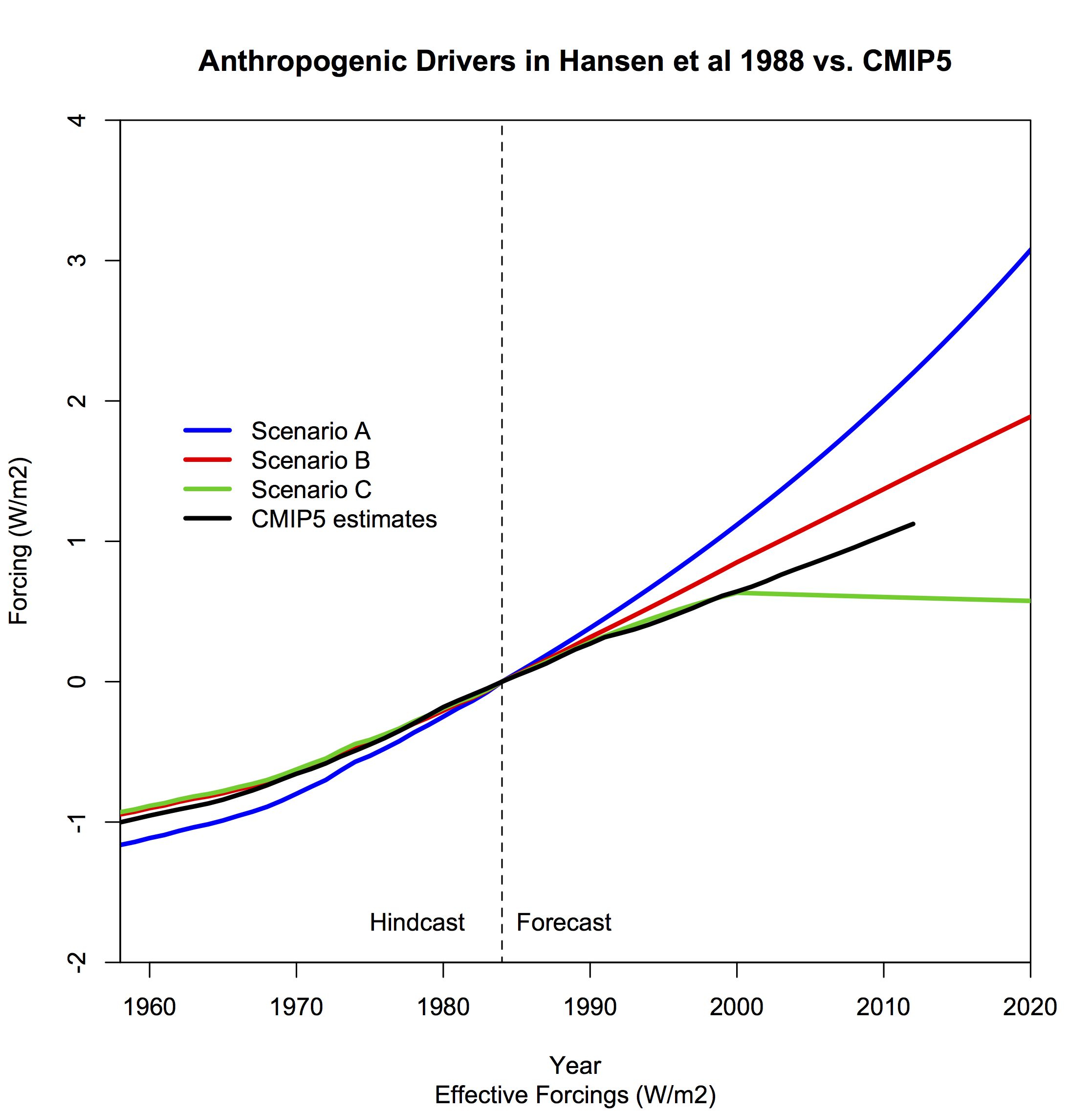
If we compare the H88 forcings since 1984 to an estimate of the total anthropogenic forcings calculated for the CMIP5 experiments (1984 through to 2012), the main conclusion is very clear – forcing in scenario A is almost a factor of two larger (and growing) than our best estimate of what happened, and scenario B overshoots by about 20-30%. By contrast, scenario C undershoots by about 40% (which gets worse over time). The slight differences because of the forcing definition, whether you take forcing efficacy into account and independent estimates of the effects of aerosols etc. are small effects. We can also ignore the natural forcings here (mostly volcanic), which is also a small effect over the longer term (Scenarios B and C had an “El Chichon”-like volcano go off in 1995).
The amount that scenario B overshoots the CMIP5 forcing is almost equal to the over-estimate of the CFC trends. Without that, it would have been spot on (the over-estimates of CH4 and N2O are balanced by missing anthropogenic forcings).
The model predictions were skillful
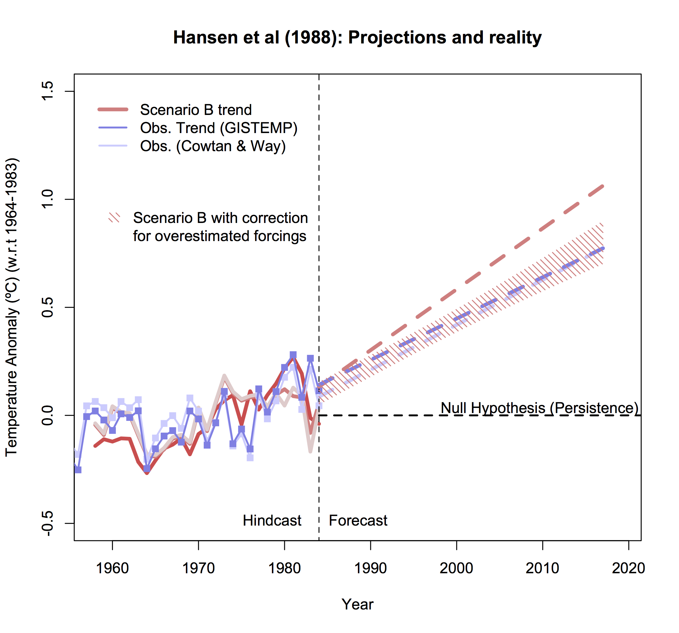
Predictive skill is defined as the whether the model projection is better than you would have got assuming some reasonable null hypothesis. With respect to these projections, this was looked at by Hargreaves (2010) and can be updated here. The appropriate null hypothesis (which at the time would have been the most skillful over the historical record) would be a prediction of persistence of the 20 year mean, ie. the 1964-1983 mean anomaly. Whether you look at the trends or annual mean data, this gives positive skill for all the model projections regardless of the observational dataset used. i.e. all scenarios gave better predictions than a forecast based on persistence.
What do these projections tell us about the real world?
Can we make an estimate of what the model would have done with the correct forcing? Yes. The trends don’t completely scale with the forcing but a reduction of 20-30% in the trends of Scenario B to match the estimated forcings from the real world would give a trend of 0.20-0.22ºC/decade – remarkably close to the observations. One might even ask how would the sensitivity of the model need to be changed to get the observed trend? The equilibrium climate sensitivity of the Hansen model was 4.2ºC for doubled CO2, and so you could infer that a model with a sensitivity of say, 3.6ºC, would likely have had a better match (assuming that the transient climate response scales with the equilibrium value which isn’t quite valid).
Hansen was correct to claim that greenhouse warming had been detected
In June 1988, at the Senate hearing linked above, Hansen stated clearly that he was 99% sure that we were already seeing the effects of anthropogenic global warming. This is a statement about the detection of climate change – had the predicted effect ‘come out of the noise’ of internal variability and other factors? And with what confidence?
In retrospect, we can examine this issue more carefully. By estimating the response we would see in the global means from just natural forcings, and including a measure of internal variability, we should be able to see when the global warming signal emerged.
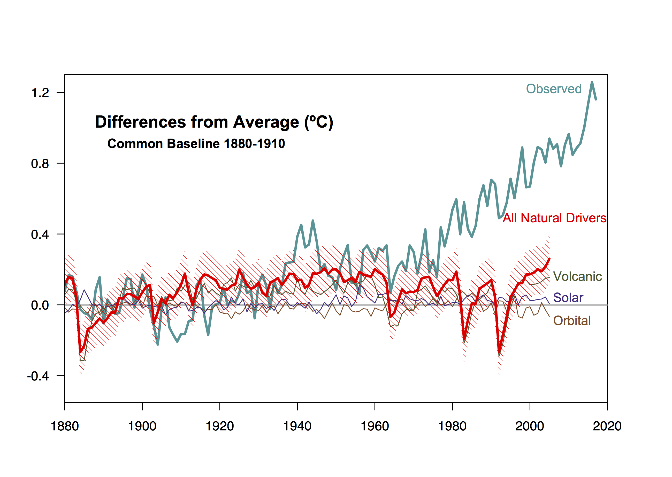
The shading in the figure (showing results from the CMIP5 GISS ModelE2), is a 95% confidence interval around the “all natural forcings” simulations. From this it’s easy to see that temperatures in 1988 (and indeed, since about 1978) fall easily outside the uncertainty bands. 99% confidence is associated with data more than ~2.6 standard deviations outside of the expected range, and even if you think that the internal variability is underestimated in this figure (double it to be conservative), the temperatures in any year past 1985 are more than 3 s.d. above the “natural” expectation. That is surely enough clarity to retrospectively support Hansen’s claim.
At the time however, the claim was more controversial; modeling was in it’s early stages, and estimates of internal variability and the relevant forcings were poorer, and so Hansen was going out on a little bit of a limb based on his understanding and insight into the problem. But he was right.
Misrepresentations and lies
Over the years, many people have misrepresented what was predicted and what could have been expected. Most (in)famously, Pat Michaels testified in Congress about climate changes and claimed that the predictions were wrong by 300% (!) – but his conclusion was drawn from a doctored graph (Cato Institute version) of the predictions where he erased the lower two scenarios:
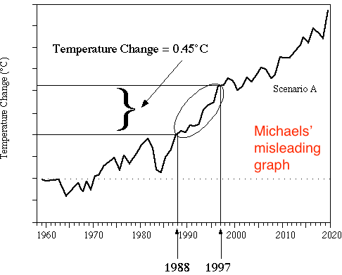
Undoubtedly there will be claims this week that Scenario A was the most accurate projection of the forcings [Narrator: It was not]. Or they will show only the CO2 projection (and ignore the other factors). Similarly, someone will claim that the projections have been “falsified” because the temperature trends in Scenario B are statistically distinguishable from those in the real world. But this sleight of hand is trying to conflate a very specific set of hypotheses (the forcings combined with the model used) which no-one expects (or expected) to perfectly match reality, with the much more robust and valid prediction that the trajectory of greenhouse gases would lead to substantive warming by now – as indeed it has.
References
- J. Hansen, I. Fung, A. Lacis, D. Rind, S. Lebedeff, R. Ruedy, G. Russell, and P. Stone, "Global climate changes as forecast by Goddard Institute for Space Studies three‐dimensional model", Journal of Geophysical Research: Atmospheres, vol. 93, pp. 9341-9364, 1988. http://dx.doi.org/10.1029/JD093iD08p09341
- J.C. Hargreaves, "Skill and uncertainty in climate models", WIREs Climate Change, vol. 1, pp. 556-564, 2010. http://dx.doi.org/10.1002/wcc.58
Thanks for the clear and useful assessment. I think there is a need for more assessment of previous projections with observations – the authors may be interested in our quick assessment of regional temperature projections from IPCC FAR and in Australia from CSIRO made in the early 1990s if you weren’t already aware of it: https://link.springer.com/article/10.1007/s10584-016-1840-9
At the risk of wading into this comment stream, I have a question (this is my first ever posting on a climate comment stream). Over the past several months I’ve been trying to read climate change information from a variety of sources (including this site) to understand the data and the interpretations/misinterpretations.
I am a lay person who is just trying to think critically about the opposing view points and go back to the source information from places like NOAA, etc to see their data and interpretation of it.
When I read the article above I first looked at the first figure (Projections and Reality) and I interpreted it to show that the observed temperatures have closely matched up with the Scenario C model output … until 2015/15/17 when the temperatures were much higher than scenario C.
When I read the next figure (graphs of the model inputs) and I looked at scenario C inputs, I interpreted it to show that CH4 and the CFC inputs closely matched the observed levels but that the CO2 and N2O inputs for scenario C were much lower than the observed levels. The CO2 observed more closely matched scenario A/B and the N2O observed more closely matched scenario B.
I’ve gone back to the read the Hansen report and his definitions of the three scenarios in section 4 of his report. So I understand that scenario A was meant to be a more extreme scenario that was unlikely, scenario B was the most likely given the trends at the time, and scenario C was the least likely and envisioned a significant curtailment of emissions.
The article then talks about making adjustments to scenario B to account for the Montreal accord and CFC levels.
Unless I misinterpreted or missed something, the article doesn’t talk about the observed CO2 levels being inline with the inputs for scenario A/B but the observed temperatures largely following the output from scenario C.
There was a point made about CO2 sensitivity and a reduction to 3.6C would allow for an “inference” that scenario B would be a better match for observed temperatures. I didn’t get the sense that was actually done, just that an adjustment was made for the CFC levels not CO2 sensitivity.
My Question/Curiosity: I’m just curious about the significance of Scenario C’s output matching the observed temperatures and the CFC/CH4 inputs for Scenario C matching observed levels, while the observed levels for CO2 and N2O were significantly higher than the scenario C inputs, yet the output matched … again, until the sharp rise in 2015/16/17 … so in the longer term maybe we’ll track closer to scenario B.
PW,
Good question. Several possible explanations are possible. First, those input gases which followed the scenario C trajectory may have been more important to temperatures than Hansen postulated. If this is the case, then longer term, we’ll fall back closer to scenario C. Second, the CO2 sensitivity ws not reduced, and would need to be reduced even further to match temperature observations. Third, Hansen included random volcanic eruptions into his graphs, which did not occur, which is the main reason that observations appear to match scenario B recently. Observations are likely to continue tracking between scenarios B and C, as they diverge greatly in his projections. Hope this helps.