
")
Gavin Schmidt and Stefan Rahmstorf
John Tierney and Roger Pielke Jr. have recently discussed attempts to validate (or falsify) IPCC projections of global temperature change over the period 2000-2007. Others have attempted to show that last year’s numbers imply that ‘Global Warming has stopped’ or that it is ‘taking a break’ (Uli Kulke, Die Welt)). However, as most of our readers will realise, these comparisons are flawed since they basically compare long term climate change to short term weather variability.
This becomes immediately clear when looking at the following graph:
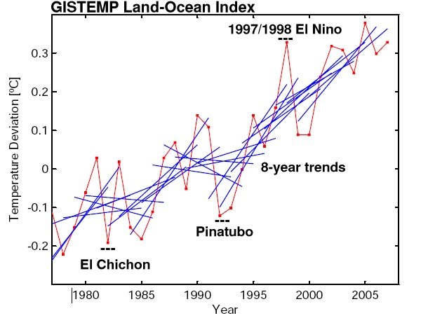
The red line is the annual global-mean GISTEMP temperature record (though any other data set would do just as well), while the blue lines are 8-year trend lines – one for each 8-year period of data in the graph. What it shows is exactly what anyone should expect: the trends over such short periods are variable; sometimes small, sometimes large, sometimes negative – depending on which year you start with. The mean of all the 8 year trends is close to the long term trend (0.19ºC/decade), but the standard deviation is almost as large (0.17ºC/decade), implying that a trend would have to be either >0.5ºC/decade or much more negative (< -0.2ºC/decade) for it to obviously fall outside the distribution. Thus comparing short trends has very little power to distinguish between alternate expectations.
So, it should be clear that short term comparisons are misguided, but the reasons why, and what should be done instead, are worth exploring.
The first point to make (and indeed the first point we always make) is that the climate system has enormous amounts of variability on day-to-day, month-to-month, year-to-year and decade-to-decade periods. Much of this variability (once you account for the diurnal cycle and the seasons) is apparently chaotic and unrelated to any external factor – it is the weather. Some aspects of weather are predictable – the location of mid-latitude storms a few days in advance, the progression of an El Niño event a few months in advance etc, but predictability quickly evaporates due to the extreme sensitivity of the weather to the unavoidable uncertainty in the initial conditions. So for most intents and purposes, the weather component can be thought of as random.
If you are interested in the forced component of the climate – and many people are – then you need to assess the size of an expected forced signal relative to the unforced weather ‘noise’. Without this, the significance of any observed change is impossible to determine. The signal to noise ratio is actually very sensitive to exactly what climate record (or ‘metric’) you are looking at, and so whether a signal can be clearly seen will vary enormously across different aspects of the climate.
An obvious example is looking at the temperature anomaly in a single temperature station. The standard deviation in New York City for a monthly mean anomaly is around 2.5ºC, for the annual mean it is around 0.6ºC, while for the global mean anomaly it is around 0.2ºC. So the longer the averaging time-period and the wider the spatial average, the smaller the weather noise and the greater chance to detect any particular signal.
In the real world, there are other sources of uncertainty which add to the ‘noise’ part of this discussion. First of all there is the uncertainty that any particular climate metric is actually representing what it claims to be. This can be due to sparse sampling or it can relate to the procedure by which the raw data is put together. It can either be random or systematic and there are a couple of good examples of this in the various surface or near-surface temperature records.
Sampling biases are easy to see in the difference between the GISTEMP surface temperature data product (which extrapolates over the Arctic region) and the HADCRUT3v product which assumes that Arctic temperature anomalies don’t extend past the land. These are both defendable choices, but when calculating global mean anomalies in a situation where the Arctic is warming up rapidly, there is an obvious offset between the two records (and indeed GISTEMP has been trending higher). However, the long term trends are very similar.
A more systematic bias is seen in the differences between the RSS and UAH versions of the MSU-LT (lower troposphere) satellite temperature record. Both groups are nominally trying to estimate the same thing from the same data, but because of assumptions and methods used in tying together the different satellites involved, there can be large differences in trends. Given that we only have two examples of this metric, the true systematic uncertainty is clearly larger than the simply the difference between them.
What we are really after is how to evaluate our understanding of what’s driving climate change as encapsulated in models of the climate system. Those models though can be as simple as an extrapolated trend, or as complex as a state-of-the-art GCM. Whatever the source of an estimate of what ‘should’ be happening, there are three issues that need to be addressed:
- Firstly, are the drivers changing as we expected? It’s all very well to predict that a pedestrian will likely be knocked over if they step into the path of a truck, but the prediction can only be validated if they actually step off the curb! In the climate case, we need to know how well we estimated forcings (greenhouse gases, volcanic effects, aerosols, solar etc.) in the projections.
- Secondly, what is the uncertainty in that prediction given a particular forcing? For instance, how often is our poor pedestrian saved because the truck manages to swerve out of the way? For temperature changes this is equivalent to the uncertainty in the long-term projected trends. This uncertainty depends on climate sensitivity, the length of time and the size of the unforced variability.
- Thirdly, we need to compare like with like and be careful about what questions are really being asked. This has become easier with the archive of model simulations for the 20th Century (but more about this in a future post).
It’s worthwhile expanding on the third point since it is often the one that trips people up. In model projections, it is now standard practice to do a number of different simulations that have different initial conditions in order to span the range of possible weather states. Any individual simulation will have the same forced climate change, but will have a different realisation of the unforced noise. By averaging over the runs, the noise (which is uncorrelated from one run to another) averages out, and what is left is an estimate of the forced signal and its uncertainty. This is somewhat analogous to the averaging of all the short trends in the figure above, and as there, you can often get a very good estimate of the forced change (or long term mean).
Problems can occur though if the estimate of the forced change is compared directly to the real trend in order to see if they are consistent. You need to remember that the real world consists of both a (potentially) forced trend but also a random weather component. This was an issue with the recent Douglass et al paper, where they claimed the observations were outside the mean model tropospheric trend and its uncertainty. They confused the uncertainty in how well we can estimate the forced signal (the mean of the all the models) with the distribution of trends+noise.
This might seem confusing, but an dice-throwing analogy might be useful. If you have a bunch of normal dice (‘models’) then the mean point value is 3.5 with a standard deviation of ~1.7. Thus, the mean over 100 throws will have a distribution of 3.5 +/- 0.17 which means you’ll get a pretty good estimate. To assess whether another dice is loaded it is not enough to just compare one throw of that dice. For instance, if you threw a 5, that is significantly outside the expected value derived from the 100 previous throws, but it is clearly within the expected distribution.
Bringing it back to climate models, there can be strong agreement that 0.2ºC/dec is the expected value for the current forced trend, but comparing the actual trend simply to that number plus or minus the uncertainty in its value is incorrect. This is what is implicitly being done in the figure on Tierney’s post.
If that isn’t the right way to do it, what is a better way? Well, if you start to take longer trends, then the uncertainty in the trend estimate approaches the uncertainty in the expected trend, at which point it becomes meaningful to compare them since the ‘weather’ component has been averaged out. In the global surface temperature record, that happens for trends longer than about 15 years, but for smaller areas with higher noise levels (like Antarctica), the time period can be many decades.
Are people going back to the earliest projections and assessing how good they are? Yes. We’ve done so here for Hansen’s 1988 projections, Stefan and colleagues did it for CO2, temperature and sea level projections from IPCC TAR (Rahmstorf et al, 2007), and IPCC themselves did so in Fig 1.1 of AR4 Chapter 1. Each of these analyses show that the longer term temperature trends are indeed what is expected. Sea level rise, on the other hand, appears to be under-estimated by the models for reasons that are as yet unclear.
Finally, this subject appears to have been raised from the expectation that some short term weather event over the next few years will definitively prove that either anthropogenic global warming is a problem or it isn’t. As the above discussion should have made clear this is not the right question to ask. Instead, the question should be, are there analyses that will be made over the next few years that will improve the evaluation of climate models? There the answer is likely to be yes. There will be better estimates of long term trends in precipitation, cloudiness, winds, storm intensity, ice thickness, glacial retreat, ocean warming etc. We have expectations of what those trends should be, but in many cases the ‘noise’ is still too large for those metrics to be a useful constraint. As time goes on, the noise in ever-longer trends diminishes, and what gets revealed then will determine how well we understand what’s happening.
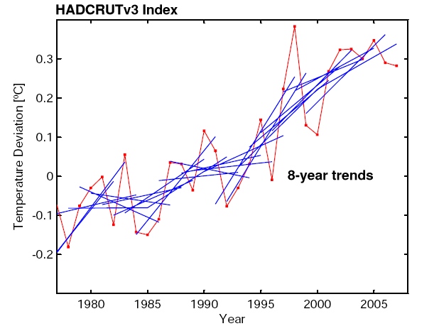
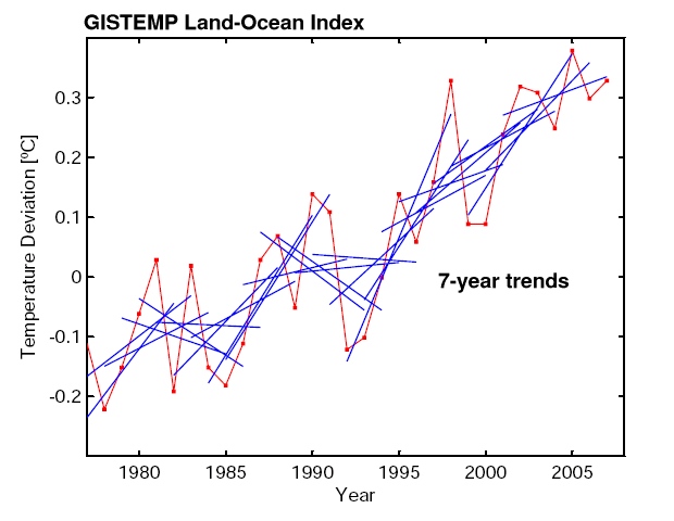
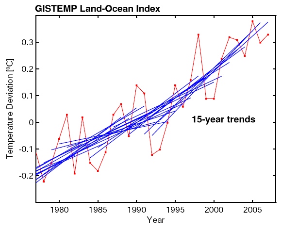
Update: We are pleased to see such large interest in our post. Several readers asked for additional graphs. Here they are:
– UK Met Office data (instead of GISS data) with 8-year trend lines
– GISS data with 7-year trend lines (instead of 8-year).
– GISS data with 15-year trend lines
These graphs illustrate that the 8-year trends in the UK Met Office data are of course just as noisy as in the GISS data; that 7-year trend lines are of course even noisier than 8-year trend lines; and that things start to stabilise (trends getting statistically robust) when 15-year averaging is used. This illustrates the key point we were trying to make: looking at only 8 years of data is looking primarily at the “noise” of interannual variability rather than at the forced long-term trend. This makes as much sense as analysing the temperature observations from 10-17 April to check whether it really gets warmer during spring.
And here is an update of the comparison of global temperature data with the IPCC TAR projections (Rahmstorf et al., Science 2007) with the 2007 values added in (for caption see that paper). With both data sets the observed long-term trends are still running in the upper half of the range that IPCC projected.
Re the GISTEMP Land-Ocean Index graph: I should think that an 8-year RUNNING MEAN would give an astonishingly-good fit to the data; one that will be statistically-sound as a regression. But would we welcome the eventual outcome of its prediction?
Gavin and Stefan – nice discussion. I saw Tierney’s post yesterday and thought – “why is anybody trying to do a comparison of such a short time period? It’s meaningless!”
That said, I do have a question that’s come up in my mind after some discussions with perhaps more knowledgeable “skeptics” than Tierney and Pielke Jr. As you put it, “the climate system has enormous amounts of variability on day-to-day, month-to-month, year-to-year and decade-to-decade periods.” and this seems to derive from the chaotic forces that determine weather itself.
So the question is – do we have a good handle on the natural decay times for random perturbations on the climate system? Pinatubo provided one example of a delta-function perturbation, and it seemed like the response decayed over roughly a year. But there are certainly longer-term responses as well: the deep ocean we know has 1000-year response times, the large icesheets presumably also on about that timescale. What about in between? Wouldn’t a natural climate system response time of several decades make it almost impossible to get meaningful averages out of climate system variables, if they could be significantly influenced by random fluctuations accumulated over such long time periods? Any good references on this issue?
[Response: It’s clear from the data that there is no one time scale for the climate system response to forcings. There are short term responses to the seasonal cycle for instance, longer responses to Pinatubo, and even longer decadal responses to GHG forcing – which could in fact be longer once you factor in vegetation or ice sheet impacts. Thus for any averaging period, one needs to be cognizant of the slower components for which that period won’t average over the noise. The deep ocean instrumental records are particular problematic in this respect. Glaciers are a little different because they are integrated metrics and have some averaging already built in. – gavin]
In the category of comparing “long-term climate change to short-term weather variability,” Boston Globe columnist Jeff Jacoby has offered something that may be new. In a Jan. 6 column headlined “Br-r-r! Where did global warming go?” he used a list of recent instances of unexpected coldness to suggest that the planet may in fact be cooling, not warming. It’s interesting that he admitted that his data are anecdotal, but that he persisted at the level of global climate generalization anyway. (Have your cake and eat it too?) He wrote that “all of these may be short-lived weather anomalies, mere blips in the path of the global climatic warming that Al Gore and a host of alarmists proclaim the deadliest threat we face. But what if the frigid conditions that have caused so much distress in recent months signal an impending era of global cooling?”
Oh do come on.
I have seen that the hadley center has said that the global average temperatures since 2001 and 2007 are statistically indistinguishable. each year has a temperature that falls within the error bars of all the years 2001 – 2007. That being the case you can say NOTHING about any trend in this data set except that the data indicates no change in temperature over that period. Whether you think that is evidence that global warming has halted is debatable but you can’t bring any statistical analysis to bear to show that the temperature change in the period was other than zero.
You are working hard with a lot of statistical analysis to see structure in the 2001-2007 period that you are just not justified in seeing. We know nothing about any trend in this period because we haven’t measured a trend. The measurements show the temp has been constant and no amount of ‘analysis’ on your part will change that.
Congratulations on an excellent post. I thought I would draw attention to a stark example of a national newspaper in the UK repeatedly claiming that global warming has stopped, using exactly the flawed reasoning that you have highlighted – a columinist for ‘The Sunday Telegraph’ has made this claim nine times in the last six months – most recently last Sunday (see halfway down: http://www.telegraph.co.uk/news/main.jhtml?xml=/news/2008/01/06/nbook106.xml). I have written a number of times to the newspaper to correct the misleading impression he is creating – sometimes they publish the letter, mostly they don’t. But Booker hasn’t stopped repeating his misleading claim. I’m now planning to take the case to the UK Press Complaints Commission on the grounds that it represents a persistent breach of its code on misleading and inaccurate reporting.
Gavin-
Thanks for this post. There are a few clarifications that you ought to probably point out, and I’d ask that you present my comments in full, rather than selectively edit them.
1. IPCC 2007 issuing a “prediction” starting in 2000, is not really a prediction, since it starts at a time before the prediction is made. As you know, rigorous forecast evaluation begins at the date a prediction is made. Thus, what I prepared and John Tierney showed are simply examples of how a forecast verification is done. In addition, the figure that you point to in IPCC AR4 Chapter 1 really wouldn’t qualify as a rigorous forecast verification (except perhaps for 1990).
2. One way to look at a comparison of models and short-term is as you have and suggest that it is “misguided” because models are based on the longer-term. My view is the opposite — modelers are doing us a disservice by neglecting the short-term. If multi-year and decadal variability is so great as to obscure a long-term trend, then it would be nice to see that reflected in the uncertainty estimates of the models for what to expect over the next 10 years. You run very close to suggesting that climate predictions simply cannot be verified except on a multi-decadal time scale, which I think overstates the case at best, and moves modeling outside the realm of falsifiability, and thus away from the scientific method. Hindcast checks are great, but science aways works better with falsifiable hypotheses on timescales that allow for feedback into the research process.
3. You are incorrect when you assert that “Each of these analyses show that the longer term temperature trends are indeed what is expected.” In fact, IPCC 1990 dramatically over-forecast trends, as show by the IPCC figure that you reference and that I provide here:
http://sciencepolicy.colorado.edu/prometheus/archives/climate_change/001317verification_of_1990.html
There are perhaps good reasons for this like IPCC treatment of aerosols and a subsequent volcanic eruption (but forecast failures always tell us why they were wrong, which is part of their value). IPCC 1995 dramatically lowered its predictions (and as I’ll post up on our blog soon, and had a much more accurate prediction through 2007). But both IPCC 1990 and IPCC 1995 cannot be consistent with observations, since 1995 cut its decadal average trend by 50%.
4. Finally, the IPCC has made many predictions in 1990, 1995, 2001, and 2007. To suggest that comparing the evolution of predicted variables with observations is misguided is itself a strange dodge. There are good reasons to compare models with data, and in fact, your deconstruction of Douglass et al. paper does exactly that. Over the long run, if your believe your predictions to be correct, then a comparison with actual data will eventually prove you to be correct. That there is large variability in the shorter terms simply means a bit larger uncertainty bounds on such predictions. But to avoid forecast verification altogether is a strange position to take.
Thanks again.
[Response: Roger, How can you read the post above and claim that we’re avoiding forecast verification altogether? This is just perverse. I spend almost all of my time comparing observations with predicted variables, so I don’t see what you are getting at in point 4 at all. The point being made is that each comparison has varying degrees of usefulness. 8 year trends in the global mean temperatures are not very useful. 20 year trends are more so. Better still are superposed averages of the response to volcanoes or ENSO variability etc. In each case, models predict a mean response and an estimate of the noise.
Dealing with your individual points though, IPCC may have been published in 2007, but the model runs reported were made in 2004 in most cases, similarly, Hansen’s paper was published in 1988, but the model runs were started in 1985, thus forecast validation can usefully be made from when the runs started, rather than when they were published. Secondly, the pictures you and John showed were not correct if you wanted to do a short term forecast simulation. The line you took from IPCC was not the envelope, or even a fair distribution of the simulations over that short period. You would find that the actual simulations would have a substantially greater error bar (as in the distribution of 8 year trends we mentioned above). Instead you used the IPCC estimate of the long term trend (which has a much smaller uncertainty). This data is easily available, and if you want to do forecast validation properly you should use it. The response you’ve got from other scientists is precisely because they are aware of this.
I’m not really sure what was being forecast in 1992, and I’ll have to look it up before responding.
You talk about the absence of short-term validation as being unscientific. This is simply ridiculous. It is easy to see that unpredictable weather noise dominates short term variability. It is well known that this is unpredictable more than a short time ahead. Claiming that the forced climate response must be larger than the weather noise for climate prediction on all time scales is just silly. There are examples where it is – for instance in the response to Pinatubo (for which validated climate model predictions were made ahead of time – Hansen et al 1992) – but this is not in general going to be true. A bigger point is that ‘predictions’ from climate models do not just mean predicting what is going to happen next year or the next decade. They also predict variables and relationships between variables that haven’t yet been measured or analysed – that is just as valid a falsifiability criteria. They can test hypotheses for climate changes in the past and so on. The statistics of the weather make short term climate prediction very difficult – particularly for climate models that are not run with any kind of initialization for observations – this has been said over and over. Why is this hard to understand? – gavin]
Gavin- A further comment. Based on your analysis is it fair to conclude that linking the 2007 NH sea ice melt to long-term climate change is equally as misguided as comparing an 8-year record of global temperatures to long-term climate change?
[Response: The long term decline in Arctic sea ice is by far the more powerful test. But ‘equally misguided’ is incorrect. The issue is how unusual an event is (and by all analyses the 2007 melt was huge). That makes it extremely unlikely to be on it’s own just another fluctuation of the noise – the same was true of the 2003 European heat wave. In such cases it is sometimes possible to estimate how much more likely a similar event has become because of climate change, and if that is a substantial increase, it might make sense to apportion some causality. But it depends very much on the case at hand, how unusual it was and how it ties into expectations. – gavin]
Bob Ward should take the UK’s Met Office Hadley Center to the courts as they have made exactly the same claim as the telegraph Newspaper. What’s source for the goose is source for the gander as I think they say.
I offer this brief off-topic introduction. I have been a regular at the accuweather blog for awhile now, and I’ve come here because I welcome the more disciplined moderation policy here. I’m weary of seeing the same denier lies repeated relentlessly with no apparent intervention. The mere fact that several of the more egregious deniers there complain of being “censored” here raises my appreciation for this site.
This particular piece is an excellent example of the kind of reasoned, analytic, and scientific information about AGW that I seek. Regarding Corneliussen’s comment (number 3) above, I do hope that nobody takes Jacoby too seriously. While there is, of course, some statistical likelihood that we are entering a period of cooling, I would remind us that a) even a stuck (analog) clock is right twice a day and b) even if we do enter a period of cooling, my take on our current understanding (which may eventually prove incorrect) is that the anthropogenic warming signal will make such cooling less pronounced than it would otherwise be.
In short, even a period of cooling will not, of itself, invalidate the AGW hypothesis whatsoever. Even in that scenario, it seems to me that the question is whether or not the measured temperature is or is not warmer than it would be without the measured dramatic increase in anthropogenic atmospheric CO2.
I am curious why you chose an 8 year running average. Those who suggest that global warming has “stopped” or that the data does not suggest recent global warming usually say “since 2000” or “since 2001”. These would indicate 7 year or 6 year averages, yet you choise a 8 year average for illustration.
Why?
[Response: Because Tierney&Pielke’s plot runs from 2000 to 2007 (8 data points), and since we responded to Tierney, we chose the same interval as them. For shorter intervals the problem obviously gets worse and worse. The extreme case is two-year trends. That is the red lines in the plot. They go downward very often. Yet nobody in their right mind would describe this as “global warming stopped in 1981, then again in 1983, then again in 1988 and again in 1990”. Or claim that these short coolings cast any doubt on global warming. -stefan]
Fig.1.1. of the 4AR reference given clearly shows that since 2001 we have stable global temperatures (2001 to 2005, now we know this to be true also for 2006 and 2007); this is an observational situation that was never found before since 1990. So ignoring trends, and focusing on year to year variability, what would be the correct conclusion to draw?
[Response: Making statements about statistically significant changes in variability is even harder than statements about trends. Thus, I would simply note it and not draw any particular conclusion. – gavin]
For what it’s worth, the blue 8-year trend lines all seem to converge into a positive linear trend between 1995 and 2005, suggesting a consistent increase in temps. Obviously it isn’t worth much since a decade isn’t really long enough to look for climate trends, but I don’t understand what Tierney and Pielke Jr’s logic is. Even a rudimentary understanding of trends and stats renders their point moot.
I’ve been staring at the Hadley data lately, and they are definitely reporting cooling for the last two to three years. It seems this is far more southern hemisphere than northern, and far more ocean than land.
First, what meaning can be derived from the difference between land and ocean anomalies? Is it accurate to produce a global average which gives the ocean temperature more weight than land? In other words, is an “area average” a good way to determine the actual global trend?
Second, have the instruments being used to determine sea surface temperature been satisfactorily validated? If I recall correctly, there have been some problems correctly interpreting readings from the instruments which were launched several years ago.
Or is this more related to the difference in methods Gavin mentioned?
Gavin – thanks for an informative post. Does the 2007 value you plot include December? I noticed from GISTEMP that Dec. ’07 was cooler than other months – can this be attributed to the strong ongoing La Nina in the Pacific? Thanks, David
[Response: Yes it does include Dec 07. And indeed it does seem to be related to the La Nina. – gavin]
Gavin (7)-
Thanks, a few replies:
You ask “How can you read the post above and claim that we’re avoiding forecast verification altogether?”
Well, my first clue is when you misrepresented why I did, and what John Tierney reported. You characterized the effort as “attempts to validate (or falsify) IPCC projections of global temperature change over the period 2000-2007.” No such claims were made by me, and I don’t think by Tierney.
In my post I was careful to note the following: “I assume that many climate scientists will say that there is no significance to what has happened since 2000, and perhaps emphasize that predictions of global temperature are more certain in the longer term than shorter term.”
And John Tierney wrote: “you can’t draw any firm conclusions about the IPCC’s projections — a few years does not a trend make”
So why misrepresent what we said? Models of open systems cannot in principle be “validated” (see Oreskes et al 1994).
I simply compared IPCC predictions with observations as an example of how to do a verification, which is standard practice in the atmospheric sciences, but much less so in the climate modeling community (and yes, I think this is indeed the case). Instead of telling your readers all of the reasons that a verification exercise is “misguided” you might have instead constructively pointed to the relevant forecasts with proper uncertainty bars (please do post up the link), or better yet, simply shown how an analysis comparing 2000-2007 with relevant predictions would have been done to your satisfaction.
Given that you point to the IPCC AR4 Figure 1.1 in positive fashion, I remain confused about your complaint about what I did — I don’t recall you complaining about IPCC efforts in verification previously.
How about this: We agree that rigorous forecast verification is important. There also does not a clear agreement among researchers as to (a) what variables are most important to verify (b) Over what times scales, (c) what actual constitutes the relevant forecasts, and (d) what actually constitutes the relevant observational verification databases. Then this is a subject to work through collegially, rather than try to discredit, dismiss, or suppress.
Thanks.
PS. As I stated on my blg. If discussing forecast verification in the context of climate model predictions is to be a sign of “skepticism,” then climate science is in bad shape. For the record I accept the consensus of IPCC WG I.
[Response: Roger, I’m flummoxed. You keep bringing in things that have not been said, and rebuttals to arguments that have not been made. All we have done is point out statistical issues in two things you compared. Oreskes paper is a case in point – I have no desire to argue about the semantics of verification vs evaluation vs validation – none of that is relevant to the overriding principle that you have to compare like with like. In a collegial spirit, I suggest you download the model data directly from PCMDI and really look at what you can learn from it. You might get a better appreciation for the problems here. Verification is not misguided. Your attempt at verification was. – gavin]
John Lederer,
http://scienceblogs.com/stoat/2007/05/the_significance_of_5_year_tre.php#
Gavin,
You stated “The red line is the annual global-mean GISTEMP temperature record (though any other data set would do just as well),…
Can you provide graphs of the other data sets? I want to see them do just as well..
Thanks
Jon P
If you replace 8-year trend lines with n-year, at what value of n do they start to faithfully reflect the underlying trend?
I see now that in reporting in item 3 above on the Boston Globe’s Jeff Jacoby’s contribution in the category of misconstruing weather as climate, I probably should have bee explicit: my own opinion, for what it’s worth, is that Jacoby’s contribution is preposterous.
Gavin,
You indicated that the GISS product extrapolates over the arctic region. Extrapolate means to infer or estimate by extending or projecting known information. How is this done and can you explain why is it valid? Is this simply using widely spaced and limited data from within the arctic itself and extrapolating to cover the entire region, or extrapolating somehow from the perimeter of the arctic?
[Response: This is explained in the GISTEMP documentation, but in areas with no SST information (like most of the Arctic), the information from met stations is extrapolated over a radius of 1200 km. That fills in some of the Arctic. A validation for that kind of approach would be a match to the Arctic buoy program – but I haven’t looked into that specifically. – gavin]
“In fact, IPCC 1990 dramatically over-forecast trends, as show by the IPCC figure that you reference and that I provide here:”
Roger,
Your blog post neglects to even mention the “good reasons” for “forecasts” to be off–namely the Mt. Pinatubo eruption. Don’t you think you owe it to those who read your blog to point out that:
A. The IPCC projections do not include volcanic eruptions and
B. Your graphs starts immediately before a volcanic eruption that had a large effect on global temperatures.
I’m afraid burying it (and IMO downplaying it) in your comments does not draw an accurate picture.
Jon P writes ” Can you provide graphs of the other data sets? I want to see them do just as well” I agree. And this, of course, brings up the perennial question. Which of the various data sets of average annual global temperature anomaly is closest to the truth? When we get some good scientific analysis which brings an understanding of that question, we will have advanced the yardsticks a very long way.
Is there an element of “cherry picking” in this article? Would an illustration using HadCRU or RSS with a moving average of either 5, 6, 7, or 9 years been as helpful to you in making your point?
[Response: The distribution of trends will be very similar – most of this variability is due to real weather, not instrumental noise. But I’ll check and report back. – gavin]
As a layman who is trying to understand this issue, I’ve been struggling with how to assess the forecast skill of the GCMs. I think this is an extremely important issue and I wish I could find more information regarding tests that would confirm or falsify the forecasting skill of the GCMs. I agree with your point that short-term deviations from a trend are not necessarily significant and do not necessarily indicate that the GCM’s are unreliable. However, I think that Roger Pielke, Jr. has a point when he suggests that accurate short-term forecasts are used to show how reliable the GCMs are, but inaccurate short-term forecasts are attributed to random noise in the actual data. This seems like a “head we win, tails you loose” verification method.
As another example, I have read here how the GCM’s accurately forecast the effect of the Pinatubo erruption. If by accurate, you mean that the GCM’s predicted that dumping massive amounts of aersols into the atmosphere would cause cooling, I am not impressed. The mental model that exists in my head would be just as “accurate”. If, however, by “accurate” you mean that the GCM’s made reasonably close predictions of the extent of the cooling, then it seems you are playing the “head I win, tails you loose” game suggested by Roger Pielke’s comment.
[Response: Huh? When did we say that short term predictions were good if they agreed with the models? Any test of a model has to be accompanied by an analysis of the uncertainties – and if a test happens to be a good match, but the uncertainties indicate that was just a piece of luck, then it doesn’t count. Pinatubo is different because the forcing in that case was very strong, and so it dominated the short term noise (at least in some metrics like the global mean temperature). Look at Hansen et al 2007 for more discussion of this. Pinatubo is more interesting validation than just for temperatures too though. Models get the LW and SW TOA radiation changes, they get the changes in water vapour, they get the impact on the winter NAO. None of those things were programmed in ahead of time. – gavin]
Walt, you said you’d been “staring at the data” and that Hadley was “definitely reporting ….” How much statistics do you know? Did you do any math? People are very good at detecting trends simply by looking at images — and very often see what is not actually there.
This worked to detect large predators — imagining a leopard has low cost compared to not seeing a leopard — but the same talent leads to gross error — imagining a recession is expensive compared to not noticing a recession.
Looking doesn’t suffice for definitely reporting. Math may.
How did you arrive at your conclusion?
Hank Roberts:
I understand the problem with short term trends.
However, if someone says “the last 6 or 7 years is suggestive that global warming has stopped” it is not good form to refute by showing a spread of 8 year trends. It just inserts another issue.
Why 8 for the refutation rather than the 6 or 7 year record advanced in the original assertion?
[Response: Because that was what was used by Tierney. The spreads for 6 or 7 year trends are even higher. – gavin]
The problem here is that you dont have weather variability you have VOLCANO variability. If you factor out the volcano effects, ( I recall tamino doing something similiar on his site) and then look at the 8 year trend you will get a different picture. That might be an interesting excercise. Tamino??
Some interesting comments here, and would just like to add my own observations, well not my “own” but reports here in Scandinavia. Spitzbergen is having extremely mild conditions, and when I say mild, well. Last week is was the warmest place in Norway about +8C, and heavy preciptation at their main weather station, 43mm in one day, and no it was not snow, it was rain. There is still no winter sea ice south of the islands, neither was there any for the past 2 winters. Further south on the mainland of Norway, the high plateaus are having huge snow deposits and its only January, something like 10-12 meters already on the Jolsterdals glacier. Because of the milder winter “weather”, records are being broken all the time with precipitation, most likely the record of over 5000mm is in danger.
Gavin-
Thanks but this is a pretty lame response: “In a collegial spirit, I suggest you download the model data directly from PCMDI and really look at what you can learn from it.” You are the climate scientist no? If you are unwilling to explain what is substantively wrong is my efforts to provide an example of forecast verification, then so be it.
I am quite confident in my conclusions from this exercise as summarized from my blog Prometheus, and nothing that you say here contradicts those conclusions whatsoever:
1) Nothing really can now be said on the skill of 2007 IPCC predictions.
2) By contrast IPCC dramatically over-predicted temperature increases in its 1990 report.
For 1995, 2001 (and some interesting surprises) please tune in next week.
Gavin, if you do decide to provide substantive critiques of the two conclusions above please do share them, as I still have absolutely no idea what your complaint about this exercise actually is, other than the fact that it took place.
[Response: You are again changing the subject. Who ever claimed that the 2007 IPCC projections had been shown to be skillful? I need to look at the 1990/1992 reports in more detail to comment on point two (as I said above). If you don’t ‘get’ what my complaint was after all this, I am surprised, but I will repeat it concisely: 1) You need to compare like with like. 2) Long-term trends have different statistical properties than short term variability. 3) Any verification attempt needs to take that into account. – gavin]
A quick question about the 1997/1998 El Nino and the annual mean growth in atmospheric CO2 concentrations that occurred in 1998. See:
http://www.esrl.noaa.gov/gmd/ccgg/trends/
Is there a connection that’s obvious from the models, or other studies?
(Also, what’s the html tag for the tilde? That’d be useful to post in a handy location, given how often El Nino/La Nina events come up.)
Roger Pielke Jr is capable of doing good work, but too often he just likes to be provocative and will be disingenuous to do it. His latest critique of the IPCC is another unfortunate example of the later.
Roger took a quote from a comment of mine on RealClimate about Environmental Defense’s website. I wrote that I liked the Q&A section where readers could submit questions about climate change. Roger on his blog dishonestly claimed that Dr Judith Curry made my comment and claimed Dr Curry was endorsing Environmental Defense’s politics. Roger then blocked my comments when I tried to correct his mistaken claims.
Its a bit of a stretch for him to complain that RC is selectively editing his comments.
Gavin-
Please explain how you accounted for short term variability in your over effort at verification here (other than to say they don’t mater when looking at trends):
https://www.realclimate.org/index.php/archives/2007/05/hansens-1988-projections/
My approach to verification is identical to yours in the Hansen post that you link to. And indeed in my first blog post on this I was careful to make the same qualification about short term trends as you do in this current post, which I will repeat since you haven’t acknowledged it:
“I assume that many climate scientists will say that there is no significance to what has happened since 2000, and perhaps emphasize that predictions of global temperature are more certain in the longer term than shorter term.”
So what is it that you are complaining about again?
[Response: If you try and step back from simply trying to be contrary, I suggest focusing on the the main principle that you have to compare like with like. In the post I did on the 1988 projections, I compared long term trends with long term trends. It works there because in both the model output and observational data have uncertainties in the long term trends that were small compared to the signal. This is not true for 8 year trends. The figures you produced show the long term trend (and it’s uncertainty) and the short term variability. That is not an appropriate comparison. Either put in the full envelope of model output over the same period, or just plot the trends and their uncertainty for the 8 year period. – gavin]
[Response: Let me try to explain with a simple example. Imagine you want to check the prediction that Colorado gets warmer during spring. The prediction is for a roughly sinusoidal seasonal temperature cycle, based on solar zenith angle. Would you test this prediction against a piece of observational data from 10-17 April? Of course not! Random weather variability means that a cooling from 10-17 April does not falsify the seasonal cycle, nor would a warming verify it in any way, because the time period is just too short. The variance of weather is larger than the seasonal warming from 10-17 April. Do exactly the same exercise for a two-month period rather than 8 days, and it will make sense. The variance of weather is then still the same, but the seasonal warming over this longer period is much larger, so now you get a sensible signal/noise ratio. -stefan]
p.s. If you’re still not getting it, try reading our popular post “Doubts about the advent of spring“.
Re: #25
Hank,
Not sure I follow your train of thought, but I can handle that last question: the Hadley graphs clearly come down for the past two years, and I have seen the results from number crunchers which validate that result.
The color coded maps clearly show two large cooling regions, both over water.
http://www.metoffice.gov.uk/research/hadleycentre/obsdata/HadCRUT3.html
The graphs for northern and southern hemisphere are broken out; the northern hemisphere goes up continuously while the southern hemisphere goes down in the last two years.
http://www.metoffice.gov.uk/research/hadleycentre/obsdata/HadCRUGNS.html
The graphs for land and sea are broken out. Land goes up sharply through the most recent year; sea temps trend down noticably over the last two years.
http://www.metoffice.gov.uk/research/hadleycentre/CR_data/Monthly/NMAT_SST_LSAT_plot.gif
Mr. O’Sullivan (31): I’m not sure why RC lets off-topic hearsay comments with personal attacks through like this but for the record you are welcome to post a comment on our site at any time. I have no idea what you are talking about regarding Judy, but she is a top scholar who I have an awful lot of respect for, even though we don’t always agree on everything.
As promised, the distribution of 8 year trends in the different data sets:
Data ____ Mean (degC/dec) ___ standard deviation (degC/dec)
UAH MSU-LT: __ 0.13 ____ 0.25
RSS MSU-LT: __ 0.18 ____ 0.24
HADCRUT3v: ___ 0.18 ____ 0.16
In no case is the uncertainty low enough for the 8 year trend to be useful for testing models or projections.
Great post Gavin and Stefan. This whole line of attack by skeptics/doubters/deniers is silly, since they won’t admit they’re wrong once we get some record hot years in the near future. I have blogged on this:
http://climateprogress.org/2008/01/07/no-warming-since-1998-get-real-deniers/
A pdf / frequency distribution of the eight year trends from your graph might be interesting too. The centre of the distribution should be ~0.2/decade.
Gavin, I think you’re copying me! My own version of the signal-to-noise issue is here, my display of year-end results from NASA GISS is here, and while I’m waiting for HadCRU and NCDC to post their year-end data I looked at northern-hemisphere land data from NASA here.
I guess it’s often true, great minds think alike.
Re: #17 (Jon Pemberton) and #22 (Jim Cripwell)
Jon, it looks like my blog isn’t the only place you’re contributing a drive-by pot-shot. As I responded there, I haven’t posted the year-end results from HadCRU or NCDC because they haven’t been put in the online data files yet.
Gavin-
My last comment on this thread. As the focus of your criticism, you have selected from a series of posts leading to one focused on a much longer time period starting in 1990 an example that I provided to show what verification looks like using IPCC AR4 predictions from 2000 (hence 8 years). You ignore the longer term view that I have provided.
Not only that, you pretend as if I did not explicitly acknowledge in my first post that nothing can be said about verification over 8 years, for exactly the reasons that you describe here. Instead, you suggest that I have implied otherwise.
If you can do a better verification of historical IPCC predictions, then by all means show it. There are many forecasts that have been made since 1990 and the more people engaged in this the better.
More generally, you guys at RC may indeed be the smartest guys in the room, but sometimes constructive efforts are more appropriate than simply criticism of why everyone else doesn’t meet your standards. I’ll continue the exercise next week, with verifications for IPCC 1995 and 2001 and then I’ll place all four assessments into comparative context. I have no doubt that you won’t like any of it, but even so, your comments are welcomed, but especially constructive comments.
Thanks for the exchange today, and providing a forum for discussion here at RC.
[Response: I still don’t know why you are reacting so negatively to this post. We spent considerable effort to outline the issues involved in forecast verification very much in the spirit of constructive engagement, and yes, pointing out issues with your figure as used on Tierney’s blog. Your responses here and the additional commentary on your blog this morning have certainly not added to the spirit of collegiality. That is a shame. – gavin]
I see over at Roger Pielke. Jr.’s blog he has now posted the IPCC forecasts from 1990. It appears from his graphic that the projection based on a 1.5 degree climate sensitivity for 2x CO2 has been the most accurate. I would further note that Steve McIntyre discusses today (1-11-2008) Wigley 1987 published in Climate Monitor. McIntryre notes in passing a discussion by Wigley of climate sensitivity. Wigley states, “If one accounts for the ocean damping effect using either a PD or UD model, and, if one assumes that greenhouse gas forcing is dominant on the century time scale, then the climate sensitivity required to match model predictions is only about 0.4 deg C/wm-2. This corresponds to a temperature change of less than 2 deg C for a CO2 doubling. Is it possible that GCMs are this far out? The answer to this question must be yes.”
So it appears from Pielke’s graph from 1990 on that the actual data is consistent with a CO2 doubling sensitivity of about 1.5C and from Wigley’s comments based on observations prior to 1987 a climate sensitivity of less than 2C for 2x CO2. So looking at these “long-term” trends isn’t it reasonable to question the output of GCM that place CO2 climate sensitivity well above 2C?
I realize this may be a complex question to answer so if you could direct me to link with an explanation that would be helpful to me.
[Response: I am looking at the 1992 projections as we speak. First off, these are not GCM estimates, but from a simple box model – and so ‘weather’ variability is outside their scope. Nonetheless, it’s worth looking into. The first question is the forcing that was applied. From figure Ax.1, it appears that the increase in forcings for all the IS92 scenarios are in the range of 0.5 W/m2 per decade to 2010 (slightly higher maybe, but it’s difficult to read off the graph). In the real world, forcings (as estimated by GISS and not including volcanic effects) increased at 0.36 W/m2 per decade (1990 to 2003). Thus the projections are likely biased high not due to the climate sensitivity but due to the overestimated forcings growth. The temperature trends over that period in the GISS record is 0.24 +/- 0.04 degC/dec. The best estimate ‘2.5 deg C’ sensitivity model has a trend of 0.25 degC/dec in figure Ax.2 (2.8 degrees in 110 years) which is somewhat less than shown in RP’s graph for some unknown reason (actually, none of his model output lines seem to match up with the figure – puzzling). Once you include an adjustment for the too-large forcings (by ~40%) the mid-range model outputs line up pretty well. Pinatubo complicates things, but I don’t see any big problem here. – gavin]
Jon Pemberton has commented on my blog that he’s not taking pot-shots, just asking a question. I have no reason not to believe him. So, my apologies.
Christian Desjardins asserts:
[[That being the case you can say NOTHING about any trend in this data set [i.e., 2001-2007] except that the data indicates no change in temperature over that period. Whether you think that is evidence that global warming has halted is debatable but you can’t bring any statistical analysis to bear to show that the temperature change in the period was other than zero.]]
Well, no, because a sample size of N = 7 isn’t enough to be statistically meaningful. But if you do a linear regression, the trend is up. Try it yourself!
I think that roger is trying to wind you all up here RC. It looks to me as if you have wasted enough time answering his queries and deliberate attempts at obfuscation.
You have a great deal of patience.
I second that pete best (#43).
re 29 (Gavin):
Gavin: “Who ever claimed that the 2007 IPCC projections had been shown to be skillful?”
What is your opinion on the “skill” of the 2007 IPCC projections?
[Response: I expect that they will be skillful. But this can’t yet be determined. – gavin]
I was caught off guard by the 2007 NASA hemispheric and global temperature anomalies which just came out. It seems that December of 2007 was much warmer than NOAA and others had figured.
Re #40: Gavin, now why did you exclude the volcanic forcing when figuring the GISS “actual” forcing increases? Is there no “average natural aerosol forcing” that is assumed in the projections? It seems plausible anyway that when volcanic forcing is added then the forcing increase due just to the emmissions scenario is going to be higher than you have shown. It may in fact be close to what is shown by the 1992 report? Roger states that we are running on the high end of the emmissions scenario. Please advise.
[Response: Because I was comparing the scenarios which didn’t have volcanoes either. But as I said, Pinatubo complicates things. Given that those projections were done with a simple energy balance model though, it would be trivial to add Pinatubo in as an extra forcing and see what difference it made. As to whether we are on the high end of the scenarios, I don’t think that is correct (but I haven’t looked carefully). CO2 is increasing faster, but CH4 has stabilised, and CFCs are falling faster, aerosol changes are potentially important but not very well characterised. This will become clearer in a few years time. – gavin]
> I have seen the results from number crunchers
Cite please? For a two or three year trend to be significant it has to be huge.
Gavin, Tamino, could y’all do what William Connolley did in his exercise (stoat, link above) and indicate on your similar images which of the short-term trend lines are significant and which aren’t? It helps make the point that we can’t _see_ which is which on a picture.
What I would like to see is a 29 year graph (1979 – 2007) with all the data sets GISS, UAH, RSS, and HADCRUT3v as a comparison.
Love to have an explanation of the differences between the data sets (what average warming trend they are showing and why they ‘might’ be different) and if there are discrepancies between the actual data and any modeling for the same period.
I am assuming that this data exists for the requested time period.
As you can all tell I am a layman, but find this all very interesting and believe all temperature measurement data in one “post” would be the most beneficial to many people.
btw, Tamino, thank you. I can understand your reaction from what I have read on your blog at times :-)
No deniers, no alarmists, just science. Cue the Coke commercial music…..
Jon P
Ref 42 Christian writes “Well, no, because a sample size of N = 7 isn’t enough to be statistically meaningful. But if you do a linear regression, the trend is up. Try it yourself!” I have and you are quite right when you start any time in the 1970’s. Which means current temperatures are significantly higher than they were in the 1970’s. However, if you try any other sort of least squares regression fit, e.g. polynomial, then the NASA/GISS data still shows increasing temperatures, but the other data sets show that temperatures have stabilized, if not actually peaked. I used CurveExpert 1.3 for the analysis; shareware.