 This is joy as in ‘Joy Division’, not as in actual fun.
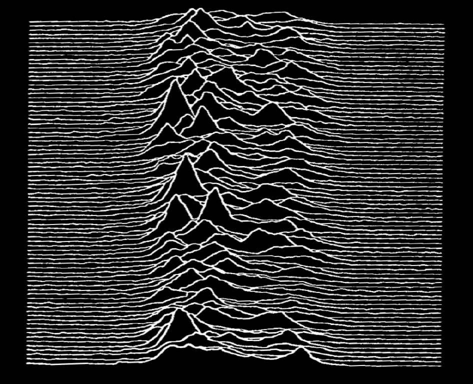
Many of you will be familiar with the iconic cover of Joy Division’s Unknown Pleasures album, but maybe fewer will know that it’s a plot of signals from a pulsar (check out this Scientific American article on the history). The length of the line is matched to the frequency of the pulsing so that successive pulses are plotted almost on top of each other. For many years this kind of plot did not have a well-known designation until, in fact, April this year:
I hereby propose that we call these "joy plots" #rstats https://t.co/uuLGpQLAwY
— Jenny Bryan (@JennyBryan) April 25, 2017
So “joy plots” it is.
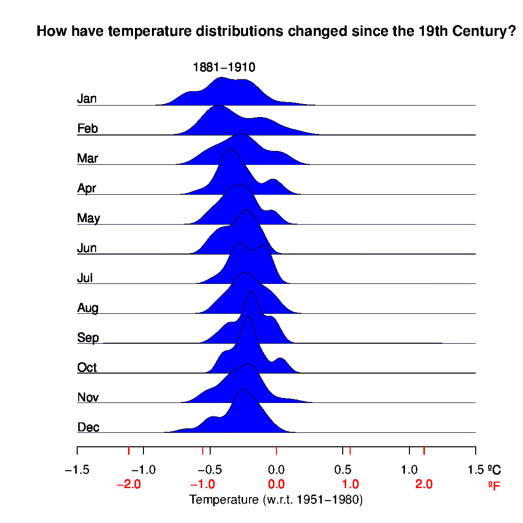
Anyway, after a nice example crossed my twitter feed earlier this week, I thought it would be fun to try out something similar for climate data – specifically GISTEMP. After a little playing around and putting together an animation of the results I produced this, showing successive monthly distributions for each 30 year climatology period (stacked every 10 years), and adding the last two years independently.
Global average monthly temperature distributions since the 19th Century from GISTEMP #joyplot pic.twitter.com/cmZ5MeWytk
— Gavin Schmidt (@ClimateOfGavin) July 19, 2017
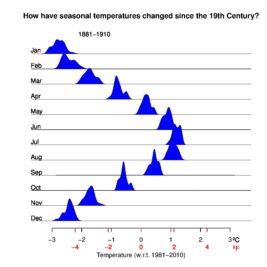
Another example from Chris Colose split the distributions in latitudes:
So I added future changes in latitude space… pic.twitter.com/EsyqObymEB
— Chris Colose (@CColose) July 19, 2017
But there is obviously more that one could do here, and so here are some variations on the theme. Some people preferred a different temperature scale, so I added a Fahrenheit line (though perhaps ice age units would the best: 1 IAU = 5ºC). Also, people wanted finer time resolution, so here it is with distributions recalculated every 2 and every 5 years.

And here is one showing the seasonal cycle as well (climatology taken from MERRA-2):
These should be downloadable if you want to use them elsewhere (just point back here for credit). Feel free to suggest other uses or variations in the comments, and if there’s time we can add them too.
If you want to play around with similar plots, the R code is here. The inputs are the monthly means from GISTEMP, and the seasonal anomalies from MERRA2. Should be easy enough to adapt to other data.
Nice addition to the visualization library. Many thanks
Great visualization with animation of real changes.THANKS!
Terrific! For those who can read graphs — admittedly not the majority of the population — makes it very clear that the coldest days now are like the hottest days in my grandfather’s time. Why doesn’t everybody know that?
Spencer @3: “the coldest days now are like the hottest days in my grandfather’s time”.
These are distributions of monthly averages, not daily data, I presume; though it’s not completely clear. Obviously, because of averaging months will have a lot less spread.
Still, seeing just how far the recent decades, and particularly the recent two years, are outside the early 20th century distributions is a bit eye opening.
The “joy plots”are akin to raster plots, used by physiologists for decades.
Elsewhere in the world of data visualization & semiosis , the GWPF has commissioned a cartoon to explain the work of Roger Pielke Jr.
It has been deconvoluted here:
https://vvattsupwiththat.blogspot.com/2017/07/pielkes-gwpf-performance-further.html
Data worms of joy!
Those are gorgeous and amazing!
I believe these kinds of things have been dubbed variable area wiggle traces and they are used when slant stacking signal returns for minerals exploration, ironically, mostly for petroleum.
The Python module PySeis apparently has a facility for plotting these.
Very cool!
Is the laggard latitudinal behavior of 44-64S likely due to the proportion of ocean?
Lets dance, put on your Red shoes and dance the Blues.
I take some comfort from the fact that I’m a resident of the 44-64S range of latitudes. Now please don’t all rush down here to join me!
Digby Scorgie – that puts you in Patagonia or the southern half of New Zealand’s South Island. If the latter, then, HI! I live in the northern half of the South Island, in the lee of the Southern Alps. It is supposed to be a dry climate here but we have had horrendous rainstorms – like a months rain in two days. The climatic fact of life here is that we are a small island in a large ocean. The ocean acts as a thermostat to some degree, but is also a source of water vapour, which usually makes itself felt on the windward side of the Alps, with a rainfall of metres/year.
What does it mean when the plotted data points flatten out more particularly in Oct and Nov. but not so much in May and Feb?
Similar but different. In March I noticed an Unknown Pleasures feel to a chart that I’d made of the date and extent of Arctic sea ice annual maxima since 1990. Some visual tweaks later, I posted it at Neven’s place.
http://forum.arctic-sea-ice.net/index.php/topic,179.msg107101.html#msg107101
And it is very nice to see new ways to visualize data. Just a few days ago saw the classic one now animated. useful because not everyone can grasp the ramifications.
http://ccimgs-2017.s3.amazonaws.com/2017SummerHeatPrepPackage/2017SummerHeatPrepPackage_BellCurve_Animated_en_title_sm.gif
Hi Gavin,
“1 IAU = 5ºC”
Why do you say 1 IAU = 5C? Annan and Hargreaves 2013 (https://www.clim-past.net/9/367/2013/cp-9-367-2013.pdf) gives a best estimate of 4.0C.
As far as I am aware, Annan and Hargreaves 2013 is the best estimate. Is there a more recent estimate I am unaware of? Or is there a reason you dislike Annan and Hargreaves 2013?
“She’s Lost Control” playing in the background. (If you classify the Earth as feminine and volatility as epileptic seizures.)
Is the one with the seasonal cycle global? It might be good to do this with a single hemisphere. I initially thought that it was striking that Jan is almost as warm as March used to be, but I don’t think that’s true in the sense I was thinking, because global data will have a damped seasonal cycle.
Anybody know why comments are appearing bylined in Finnish again? It happens every so often.
‘-1=e^ipi kirjoitti’, for example.
When I posted my last comment, Google Chrome reverted to showing bylines in English again!
I’ve seen the Finnish rendering of ‘says’ previously with Firefox, and only on RC.
It’s a mystery! A low priority one, however.
My God! The distributions in the first graphic crawl!
David beach @13
Not Patagonia and not the Wet Coast of the South island! Yes, we’ve had floods and fires and droughts, all hints of nasty things to come. Still, I’d rather be here than the Northern Hemisphere.
Is there a good article that explains temperature distribution in the way you are using it here? I’m familiar with the term as it relates to bodies of water, but not sure I am understanding how it is being used here for monthly or seasonal climate. Just want to be accurate if/when I share these amazing graphics with others.
It looks to me Like your charts are showing no significant temperature increase since 1890. Let me know if I am correct.
Thank you,
Rich Hood
[Response: You could not be more wrong. – gavin]
#21 Mal, there are definitely Finnish contributors to the site, so my guess is a rogue language=finnish tag somewhere that went away again, and Chrome being clever about it.
On-topic, these plots do a great job of showing a lot of information in a handful of dancing slugs.
I think you need to add some music to the latitude joy plot – or a voiceover of someone calling a race (for some reason, this plot makes me think of a horse race or an olympic sprinting race or something similar).
Revised, more coffee needed:
Somehow I am missing the link to download the plots. To me, the most striking thing about them is how far out to the right are the last couple of years. No one can look at them and talk about a “pause.” Thanks, Gavin.
CIP (#10)
Since you’re asking about my plot,the lagged behavior there is largely because of the ocean. It’s not just the heat capacity though (some older suggestions highlight the deep mixed layers and fact that heat is taken up and mixed downward), but actually a lot of the heat taken up by the Southern Ocean is being transported equatorward by the ocean.
Richard Hood @25
The temperature distributions shift to the warmer side by about a degree — and this is not showing an increasing temperature? I’m stunned.
Good grief, look where Richard Hood works: http://bestcarboncapture.ca/
What rough beasts, their hour come round at last,
Slouch towards Bethlehem to be born,
bringing the destruction of the heavens by fire,
and melting the elements in the heat?
https://www.theparisreview.org/blog/2015/04/07/no-slouch/
biblehub.com/2_peter/3-10.htm
Joy plots? In chemistry we’ve plotted data like this for years, such as for the time evolution of NMR spectra. They’ve always been called “stack plots”, in which in addition to the y-offset there is a small x-offset to allow changes in peak intensity to be clear. An example is shown here. http://www.process-nmr.com/pdfs/Reaction_Monitoring/tBuOH%20Reaction%20-%20Whitewashed.jpg
There’s nothing new under the sun, it seems.
Yes, add some music! :-)
Is there enough data to plot night temperatures, which might well be expected to change more than average temperatures?
This would be a great way to visualize the changes in datasets over time. Should be easy to demonstrate to naysayers how they often change in both directions from calibrations, etc.