Every so often people who are determined to prove a particular point will come up with a new way to demonstrate it. This new methodology can initially seem compelling, but if the conclusion is at odds with other more standard ways of looking at the same question, further investigation can often reveal some hidden dependencies or non-robustness. And so it is with the new graph being cited purporting to show that the models are an “abject” failure.
The figure in question was first revealed in Michaels’ recent testimony to Congress:
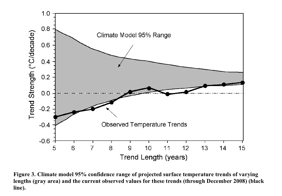
The idea is that you calculate the trends in the observations to 2008 starting in 2003, 2002, 2001…. etc, and compare that to the model projections for the same period. Nothing wrong with this in principle. However, while it initially looks like each of the points is bolstering the case that the real world seems to be tracking the lower edge of the model curve, these points are not all independent. For short trends, there is significant impact from the end points, and since each trend ends on the same point (2008), an outlier there can skew all the points significantly. An obvious question then is how does this picture change year by year? or if you use a different data set for the temperatures? or what might it look like in a year’s time? Fortunately, this is not rocket science, and so the answers can be swiftly revealed.
First off, this is what you would have got if you’d done this last year:
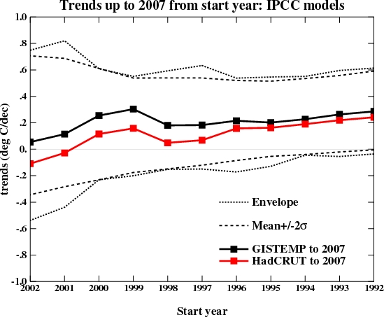
which might explain why it never came up before. I’ve plotted both the envelope of all the model runs I’m using and 2 standard deviations from the mean. Michaels appears to be using a slightly different methodology that involves grouping the runs from a single model together before calculating the 95% bounds. Depending on the details that might or might not be appropriate – for instance, averaging the runs and calculating the trends from the ensemble means would incorrectly reduce the size of the envelope, but weighting the contribution of each run to the mean and variance by the number of model runs might be ok.
Of course, even using the latest data (up to the end of 2008), the impression one gets depends very much on the dataset you are using:
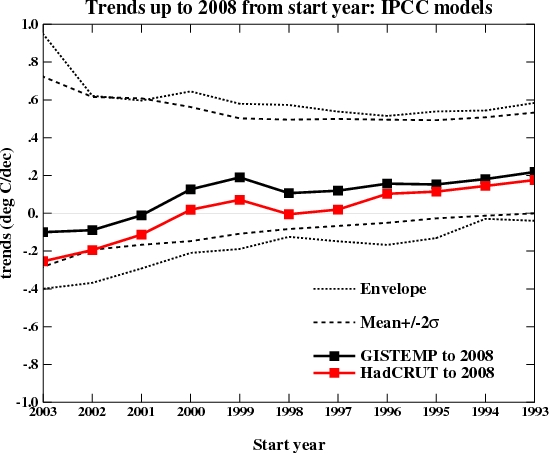
More interesting perhaps is what it will likely look like next year once 2009 has run its course. I made two different assumptions – that this year will be the same as last year (2008), or that it will be the same as 2007. These two assumptions bracket the result you get if you simply assume that 2009 will equal the mean of the previous 10 years. Which of these assumptions is most reasonable remains to be seen, but the first few months of 2009 are running significantly warmer than 2008. Nonetheless, it’s easy to see how sensitive the impression being given is to the last point and the dataset used.
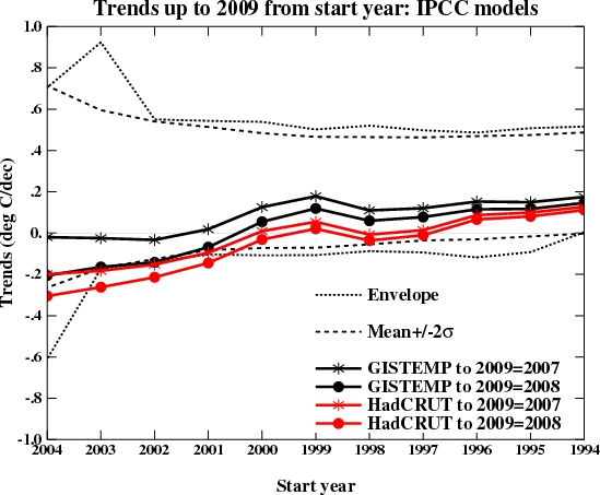
It is thus unlikely this new graph would have seen the light of day had it come up in 2007; and given that next year will likely be warmer than last year, it is not likely to come up again; and since the impression of ‘failure’ relies on you using the HadCRUT3v data, we probably won’t be seeing too many sensitivity studies either.
To summarise, initially compelling pictures whose character depends on a single year’s worth of data and only if you use a very specific dataset are unlikely to be robust or provide much guidance for future projections. Instead, this methodology tells us a) that 2008 was relatively cool compared to recent years and b) short term trends don’t tell you very much about longer term ones. Both things we knew already.
Next.
That might have to do with my 401K having largely kicked the bucket recently despite economists insisting the problems of the first 1/2 of the 20th century having been solved, while gravity still causes me all sorts of bruises when I stumble and fall …
Captcha suggests I get drunk when I think about the triumphant success of economics: more SAUTERNE.
Gavin: What does “OLS” mean?
I forwarded your email to me congressman’s office.
[Response: Sorry, Ordinary Least Squares – the basic linear regression technique. – gavin]
#43 Jeff:
There is ample opportunity to improve trees and other plants if we can agree that the key productivity criterium is efficiency of carbon capture. Cultivated potatoes are no more what they used to be in the wild.
In fact, an improvement on some of the sequestration ideas. Probably more greenwash than a solution, though.
Alan of Oz says:
“Most of his stuff is really just informed science fiction but he has contributed to Maths.”
Most of his stuff informed science fiction? Contributed to Maths?
You obviously do not understand much about physics. Dyson’s contribution to physics has been huge.
Climate science has its base in physics. I doubt very much that there is a climate scientist alive whose understanding of physics is as profound as Dyson’s.
Re. No. 37
Yes, UAH 1996-2009 is not flat, but 1997-2009 is for UAH, RSS and HADCRUT. 1998, 2000, 2001 and so on would show significant cooling trends. The only starting year since 1997 that would give a warming trend for these datasets is 1999. (GISSTEMP is different as it was the only dataset that showed 2007 as a particularly warm year. Also, compared with all the others, it has 2005 rather than 1998 as the warmest year.)
Gavin,
Thank you for the informative graphs. They have prompted me to make my first blog post. My question will expose my ignorance on the AGW topic but we all have to start somewhere… Have there been model runs that assume no human emissions of CO2 from burning fossil fuels? (Showing the envelope the trend should fall within naturally) It would be very interesting to me to see the same graphs you provided with the natural expectation for the gray area. I think this would go a long way in visually showing me how we are affecting the global temperature by letting me see side by side how things should be naturally versus how things are, as illustrated by your graphs. I apologize in advance first of all if this is common knowledge and secondly, if my terminology is incorrect.
Tad
[Response: Yes. The picture in question is here (from IPCC AR4 WG1 Fig 9.5). The lower panel is what you get without any human-caused emissions of greenhouse gases and aerosols, the upper panel is what you get if you include them. The black line is the observed temperature. – gavin]
#37
To be sure, the thirteen years shown in the graph Gavins provided are upward trending.
Below is an interesting 1-2-3 snapshot of the same data in more recent, decreasing windows. Again, I do not mean to suggest AGW theory is in any sense disturbed by these graphs or that we are in a cooling state. Clearly, though, there is a relative flatness in the last decade. Key word: relative. I think it’s an interesting mini-trend, others do not.
http://www.woodfortrees.org/plot/uah/from:1999/to:2009/plot/hadcrut3vgl/from:1999/to:2009/plot/uah/from:1999/to:2009/trend/plot/hadcrut3vgl/from:1999/to:2009/trend
http://www.woodfortrees.org/plot/uah/from:2000/to:2009/plot/hadcrut3vgl/from:2000/to:2009/plot/uah/from:2000/to:2009/trend/plot/hadcrut3vgl/from:2000/to:2009/trend
http://www.woodfortrees.org/plot/uah/from:2001/to:2009/plot/hadcrut3vgl/from:2001/to:2009/plot/uah/from:2001/to:2009/trend/plot/hadcrut3vgl/from:2001/to:2009/trend
[Gavin or current moderator, I am not savvy enough to turn links these into “here, here, and here” — please let me how or change it on your own. I apologize for the clutter otherwise.]
One thing that might happen is a larger year-to-year variation in temperature just because we are dealing with larger numbers. I am wondering if a larger spread is contributing the the severity of the flooding in North Dakota. The flooding seems early by a month compared to historic huge floods. A deeper winter followed by a more rapidly warming spring than historically known might account for the extra surge of water. I’ve seen exploration on the effect of warming on alpine snowpack, but it also ought to affect lower lying snow as well.
Finding extreme endpoints may be easier as warming continues.
From response to 28:
“I’d be more than happy to discuss these things with him if he had any interest in furthering his education. – gavin”
I presume he would, as he seems to lack the arrogance implied in the comment above.
Sven says, “The only starting year since 1997 that would give a warming trend for these datasets is 1999.”
Which happens to be the first year where the starting point is not strongly influenced by the 1998 El Nino. Next!
Jari says, “I doubt very much that there is a climate scientist alive whose understanding of physics is as profound as Dyson’s.”
And by the same token, the number of physicists who have a better understanding of climate than Dyson are legion. Expertise matters. Do you ask your electrician for advice on a heart problem?
> I think it’s an interesting mini-trend
http://dx.doi.org/10.1016/S0165-1765(99)00251-7
http://tamino.wordpress.com/2007/10/21/how-to-fool-yourself/
http://plasmascience.net/tpu/downloads/Kleppner.1992.pdf
http://www.youtube.com/watch?v=TZm7BM1WIEc
Steve Reynolds, Where economists are in general agreement (a rarity), I tend to listen to them. When their opinions contradict physical reality (e.g. assuming current models of economic growth can continue indefinitely), physical reality wins.
And how hard would it be to add error bars or confidence intervals to the charting at woodfortrees? Without them, folks like wossname up there can just use it to fool themselves.
This is a bit off-topic but a general comment on mitigating the effects of low occurrence, large magnitude outliers on calculated trends: use robust estimation methods rather than rather than methods based on first- and second-order statistics such as OLS. For example, report median and median absolute deviation rather mean and standard deviation. I mention this because mean and st.dev. are very sensitive to outliers and (I think) should be “taken with a grain of salt” unless skew and kurtosis are also reported. In contrast, median and median absolute deviation are pretty robust (in the colloquial sense as well as the mathematical one).
There’s a nice article by Willmott, et al. on the robust statistics in a recent issue of Atmospheric Environment: “Ambiguities inherent in sum-of-squares-based error statistics”, vol.43, p.749 (January 2009). And some book refs for those who are interested: Robust Statistics by Peter Huber, Robust Regression and Outlier Detection by P.Rousseeuw and A.Leroy. The Section of Statistics at Katholieke Universiteit in Leuven also has a very useful website, http://wis.kuleuven.be/stat/robust/
Chris
I found this useful
..From which you can see (I hope) that the series is definitely going up; that 15 year trends are pretty well all sig and all about the same; that about 1/2 the 10 year trends are sig; and that very few of the 5 year trends are sig…
The graphs selected by wmanny (#56) show a cooling trend for the period 2001-2009. This is obvious.
But this per se doesn´t say anything about climate sensitivity being wrong (or models, for that matter). It just shows that CO2 forcing is not fast enough to override all other forcings. If CO2 emmissions were, say, only 1/5 of it is, we would see much more pronounced cooling periods – even assuming today´s calculated sensitivity to be accurate.
How do models respond if you feed them with the ENSO fo the last 7 or 8 years?
(I´m a layman. I don´t know if it really works this way)
Alexandre, I’m just another reader here, not a scientist, not a statistician.
But I’ve read the comments and links. You haven’t, or haven’t understood why wmanny’s wrong.
So are you.
Here’s why (shorter version of what’s been said and linked above)
wmanny picked too short a period to know anything about a trend.
That’s all.
Can I enquire how the model ensembles would perform against the satellite temperature data (RSS/UAH)?
#54 Yari,
“Climate science has its base in physics. I doubt very much that there is a climate scientist alive whose understanding of physics is as profound as Dyson’s.”
With respect to the NY times article, he didn’t show a well reasoned understanding, rather
a matter of fact collage of incoherent thoughts. His mastery of physics may be doubtless,
but his grasp on climate science doubtful.
I would rather read a paper on Climate by Dyson, if you have one , please link…
Hank,
I am asking a question and not a rhetorical one. Repeatedly, though you seem unwilling to notice them, I through caveats around like rice at a wedding. Is it that you believe I am wrong to ask the question? If not, what am I wrong about? Why is “relative flattening” such a difficult premise? In any event, since you are inclined to turn my “mini-trend” into a trend, I offer yet another olive branch — how about we call it a “micro-trend”? I’ll go to nano- or pico- if necessary, but the question stands.
Walter
Getting back to the Michaels graph
#36
Some constructive criticism for Chip:
a) It appears that the trend length is wrong in the Michaels graph. Checking against the years in Gavin’s graph seems to show an “off by one” error. For example the trend since 1998 in HadCRUT (i.e. 0) is labeled as 11 year trend, but in fact is the 10 year trend.
b) As Gavin pointed out, the CI calculation is unclear. Obviously it should change because of (a) above, but you should clarify how it was calculated, and justify the departure from Gavin’s calculation. Or better yet, just use the correct calculation.
c) The uncertainty envelope for the observations should be included, as Gavin has done.
d) The other major data set, GISTEMP, should be included as Gavin has done.
Once you’ve done all that, you should also include the same graph for 2007, to make it apparent how much short-term trends can change in one year.
I have one more suggestion, but that will require a separate comment.
#47 et al – Re: Knowing which experts to trust
As with Pat Michaels, one good approach is indeed to look for a relationship between their source of funds, and the likely impact of their findings on the prospects and objectives of their benefactors. The case of the tobacco company scientists who found no link between smoking and lung cancer springs to mind.
Climatology as a whole should not escape this scrutiny either. I think I’m right in saying its ultimate source of funds – peer reviewers included – is virtually always the state; and, in the main, climatology’s findings currently provide the state with an excellent new rationale to expand itself, and vastly extend its control over society.
Being a scientist does not make a person immune to motivations of ideology and vested interest, however objective they otherwise may be. The lingering question is not so much what experts do tell the layman, but what they don’t.
For Don Keiller:
http://scholar.google.com/scholar?q=how+the+model+ensembles+would+perform+against+the+satellite+temperature+data+RSS+UAH%3F
Remember to note the “cited by” numbers and click there to see what later publications have relied on the article; read the footnotes, read the citing papers, check for errata, and note how the idea has changed over time)
For contrast, you’ll find you’ve posted a question much beloved of some of the usual sites that argue it ain’t happening. To make the comparison, use Google instead of Scholar:
http://www.google.com/search?q=how+the+model+ensembles+would+perform+against+the+satellite+temperature+data+RSS+UAH%3F
re 73. And why would they conspire amongst the 160+ sovereign countries and the thousands of climate scientists AND STILL MANAGE TO HIDE THE CONSPIRACY.
Even harder, do so with GWB in charge of the US government…
Try your explanation on sites about sept 11th. After that attack, governments had nearly carte blanche to do what they wanted with no oversight.
#68 Hank Roberts
I think my problem was a poor choice of words. I´m a layman as well as a non native English speaker.
Yes, my knowledge goes as far as to know that 7 or 8 years is too short a period to determine any climatic trend. My tentative reasoning did not aim to imply that.
I´ll try to rephrase it. The speed of the warming depends on the pace of GHG emmissions. Were this pace slow enough, you could even have much longer periods of cooling without challenging what we know about the climate sensitivity. You could, say, have 25 years of cooling like we had at the middle of last century. Other forcings would have room to cause that only because the GHG increase would be so slight (like it was last century). Yet this would not disprove the man made greenhouse effect.
Even at our present emmision pace, if these other forcings had enough intensity on the cooling side, we could have a 25-year cooling period even now. If the sun radiation had a steady many-decade strong enough drop, for instance, it could stabilize or even reduce the global temperature during this period, and this would not refute what is known about climate sensitivity to GHG.
So this is why I asked about ENSO. If it were possible to feed the models with the last 7 or 8 years of ENSO, what would they show? Wouldn´t they get much closer to the observed temperatures? Wouldn´t the better ex-post knowledge of the other forcings allow them to be isolated and better show the influence of GHG forcing in this recent period?
(I don´t know if ENSO is technically a “forcing”. I ask for some tolerance to inaccuracy here…)
Gavin said: “…short term trends don’t tell you very much about longer term ones.”
#24 Dick Veldcamp Gavin said to Gavin:
“…from a PR viewpoint … I am afraid that the message people will take from your graph is: “Hey, even the AGW-scientists get a cooling trend” (because the leftmost points are below zero), while not realising that a trend based on a few years (and hence the whole graph) is rubbish.”
This is a very real problem. Perhaps the addition of long-term trend information within the graph would help. Here’s my attempt to do just that:
http://deepclimate.files.wordpress.com/2009/03/global-surface-trends2.gif
The dashed line is the trend from 1979 to 2008 (0.17 deg C/decade in both GISTEMP and HadCRUT).
Ex. 1 Year 2003. Here we see that HadCRUT short-term trend is -0.25 deg C/decade. Yet the long term HadCRUT trend from 1979 has not changed. 1979-2003 is exactly the same as 1979 to present (0.17 deg C/decade).
Ex. 2 Year 1998. As is well known, the 10-year trend since the large El Nino is flat in HadCRUT and only 0.1 deg C/decade in GISTEMP. And yet the long term trend from 1979 is up from about 0.15 deg./decade in 1998 to 0.17 deg./decade at present.
It may surprise some that a long term trend can be greater than both trends in two sub-periods, as is the case for almost all “pivot” points as far back as 1995 in these data sets. That’s a fact that Michaels and the Cato Institute would like to keep well hidden. They shouldn’t get away with it.
You need to drop the word “trend” entirely. “trend”, in statistics (and therefore science), implies significance. You’re seeing noise, not a trend, and it’s not interesting, it’s *expected*.
You obviously do not understand much about physics. Dyson’s contribution to physics has been huge.
Actually his most important contribution was to condensed matter physics, and while it may be true that most if not all of climate science is attributable to condensed matter physics, most of that we take for granted now, however, when the subject under analysis here is land, sea and atmospheric response to solar incident radiation, we are indeed mostly referring to MACROSCOPIC physics.
Sometime in the near future work by Dyson as incorporated into condensed matter physics may very well indeed yield appropriate technological solutions to the climate change problem, but the fundamental result is not dependent on it. We knew about this problem long before we had big supercomputers. Condensed matter physics make it easier.
Captcha : may fossil
re 73. Funding from a source that has a financial stake in the outcome raises questions, but does not necessarily invalidate the science. In the case of Pat Michaels, his misrepresentation of James Hansen’s data, plus this particular exercise in obfuscation, cause me to distrust anything he says.
In physical sciences like climate science it is virtually impossible to be dishonest, since dishonesty in method or data is rather easy to expose (like this post). Of course there can always be honest differences about the interpretation of data.
Conspiracy of governments? Are you kidding? Kyoto would have been a roaring success if anything like that were afoot.
BFJ Cricklewood wrote in 73:
Maybe I can help. Here are the organizations that Patrick J. Michaels has (or has had) direct ties to…
http://www.exxonsecrets.org/index.php?mapid=1365
… with those that have received money from Exxon indicated by dollar signs. I have gone ahead and expanded the links for key individuals on those which have received the most money — and links to the organizations that those key individuals are tied to are automatically filled in. The organizations that have received the most funding are ALEC (American Legislative Exchange Council), CEI (Competitive Enterprise Institute), CFACT (Committee for a Constructive Tomorrow), the George C. Marshall Institute, Heartland Institute and Heritage Foundation. (The CATO Institute is still one of the smaller players so I’ll let people dig into that one for themselves.)
Clicking on the links that I have included just above will take you to the entries for those organizations in SourceWatch. There you will find out for example that ALEC, Competitive Enterprise Institute, Heartland Institute, and Heritage Foundation has been involved in both the defense of cigarettes and fossil fuels. However, back in the map if you hover your mouse over any organization and left-click left click on “More Info” you can bring up a bunch of information, including the main details, overview, further description, funding from Exxon for each year — well you get the idea. Follow the links and it will even bring you to pdfs of the form where Exxon declares its “charitable contributions” for tax purposes.
However, the map is only good for Exxon. It doesn’t include all of the other oil and other fossil fuel companies. But it is a start. Hopefully you can take it from here.
Mr. Cricklewood, you should check your assumption.
You’re assuming all climate science is paid for by governments — you believe most of the money spent on understanding this are in academia or civil service jobs rather than industry? And that it’s part of a plot by governments to extend their power?
I posted this link in the Climate Models FAQ topic a while back, suggesting this be part of the developing FAQ. Check it out, just to give you a start on learning how industry has been using climate modeling for a long time, successfully.
http://www.nap.edu/openbook.php?record_id=5470&page=11
Proprietary work for industry isn’t published routinely; you have to look a bit harder to find out about it.
Don’t expect industry to publish their scientific work. And don’t expect industry’s PR position to be consistent with its proprietary research funding.
http://scholar.google.com/scholar?num=50&hl=en&lr=&newwindow=1&safe=off&q=%22public+health%22+%22sound+science%22+%2Bpetroleum&btnG=Search
You have to be more skeptical about this kind of thing or you’ll fall for people who claim public health is s_c__l_sm.
PS to my comment above…
You can also bring up information on Patrick J. Michaels — the guy at the center of the web on…
http://www.exxonsecrets.org/index.php?mapid=1365
… by hovering your mouse over him and left-clicking.
This is some of his own funding (including coal):
… and here is the Exxon funding for the major organizations followed by Michaels’ role in them:
CEI – $2,005,000 – CEI Expert
CFACT – $582,000 – Board of Academic and Scientific Advisors
George C. Marshall Institute – $840,000 – Author
Heartland Institute – $676,000 – Expert
Heritage Foundation – $530,000 – Policy Expert
Hank Roberts:
“And don’t expect industry’s PR position to be consistent with its proprietary research funding.”
Exactly. The oil and gas industry denies climate models when they make projections of future climate – but at the same time uses paleoclimate models to help them figure out where oil and gas may be located.
Looking for best gcm model using anthropogenic surface processes (anthropogenic forcings) without economic specific data (ie GDP or average income etc).
#67 Alexandre
My apologies if I do not fully understand your context?
I thought about what you were getting at and to get it in context you may need to understand that natural variability exists both in the natural and anthropogenically influenced climate.
You cant say that the anthropogenic effect is being completely overridden by natural right now though. If that were true, then the average temperature would be following the natural trend-line, which is far below where we are.
Take a look at this chart:
http://www.ossfoundation.us/projects/environment/global-warming/natural-variability/overview/image/image_view_fullscreen
The current lower short term trend/temperature is still above what would be expected in the natural cycle. Short term trends are meaningless when you are looking at long-term and overall forcing and inertia.
#81
IMHO, SourceWatch.org (yes, I’m a sometime volunteer contributor) is a great resource.
The SourceWatch article on Pat Michaels begins thus:
Patrick J. Michaels (±1942- ), also known as Pat Michaels, is a “global warming skeptic” who argues that global warming models are fatally flawed and, in any event, we should take no action because new technologies will soon replace those that emit greenhouse gases.
Michaels, who has completed a Ph.D. in Ecological Climatology from the University of Wisconsin-Madison (1979) is Editor of the World Climate Report. He is also associated with two think tanks: a Visiting Scientist with the George C. Marshall Institute and a Senior Fellow in Environmental Studies with the Cato Institute.
The Cato ad, Michaels’ recent House testimony and the RealClimate commentary posts have all been added to the article.
Alexandre (76) — Learning about how climate attribution studies are done might aid you with your question, to which I don’t know the answer.
Chip, you say:
“I bring this up just to clarify that we are comparing observations with the distribution of all model trends of a particular length, not just those between a specific start and stop date (i.e. we capture the full (or near so) impact of internal model weather noise on the projected trend magnitudes)”
Your i.e. does not follow. Are you really claiming that models perfectly simulate “internal model weather noise”? Do you believe that if you examine model output you are looking at the real world?
I mean, if you put a variation (like a sine curve) on top of an increasing trend (exponential, linear or logarithmic), you get a combined trend + variation – read the time series link. However, are you assuming that these natural variations are periodic oscillations? Are you thinking of the trend and the variations in such hopelessly simplistic terms – as if we could model global climate with a handful of exponential and trigonometric functions, as Douglass & Knox tried to do?
Even with the unwarranted simplification, let’s say we apply your procedure to a sine curve superimposed on a linear temperature increase, but instead of using short time scales, we use long time scales – the time scales at which natural fluctuations average out? Yes, we know that at short time scales natural variations can dominate the global warming trend – but why didn’t you look at 320 months, 640 months, etc?
Take a look at the trends in ocean heat content over the past few decades – the models predict a steady increase, but the data shows a steplike advance.
http://www.physorg.com/news133019164.html
That’s another puzzling thing about your approach – the focus on a single metric. Why not look at ocean temperature trends vs. model predictions as well? How about Arctic sea ice volumes vs climate model predictions – what does that one look like?
From that perspective, your work just looks like propaganda aimed at introducing doubt into the discussion, nothing more – right along the lines of “the world is slipping into a cooling period because of the PDO.”
Now, for real issues related to climate modeling, keep in mind that the real internal variability is starting to be captured – not by statistical hand-waving, but rather by using ensembles of global circulation models that rely on numerical integration of climate equations:
http://www.precaution.org/lib/warmer_after_2009.070810.pdf
That’s another test of climate models, specifically of skill in predicting the natural variation contributions – but models have already been well-tested, for example, Pinatubo confirmed that the basic radiative balance and ocean heat absorption issues were fairly well understood, and the 2xCO2 = 3C heating still seems about right.
The only thing left for denialists to do is nit-pick over a small group of residual issues, while also using PR methods to spread the message.
#76 Alexandre
I understand about poor choices of words, not an uncommon problem in such a complex subject. I’m sure I still do it all the time :)
Here is the general picture of the Climate Forcings:
http://www.ossfoundation.us/projects/environment/global-warming/forcing-levels
I’m a layman also, but from what I can tell, you would actually need long term negative forcing that reduced the positive forcing more to get longer term negative trend. Since the forcing is still around +1.6 W/m2, I expect continued long term warming. If we increased aerosol output thus increasing negative forcing through our industrial processes we could increase the negative forcing component. There are large risks in increasing pollution as well though.
As Dr. Hansen and others have pointed out, we made a deal with the devil and we are the devil in this context. We added positive forcing and negative forcing. If we get to a point where we can no longer pollute due to effects on human population… well, you can begin to imagine the dilemma.
Also, the amount of increase in GHG’s in the last century can not reasonably be considered slight when considering forcing levels.
This took us from a natural cycle forcing range of around 0 W/m2 to -3.4W/m2 (interglacial/glacial) to a whopping +3.8 W/m2 to -3.4Wm2.
It is difficult to see this as ‘slight’.
Even at solar minimum and if that minimum period persists, it is hard to fathom the positive forcing and feedbacks not overriding the negative. There would have to be a physical reason for it to do so.
As far as ENSO, I’m pretty sure their effects are fairly well considered and that those considerations are getting better all the time. There are a lot of pieces in the climate puzzle.
Dale Power says:
It doesn’t even matter if it is a lie, as long as people hear it several times, it will be excepted by most as having been fact.
How very true Dale Power, in all sorts of contexts.
82 Hank Roberts
No, not all is by governments. Just the (ovewhelming) majority of it.
Governments, like other organisations, spend money on what will help them grow and prosper. Call that a ‘plot’ if you must.
Mr. Cricklewood says: “Climatology as a whole should not escape this scrutiny either. I think I’m right in saying its ultimate source of funds – peer reviewers included – is virtually always the state; and, in the main, climatology’s findings currently provide the state with an excellent new rationale to expand itself, and vastly extend its control over society.”
Congratulations Mr. Cricklewood, with this paranoid rambling, you have graduated from the ranks of paranoid crank to full blown nutjob. I hope you will use these new powers wisely.
Deep Climate wrote in 87:
Definitely a great resource. Extensive and in depth. Still I like the interactive map at Exxon Secrets:
http://www.exxonsecrets.org/index.php?mapid=1365
A lot of facts if you know how to use it.
However, another good place to try is of course DeSmogBlog at:
http://www.desmogblog.com
They may not have one definitive entry on each subject, but they have a bunch of articles on Pat Michaels, ALEC (American Legislative Exchange Council), CEI (Competitive Enterprise Institute), CFACT (Committee for a Constructive Tommorrow), George C. Marshall Institute, Heartland Institute, and Heritage Foundation. I am sure that many of the other organizations show up as well.
GBS – Aesthetic Engineer (85) — I’m not sure your question makes sense. AFAIK all the GCMs currently in use have skill or they wouldn’t be used. AFAIK all just include the physics, nothing about economics, etc.
28. Gavin;
The notion that Freeman ” has never had a conversation with a climate modeller” seems completely over the top.
His contributions to hydrodynamics reflect long association not just with Princeton modelers like Mahlman, but La Jolla oceanographers like Higgens-Longuet, and I suspect his views reflect the formers’ oft-stated skepticism about the difficulty of making decadal projections when decadal processes and parameters are imperfectly understood.
It is always a temptation to impute too much to too few words– a NYTimes report of a cocktail party remark , or a simple declarative sentence addressed at NYRB readers, should not be elided with a Phys. Rev. review article.
[Response: Sure – but his statements sound like nothing I have heard or would have implied based on discussions with actual modellers ( and I’ve talked to most). If he wanted such a conversation I’d be happy to host it here. Dyson may be wicked smart but on this he is way out. – gavin]
Like Lowells and Cabots, chic ubergeeks may speak only to each other and to God, but as RC gets cut a lot of slack for its devotion to clarity, a physicist’s physicist like Dyson may deserve some as well.
#56 Tad – Gavin’s reply
Thank you Gavin. The linked graphs were a great help in putting this discussion into context for me.
Tad
Note to John P. Reisman:
This is a just-published report on the role of the negative aerosol forcing over the Atlantic ocean:
http://www.sciencemag.org/cgi/content/abstract/1167404v1
The Role of Aerosols in the Evolution of Tropical North Atlantic Ocean Temperature Anomalies, Evan et al. Science Mar 26 2009
The press release is here:
http://www.sciencedaily.com/releases/2009/03/090326141553.htm
The only thing that raises some questions is the nature of the simple physical model they used to estimate the temperature response of the oceans, and the resulting error bars on their estimates of the aerosol contribution. This claim is a little iffy, though:
See earlier research from this group:
http://www.sciencedaily.com/releases/2006/10/061010022224.htm
The question involves the warming of the Atlantic, as reported in Levitus 2005, who reported 7.7, 3.3, and 3.5 x 10^22 Joules for the Atlantic, Pacific and Indian Oceans. That is a long-term trend over the period from 1955-2003, while the Evan et al. paper only looks at the past 26 years of aerosol data (satellite limitations), meaning that a direct comparison is difficult. Anyway, the most up-to-date ocean study seems to be this:
http://www.nature.com/nature/journal/v453/n7198/abs/nature07080.html
That doesn’t really match with an aerosol explanation, however – the question will be to see what datasets Evan et al. used. If the warming was overestimated, then the effect of aerosol reduction would also be overestimated.
In any case, this is legitimate science, though ocean response estimates based on simple models tend not to be very reliable, and the percentage claims must have very large error bars, probably asymmetric error bars at that – systematic errors are common in simple ocean models.
To understand this, take a look at CLIMATE CHANGE: Confronting the Bogeyman of the Climate System, Richard Kerr, Science 2005
In particular, see Carl Wunsch’s comments:
Notice also that the most modern coupled atmosphere-ocean models fail to produce anything like a halt in the MOC. These are some of the reasons why simple ocean models don’t carry much weight.
Now, as far as the media effort to assign a percentage of the Australian drought to global warming, that is a very strange issue indeed:
Global warming 37 pct to blame for droughts-scientist
Wed Mar 25, 2009 Reuters
However, a little searching reveals that Dr. Peter Baines has never published anything related to drought in Australia, whatsoever. Where does this data come from, that Reuters published as fact?
Not a very good sign at all. How does Reuters (David Fogarty reporting as the Reuters Climate Change Correspondent) justify that? The article has appeared in quite a few places, such as the Toronto Star – but why? Normally, an article like this follows the publication of a scientific article – and how did we go from being unable to assign any specific event to global warming, to being able to assign a 37% contribution from global warming? Could it be 75%? Or 15%? Or are we just supposed to take it on faith?
In other words, most of modern science is simply a plot to extend the power of government, and has no basis in objective reality or data, right?
May I buy you a cigarette? Or 1,000,000 of them? And light them for you?
Because, I’m sure, just like Richard Lindzen, probably the most scientifically credible skeptic out there (tenured at MIT and all), you believe that the evidence that cigarette smoking can lead to lung cancer and heart disease is just a “plot” to extend government power.
Ray Ladbury No.60
“Which happens to be the first year where the starting point is not strongly influenced by the 1998 El Nino. Next!”
And so are all the years after 2000 (incl.) not influenced by 1998 él nino. Next!