The blogosphere (and not only that) has been full of the “global warming is taking a break” meme lately. Although we have discussed this topic repeatedly, it is perhaps worthwhile reiterating two key points about the alleged pause here.
(1) This discussion focuses on just a short time period – starting 1998 or later – covering at most 11 years. Even under conditions of anthropogenic global warming (which would contribute a temperature rise of about 0.2 ºC over this period) a flat period or even cooling trend over such a short time span is nothing special and has happened repeatedly before (see 1987-1996). That simply is due to the fact that short-term natural variability has a similar magnitude (i.e. ~0.2 ºC) and can thus compensate for the anthropogenic effects. Of course, the warming trend keeps going up whilst natural variability just oscillates irregularly up and down, so over longer periods the warming trend wins and natural variability cancels out.
(2) It is highly questionable whether this “pause” is even real. It does show up to some extent (no cooling, but reduced 10-year warming trend) in the Hadley Center data, but it does not show in the GISS data, see Figure 1. There, the past ten 10-year trends (i.e. 1990-1999, 1991-2000 and so on) have all been between 0.17 and 0.34 ºC per decade, close to or above the expected anthropogenic trend, with the most recent one (1999-2008) equal to 0.19 ºC per decade – just as predicted by IPCC as response to anthropogenic forcing.
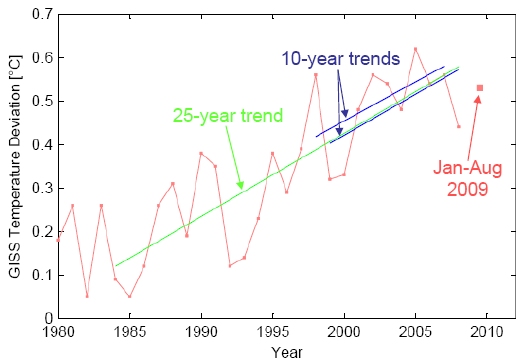
Figure 1. Global temperature according to NASA GISS data since 1980. The red line shows annual data, the larger red square a preliminary value for 2009, based on January-August. The green line shows the 25-year linear trend (0.19 ºC per decade). The blue lines show the two most recent ten-year trends (0.18 ºC per decade for 1998-2007, 0.19 ºC per decade for 1999-2008) and illustrate that these recent decadal trends are entirely consistent with the long-term trend and IPCC predictions. Even the highly “cherry-picked” 11-year period starting with the warm 1998 and ending with the cold 2008 still shows a warming trend of 0.11 ºC per decade (which may surprise some lay people who tend to connect the end points, rather than include all ten data points into a proper trend calculation).
Why do these two surface temperature data sets differ over recent years? We analysed this a while ago here, and the reason is the “hole in the Arctic” in the Hadley data, just where recent warming has been greatest.
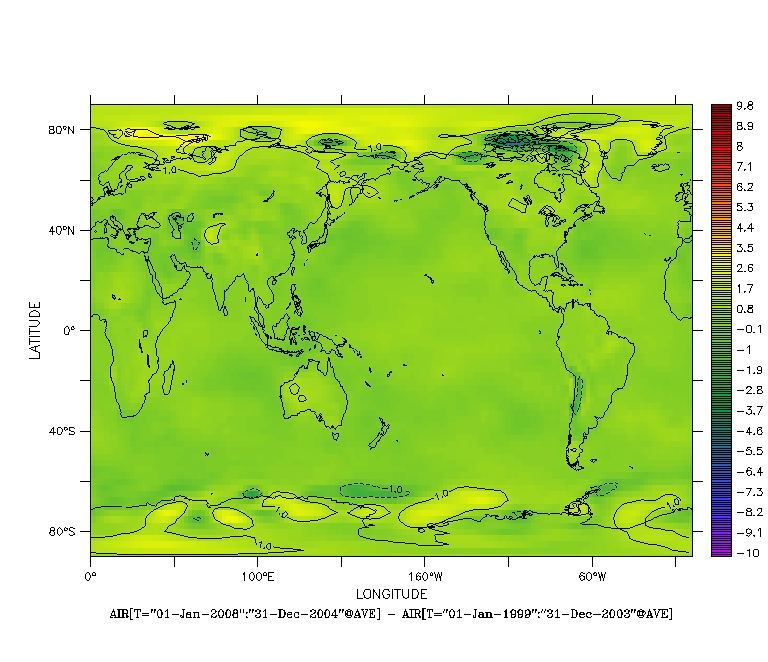
Figure 2. The animated graph shows the temperature difference between the two 5-year periods 1999-2003 and 2004-2008. The largest warming has occurred over the Arctic in the past decade and is missing in the Hadley data.
If we want to relate global temperature to global forcings like greenhouse gases, we’d better not have a “hole” in our data set. That’s because global temperature follows a simple planetary heat budget, determined by the balance of what comes in and what goes out. But if data coverage is not really global, the heat budget is not closed. One would have to account for the heat flow across the boundary of the “hole”, i.e. in and out of the Arctic, and the whole thing becomes ill-determined (because we don’t know how much that is). Hence the GISS data are clearly more useful in this respect, and the supposed pause in warming turns out to be just an artifact of the “Arctic hole” in the Hadley data – we don’t even need to refer to natural variability to explain it.
Imagine you want to check whether the balance in your accounts is consistent with your income and spendings – and you find your bank accounts contain less money than you expected, so there is a puzzling shortfall. But then you realise you forgot one of your bank accounts when doing the sums – and voila, that is where the missing money is, so there is no shortfall after all. That missing bank account in the Hadley data is the Arctic – and we’ve shown that this is where the “missing warming” actually is, which is why there is no shortfall in the GISS data, and it is pointless to look for explanations for a warming pause.
It is noteworthy in this context that despite the record low in the brightness of the sun over the past three years (it’s been at its faintest since beginning of satellite measurements in the 1970s), a number of warming records have been broken during this time. March 2008 saw the warmest global land temperature of any March ever recorded in the past 130 years. June and August 2009 saw the warmest land and ocean temperatures in the Southern Hemisphere ever recorded for those months. The global ocean surface temperatures in 2009 broke all previous records for three consecutive months: June, July and August. The years 2007, 2008 and 2009 had the lowest summer Arctic sea ice cover ever recorded, and in 2008 for the first time in living memory the Northwest Passage and the Northeast Passage were simultaneously ice-free. This feat was repeated in 2009. Every single year of this century (2001-2008) has been warmer than all years of the 20th Century except 1998 (which sticks out well above the trend line due to a strong El Niño event).
The bottom line is: the observed warming over the last decade is 100% consistent with the expected anthropogenic warming trend of 0.2 ºC per decade, superimposed with short-term natural variability. It is no different in this respect from the two decades before. And with an El Niño developing in the Pacific right now, we wouldn’t be surprised if more temperature records were to be broken over the coming year or so.
Update: We were told there is a new paper by Simmons et al. in press with JGR that supports our analysis about the Hadley vs GISS trends (sorry, access to subscribers only).
Update: AP has just published an interesting story titled Statisticians reject global cooling, for which they “gave temperature data to four independent statisticians and asked them to look for trends, without telling them what the numbers represented”.
http://www.cdc.noaa.gov/map/images/rnl/sfctmpmer_30a.rnl.gif
Very warm indeed. Its amazing to even ponder on the possibility of a cooling when viewing such a display.
Although the evidence is very short term, cooling means cooling, and there ain’t much of it going around.
From the comments made here, it seems that a 10 (or even 20) year pause in warming wouldn’t be enough to refute the AGW thesis. So I wonder how long of a pause/cooling trend would be required to send you all back to the drawing board/super computer?
Leaving aside the possibility of cooling, there is still the issue of how rapid the warming will be. Within the simulation results, there does seem to be a pretty wide range of outcomes, with some models predicting much higher rates of warming than others. These more dire outcomes are often cited when trying to create a sense of urgency for policy actions. So how long of a period of ‘below trend’ warming would be required to discredit the more dire predictions?
“Rubbish. This is a toally nonsensical statement. It precludes all the other GHGs and other causes of climate forcing.”
Correct, Skeksis.
Ergo the position that marc was asking “would the temperature go up evenly” is false.
It is also why your denialist friends’ insistence that AGW is wrong because CO2 has gone up recently and over two selected points the temperature has gone down is likewise totally nonsensical, since that too precludes any other cause of climate forcing.
In your glee at this apparent attack vector, I’m afraid you’ve shown that you CAN think this through, but that you merely don’t.
Which isn’t skepticism.
TimJ:
Yes it has:
http://BartonPaulLevenson.com/Correlation.html
No, they have not:
http://BartonPaulLevenson.com/Ball.html
http://BartonPaulLevenson.com/Reber.html
http://BartonPaulLevenson.com/VV.html
Depends on how much in the way of greenhouse gases we emit, doesn’t it?
“From the comments made here, it seems that a 10 (or even 20) year pause in warming wouldn’t be enough to refute the AGW thesis”
Well, one reason is that the temperatures on the decade average are still going up, so no pause at all.
Without such a pause, there’s no expectation that a hypothetical pause for 10 or even 20 years will (in the absence of such a pause) cause AGW to be refuted by the evidence.
Brian Dodge:
India and Pakistan have already exchanged fire and had troops killed over the question of which side owned a glacier.
Marc, if you’re talking just about taking the surface temperature of the earth as a whole, then this won’t help any, since you’ll be ignoring the considerable sink of energy known as “The honking great big lump of ocean”. Satellites not being all that great at looking deep into the oceans.
Thomas and Hank:
You take the average temperature recorded in each equally-sized grid square, then average those figures. I think Arrhenius was using 15 C in 1896 (288 K), and I know Hulbert got 287 K in 1931. The web page for the ISCCP gives 288.4 K as the average for 1983-2008.
Jari #90, note that the picture is only for illustration — and nothing more was claimed. GISTemp doesn’t use any reanalysis products.
Excellent post – but it is amazing how much rubbish is out there about the “global cooling”! But, tell me, why we don’t rely more on the satellite record as more years are accumulated wtih it? Ultimately, it should be the most reliable temperature record.
Andrew Freedman (97),
There are no measurements in a large part of the Arctic, and the Hadley centre decided not to fill it in (because they don’t want to introduce extra uncertainty), whereas GISS uses a filling procedure based on nearby stations to estimate the temperature in the uncovered part of the Arctic. If the Arctic warms faster than the global average (which it does), Hadley’s approach results in an underestimate of the global average temperature anomaly.
This post has more:
https://www.realclimate.org/index.php/archives/2008/11/mind-the-gap/
For Karl @102, who asks the question that seems to come up at least once in practically every thread, since there was already a ~30 year period of cooling or flat temperatures in the mid 20th C (~1945-1976) yet the trend for the century as a whole was not only positive, but steeply so, 10, 20, or even 30 years of less steep warming or even cooling does not and can not refute or discredit the AGW thesis.
In addition, Karl seems to be unaware that the more dire model projection outcomes occur with the larger assumed emission scenarios, which are entirely unpredictable and dependent not on physics, but on what we as a species decide to do in terms of burning fossil carbon fuels. Don’t blame the modelers for not being able to predict future human behavior.
#79 Krog
My interpretation based on your answer is that you don’t care about learning the answer to your questions… So why did you ask? Is it that:
1. You like to ask questions you don’t want answers for?
2. You are ignoring the facts?
3. You like disrupting the thread?
4. You like wasting peoples time?
5. You are inconsiderate?
6. You like seeing your words online?
7. You are bored and have nothing better to do?
You should read page for of the IPCC report as suggested. It’s only one page (actually about two paragraphs and a graphic with a description). But I guess two paragraphs are a bit much to ask you to read. Are you opposed to educating yourself and science?
To compare ‘a page’ in a report to War and Peace… Hmmm… How moronic.
BTW The answer is more simple than you think. Just add up the positive and negative numbers and their ranges that are contained in the two paragraphs.
Or am I grossly misinterpreting that which you apparently infer/state in your post?
Climate Denial Crock of the Week takes on the distortions of this issue –
http://www.youtube.com/watch?v=khikoh3sJg8
Marc (#47), Mark is right–the thermal “inertia” of the system means that there’s not much result on short time scales from orbital eccentricity. (The various orbital cycles have been well studied, and are nicely illustrated at the Wikipedia article on Milankovitch cycles–though the animation there seems to cause my browser some hiccups these days.)
However, there is a longer-term climatic result as the eccentricity and axial precession affect the hemispheres differentially. This is briefly discussed in this story about Kaufman 2009:
http://www.cbc.ca/technology/story/2009/09/03/climate-environment-arctic-change.html
(The original press release for the Kaufman paper goes into more detail, IIRC.)
WRT your first question: if you recall, the marked effects of Pinatubo on global temps showed up fairly immediately, and they were a result of (essentially) reducing the effective insolation. So you can see that solar effects can indeed show up on relatively short timescales.
There’s a bit more discussion here:
http://trs-new.jpl.nasa.gov/dspace/bitstream/2014/20804/1/98-1888.pdf
Karl 7 October 2009 at 1:05 AM:
For the past several decades, climatologists have agreed that 30 years is usually enough data to show long-term global trends in global surface temperature data. Most weather cycles (ENSO, NAO, AO, etc) have a much shorter period than 30 years. A 30-year period with no upward trend in global surface temperature would be strong evidence that the global climate was no longer warming. Even 20 years would be substantial evidence.
However, a non-warming earth would not be evidence that CO2 (for example) was not a greenhouse gas. There are numerous other factors affecting climate (as has been covered here many times in the past). One example would be some aerosols, which cause cooling. From about 1940 to about 1970, global surface temperature trended slightly downward. The cause was probably cooling from aerosols being sufficient to offset greenhouse gasses like CO2. Note that aerosols are still causing some cooling, but greenhouse gasses are more than sufficient to offset that cooling. A typical breakdown of factors affecting climate can be found on page 4 of the IPCC AR4 WG1 summary for policy makers, which I have linked to in a previous post. (Keep in mind that CO2 accumulates, while aerosols rain out, so if emissions of both CO2 and aerosols were constant, CO2 levels would rise, while aerosol levels would stay constant, and the warming from CO2 would eventually overpower the cooling from aerosols.)
GISTEMP and Hadley CRU are not the only evidence in favor of a warming climate. The ranges of plants and animals which are limited by temperature are expanding toward the poles. Gardeners and farmers in New England can now regularly grow many crops which were once on viable in the south. Glaciers are melting world wide.
“Actually, it’s a Steckis own goal … Mark doesn’t claim that CO2 is the only cause for rising temps, and Steckis takes him to the woodshed for suggesting that Mark claims that CO2 is the only cause.
Own goal, Steckis.”
On reflection. You might be right.
re 116:
No. Am.
Don’t treat skeptics as a lumped phenomenon. Most don’t claim to have the scientific background to make judgements. They are expressing intuitive doubt which has been developed over years over reading and listening to popular crap that ultimately proved wrong. Medical advice is one common area in which they’re told one thing today only to be made fools of later. They don’t know what else to do, but remain skeptical. This is a separate sociological issue. You can pounce on high-profile skeptics if you want, but the average citizen that remains skeptical makes a good point – their friends who seem sure about climate change can’t explain their own view. In other words non-skeptics can’t explain why, they simply chose to get on that side of it. And most people just don’t care because they don’t believe anything can or will be done about it. So quit waging war like this, as if the real problem is that everyone is stupid, except for you.
I think that one difficulty folks have with the orbital eccentricity/aphelion thing is that most haven’t lived far enough north or south to really experience the “midnight sun” effect. They know about it in an academic sort of way, but tend not to integrate that knowledge into other topics.
So, thinking about the global effect of orbital eccentricity, you want to remember that there are big chunks of the globe at high latitudes that have zero solar exposure for periods of up to several months. (And conversely, of course, corresponding periods of 24-hour solar exposure at the other end of the seasonal cycle.)
On another sub-topic, the lower trop anomaly on UAH for September is up on Roy Spencer’s UAH graph page as .42–maybe the 4th- or 5th-highest value ever, according to Eyeball Mk. I. Of course it’s a fairly volatile metric; May was about 0, IIRC. (And then there’s that whole UAH seasonal artifact question.)
Temperatures are continuing to rise.Check it out:
“A simple mathematical calculation of the temperature change over the latest decade (1998-2007) alone shows a continued warming of 0.1 °C per decade. The warming trend can be seen in the graph of observed global temperatures. The red bars show the global annual surface temperature, which exhibit year-to-year variability. The blue line clearly shows the upward trend, far greater than the uncertainties, which are shown as thin black bars. The recent slight slowing of the warming is due to a shift towards more-frequent La Niña conditions in the Pacific since 1998. These bring cool water up from the depths of the Pacific Ocean, cooling global temperatures.”
http://www.metoffice.gov.uk/climatechange/guide/bigpicture/fact2.html
A (slight) slowing of the warming, of course, doesn’t indicate a cooling. It merely means that the warming isn’t keeping up the same pace as in prior decades.
Mark(57) says, “After all, EVERY SINGLE TIME you take a measurement, you are making an educated guess as to the reading on the scale.”
Now that is just plain silly bombast!
Sorry; couldn’t resist.
Create the problem, Steer the reaction, Those who created the problem propose the solution. Manufacture cognitive dissonance. Do it over and over again.
This is the Hegelian Dialectic.
What is the Hegelian Dialectic?
http://www.crossroad.to/articles2/05/dialectic.htm
Well Dr. Roy’s UAH put’s September 2009 at just 0.012C anomaly less than the 0.432C+ anomaly of 1998. Global cooling pause and all during this century deep solar minimum? All that snow cover missing in Northern Siberia and 1.7 million km square sea ice area per the Cryosphere might have something with that as well… no wait, it’s adiabatic cooling due atmospheric pressure reduction at sea level, because of Carbon binding to O2, which then is absorbed by the oceans… I read it here somewhere, post 594 by Tony. A Wicker Man?
The applicable IPCC projection charts, emissions history and observational data (mean of Hadcrut/GISS/NCDC) on global surface temperature:
http://i161.photobucket.com/albums/t231/Occam_bucket/IPCCTemperatureProjection.png
Astonishing that anyone could honestly infer an underlying cooling trend from this data. It clearly shows a warming trend that closely follows the IPCC A1F1 scenario projection – the path we are most closely following so far. The cherry picking of subsets of this data is naive or purposely missleading as even this complete data set has only recently become long enough to adequately gauge IPCC projections – hence my omission of the AR4 projections.
One trend that has always bothered me is this one:
http://www.woodfortrees.org/data/hadcrut3vgl/from:1910/to:1940/plot/hadcrut3vgl/from:1910/to:1940/trend
1910-1940, trend ~= 1.5K/decade. Mauna Loa doesn’t go back that far, so I can’t plot it on WFT, but surely CO2 was relatively stable until after WWII? It was around 315ppm in 1958, and if you extrapolate it linearly by eye back to 1940 you hit somewhere near 280ppm, which I gather is the estimate of pre-industrial CO2:
http://www.woodfortrees.org/plot/esrl-co2/plot/esrl-co2/trend/plot/square:10/from:1940/scale
I understand the aerosol explanation of the dip from 1940-1970 that ‘llewelly’ referred to @116, but I’ve never heard (or can’t remember!) one for the earlier pronounced rise, for which the trend almost matches the last 30 years:
http://www.woodfortrees.org/plot/hadcrut3vgl/from:1910/to:1940/mean:36/plot/hadcrut3vgl/from:1910/to:1940/trend/plot/hadcrut3vgl/last:360/mean:36/plot/hadcrut3vgl/last:360/trend
If it wasn’t CO2, what process could have caused that earlier rise, and has this process stopped now?
Michael, you’ve confused Big Coal with the government.
This isn’t unusual, and has been true sometimes, in some places. But that’s not so-cia-lism, it’s corporatism.
The people who caused the problem are long since dead, and the companies they founded are now the people trying to fool you into thinking they’re your friends and the gummint is your enemy.
The rotating globe shows some interesting details besides the larger-scale trends – there seem to be some di/multipole pairs of warming and cooling – in southwest-central Asia, part of the Andes, and cool(ing) spots around some islands and protrusions of Eurasia enveloped and next to the Arctic warm spot. Any thoughts? (Is their more snow or cloud cover over the islands near the warm water, for example? Are these trends associated with changes in circulation patterns?)
Also a hot-spot over Lake Superior. Ice albedo feedback, I’d suspect. (not related much, but I saw on the Weather Channel several days ago that there was lake effect rain.)
“Now that is just plain silly bombast!”
No, Bob bob. THAT was plain silly bombast.
When you read a thermometer with gradients on the side, you cannot see the EXACT line that the volume of the thermometer content settles at.
But you can see it isn’t exactly at one of the markings either side.
So do you throw your hands up in disgust because you can’t make a reading, or do you GUESS whether it’s on one line or another, or even figure some fraction between the two and interpolate?
Because from your comments it seems like you are a very poor lab worker.
Jack says:
“Most don’t claim to have the scientific background to make judgements.”
The DO claim enough expertise to override those who DO have the scientific background to make judgements.
“They are expressing intuitive doubt which has been developed over years over reading and listening to popular crap”
Yes, the denialist creed. Definitely populist crap.
” that ultimately proved wrong”
Getting the denialists to understand that they’ve been proven wrong is the hard part.
They’re adamantly opposed to understanding.
Jack, if it’s true “They don’t know what else to do, but remain skeptical. ” then why are they so selectively credulous?
If you were skeptical about whether that plug was live or not, would you
a) touch it to see
b) find a way to turn off all power
?
(b) one would hope.
So if you hear that CO2 will warm the planet and are shown that the planet HAS warmed, when you hear that there may not be a problem, do you pick
a) there’s nothing to worry about so keep pouring out CO2
b) stop pouring out CO2 until you’re certain it’s OK
?
And if the answer is (a) why was your answer to the earlier one different?
If you are not one of these people who are skpetical because they have no choice but to be, maybe you can answer why so many seem to choose (a) wrt CO2 emissions yet wouldn’t consider choosing (a) on the possibly live plug scenario (one assumes this to be the case since the hospitals would otherwise have a much higher casualty waiting list with elecrical burns).
Karl (102), for an example of how to approach this question, see Tamino’s article about betting on global warming:
http://tamino.wordpress.com/2008/01/31/you-bet/
Jack, maybe an example of the populist crap that people swallow because they are NOT skeptical can be shown by this informative piece by Greenfyre:
http://www.youtube.com/watch?v=khikoh3sJg8
Bottom line:
Scientist says “we may see periods of 10, maybe even 20 years where we get some cooling”
Populist crap says “an IPCC scientist says we’re looking at 30 years cooling. 40 years. At least”.
And guess what: when it warms over the next 10 years, it won’t be shown as proof there’s AGW by the populist crap, but as how the IPCC scientists got it wrong again.
Hank,
Clearly you are the one who is confused. That is clearly inferred by your response. I know how your mindset came about.
I made no mention of any current government, corporate, or political entity in my post. Nor did I cast blame on anyone.
Here is a little more homework for you to do.
The Hegelian Dialectic if you are interested.
http://nord.twu.net/acl/dialectic.html
http://nord.twu.net/acl/evolution.html
Re #129 Mark
The problem is that there are a lot of people who insist that the only two options to see if the plug is live are:
a) touch it to see
b) burn the house down to be safe
in which case a) looks like the sensible option, because their plumber friend says that if you just touch the plug quickly, you won’t get a shock. Who would you rather trust, some smart-ass physicist who is just in it for the money, our a plumber who actually earns a decent living by doing this stuff?
You guys have got it all wrong when it comes to divining the 10 year trend. A poster on the Science Blog of the Year shows the correct method …
ok, so plotting a ten year period from 2000-2010
http://www.woodfortrees.org/plot/hadcrut3vgl/last:111/plot/uah/last:111/plot/rss/last:111/plot/gistemp/last:111/plot/hadcrut3vgl/last:111/trend/plot/uah/last:111/trend/plot/rss/last:111/trend/plot/gistemp/last:111/trend
shows that temperatures have been flat for the last 10 years
Now d’ya see where you’re going wrong? The key is to include months that haven’t happened yet in your 10 years, then you can get the answer you want….I mean get the right answer.
I don’t think it was meant ironically…
Good post, but I still think that we have to think about other ways to present temperature charts. See:
Discussion @ Deltoid and pointers there, but key observations are:
a) Humans are not good at doing regressions in our heads. We do not easily estimate the actual SLOPE of a segment of a jaggy trendline.
b) Our visual systems are drawn to extremes, one of the reasons people draw lines between end points.
Meanwhile, people constantly cherry-pick the exact start date and interval lengths, but just showing a longer one is not necessarily convincing.
SO, see Fig 1 which plots HadCRUT2v at the top, and at the bottom, shows 25,30, 35-year SLOPEs, year-by-year, so there is no arguing about cherry-picking a start-year or interval-length.
This converts a difficult task of estimating slopes into a first-derivative-like display, in which people can do the much easier task of looking at data on a normal scale. Specifically, in the last 110 years, there have been only a few decades in which 25,30, or 25-year SLOPES were negative.
This can also be compared with Fig 4: 5,10,15,30-year SLOPEs. 5-year trends are all over the map, but even 10-year ones haven’t been negative since mid-1950s.
I don’t know that these are optimal, and Bob Grumbine and I have argued somewhat about the use of endpoints versus midpoints, but the *general idea* is that human perceptual systems are rather sensitive to noise, and the usual temperature charts unfortunately are not as compelling as they might be.
#121, I’ll repeat something I said a long time ago on Dot Earth:
If you inserted a thermometer into the rectum of a denier (or skeptic, as they prefer to be called), withdrew it, and announced a reading of 98.6, they would say that it actually said 97.4. You would then be treated to weeks of posts and justifications to that effect.
Jack (~#118, 10:28 AM):
You are not talking about skeptics, you are describing people who are clueless. Being disappointed with popularized information about medicine, global warming, or whatever is a problem for those who are ignorant and unwilling to learn what the science actually says. On a website where there are science learning resources and scientists willing to answer questions, how do you propose that someone who repeatedly refuses to learn should be treated? Do you believe that the people who come here and continue to post disinformation are members of your “just don’t care” group?
Steve
Marc DeRosa (91) — You have posed a fine and useful question: what is the role of eccentricity upon global (and hemispheric) temperatures (temeprature anomolies) and how long is the lag?
I’m particularly interested in the lag question, although I haven’t thought previously about this annual effect. My amateur first stab is this should be about the same as the lag from summer solitice to the warmest part of summer, almost 2 months around here.
There might be papers in the journals about this; dunno.
Re:3135,by mike r.
Heaven forgive me, but there have been frustating times when I’ve wondered whether a hockey stick might be a more appropriate instrument.
Make your own analysis at woodfortrees.org!
That should show every engineer and scientist a little about the temperature record…
Here, I did it with HadCRU and GISS:
http://tinyurl.com/yc5pnfv
The ice trend in the Arctic can be seen here:
http://www.sciencedaily.com/images/2009/10/091006122328-large.jpg
Despite what some commentators have said, this is not exactly recovery, any more than 2007 was a collapse – more like fluctuations around a downward trend.
Nevertheless, the New York Times climate section ran with this headline:
“Over the Summer, a Spread of Thicker Arctic Ice – Revkin”
This is side-by-side with a lot of predictive news headlines:
“Obama Adviser Says No Climate Change Law This Year New York Times”
“Obama Aide Concedes Climate Law Must Wait New York Times”
“Obama Unlikely to Sign Climate Bill Ahead UN Meet New York Times”
Does the New York Times have a horse in this race? Are they engaging in something other than unbiased journalism on this issue?
The obvious conflict of interest here is that the major institutional investors in the Times of New York are also some of the largest shareholders in fossil fuel corporations, from Exxon and Chevron to Duke and Southern. The Times also has an unfortunate habit of using industry front groups set up by these financial and industrial conglomerates as their ‘expert source’ for all matters relating to the national electricity supply, as well – and instead of sending their star climate reporters to Copenhagen, they sent them to the industry front group meeting on the subject – and Revkin justified this behavior on the basis of the carbon emissions saved by not engaging in air travel (yes, that’s true).
As far as the sea ice recovery that Revkin trumpets? Look again at that graph – notice that the >2 year old ice (green) is still in decline and has shown no recovery?
There is really very little evidence to support Revkin’s published claim that we are “at a time when global temperatures have been relatively stable for a decade and may even drop in the next few years.” – no matter how authoritative he tries to sound about it, this is slanted journalism.
Maybe we need to pass a law banning banks and institutions that invest in fossil fuels from also investing in media corporations – maybe then you’d see some unbiased science reporting, and maybe even honest reporting on the energy industry as well.
John Mashey 7 October 2009 at 3:18 PM:
Looking at the thick red line – which I read to be the 10-year slopes – I see a negative region at about 1965 – 1961 and another at about 1975 – 1979. Looking at the pale blue line – which I take to be the 15-year slopes – I see another negative region at about 1970 – 1978.
However I agree with your thesis that the human brain is bad at calculating trends.
Another good post, guys.
A minor, minor point, though. In the caption to fig. 1, perhaps the phrase “all ten data points” should read “all 11 data points”, given that it refers to 1998 to 2008.
For the folks who want a monotonic increase as proof of global warming, do you think the temperature was the same every year before we started pumping out enough CO2 to make a difference? It’s instructive to look at the first 50 years of the HadCRUT3 dataset. The trend is slightly up but not significantly so, and there are big inter-annual variations, as much as 0.4K. Now imagine you have added an upward trend to that data, by adding a linear increase to each data point. Will it increase monotonically? No, not unless your new trend is bigger than any inter-annual increase. See my blog for discussion of this.
Paul Clark @126, First, why did you pick 1940, instead of 1945, which looks to be the peak of the pre-WWII warming?:
http://www.woodfortrees.org/plot/hadcrut3vgl/from:1910/to:1950/plot/hadcrut3vgl/from:1910/to:1950/trend
Second, why would you think that CO2 was relatively stable prior to WWII, when we began burning fossil carbon fuels on an industrial scale in 1750, and the rate industrialization and burning increased exponentially from then?
Third, if you extrapolate the atmospheric CO2 linear trend line by eye back to 1940 you do indeed hit somewhere near 280ppm. But notice that the slope of the actual CO2 curve reduces as you move further back in time. Extrapolate it back to 1940 and you get to ~310 ppmv:
http://skepticalscience.com/The-CO2-Temperature-correlation-over-the-20th-Century.html
As per above, rising CO2 was one of the forcings during the 1910-1945 warming, but so was an increase in solar activity:
http://www.globalwarmingart.com/wiki/File:Solar_Activity_Proxies_png
Phlip Machanick @147, two questions I like to ask those who ignore natural variability and expect monotonic temperature increases:
1) Was every year warm during the Medieval Warm Period?
2) Was every year cold during the Little Ice Age?
We all here know the answer to both questions is of course not, but the questions cause strong cognitive dissonance among “sceptics”/deniers.
re: #145 llewelly
Thanks, that was a slip of the fingers before going out.
I meant to write “but even 10-year ones haven’t been negative since mid-1970s”, not 1950s.
Actually, this accidentally illustrates the point: you found that error quickly on a slope chart, where it is obvious … but on anormal temerpature chart, it’s not so obvious.
Here’s a wish, for anyone out there that still writes serious code: it woudl be nice to have an interactive view of Figure 1 (which had both temperature and slopes), and had a slider bar that was the number of years.