The responses to the last post on the Rideau Canal Skateway season changes were interesting, and led to a few pointers to additional data sets that show similar trends and some rather odd counter-points from the usual suspects.
Minnesotan Lakes
The most comprehensive (and up-to-date) set of “ice out” data for lakes is, unsurprisingly perhaps, from the Dept. of Natural Resources in Minnesota. Data (sometimes patchy) goes back in places to the 19th Century. The earliest data is for Lake Pepin starting in 1843. By 1900, there are a further 6 lakes with data: Clear, Christmas, Minnetonka, Osakis, Sagatagan, and Shields.
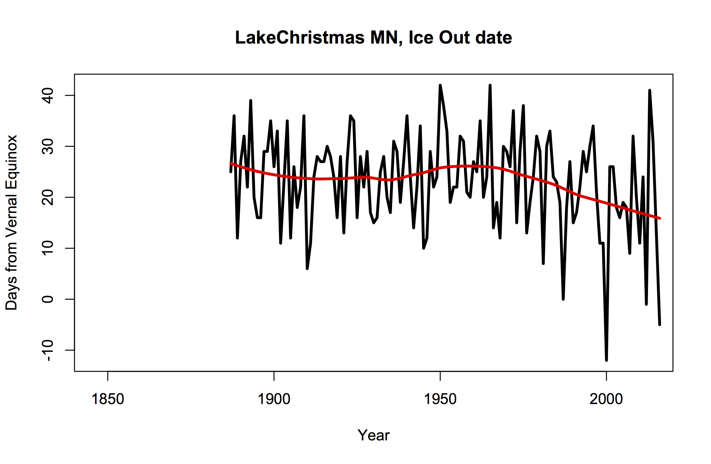
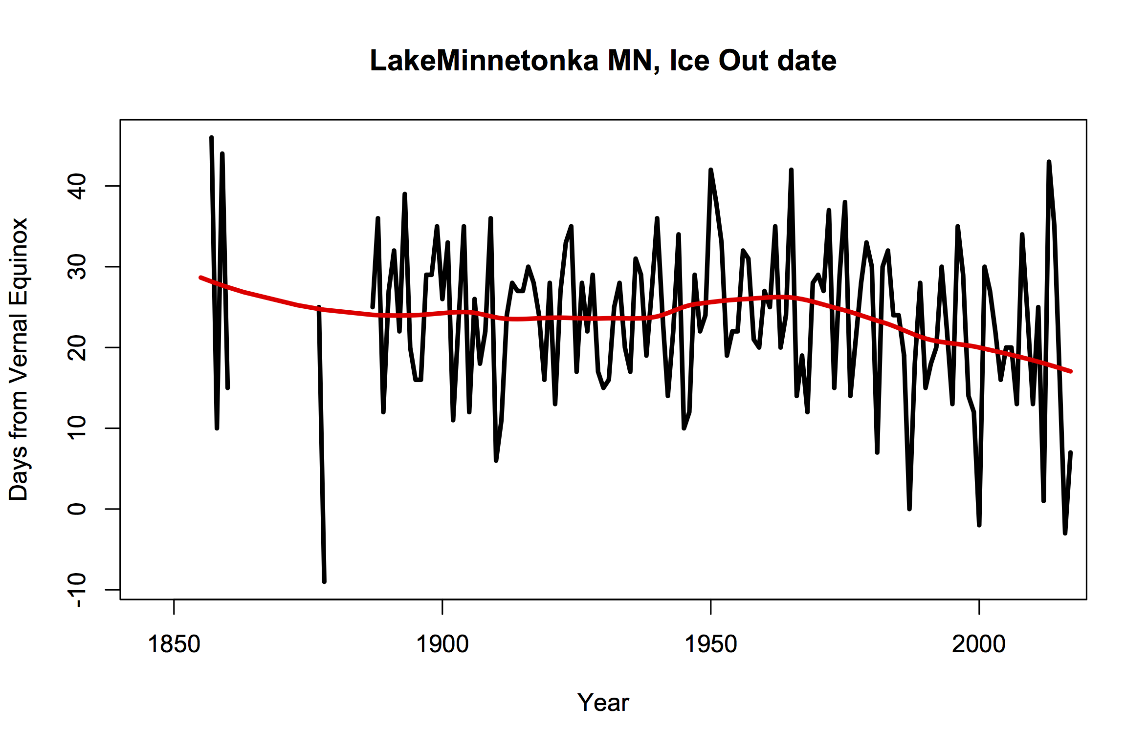
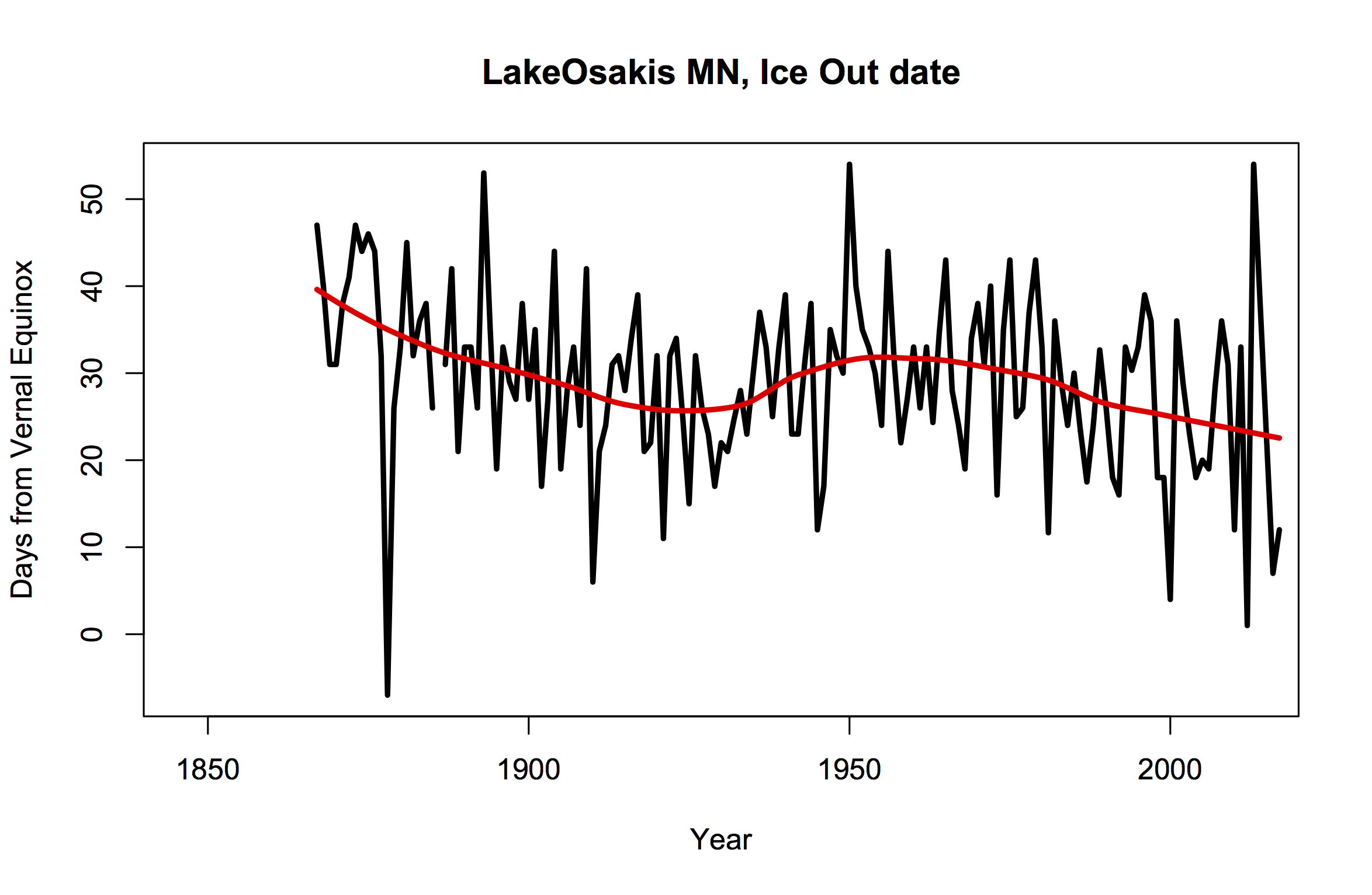
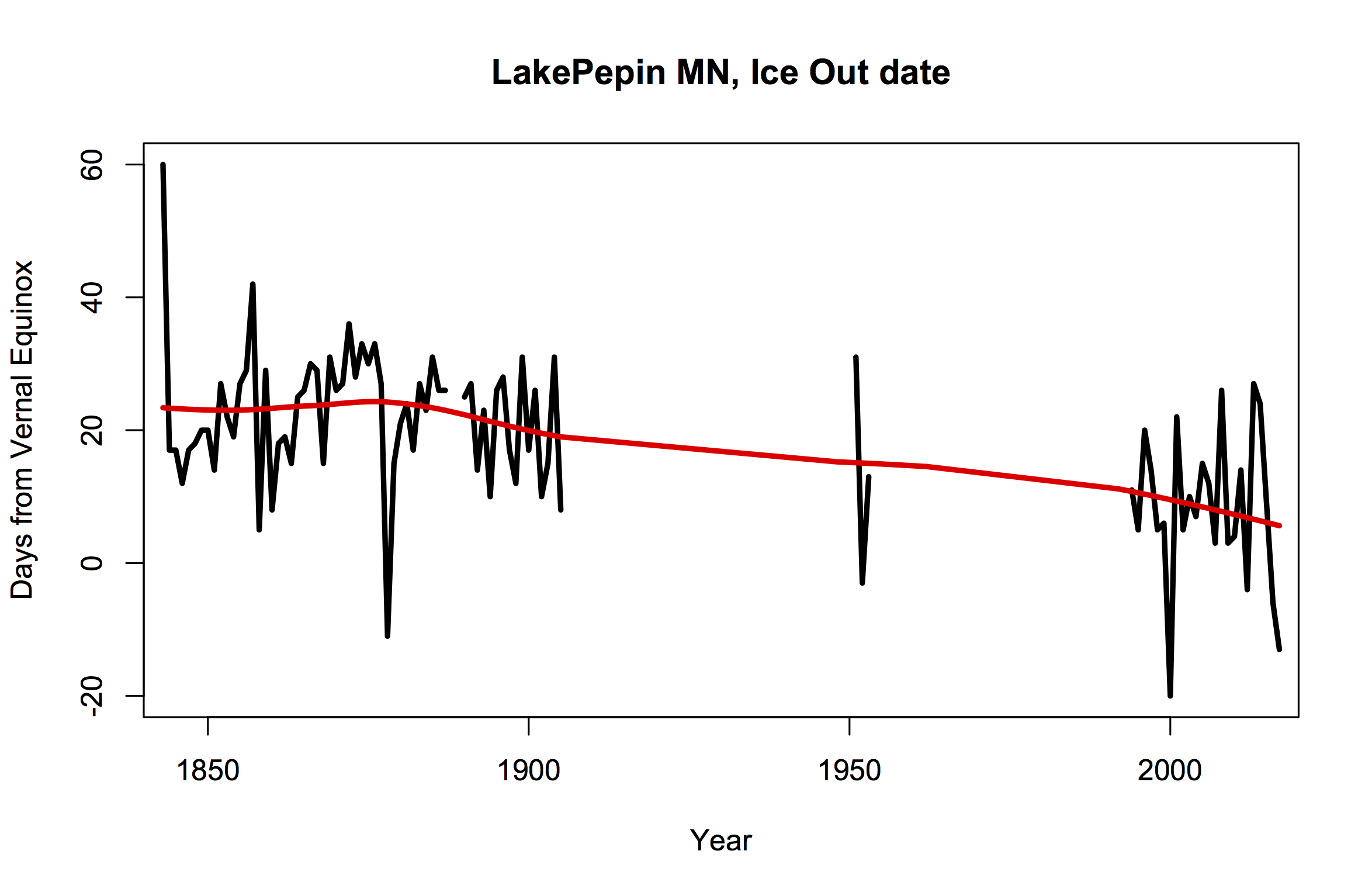
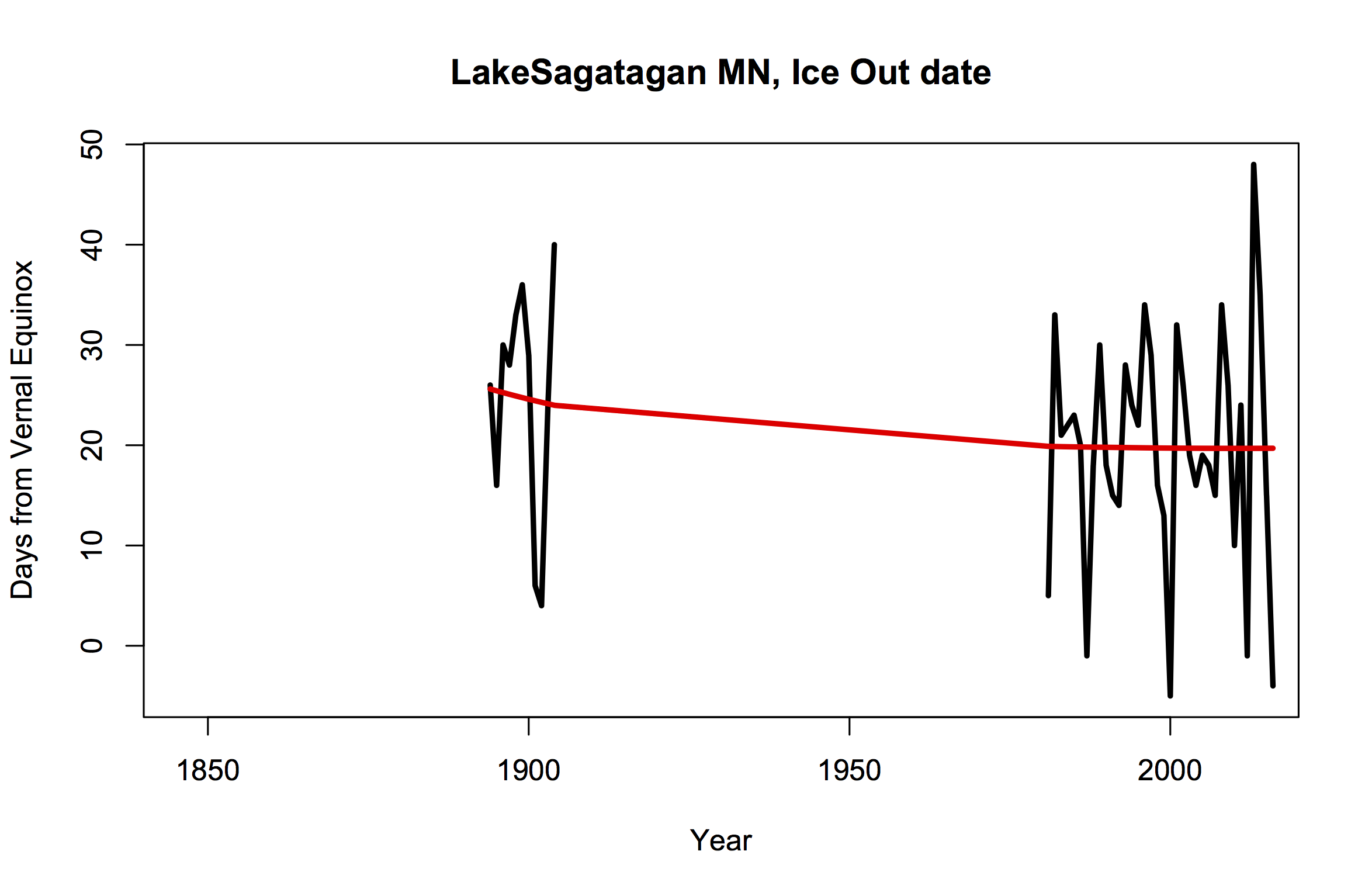
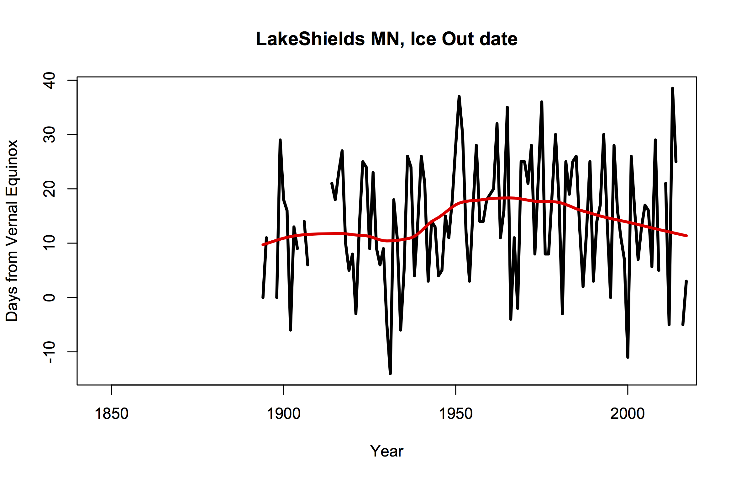
Figure 1: The seven longest data sets of Minnesotan lake “ice out” dates (with data back to at least 1900). Ice out date is shown relative to the vernal equinox (see below for details). Red lines are loess ~30yr smooths.
One commentator on twitter made a point of picking out Lake Minnetonka, and noting that the earliest ice out date on record was in 1878, as if that negated any of the long term trends there or elsewhere. It is however quite interesting to look into data from that year. Pepin, Osakis and Clear had huge anomalies that year, and estimates of regional temperature show a very warm winter that has only recently been matched. Given the standard deviation in the residuals (about 10 days), the 30+ day earlier ice out was a massive anomaly (more than 3 ) and was noticed and commented on at the time. Contemporary reports from Minneapolis described it the “Year without a Winter”. But one warm winter does not a trend make, and the trends in almost all the lakes are clearly towards an earlier ice out over the last 40 years. Given the interannual variability though, you still need a multiple decades to significantly detect a trend of 10 days or so per century.
Other North American lakes
There are good data sets for dozens of other lakes in North America, notably ice duration from Lakes Mendota and Monona in Wisconsin. Note that ice duration is slightly less noisy dataset than ice out.
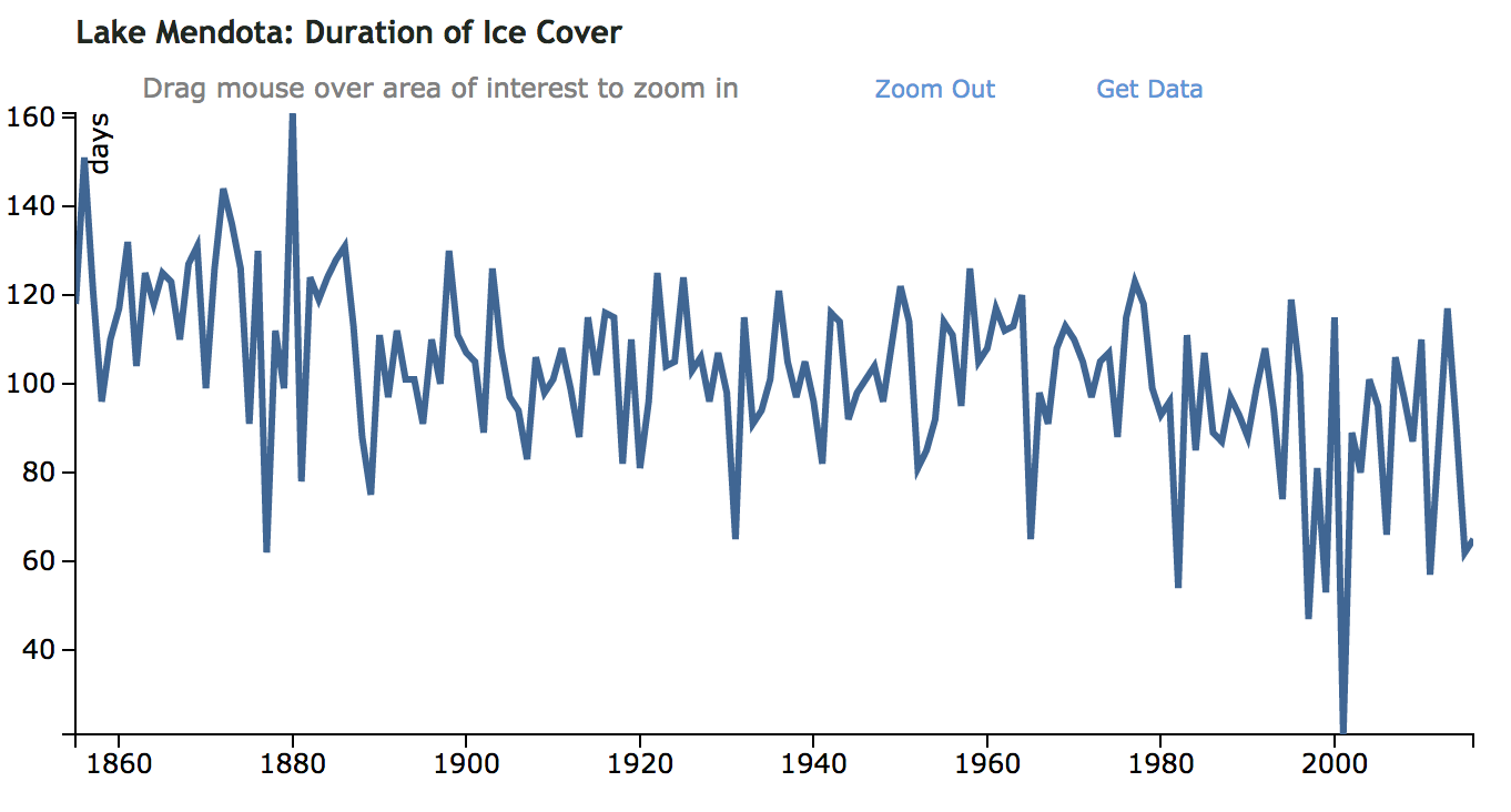
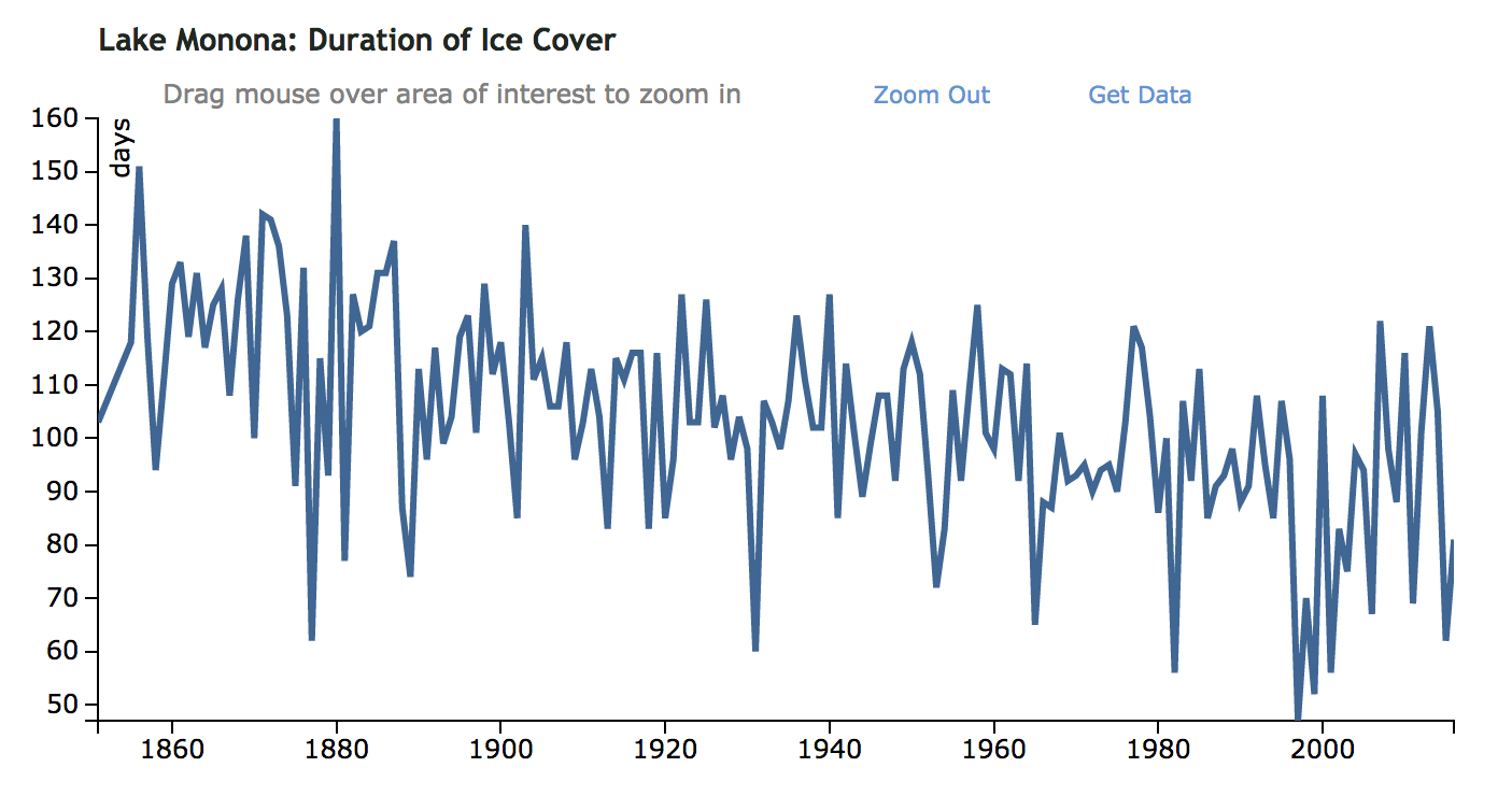
These data are nominally collated by the Global Lake and River Ice Phenology Database, but it isn’t that up-to-date, though it does include a lot of long records from Europe.
One other notable lake is Lake Winnipesaukee in NH (h/t David Appell), which has records from 1887 and a betting pool.
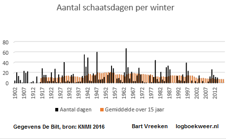
Dutch skating days
One reader pointed me to a graph of declining “schaatsdagen” (skate days) at De Bilt in the Netherlands made by Bart Vreeken. There is a partial dataset online, but I’m not really clear on the provenance of the data or how it was calculated.
Note on accounting for calendrical anomalies
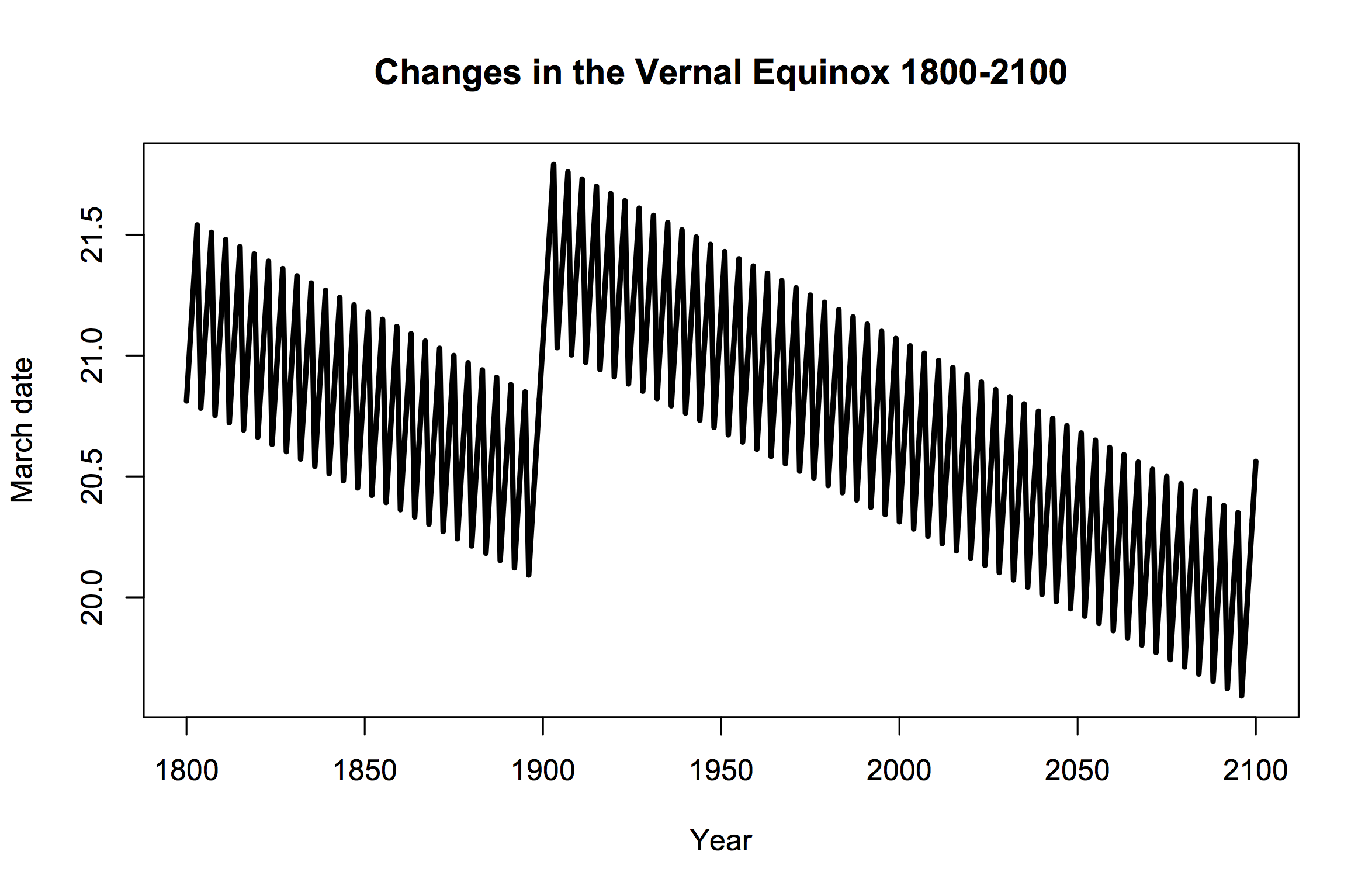 Because of the fact that the orbital period of the Earth around the sun is not an integer number of days, the astronomical “seasons” move around a little in the calendar. Thankfully, it doesn’t move around quite as much since the adoption of the Gregorian Calendar, but on short timescales (< 500 years) the impacts of leap years and the variation of the vernal equinox can alias climatic trends. The VE is normally either the 20th or 21st of March, though this century will have a few years with the VE on March 19th as well (calculations are here). Records which are based on calendrical dates (such as ice on, or ice out) therefore have a little noise in them just because of this. So for ease of comparison, in my plots I generally show the number of days from the vernal equinox to account for it. This is a small correction and in general doesn’t make any noticeable difference, though it can affect the rankings of individual years.
Looking forward to seeing Spencer, Christy and Curry skating on thin ice…
Last year I tried to summarize the Minnesota DNR collected Ice-out data from 1950-2017 here: https://sites.google.com/view/minnesota-climate-education/ice-out
somewhat following this paper by Jensen et al.: https://marine.rutgers.edu/~ojensen/Documents/Jensen_etal_2007_L&O.pdf
Still not sure if their method is the best way to visualize this ice-out data, but I like that you can see the trends of many lakes at once.
Visser & Petersen (2009) also has a nice analysis on the changes in likelihood of holding the Dutch ‘Elfstedentocht’ (Eleven City Ice Skating Marathon): https://doi.org/10.1007/s10584-008-9498-6
This was a very hard blog to read. You need to explain the graphs provided more. If you do not have expertise in this this is VERY hard to read. I didn’t understand anything and this is meant for a very limited audience. I do not recommend unless you 100% understand this.
Sorry to post a slightly off topic question, but I seek the input of RealClimate experts. I regularly speak to public audiences about climate change (see http://www.andrewgunther.com/climate-change/#talks for details), and use the NASA/GISS dataset to discuss global average temperature of the atmosphere.
Can any of you knowledgeable folks provide an interpretation of the spike in the annual temperature anomaly data in the early 1940s? I have read about suppression of the temperature anomaly due to particulate and aerosols in the years after the war, Agung and other eruptions, but have not found any interpretations about the early ’40s air temperatures.
Thanks!
Blog Critic, #4–
This site is, in general, intended for and used by, more scientifically sophisticated readers, to whom those graphs are pretty self-explanatory.
But if you are interested in the topic, I can point to a couple of resources that may help. One is the “start here” tab on this site, which is meant as introductory, and provides some context. (It’s at the very top left of the window.) Another is a new blog from ‘Tamino’, who explores the topic of carbon-induced climate change from a statistical point of view. His new blog is aimed a youth and other laypersons, and uses plain language (though the concepts presented are not watered down).
It’s here:
https://climateyes.wordpress.com/
Andy Gunther @5
First, 1941 and 1942 were strong el Nino years.
Second, change in sea surface measurement during wartime. The temperatures were collected only by US ships versus British ships. The US used intake temperatures, the British used buckets. This added a warming bias to the record during the war years.
This can be seen by looking at the temperature records. The land temperature record was relatively flat with slight warming due to the el Nino. Only the sea surface temperature record shows the large spike. Refer to IPCC 5AR WG1, Chapter 2, Observations: Atmospheric and Surface, FAQ 2.1, Figure 2, page 199.
http://neven1.typepad.com/blog/2018/02/talk-about-unprecedented.html
To gavin:
The “(calculations are here)” part of the post links to a Nasa site which has broken links to the subroutines applied. Is it possible that a different site provided the actual calculation code you used?
Thanks.
[Response: The interactive calculation works. I’ve pinged the webmaster on the actual code. – gavin]
[Further response: The code links have been fixed. Thanks. – gavin]
I did the Minnesota ice-out date analysis a few years ago and had an interactive chart that would take the most recent data from the Minnesota DNR and plot that. Unfortunately, they changed the format since and so I will have to redo some of the code.
In any event, this is a static set of charts for various 1 degree latitude strips across Minnesota. Note the strong downslope in the overall noise indicating an earlier ice-out over time
More info on how to collect the ice-out data from the Minnesota DNR here:
http://contextearth.com/2013/09/15/ice-out/
I presented the architecture of the semantic web server at last year’s AGU. The goal is how best to organize data and models for earth science research.
https://agu.confex.com/agu/fm17/meetingapp.cgi/Paper/276374
And here is an analysis from Canada: “Declining availability of outdoor skating in Canada”, by Brammer et al. 2014 (http://www.nature.com/articles/nclimate2465). From the first paragraph:
“Here we report that the availability and benefits of skating on the world’s largest outdoor ice skating facility: declined from 1972 to 2013, was strongly dependent on weather, and is projected to continue declining with an accelerated rate between 2020–2090.”
What makes the ice-out data a good metric is that it arguably has less bias with respect to urban areas that temperature stations. Observations are frequently in remote areas, far away from asphalt and immune to instrumentation and siting measurement artifacts.
Andy (@ # 5, 2/26/18; 10:57A) – Going a Ways back in time, there was an anomaly in the British ‘Thermal Trace,’ that was about that era, & discovered to have resulted from some alteration of inlet cooling water for steam vessels. Or, maybe it was when the ‘Method’ shifted from lowered buckets to inlet thermal gauge reads.
I don’t know whether this points you towards what you are asking about. Hope so. Just a quick guess. (> 70% of the Pale Blue Dot is covered in H2O, so sea surface temps can swamp land surface temps, even tho the latter may ‘outnumber’ the former by orders of magnitude.)
In addition to New Hampshire’s Lake Winnepesaukee (1887-present) mentioned in the original post, another well known record exists for Lake Sunapee (1869-present). With smoothing, both time series show a clear signature of early warming, 1945-1975 pause, then post-1975 warming characteristic of global trends.
CCHolley says:
“First, 1941 and 1942 were strong el Nino years.”
This appears to be the strongest ~3-year El Nino interval on record.
This is the WWII measurement transient onboard the ships
https://i2.wp.com/www.skepticalscience.com/pics/sst3-measurement-types.gif
“Can alias climactic trends”
Did you mean warp, hide, or bias, as opposed to alias?