Another January, another annual data point.
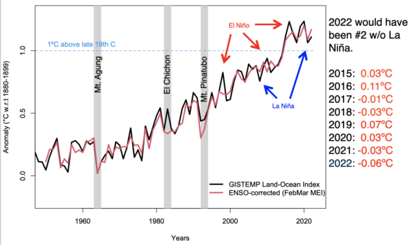
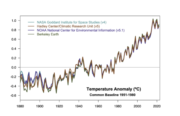
As in years past, the annual rollout of the GISTEMP, NOAA, HadCRUT and Berkeley Earth analyses of the surface temperature record have brought forth many stories about the long term trends and specific events of 2022 – mostly focused on the impacts of the (ongoing) La Niña event and the litany of weather extremes (UK and elsewhere having record years, intense rainfall and flooding, Hurricane Ian, etc. etc.).
But there are a few things that don’t get covered much in the mainstream stories, and so we can dig into them a bit here.
What influence does ENSO really have?
It’s well known (among readers here, I assume), that ENSO influences the interannual variability of the climate system and the annual mean temperatures. El Niño events enhance global warming (as in 1998, 2010, 2016 etc.) and La Niña events (2011, 2018, 2021, 2022 etc.) impart a slight cooling.
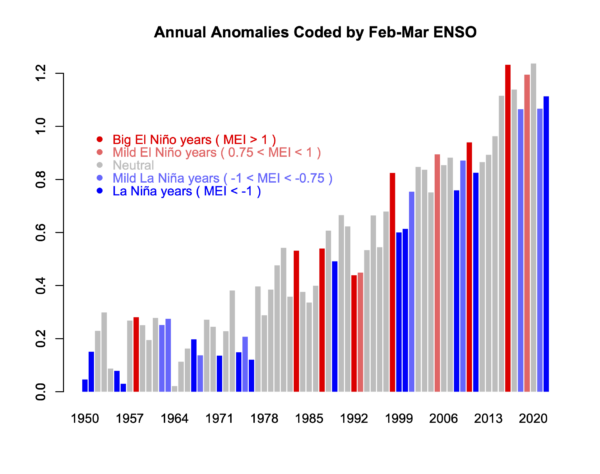
Consequently, a line drawn from an El Niño year to a subsequent La Niña year will almost always show a cooling – a fact well known to the climate disinformers (though they are not so quick to show the uncertainties in such cherry picks!). For instance, the trends from 2016 to 2022 are -0.12±0.37ºC/dec but with such large uncertainties, the calculation is meaningless. Far more predictive are the long term trends which are consistently (now) above 0.2ºC/dec (and with much smaller uncertainties ±0.02ºC/dec for the last 40 years).
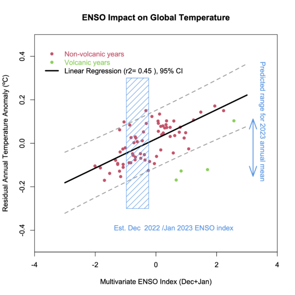
It’s worth exploring quantitatively what the impact is, and this is something I’ve been looking at for a while. It’s easy enough correlate the detrended annual anomalies with the ENSO index (maximum correlation is for the early spring values), and then use that regression to estimate the specific impact for any year, and to estimate an ENSO-corrected time series.
The surface temperature records are becoming more coherent
Back in 2013/2014, the differences between the surface indices (HadCRUT3, NOAA v3 and GISTEMP v3) contributed to the initial confusion related to the ‘pause’, which was seemingly evident in HadCRUT3, but not so much in the other records (see this discussion from 2015). Since then all of the series have adopted improved SST homogenization, and HadCRUT5 adopted a similar interpolation across the pole as was used in the GISTEMP products. From next month onwards, NOAA will move to v5.1 which will now incorporate Arctic buoy data (a great innovation) and also provide a spatially complete record. The consequence is that the surface instrument records will be far more coherent than they have ever been. Some differences remain pre-WW2 (lots of SST inhomogeneities to deal with) and in the 19th C (where data sparsity is a real challenge).
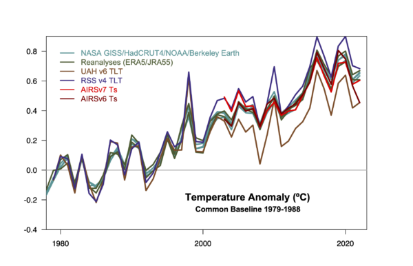
The structural uncertainty in satellite records is large
While the surface-based records are becoming more consistent, the various satellite records are as far apart as ever. The differences between the RSS and UAH TLT records are much larger than the spread in the surface records (indeed, they span those trends), making any claims of greater precision somewhat dubious. Similarly, the difference in the versions of the AIRS records (v6 vs. v7) of ground temperature anomalies produce quite distinct trends (in the case of AIRS v6, Nov 2022 was exceptionally cold, which was not seen in other records).
When will we reach 1.5ºC above the pre-industrial?
This was a very common question in the press interviews this week. It has a few distinct components – what is the ‘pre-industrial’ period that’s being referenced, what is the uncertainty in that baseline, and what are the differences in the long term records since then?
The latest IPCC report discusses this issue in some depth, but the basic notion is that since the impacts that are expected at 1.5ºC are derived in large part from the CMIP model simulations that have a nominal baseline of ~1850, ‘pre-industrial’ temperatures are usually assumed to be some kind of mid-19th Century average. This isn’t a universally accepted notion – Hawkins et al (2017) for instance, suggest we should use a baseline from the 18th Century – but it is one that easier to operationalise.
The baseline of 1880-1900 can be calculated for all the long temperature series, and with respect to that 2022 (or the last five years) is between 1.1 and 1.3ºC warmer (with Berkeley Earth showing the most warming). For the series that go back to 1850, the difference between 1850-1900 and 1880-1900 is 0.01 to 0.03ºC, so probably negligible for this purpose.
Linear trends since 1996 are robustly just over 0.2ºC/decade in all series, so that suggests between one and two decades are required to have the mean climate exceed 1.5ºC, that is around 2032 to 2042. The first specific year that breaches this threshold will come earlier and will likely be associated with a big El Niño. Assuming something like 2016 (a +0.11ºC effect), that implies you might see the excedence some 5 years earlier – say 2027 to 2037 (depending a little on the time-series you are following).
2023 is starting the year with a mild La Niña, which is being forecast to switch to neutral conditions by mid-year. Should we see signs of an El Niño developing towards the end of the year, that will heavily favor 2024 to be a new record, though not one that is likely to exceed 1.5ºC however you calculate it.
[Aside: In contrast to my reasoning here, the last decadal outlook from the the UK MetOffice/WMO suggested that 2024 has a 50-50 chance of exceeding 1.5ºC, some 5 or so years early than I’d suggest, and that an individual year might reach 1.7ºC above the PI in the next five years! I don’t know why this is different – it could be a larger variance associated with ENSO in their models, it could be a higher present day baseline (but I don’t think so), or a faster warming rate than the linear trend (which could relate to stronger forcings, or higher effective sensitivity). Any insight on this would be welcome!]
References
- E. Hawkins, P. Ortega, E. Suckling, A. Schurer, G. Hegerl, P. Jones, M. Joshi, T.J. Osborn, V. Masson-Delmotte, J. Mignot, P. Thorne, and G.J. van Oldenborgh, "Estimating Changes in Global Temperature since the Preindustrial Period", Bulletin of the American Meteorological Society, vol. 98, pp. 1841-1856, 2017. http://dx.doi.org/10.1175/BAMS-D-16-0007.1
Well, I am of the conviction that we ARE already at +1,5°C. The AR6 SPM has a nice picture showing a +1,5°C warming, offset by a ~-0,4°C cooling from sulphur oxide, giving the observed value of ~+1,1°C.
Whilst an El Nino event obviously causes a positive spike in global average surface temperatures, this is due to heat being transferred from the Pacific ocean to the atmosphere: ie it is a redistribution of energy rather than an increase in the total energy of the atmosphere/oceans/land surface.
Is there any estimate of how, if at all, an El Nino effects that overall energy budget?
For example, if the surface waters of parts of the Pacific (and the atmosphere), are warmer than normal during an El Nino it would be expected that they would radiate more energy to space, thus causing an overall decrease in energy. However, I suspect that changes in clouds may have a larger impact.
Do we know what that is?
@Slioch says: – ” …during an El Nino it would be expected that they would radiate more energy to space, thus causing an overall decrease in energy. However, I suspect that changes in clouds may have a larger impact.Do we know what that is? ”
ms: — I suspect the same. La Nina years can be ~0.5°C cooler as they push & hide large amounts of energy into the western Pacific, while El Nino years release more energy stored in the Pacific Ocean.
The Earth Energy Imbalance @ Top Of Atmosphere (EEI @ TOA) was close to zero W/m² (neither warming nor cooling) in 2010, also a very hot El Nino year, while in 2012, a strong El Nina year, the EEI was increased again to almost 1.5W/m².
El Nino years thus moderate the increase in global warming and are therefore more advantageous for the earth’s climate in the long term. This is IMO due to the generally higher relative humidity (RH) of El Ninos. In the graph of the Met Office for RH you can recognize the El Nino years 1998, 2010, 2016 by the maximum peaks.
https://climate.metoffice.cloud/dashfigs/humidity_RH.png
https://pub.mdpi-res.com/atmosphere/atmosphere-12-01297/article_deploy/html/images/atmosphere-12-01297-g004.png?1634310863
I am convinced that the falling trend in RH (with a slight increase in absolute humidity) is primarily due to the steady accumulated loss of evaporative landscapes, the desertification & land use change and this is therefore also responsible for a declining cloud albedo, which @ TOA is responsible for much of the increasing EEI & global warming trend. I have described this in more detail on my website.
https://climateprotectionhardware.wordpress.com/
Have you heard of the exotic but interesting hypothesis that some of the global warming is generated by the undersea volcanoes, the “ring of fire” under the Pacific Ocean, and brought to the ocean surface from time to time by the El Nino?
That the decline in cloud cover has caused some of the global warming according to CERES measurements has been noted recently, but the cause of the decline in cloud cover is as yet unclear as far as I know. It could be an amplification effect of the greenhouse effect, but has not yet been so predicted by climate models.
The TOTAL heat flow from the Earth to the surface works out to about .08 watts per square meter averaged across the globe. The total heat flow coming down from above is about 1380 watts per square meter.
This is a factor of about 17,000 to 1. Upwelling land heat is essentially rounding error in terms of what the Sun contributes and is highly unlikely to be a causal factor here.
Particularly since (AFAICT) there’s absolutely no reason to think that there is any increasing trend in the upward heat flux from said undersea volcanoes.
jgn,
Because the world catches sunlight on its cross-sectional area (π R^2) but has the total area of a sphere (4 π R^2), the incoming solar flux density is only 1361.5 / 4 = 340 W m^-2. Also, 29.4% of that is reflected away by the Earth’s clouds, ice, and a bit by the surface, so the flux density absorbed by the climate system is only 240 W m^-2. But your objection was correct in essence; the solar heating is overwhelming compared to the geothermal heating.
jgnfld
Yes, we discussed and found the same among the amateur astronomers at the beginning of the climate dispute, in order for us just to orientate first. I did calculate it further for them in terms of lit candles a 100 watts per land area.
I once withnessed a lecture of geochemistery for the same people, where the Lecturer claimed that eartyh heat was the relict of masses fallen down and together in the beginning 4.5 billion years ago. And could not believe it.
The plausible explanation is most probably radioactive heat from uranium and thorium decay.
This is an old and fameous story. The Kelvin Helmholz- theory from 19th century explains solar heat and temperature as the result of solar contraction in its gravitational field, and gave 25 000 years for the age of it all. And railway waggons of coal so and so long per second for comparishion.
Who cleared it up was Arthur Eddington who knew Einstein and suggested hydrogen fusion into helium with mass- defect .
Which is a heat source that makes necessary timescales for believing in Geology ( the plausible age and history of common bedrocks) and in Darwins theory quite more plausible.
The “undersea volcanoes” hypothesis flounders on the radioisotope analysis of the new carbon dioxide, which clearly indicates that it’s coming from fossil fuels and not from volcanoes.
Also, there’s no reason to think undersea volcanoes are now suddenly increasing their output all over the world. This is a hypothesis of desperation by the deniers.
Levenson
How can you discriminate volcanic CO2 from fossile fuels, when most of the volcanic CO2 comes from heating of fossile carbonates, that are indeed due to fossile bio?
It seems that levenson is teaching boldly above and beyond his personal experience and competition here again.
That is not edeucating, it is stupidifying!
It is flattening the earth and peoples understanding again.
Hello Gavin, i go with Hansen that 1.4-1.5 will be reached very soon, as the EEI is now at extremely high levels and our SOx emissions are decreasing significantly.
Here is the latest Hansen post on the matter: https://mailchi.mp/caa/global-temperature-in-2022?e=176c11ab68
And what is very impressive and underlying the above is that we have now record levels of heat accumulation in the western Pacific Ocean (actually its out of the charts now), so the stage is set for an extreme El-NIno or more El-NIno’s the coming years: : https://www.pmel.noaa.gov/tao/wwv/gif/wwva_std_w.gif
Further we have record increases in methane levels (2022 will be similar or even higher than 2021), Arctic sea ice nearly vanished end of summer over its entire area, snow cover becoming also increasingly vulnerable, with marine heatwaves forming all over the place now.
My personal guess is that we reach a warming till 2030 with your above-used baseline of about 1.6-1.8 °C (Arctic sea ice in summer is the elephant in the room) in at least one year with no significant cooling afterward.
But most scary: after the next temperature jump things will get really ugly on our planet as we will be confronted with an even steeper non-linear increase in extreme events than what we observe after the last temperature jump in 2016 far exceeding what we thought possible (the first events we already have today)…
All the best
Jan
RE Gavin’s: “or a faster warming rate than the linear trend (which could relate to stronger forcings, or higher effective sensitivity). Any insight on this would be welcome!]
and Jan’s: “Hello Gavin, i go with Hansen that 1.4-1.5 will be reached very soon, as the EEI is now at extremely high levels”
For Gavin I would include “all of the above” and more (eg. biosphere “response”), including heat flux trend is not linear (the rate is increasing). For Jan, thanks for classifying current (approx. 1.2 Watt/m2) heat flux into the “Earth system” as extreme. However, with increasing Radiative Forcing (now exceeding 4W/m2), due to record annual emissions, that flux (which lags RF) is increasing at approx. 0.5 Watt/m2.
Mother Earth has an elevated temperature (due to some disease factor) and is going into critical.
My EEI heat flux “increasing at approx. 0.5 Watt/m2” is per decade (Hansen et al. submitted paper). I apologize for the omission. This is occurring over the entire surface of the planet, so multiply by that surface area (5.1 x 10 to the 14th power) for total present heating.
Hello Gavin. Is there a solid evidence-based explanation for the approx flatline over the period 1950-1975? I have been searching for some time but never found one.
In the context of major contributor (not claiming sole cause)
For a starter, review the aerosol pollution record and the direct & the indirect cooling radiative forcings
Of course, that pollution has come on varying degrees of control in regulatory jurisdictions over time
So after a rapid rise in the period noted, there has been a reduction in slope, then plateau, and in recent decade or so and decline
So masking and now reducing masking of warming from the positive GHG radiative forcing
Summary in IPCC AR6 WG1 Figure 2.10
William Owens
No, I would not call that ” a plateau” and decline after 2016. It is within the natural noise, the ENSO.
Look at the longer run. that is supposed to be the climate.
One can see better if one accepts and assumes those major causes and features, and that is what it is about.
If you are to secure and to serve data and hope that it will stand and be valid, you better look out for such things. regardless of dicipline.
I can use my own experience from other diciplines here and follow it, because I am aquainted to such things in empirical servography and oscilloscopy analogue signals which it is based on.
Also know a bit about free handed drawing having to represent something that ought to be reality.. And of optical illusions., & wishful thinkings..
Novum organum and idolæ mentis by Francis Bacon, for instance, on pensum first.
And perhaps Der Spieler, The Gambler, Dostojevski on wishful thinking and what it may come to cost.
MB: Hello Gavin. Is there a solid evidence-based explanation for the approx flatline over the period 1950-1975? I have been searching for some time but never found one.
BPL: Try here:
https://bartonlevenson.com/GreatStasis.html
People can look at. a graph and see different things. You see a “flatline over the period 1950-75.” Others may see an unusual surge in global temps during the period 1939-52. There were of course some rather significant developments during ’39-52, including major war and disruption in the global economy. A strong El Nino in ’41-42 may have been a factor as well.
This is readable Dr. Schmidt.
I wonder what I could read more closely out of Fig 1 with Nino and Nina and Neutral.
Jan
“My personal guess is that we reach a warming till 2030 with your above-used baseline of about 1.6-1.8 °C (Arctic sea ice in summer is the elephant in the room) in at least one year with no significant cooling afterward.’
Not quite sure what that means: “we WON’T reach a warming till 2030”?
Behind the paywall, there is a 2600 word article in Murdoch’s Weekend Australian of 14-15Jan23 by their in-house skeptical journalist Graeme Lloyd headlined “Weather ‘extremism’ fans fear in politics of climate”. The Murdoch papers are shunned by Australians concerned about climate change but with a large claimed national daily readership and an agenda to sow doubt about climate change their influence is concerning. In his latest effort Lloyd references concerns by “US climate scientist Judith Curry” that “psychological injury” is being caused to children by “apocalyptic” climate change rhetoric. As well as Curry, Lloyd quotes “fellow US climate scientist John Christy” and “Australian scientist Jennifer Marohasy” rehearsing their claims about the effect of urban heat islands and BOM methodology on surface temperature data analyses: the usual suspects making the usual claims.
On La Nina Lloyd makes the reasonable point that consecutive La Nina events are “relatively common”—half of all past Australian events since1900—but goes on to argue that three La Nina events in a row—four times since 1900 including the present one—are “less common”, implying three-in-a-row is also normal and natural.
Lloyd also writes: “The takeaway is that natural variability continues to play its role in climate against a background warming trend. According to BoM, the background heating from climate change has elevated average Australian temperatures by more than 1.47C since 1910. This compares with a global average increase reported by the Intergovernmental Panel on Climate Change of 1.07C since the industrial revolution.
I understand continental interiors warm faster than the global average. And also that the poles are warming faster. But perhaps when summarising this research for mainstream media consumption its worth pointing out that warming where many people live has already reached 1.5C. Because it’s not widely understood.
https://www.theaustralian.com.au/inquirer/explosion-of-extreme-weather-mentions-fans-fear-in-politics-of-climate/news-story/248494e7f41ba2d70512acafe4c31992 ($)
John Ransley, it’s interesting to see what the denial media/pundit industry always leaves out. So when Judith Curry acts concerned about The Kids these days – she never reflects on the distinct possibility that kids would feel a bit safer about the future if they didn’t see that a good many adults are actively promoting a do-nothing approach that will make climate impacts far worse than if the adults in charge were all working to address the problem together. No reason a “conservative” approach to actually fixing climate change wouldn’t have worked if it had ever been pushed by conservatives rather than the deny/delay/distract approach that became the preferred option.
And the same crowd acted the same for the pandemic – wailing and moaning about the harm done to The Kids from being held out of school – yet their preferred agenda of just rushing herd immunity by infection would have tended to make a lot more of those children lose parents, aunts, uncles, grandparents than actually did suffer that traumatic, permanent loss. But you would never find a comparison of the impact on a child from loss of adult family members vs loss of in-person schooling for a year or two.
It would be useful if schools started aggressively teaching critical thinking to students, and devoted a semester to critical examination of the kinds of “science” that gets promoted in Murdoch opinion columns.
You write: “For instance, the trends from 2016 to 2022 are -0.12±0.37ºC/dec but with such large uncertainties, the calculation is meaningless.”
Okay, but how large or small are the uncertainties in the data shown here in the graphs “GISTEMP anomalies (w.r.t. late 19th C) ….” and “Four surface-station based estimate of global warming since 1880” ?
Because the older measurements were made with glass thermometers and 3 readings per day, the uncertainties here should be greater than the measurements made in the last 40 years or so, which were made with electronic thermometers and data taken continuously in the minute and hour range.
[Response: The uncertainties in the annual means clearly increase as you go back farther in time, but the dominant uncertainty is spatial coverage, not instrument error or change. See here for more explanation. – gavin]
People weren’t quite as stupid in the olden days as you might imagine. Three readings a day does not mean they have to be lucky to catch the min/max temp.. Glass thermometers will still record min max. There are however a couple of issues with the change to electrical sensors
1) In locations that only took readings 2 or 3 times a day, there is a strong chance that the afternoon max may be missed or reduced
2) Glass thermometers have a natural high cut filter. Electrical ones do not. WMO guidelines say that electrical readings should be averaged over some minutes. This does not always happen, and never happens in Australia.. The hot part of the day is much more variable than the low and so the effect of using non-filtered readings is to increase the recorded temperatures compared with glass. On a typical hot day in Perth, this discrepancy can be greater than 1 degree
The largest source of uncertainty in the older data however is the huge area (70%) of extremely poor sampling pre-ARGO
Thanks, Gavin
But when the GISTEMP data have uncertainties from 0.05 °C for the last 50 years and then change to 0.15 °C until 1880, as NASA writes, why you write her in this Blog that there uncertainties of ±0.37ºC/dec ?
[Response: The first two numbers are the uncertainties in the estimate of a single annual mean number (in the last decade and in the late 19th C). The 0.37 is the uncertainty of the trend over the short and noisy period of the last 8 years. – gavin]
Gavin – “noisy period of the last 8 years”
This is based on what? newspaper headlines? Here is a plot of the Hadcrut4 standard deviation and variance on a lagging 8 year basis:-
https://photos.app.goo.gl/SjEDzWWPbgTzVjfb7
and for comparison, here is an ngram of “climeate extremes”
https://books.google.com/ngrams/graph?content=climate+extremes&year_start=1850&year_end=2019&corpus=en-2019&smoothing=0#
Gavin, sorry, but I didn’t understand why the uncertainty over an 8 year period is 0.37 and over a 50 year period is 0.1. Every data point has an uncertainty. If that uncertainty is 0.1 for each data point over the last 50 years, then it should be the same for the last 8 years.
James Hansen in his June 2021 blog shows a hiatus from 2016 to 2020/2021. And the data series from the various official measurements at woodfortrees/interactive show a slight decrease from 2016 to 2021, which is clear with the additional plot of the linear trend.
[Response: The uncertainty in a trend is given by the deviations from the line, not the uncertainty in the individual years. Basically, this goes up if the line is not a good fit – and given the interannual ups and downs, linear fits over short periods are very uncertain. Note to that the 0.05ºC uncertainty in a year is not even the same unit as the uncertainty in the trend (ºC/dec).- gavin]
The sun is the same temp every year. The earth is the same size every year. I suspect that if we could actually measure every cubic meter of the planet we would find the planet’s temperature steadily rising with little variation.
[Response: I don’t think so. ENSO and other chaotic elements of the climate system are the dominant cause of the interannual variability, not spatial sampling. – gavin]
I was thinking about temperature change and sampling.
it’s worth mentioning sea level rise.
while year to year variability is greater than rise, within 3 years that’s not the case.
For surface temperatures it’s closer to 18 years.
It might be wise to start posting both the average global land and ocean temperatures separately so that we can compare them with the overall global average. I think I’m correct in saying that the land average is close to 1.9C while the ocean average is close to 0.85C. Since most of use live on land, surely the land average is the one people should be thinking about?
[Response: We show that here, and you are roughly right, the last 5 years compared to the late 19th C, have land warming by 1.8ºC and ocean by 0.8ºC. But note the Paris Agreement limits are defined as the global mean, so they aren’t really comparable to the land-only numbers. – gavin]
@ c summerhayes
Really?
I never felt it that way, but I often felt that regional trends that are long enough to be reliable and clearly different from each other would be useful.
Such as Eurasia east and west of Ural, the eastern arctic and the western arctic that are clearly different, the southern and the northern Europe, eastern and western and southern north america and so on. Then the Australians will also believe us.
And this could also be given physical explainations so we can see and follow it for ourselves.
Also the main oceanic areas, “the seven seas” could be treated that way.
Climatic zones are allready well defined so it can be understood from anxient on. Regional predictions would follow up that well known tradition. Köppens climate categories in the old teachbooks of physical geography.
Yes Hr schmidt, 2 very fameous Köppens indicators wild oak and apple are coming over the hill right here, from southwest to northeast., so I can see for myself, The january isoterm on the map is clearly mooving to northeast here. IPCC has got a point.
And all that rain….. even in winter…. we can forget skiing and even skating….. and I had to secure the cellar- pumps that run and work more and more often..
For people to plan for the future, such rather regional aspects are important.
Make it practical and urgent practical for people where they live…..Then they will believe it and tell their children..
Besides ENSO, many researchers have also observed a correlation of global T variability to the AMO time-series, and this is just not the multi-decadal part of AMO. This brings up the question of whether some combination of AMO and ENSO would work better as a variability compensation since AMO and ENSO are not correlated with one another.
The most convenient way to observe the correlation is to use the online WoodForTrees graph plotter, choosing AMO and HADCRUT4 for example (with a bit of detrending of the latter)
https://www.woodfortrees.org/plot/esrl-amo/from:1920/mean:6/scale:0.8/to:2022/plot/hadcrut4gl/from:1920/offset:0.3/detrend:0.8/mean:6/to:2022
Is AMO a real oscillation? I say yes, as it is straightforward to model AMO via a Laplace’s Tidal Equations approach
MB: Hello Gavin. Is there a solid evidence-based explanation for the approx flatline over the period 1950-1975? I have been searching for some time but never found one.
BPL: Try here:
https://bartonlevenson.com/GreatStasis.html
V: We’ve been over this before, Bart. First of all, as you know, I’ve already demonstrated the weakness of the industrial aerosol explanation we see so often. If such aerosols had a significant cooling effect as claimed, then we’d expect to see evidence of underlying warming during the period in question in regions where industrial activity was absent or minimal. Only, as I’ve demonstrated with several specific examples, we don’t.
Moreover, if the additional factors you list were so important, then why would they suddenly de-activate during the period from the late 70’s through the late 90’s when temperatures shot up so dramatically?
Finally, the misleading nature of the scattergram you present in the link you provided ( https://bartonlevenson.com/CO218502019.html ) was made clear in a blog post I presented some time ago: http://amoleintheground.blogspot.com/2018/10/thoughts-on-climate-change-part-8-tale.html
As your scattergram is essentially the same as the one I analyzed in that post, the problem is the same as the one I revealed in that post, which I urge you once again to study.
Victor says: If such aerosols had a significant cooling effect as claimed, then we’d expect to see evidence of underlying warming during the period in question in regions where industrial activity was absent or minimal. Only, as I’ve demonstrated with several specific examples, we don’t.
The effect of aerosols on global temperatures was discussed in the past in great detail on this forum. References were made to peer reviewed studies that show that what Victor states here is an assumption made by someone not versed in the science. But of course, once again, Victor, the musicologist with no formal training in science, claims superior knowledge to those experts even after all this was explained in great detail. Typical Victor, rinse, lather, repeat.
I think you mean “blather, rinse, repeat.”
Oh please, not this idiotic nonsense from Victor YET AGAIN. If its not bore hole material by now, what is? Why doesn’t this website enforce its own rules? We all need a shakeup at times.
Nigelj
In a way, we need some training on them. And if I do that at their own websites, I get etnically rinsed out, like if one tries to discuss that fameous military operation in terms of war, in Moskva.
Their style and madness It is “existencial” for them.
We have the opportunity here to psychoanalyze an “influenzer”.
V: We’ve been over this before…
KDM: Indeed we have.
V: …I’ve already demonstrated the weakness of the industrial aerosol explanation we see so often. If such aerosols had a significant cooling effect as claimed, then we’d expect to see evidence of underlying warming during the period in question in regions where industrial activity was absent or minimal.
KDM: And we’ve pointed out to you that aerosols are not so precisely co-located as all that–tropospheric aerosols get ‘smeared’ over thousands of kilometers. See:
https://data.giss.nasa.gov/modelforce/trop.aer/
Still less is the net warming (or cooling) effect; circulation is after all mostly a hemispheric affair.
V: Moreover, if the additional factors you list were so important, then why would they suddenly de-activate during the period from the late 70’s through the late 90’s when temperatures shot up so dramatically?
KDM: Because from the 70s, the positive forcing from GHGs increasingly outpaced the negative forcing of sulphates. (Presumably this was partially due to the contemporaneous adoption of sulphate scrubbers, which inhibited the growth of aerosol emissions, but not those of GHGs. Aerosol emissions continued to grow more or less linearly, barring a couple of years in the 80s, but GHG emissions accelerated, in your word, “dramatically.”)
See:
https://data.giss.nasa.gov/modelforce/
Maybe you’d like to make a note of all this, so we don’t have to go over it yet again, some time in the indefinite future?
First I’d like to clear up the notion that I am simply a “musicologist” with no scientific training. Not true. On my high school graduation I was presented with the Bausch + Lomb award for excellence in science. In addition I earned perfect scores (100%) on all the NY State regents math exams, earning a full college scholarship as a result. As both an undergraduate and graduate student I studied perception psychology and linguistics, with extensive studies in anthropology, including training in basic statistical methods. In addition I’ve done a considerable amount of research in semiotics, culminating in a paper published in the flagship journal Semiotica. Additionally I’ve done a considerable amount of independent study in the philosophy of science, leading me to fully appreciate the importance of critical thinking, a skill that seems seriously lacking in these threads.. I have a long list of peer reviewed publications and have functioned from time to time myself as a peer reviewer.
In response to Kevin McKinney:
To refresh your memory, a presentation of 10 temperature graphs from 10 different remote regions can be found here: ( http://amoleintheground.blogspot.com/2021/03/thoughts-on-climate-change-part-10.html ) In every case we see no evidence of warming from ca. 1940 through the mid to late 70’s. This makes it impossible to argue that the expected warming trend had been negated during this period by the presence of industrial aerosols, since such a trend would have been evident in regions where little to no aerosol emissions had occurred. Unlike the wide distribution of CO2, aerosols quickly dissipate, as noted in the following paper:
“The distribution of anthropogenic aerosols’ climate effects depends on the geographic distribution of the aerosols themselves. Yet many scientific and policy discussions ignore the role of emission location when evaluating aerosols’ climate impacts. . . This suggests that climate accounting should differentiate between aerosols emitted from different countries and that aerosol emissions’ evolving geographic distribution will impact the global-scale magnitude and spatial distribution of climate change. . . Aerosols’ heterogeneous spatial distribution is recognized to influence their overall climate impact relative to more homogeneous climate forcers, like carbon dioxide.” (Divergent global-scale temperature effects from identical aerosols emitted in different regions, as published in Nature, August 2018)
KDM: . . . from the 70s, the positive forcing from GHGs increasingly outpaced the negative forcing of sulphates. (Presumably this was partially due to the contemporaneous adoption of sulphate scrubbers, which inhibited the growth of aerosol emissions, but not those of GHGs. Aerosol emissions continued to grow more or less linearly, barring a couple of years in the 80s, but GHG emissions accelerated, in your word, “dramatically.”)
V: That was a typo and if you look again at my blog post you’ll see that it was corrected. It was temperatures that accelerated dramatically, not CO2 levels, which rose at a more or less steady pace from ca. 1950 through the 21st century. It’s thus difficult to argue that the accelerating temperature rise during the last 20 years of the previous century was due to accelerating CO2 levels, as there was no such acceleration. As to the effect of sulphate scrubbers, no such scrubbers were mandated in China, yet we see essentially the same temperature upsurge in East Asia as elsewhere.
Victor,
“Unlike the wide distribution of CO2, aerosols quickly dissipate, as noted in the following paper…..”
I assume you understand that the wind can carry aerosols long distances and even if they are dispersed so they are at low concentrations they can still have some cooling effect. Single volcanic eruptions can cool wide areas of the planet. There could be other additional reasons for the flat temperatures mid last century including ocean cycles.
“It was temperatures that accelerated dramatically, not CO2 levels, which rose at a more or less steady pace from ca. 1950 through the 21st century.”
Although the graph of the Mauna Loa CO2 levels is roughly linear looking over time (it has a slight curve), actual concentration of CO2 in the atmosphere increased over time, (about 320 ppm in 1960 to about 420pppm now) and higher concentrations have a larger warming effect. Hence the acceleration of warming after about 1970 (coupled with the fact that aerosols were being reduced around that time). Victor still cant seem to understand all that and he clearly never will, or doesn’t want to. Because then his theory comes crashing down and that can be painful for the ego..
Yes, that and the fact that aerosols were emitted continually prior to the 70s. It used to be that the Sun in Los Angeles was yellow or red at noon!
What is there in “all that” do you insist I must learn to understand?
That “the wind can carry aerosols long distances and even if they are dispersed so they are at low concentrations they can still have some cooling effect”? Low concentrations have low effects, so what is your point?
“Single volcanic eruptions can cool wide areas of the planet”? True, but so what? Volcanic eruptions spew aerosols high up in the troposphere, which enables them to spread over a wide area, whereas industrial aerosols are emitted at ground level.
“There could be other additional reasons for the flat temperatures including ocean cycles. “? Yes of course. Ocean cycles are part of the natural variation that’s the most likely cause of the cooling trend.
” , , , actual concentration of CO2 in the atmosphere increased over time, (about 320 ppm in 1960 to about 420pppm now) and higher concentrations have a larger warming effect.”?
But the higher CO2 concentrations were largely due to increased industrial activity, which would have produced increased aerosol emissions. While efforts to reduce aerosol pollution were enacted in Europe and the USA, no such efforts were made in China or India, yet temperature increase in these regions was comparable to the worldwide increase during that period (late 70’s to late 90’s).
“Victor still cant seem to understand all that and he clearly never will, or doesn’t want to. Because then his theory comes crashing down and that can be painful for the ego..”
I have no theory, nigel. You’re the one promoting a theory, not me. What’s more I have no ego engagement in this issue whatsoever, which is why I never get all worked up over these discussions and see no need to make offensive remarks.
As you should be able to see, nigel (but will refuse to, obviously), there is no “all that” there, just a set of dubious assumptions with no evidence to back them up.
Reiterating again:
And have… and have…
As a hopefully interesting (and hopefully non-tendentious) comment, it interesting to note Fig. 2 in the Persad & Caldeira (2018) paper Victor cited, and which I discussed a little elsewhere.
https://www.nature.com/articles/s41467-018-05838-6
In 7 of the 8 cases considered, aerosol emissions–simulated ones, obviously–ended up causing a *warming* trend in some region in the opposite hemisphere. (Emissions from Western Europe were the exception, possibly because that is the most northerly region considered. Mute Arctic warming, and you mute global warming, too? India is at the opposite end of the spectrum; its aerosol emissions barely managed to nudge the globe in a cooling direction at all–just -0.02 C.)
The very inhomogenous trends and their global scale also offers some food for thought.
Victor,
“Low concentrations (of aerosols) have low effects, so what is your point?”
The point is even low concentrations of aerosols well away from their source could explain the flat temperatures last century in isolated locations around the planet, because it wouldn’t take many aerosols to mask the weak warming from low concentrations of CO2 mid last century.
And even if aerosols were not entirely responsible, aerosols are known to cause cooling from numerous lines of evidence, so must have had at least SOME effect even well away from their source. That much is simple logic. I suspect ocean cycles probably ADDED to the cooling effect of aerosols.
“But the higher CO2 concentrations were largely due to increased industrial activity, which would have produced increased aerosol emissions.”
No. Because by the 1970s industry was fitting sulphate aerosol scrubbers to remove aerosols.. Hence why warming became obvious after the 1970s along with the effect of higher CO2 concentrations.
“I have no theory, nigel.”
Your theory, or proposition if you prefer that word, is that aerosols are not to blame for cooling mid last century.
“and see no need to make offensive remarks.”
You are polite. So you get points for politeness, but no points from me for your pontifications on the science of this particular issue.
@ victor
Where did you have your holy victorious progressive inauguration and learnings- trainings of chosmology and systematic geopysics physical and political geography, & sphaerical geometry from?
Try and be honest now, looki back into yousrself and betray it to us.
That may help you a lot in your performance.
I might be able to help you then if you can tell that. .
What is there in “all that” do you insist I must learn to understand?
There has been significant discourse on aerosols on these RealClimate discussion threads in the past. But Victor either failed to read the responses and linked peer reviewed papers or completely failed to understand them. Typical behavior of Victor is to completely ignore the information and evidence presented and then after some time return to RealClimate and regurgitate his silliness.
So once again we are compelled to repeat the information. Unfortunately this is oh so tiresome and boorish. But that’s life with our dear Victor, a musicologist with no formal training in the physical sciences.
Anyway, in brief, the effect of aerosols on climate goes far beyond the direct radiative effects which Victor appears to be fixated on.
Aerosols have a huge effect on clouds. They promote their formation increasing cloud coverage, make clouds more reflective increasing the amount of sunlight reflected by the clouds, and increase cloud lifetimes. These effects all increase cooling and extend the regional effect of the aerosols.
Furthermore, the reflection of sunlight by aerosols and clouds have a significant effect on vertical temperature gradients and temperature gradients drive atmospheric circulation. Therefore, aerosols can and do effect the distribution of the reduced temperatures well beyond their areas of actual spacial coverage, even globally.
This is why general circulation models are used to show how aerosols effect global temperatures. And studies using these models clearly show that SO2 emissions from North America and Europe during the period of 1958-1980 likely had a significant global effect on temperatures.
In addition, one of the major lines of evidence that aerosols masked warming is that during the period of 1958-1980, night time temperatures continued to rise, which is exactly what would be expected with increasing greenhouse gas levels restricting heat loss to space. Natural variation nor ocean cycles can account for this nighttime warming. This is real evidence and not assumptive.
Some references:
Impact of global dimming and brightening on global warming
https://agupubs.onlinelibrary.wiley.com/doi/10.1029/2006GL028031
Local and remote mean and extreme temperature response to regional aerosol emissions reductions
https://acp.copernicus.org/articles/20/3009/2020/
Victor Grauer should consider just signing with his real name from now on. I asked ChatGPT something like what paper did Victor write in Semiotica https://www.degruyter.com/document/doi/10.1515/semi.1993.94.3-4.233/html
V: “…since such a trend would have been evident in regions where little to no aerosol emissions had occurred.”
Nope. That is merely reiterating what you had previously stated. Let me reiterate my first response:
(Others have made essentially the same points both on this thread and previously.)
V: That was a typo…
You misunderstand; I was saying in my own voice–other than your quoted word, “dramatically”–that GHG concentration forcing growth accelerated post-1970. Those wishing to corroborate that may do so at the following link, given in my previous comment as well.
https://data.giss.nasa.gov/modelforce/
The GHG forcings graphed for CMIP5, CMIP6, and also Hansen (2011) all show a marked acceleration between ~1970 & ~1990. (I’d embed images of these graphs here, if I could.) If you look at those graphs you’ll find that you are incorrect in asserting that “CO2 levels… rose at a more or less steady pace from ca. 1950 through the 21st century…”
V: “As to the effect of sulphate scrubbers, no such scrubbers were mandated in China, yet we see essentially the same temperature upsurge…”
Yet another reiteration of the same fallacy. You attempt to support your assertion by quoting a few words from Persad & Caldeira (2018), but you seem not to have absorbed the content of the paper as a whole very deeply. The first “result” reported is:
The second result:
Given the numerous other factors impacting regional temperature evolution, it’s no surprise that attempts to connect regional aerosol and temperature trends are not straightforward.
Instructive, in that regard, is a quarter of an hour spent playing with GISTEMP mapping, setting the time period for “the last 20 years of the previous century.”
The GISTEMP mapping tool link, for convenience:
https://data.giss.nasa.gov/gistemp/maps/
V: “…since such a trend would have been evident in regions where little to no aerosol emissions had occurred.”
Kevin: Nope. That is merely reiterating what you had previously stated. Let me reiterate my first response:
…aerosols are not so precisely co-located as all that–tropospheric aerosols get ‘smeared’ over thousands of kilometers. See:
https://data.giss.nasa.gov/modelforce/trop.aer/
V: Clearly that would depend on how high up in the troposphere the aerosols originated. Volcanic aerosols can spread widely, industrial aerosols, originating at or near ground level, do not. As should be obvious.
K: Still less is the net warming (or cooling) effect; circulation is after all mostly a hemispheric affair.
V: Irrelevant.
K: You attempt to support your assertion by quoting a few words from Persad & Caldeira (2018), but you seem not to have absorbed the content of the paper as a whole very deeply.
V: First of all, this is an extremely complex paper in which all sorts of factors are considered using a variety of different methods. Secondly it is based on more or less contemporary conditions — very different from those in effect during the period in question. Finally, regardless of what you think you may have found here or there in this paper, the conclusion, as stated at the outset of the “Discussion” section is unequivocal:
“These results demonstrate that geographic location substantially influences the cooling potential of a given aerosol emission. Crucially, countries that historically have or presently do account for the majority of anthropogenic aerosol emissions—Europe, the U.S., and China—are the regions whose emissions have the largest cooling potential.”
Weaktor,
Do me a favor and look up the logical fallacy of special pleading…
I didn’t need to look up “special pleading,” thank you Ray. I know very well what it entails.
When a rising temperature is expected according to one’s theory, yet no rising temperature is apparent, one then claims that the expected rise must have been masked by the emission of certain aerosols which just happen to be produced by the same process supposedly responsible for the expected (but nonexistent) temperature rise, THAT is special pleading.
When the evidence reveals no sign of the expected warming in regions where the presence of such aerosols was either minimal or non existent, yet one insists nonetheless that even trace quantities of aerosols would have the same cooling effect as in regions where the aerosols originated, THAT is special pleading.
When one insists that a long-term correlation between CO2 levels and global temperatures exists, despite the fact that the ONLY correlation apparent according to the evidence was limited to a single 20 year period, THAT is special pleading.
Ah, so it is clear that you aren’t even to the level of understanding logical fallacies yet–you fail at even basic logic. You posit that the theory posits that the temperature must rise monotonically. It does not. It says that all other things being equal–that is, ceteris paribus–the temperature will rise. But ceteris ain’t paribus. We know that aerosols can block sunlight–whether those aerosols are anthropogenic or volcanic in origin. We know solar irradiance fluctuates. We know the ENSO modulates cloud cover and this changes the planet’s albedo. We also know that there are other influences at play that influence the temperature year to year and month to month. However, Tamino showed quite convincingly that if you correct the temperature record for the influence of the first three factors above, you get much closer to a monotonic rise.
So, the entire premise of your statement–indeed of your entire output here at RC–is false, so your conclusion is irrelevant. BASIC LOGIC!!!
Special pleading is probably an understatement.
V: When one insists that a long-term correlation between CO2 levels and global temperatures exists, despite the fact that the ONLY correlation apparent according to the evidence was limited to a single 20 year period, THAT is special pleading.
J: When one has to reject the long-established mathematical definition of correlation in order to insist that a particular 20 year period chosen ex post facto represents the only “apparent” correlation in a long-running time series exhibiting very strong (above 0.8) correlation, and do it despite repeated corrections… I leave it to the reader to decide whether this is special pleading, errant and obdurate misuse of a simple statistical technique in the service of one’s hypothesis, or deliberate and serial promotion of a blatant falsehood.
For the most recent detailed discussion of this issue, I refer anyone unfamiliar with it, and lots of time on their hands to the Dec. 2021 archives, especially the latter postings.
V: When a rising temperature is expected according to one’s theory, yet no rising temperature is apparent, one then claims that the expected rise must have been masked by the emission of certain aerosols which just happen to be produced by the same process supposedly responsible for the expected (but nonexistent) temperature rise, THAT is special pleading.
No, it is not. It is a testable hypothesis. I tested it and it works. So your analysis is, as usual, wrong.
https://bartonlevenson.com/GreatStasis.html
Your analysis also contains a straw man fallacy. No climate scientist ever, anywhere, said that CO2 is the only thing that affects temperature. But that is implied in your example.
V: When one insists that a long-term correlation between CO2 levels and global temperatures exists, despite the fact that the ONLY correlation apparent according to the evidence was limited to a single 20 year period, THAT is special pleading.
BPL: That’s a lie and you know it, Victor. I’ve demonstrated it to you many, many times, yet you keep posting it. Stop lying, Victor.
V: “the long-established mathematical definition of correlation” must be tempered by critical thinking, if not simple common sense… etc.
J: This is a repeat of the December 2021 discussion. Common sense says that there is a very strong long term correlation between CO2 levels and global surface temperature. In general, low CO2 and low temperatures are found together, high CO2 and high temperatures. Manipulations of the definition of “correlation” don’t change that. Looking at incomplete subsets of the data don’t change it. Introducing more noise in the data by oversampling doesn’t change it.
Why do temperatures remain high and continue to increase if not CO2? You still haven’t answered.
And what does “cooling potential” mean in Persad et al? You don’t explain it, Victor, but Persad et al do. And it doesn’t have a whole lot to do with your contention.
(I’d suggest anyone in doubt read the paper as linked above, because Victor is selling a pig in a poke here.)
“We know that aerosols can block sunlight–whether those aerosols are anthropogenic or volcanic in origin. We know solar irradiance fluctuates. We know the ENSO modulates cloud cover and this changes the planet’s albedo. We also know that there are other influences at play that influence the temperature year to year and month to month.”
Special pleading.
“Tamino showed quite convincingly that if you correct the temperature record for the influence of the first three factors above, you get much closer to a monotonic rise.”
Special pleading. If the data doesn’t support your theory, feel free to “correct” the data. Why not?
“When one has to reject the long-established mathematical definition of correlation in order to insist that a particular 20 year period chosen ex post facto represents the only “apparent” correlation in a long-running time series exhibiting very strong (above 0.8) correlation, and do it despite repeated corrections… I leave it to the reader to decide whether this is special pleading, errant and obdurate misuse of a simple statistical technique in the service of one’s hypothesis, or deliberate and serial promotion of a blatant falsehood.”
“the long-established mathematical definition of correlation” must be tempered by critical thinking, if not simple common sense. As demonstrated by Anscombe’s quartet (https://en.wikipedia.org/wiki/Anscombe%27s_quartet), the math can be deceptive — as it certainly is in this case. A visual analysis of the scattergrams provided by certain “experts” posting here makes it clear that, once the timing is taken into consideration, then regardless of the math, there is no long term correlation between temperature and CO2 levels. To fall back on “the math” while ignoring the temporal distribution of the data is – yes – special pleading.
“We know that aerosols can block sunlight–whether those aerosols are anthropogenic or volcanic in origin. We know solar irradiance fluctuates. We know the ENSO modulates cloud cover and this changes the planet’s albedo. We also know that there are other influences at play that influence the temperature year to year and month to month.”
V: Special pleading.
BPL: No, Victor, not “special pleading.” You don’t understand what “special pleading” means. It’s like someone saying a cake is made of flour, water, eggs, sugar, butter, and baking powder, and you insisting that if flour alone can’t account for the cake, the other ingredients listed are “special pleading.”
Don’t use words if you don’t understand what they mean.
Victor
Your mentality was brilliantly understood, anayzed and published by Arthur Schopenhauer, who published http://www.eristische/dialektik. in 1830 on how to be right when you are unright.
The art of being unright, in English wikipedia.
Victor states his life experience is such that it is “including training in basic statistical methods.”!!!
Since he has clearly on scores if not hundreds of occasions has shown he has not one single clue what a correlation even is in any formal geometric or algebraic sense, I question the value of his life experience. He may have been given relevant experiences but he clearly has not benefited from them.
Weaktor says he had “training in basic statistical methods.”
Blink, blink, blink.
Hmm, guess it didn’t take.
Statistics won’t do you much good, Ray, if you can’t add 2 + 2.
Hr. V. Grauer,
You must also know how to draw the square root of the summa summarum and to suggest that first, …. else you learnt no statistics. and betray that you are just a bluff from the side of the Progressive Party with P..
So you are saying your innumeracy extends to basic arithmetic, and that is why you are a statistical idiot?
“If.”
nigelj says
Victor,
“Low concentrations (of aerosols) have low effects, so what is your point?”
The point is even low concentrations of aerosols well away from their source could explain the flat temperatures last century in isolated locations around the planet, because it wouldn’t take many aerosols to mask the weak warming from low concentrations of CO2 mid last century.
And even if aerosols were not entirely responsible, aerosols are known to cause cooling from numerous lines of evidence, so must have had at least SOME effect even well away from their source. That much is simple logic. I suspect ocean cycles probably ADDED to the cooling effect of aerosols.
V: These are assumptions, nigel, based on wishful thinking. Whereas I’ve provided evidence. According to the EVIDENCE, there is NO sign of an underlying warming trend during the period in question in regions where little to no industrial activity took place. If you want to argue otherwise you need to provide us with evidence. Science is based on evidence, not assumptions.
“But the higher CO2 concentrations were largely due to increased industrial activity, which would have produced increased aerosol emissions.”
nigel;: No. Because by the 1970s industry was fitting sulphate aerosol scrubbers to remove aerosols.. Hence why warming became obvious after the 1970s along with the effect of higher CO2 concentrations.
V: According to the EVIDENCE, no such scrubbers were employed in China or India, or indeed anywhere else except the USA and Europe. Thus, in most parts of the world, aerosol production would have risen along with the rise in industrial activity that produced CO2 emissions. Yet, according to the EVIDENCE, the rise in aerosols in these regions failed to produce any discernable cooling effect. Temperatures rose in these regions at roughly the same rate as it did worldwide.
“I have no theory, nigel.”
nigel: Your theory, or proposition if you prefer that word, is that aerosols are not to blame for cooling mid last century.
V: The notion that “aerosols are not to blame for cooling mid last century” is YOUR theory. Based on assumptions, NOT evidence. I have no theory to explain what happened during that period, but I do see the glaring weaknesses in yours. The critical assessment of a theory is not a theory, but simply a critique.
Correction. Nigel’s theory is that aerosols ARE to blame for the cooling. Sorry for the mix-up.
Victor.
The ‘evidence’ you quoted comprises some locations mid last century that were isolated from aerosol sources but still had flat temperatures. However you haven’t convinced us that aerosols cant spread widely and have a cooling effect on those locations. The paper you quoted does not say aerosols dont spread widely form their source. It only says some aerosols don’t ( originating in India for example).
Aerosols spread widely because of the way the global circulatory system and winds work. And read the comment up the page by CCHolley which has specific research on how aerosols behave.. Plenty of evidence there. You haven’t shown any errors in the material he quotes.
You are well educated, but you persist with some strange ideas about things. There are elements of anthropogenic warming theory that deserve some healthy scepticism, but you are missing those, and focusing on things like the explanations for flat temperatures, and correlations of warming and CO2 last century, that are not contentious or suspicious looking to me. Even the hard core degree qualified denialists dont make a big issue about those things, because explanations are obvious and sufficient, and simple maths tests show a good correlation. For gods sake investigate some other issue and move on.
Victor has suggested up the page (paraphrasing) that aerosols can’t explain the flat period of temperatures mid last century on the basis that some locations far distant from any aerosol source still show flat temperatures, and that aerosols would stay close to their source, so something else must be responsible for the flat temperatures. He used the following paper to argue this:
Divergent global-scale temperature effects from identical aerosols emitted in different regions
https://www.nature.com/articles/s41467-018-05838-6
And he referred particularly to this quote back up the page: “Aerosols’ heterogeneous spatial distribution is recognized to influence their overall climate impact relative to more homogeneous climate forcers, like carbon dioxide”
However he failed to mention this quote from the study “In other words, regions like Western Europe, Indonesia, and (to a slightly lesser extent) the United States strongly export the climate impacts of their (aerosol)emissions, while regions like India more strongly experience the cooling effects of their own (aerosol) emissions.” (The coloured maps show this quite well).
This suggests to me that Victor may have missed reading a part of the study, and that aerosols do frequently spread quite widely from their source on air currents, and still have cooling effects on locations that are distant from the source.
As a newcomer — and Without taking a side in this argument — does anyone have any estimates for the uncertainty in the cited aerosol models? E.g, how spatially dense was the collected data that was input to the models, what was the uncertainty in the measurements, effects of interpolation and resulting uncertainty in the computed temperature effects.
PS I had checked “START HERE” for info on this subject. This 2007 article from New Scientist seemed the most relevant:
Climate myths: The cooling after 1940 shows CO2 does not cause warming | New Scientist
However, Fig SPM-2 of the article shows Radiative Forcing from CO2 to be 1.66 (1.49 to 1.83) W/m3. However, the Total Direct Effect for Aerosol ranged from -0.9 to -0.1 and for Cloud Albedo Effect it ranges from -1.8 to -0.3. That is a lot of uncertainty –from Major influence to No Influence
If there is a latter peer-reviewed article in a reputable journal that settles the matter, then perhaps it could be added to the START HERE list for citation.
PPS Quote from the 2007 New Scientist article:
“Then there is the question of how all the different aerosols affect clouds. Climate scientists acknowledge that the aerosol issue is one of the key uncertainties in their understanding.”
@Gavin says: – ” What influence does ENSO really have?
It’s well known (among readers here, I assume), that ENSO influences the interannual variability of the climate system and the annual mean temperatures. El Niño events enhance global warming (as in 1998, 2010, 2016 etc.) and La Niña events (2011, 2018, 2021, 2022 etc.) impart a slight cooling. ”
ms: — Sorry Gavin – it’s the other way around. El Nino years mitigate the increase in global warming & EEI and are therefore far more beneficial to humanity and the galloping warming Earth climate in the long term.
https://pub.mdpi-res.com/atmosphere/atmosphere-12-01297/article_deploy/html/images/atmosphere-12-01297-g004.png?1634310863
La Nina years can be ~0.5°C cooler than El Nino years because they channel large amounts of energy into the ocean depths in the western Pacific, El Nino years are characterized by the better release of the stored energy in the Pacific Energy through the higher SST, LW-up-surface, evaporation & cloud albedo.
Since the Pacific, at 165 million km², is larger than all land areas combined, an El Nino usually transports significantly more water vapor (~3400km³) into the atmosphere than a La Nina.
So your sentence is only correct if you replace “global warming” with “temperature increase on the surface” – because it’s not the same.
It is widely unknown (among readers here I assume) that an El Nino year (eg. 1998, 2010, 2016) ALWAYS increases relative & absolute humidity (~ +0.5% and ~ +0.2g/Kg respectively).
https://climate.metoffice.cloud/humidity.html
However, according to the common opinion of the climate community present here, this increases the GHE –
…and the knowledge that global warming is slowed down with higher GHE through water vapor is probably suitable for the climate experts present here … to finally fall into a crisis of a deep climate coma.
Most people here will probably not wake up from this coma – before they realize that the earth is a water-cooled planet and that the real climate (lol) above all needs a lot of water and evaporation on the (land) surface to fight & slow down global warming.
However, these findings also fundamentally relativize the importance of the individual climate gases H2O, CO2, CH4,… the doubling of the CO2 concentrations, for example, has a much smaller influence on the earth’s climate than many “climate experts” here assume.
The temperature differences between El Nino & La Nina of ~ 0.5°C can also be observed in the atmosphere between the troposphere and stratosphere.
https://www.metoffice.gov.uk/hadobs/hadat/images/update_images/global_upper_air.png
The graph shows that many climate scientists confuse the loss of evaporation with higher GHG concentrations.
They argue that a cooling lower stratosphere and rising temperatures in the lower troposphere are caused by higher concentrations of CO2 — far from it… — it’s the globally falling relative humidity, desertification and the loss of evaporative landscapes that is to blame.
Have you ever heard of Phase- shift, genosse Schürle?
You, the flat earthers and desert walkers, seem also to ignore 70.8 of the earth global surfrace with fierche and white evaporative interaction between air and water. Subtract antarktis and Grønland and it will be even much more.
And that the dry, desert winds from your locations are drying up the oceans nextby,….. that are really huge however, …. and getting warmer and warmer.
When all the waters are flying in the air due to fierce winds the roaring fourties and the fierceful fifties,…, how can it then be about “evapo- transpiration” more or less when temperature and clausius clappeyron rules that all ?
The weather maps and models on the net now show even white snow in southern California and even south of that,… and 3-4 meters of packed snow uphill,….. so how can it be about “evapottranspiration” in Silicon Valley, Hollywood and in Las Vegas and in Central valley?
When one can go skiing from Dallas in Thexas all the way to Basel and even to Paris,…what about that?
Just because the Orcs and the Puttlers cannot so easily drive Troika anymore.
“clausius clappeyron rules that all”
here is one of the greatest simplifying assumptions….
A narrow and deeply restrictive perspective conceived to force a positive feedback greenhouse enhancement hypothesis.
what happens when the moist air cools? does the water simply disappear according to clausius clap?
Of course not, it condenses in one form or another, to liquid and solids.
What of the duration of these condensate in atmosphere?
What are the governing factors of total quantity of water, i.e.: vapor, solid, and liquid in the air at any given time? Certainly not only temperature.
clausius-clap reveals nothing of reality with the maximum vapor potential logic. A crutch with no bearing. [clausius, not to be dismissed, however].
what of the relevance of maximum potential vapor concepts, when considered in relation to the rarely 100% relative humidity? In fact, the latter variable indeed declining in bulk.
What are the governing factors of the liquid and solid proportion of atmospheric water?
Is the condensate maintained for long periods as microdrop translucent haze, or coalesced rapidly onto larger precipitation nuclei, transmitting vast latent energy and creating bright reflective, and simultaneously radiating surfaces?
A water cycling effect.
The vast variable water in air is governed by far more than temperature CO2 feedback effects, and is deeply coupled to hydro-biological process. Such process extends far beyond the continents.
The simplifying assumptions lead us astray. The omitted factors largely independent of forced CO2 response, with profound climate effects.
World Wetlands Day is celebrated each year on February 2 to raise awareness about wetlands. This day also marks the anniversary of the Convention on Wetlands, which was adopted as an international treaty in 1971.
Nearly 90% of the world’s wetlands have been degraded since the 1700s. Practically 100% of the ecosystem function of wetlands has been terminated in the developed envelopes.
This is coincident with 5 billion hectares of ecosystem pillaging and soil desiccation over the past couple centuries..
The transformational climate effects of ecosystems, including fungi, microflora, microfauna, and stable soil organics remains unmeasured, except for carbon cycle accounting.
For the atmosphericists: displacement of hygroscopic biotic aerosols with fine mineral hydrophobic dust micronuclei aloft. In surface budgets, profound change to energy partitioning and net radiation.
He is deiscdussing the dirts, the mosses, and the weeds.
And aviation
Free inquiry is frowned upon in climate science, as there appears to be a sort of unspoken terms of reference, or charter, under which the entire discipline operates. This imposes certain high-level requirements, assumptions, constraints, and descriptions. Any deviation from the charter will be met with hostility. The charter dictates that the goal is the elimination of excess greenhouse gas emission. While we can all agree this is a sensible goal, the unintended consequence is that it inhibits and constricts discovery of the nature of the Earth system, including the human interactions. Therefore, the lifeblood of of the scientific endeavor is eroded, having been reduced to a set of narrow beliefs and simplifying assumptions.
JCM: Free inquiry is frowned upon in climate science
BPL: Since you started off with a lie, I didn’t bother to read the rest of your post.
@bpl
MUÄhähä – said the sheep, who could not even read.
And thank you for positing your bullshit anti-science screed. Now how about some evidence:
1) that free inquiry is frowned upon in climate science. Certainly if that were true, you’d expect a negative reaction from the national societies of related fields–physics, statistics, meteorology… Last I looked, not one dissents from the consensus.
2) Where are these “high-level requirements…constraints… published?
3) Where is this charter? I’ve never seen it.
I am hoping you can provide some actual evidence as otherwise I’ll have to conclude that you are merely an anti-science moron!
Evidence that free enquiry is frowned upon…….
“I can’t see either of these papers being in the next IPCC report. Kevin [Trenberth] and I will keep them out somehow — even if we have to redefine what the peer-review literature is!”
[Response: Yawn. https://www.realclimate.org/images//rc_clip1.png – gavin]
Re: Gavin’s response.
I didn’t include this reference to try and show that they actually achieved anything or followed through on what was suggested. I included it back up what JCM had said regarding the attitude of those involved
And while you are there Gavin, it seems you missed my previous comment as you responded to the one before and after.. Admitting simple mistakes goes a long way toward building trust
Uh, Keith, you are aware that the fact that the work was discussed despite the reservations of the scientific community utterly and completely undermines the point JCM (and you) were trying to make, don’t you? Please tell me that you are not so dim that you think that consideration of a point of view demands it be respected when it is utter crap.
Assertions without evidence.
I havent got that impression Dr JCM
But it may depend on ones frames of reference and what one is looking for.
The rumors of politicians havinhg stolen our science and made it political came up by Margaret Tratcher in her relations to the soviet union and to Gorbatschov.
A lot of earlier “science” was ruled out and eradicated on theirv side then, and carriers broken. SIC!
The very “sort of unspoken terms ofr reference, or charter, under which the entire dicipline operates” was dramatically changed then.
Maggie Tratcher was a facultary chemist of Robert Boyles school, and suddenly began to rule Great Britain, its labour unions, and the very world as a chemical laboratory. The Iron Lady, they called her.
She ruled out ADVLTERARE goldmaking by Robert Boyles method, The Sceptical Chemist.
Well, done:
https://climateball.net/but-debate-me
frowny frowning frowners. frownage.
@JCM says: – ” …a set of narrow beliefs and simplifying assumptions. ”
ms: — Free and autonomous thinking has become more difficult since the installation of the Internet. The structures of human thinking are subsequently manipulated & adapted to the industrialization that is actually taking place by the voice of “big brother”. The result can be seen everywhere – and also here in the forum. Clear and sharp thinking is on the decline.
Happy slaves are the most implacable enemies of revolution – and you will hear their Free and autonomous thinking has become more difficult since the installation of the Internet. The structures of human thinking are subsequently manipulated & adapted to the industrialization that is actually taking place by the voice of “big brother”. The result can be seen everywhere – and also here in the forum. Clear and sharp thinking is on the decline.
Happy slaves are the most implacable enemies of revolution – and you will hear their stupid, muffled murmurs (see below) whenever/wherever you even put the words freedom, autonomy and fact-based logic in your mouth.
Great! Now compare yourselves to Galileo.
Are you psycho- analyzing yourself now Genosse Schürle?
Albert Einstein, (another infameous jew), once said that “To the extent that anything is physical it aint not certain. And to the extent that anything is certain, it aint not physical.
There you have your brilliant clearness and sharp thinking in a nutshell, pointed at and laid out, by another quite dirty and shabby jew. No wonder really why they hated them.
“Also schloss er messerscharf dass, nichts seinn kann, was nicht sein darf!”
SANN.
look over your central stimulants Genosse. However orthodox and traditional, They may be unhealthy and quite misleading also.
..
Still anotherb error of yours, Genosse…
The earth being a water- cooled planet…..
Not even Venus has ever been a water- cooled planet
The pyrometric temperatures on venus atop of its atmosphere directly in the solstice at .7 AU from the sun with sun in Zenith is – 40 celsius, beat that!
And at ground level rather steady 460 celsius. There is water enougyh all the way in bound chemicalo or dissolved chemical form a vaste lot of H2SO4 that is SO3 + H2O, as if there is not water enough?
Water has not got a cooling effect. That rumor is old folklore and supersticion by the desert walkers and flat earthers, the Besserwissers.
Water has got a series of thermo- static effrects by its especially high enthalpies in all of its transcitional behaviours. And that is the advantage of water wherever occuring, but it may also be dis- advantages, for instance your performing in the rains without a para-pluie.
At 37 celsius for instance with 100% air moisture, you are doomed deasd because all that exess of water has got no chilling effect at all.
Thus are the flat earthers and desert walkers beliefs, nothinjg but old supersticions repeated..
@carbonito
As long as I have my feet on the ground and can drink a beer and have not given up my soup spoon – I am a water-cooled part of the earth’s surface.
As a manufacturer of water-cooled LED technology, I am a world champion when it comes to efficiency – the same applies to water-cooled PV-T modules.
And you are a Norwegian, overheated climate frog and sick moron who should hurry to the next workshop with your homemade LSD-UFO to check the cooling water and the controls.
Perhaps reduce and even resign on the central stimulants, Genosse.
Das Pervitin ist nicht der-art gesund unde hilft kaum auf Dauer, ,verstehen Sie?
See what happened to the hittlers and what happens to the puttlers in our days.
The gratuitous insults add nothing of substance–though neither, come to think of it, did the first or second paragraphs.
ms: Sorry Gavin – it’s the other way around. El Nino years mitigate the increase in global warming & EEI and are therefore far more beneficial to humanity and the galloping warming Earth climate in the long term.
BPL: El Nino has NO EFFECT ON THE TREND AT ALL. You are as statistically illiterate as your are illiterate about climate science.
@bpl says: – ” El Nino has NO EFFECT ON THE TREND AT ALL. ”
https://bartonlevenson.com/GreatStasis.html
The great inventor of ZigZag curves and banana literature – Levenson – says there: –
*** Other factors known to have effects on Earth’s temperature are sunlight, volcanic aerosols, aerosols from pollution, heat cycles between the atmosphere and the ocean (such as El Niño), variations…….***
ms: — You tell us about a shit in green in the morning – and a bunch of red in the evening.
Are you maybe a red-green blind sheep that likes to fuck itself in the foot?
Levenson fucks himself – still the best.
@bpl says: – ” El Nino has NO EFFECT ON THE TREND AT ALL. ”
https://bartonlevenson.com/GreatStasis.html
ms: The great inventor of ZigZag curves and banana literature – Levenson – says there: –
*** Other factors known to have effects on Earth’s temperature are sunlight, volcanic aerosols, aerosols from pollution, heat cycles between the atmosphere and the ocean (such as El Niño), variations…….***
ms: — You tell us about a shit in green in the morning – and a bunch of red in the evening.
Are you maybe a red-green blind sheep that likes to fuck itself in the foot?
Levenson fucks himself – still the best.
BPL: ms once again reveals his complete scientific illiteracy. I said El Nino had no effect on the TREND. Obviously it has a great effect on an individual year’s TEMPERATURE. The TREND of the temperature and the TEMPERATURE are not the same thing, dumbass.
@bpl
If you tie a sheep’s feet together (so it doesn’t spread dirty habits and stupidity) and force its eyes open – with a bit of luck and a little persuasion it might be able to see
!!! THAT EL NINO HAS OBVIOUSLY AN INFLUENCE ON EEI AND THE TREND. !!!
https://pub.mdpi-res.com/atmosphere/atmosphere-12-01297/article_deploy/html/images/atmosphere-12-01297-g004.png?1634310863
LOW EEI + HIGHER TEMPERATURES = BETTER COOLING (LESS WARMING) OF THE EARTH:
Only the sheep can’t explain it at all…
ms: !!! THAT EL NINO HAS OBVIOUSLY AN INFLUENCE ON EEI AND THE TREND. !!!
BPL: Except that it doesn’t. The “O” in “ENSO” stands for “Oscillation.” An oscillation goes up and down, but it does not affect the trend.
If it does, it will be very simple for you to demonstrate using regression analysis. Looking forward to your report.
Hr Levenson
It is not that easy Especially it that oscillation changes the material propertiets of its field, , which is actually most often the case and called dispersion, then steady oscillation or noise in the system may have a steady effect on other “trends” also. And it may be positive or negative.
The effectrs are normally so small that they are hidden in the noisy system and ignored also by classical science because they hate dirty and noisy materials and “unlinear” systems.
I would not call it an oscillation either, because I reserve that conscept for more “harmonic ” and clean tones , waves and swingings- rotations . And rather call it a rumble or a splashing or sloshing .in order to be aware of the difference..
Something as irregular and unpredictable as the ENSO is not an oscillation to my conscepts. And its mooving both positive and negative does not rule out possible interference with eventual trends.
You should see or hear the difference between rytmic and un- rytmic noises or alarming sounds in the engines and in your car also, where ENSO is a typical un- rytmic noise. Because they have different causes. Mechanic vs viscous. . If viscous, the field parameters itself and the field- endconditions are not constant and stable
Which may indeed have its influence on other trends.
Quite in general, whenever that word cyclings or cycles are suggested in the climate dispute, there is Surrealism propagating and teaching.
Because the sea serpent does not cycle.
The sea- serpent rumbles sneezes, splashes and sloshes..
Flat earthers blind believers and landcrabs, desert walkers are selling their visionary learnings and archetyps from another world..
Can substantial ecosystem change, by the hands of humanity, have remote impacts on ENSO?
How does subtropical low cloud formation impact on advection, SST, trade-winds, and teleconnections across the tropical Pacific?
Does vast erosion of continents impact on global circulation?
Are all species of aerosols, by definition, pollution?
In a related concept, recent work to reduce phosphorus runoff to waterbodies in efforts to eliminate harmful algal blooms was shown to actually reduce total biomass and abundance of all species. Total elimination of this P input had a negative impact on the sports fisheries tourism and local economies. The goal of perfect water clarity resulted in unexpected disruption of the complex food web. So it was decided total elimination of P was not ideal, even if the waters are not crystal clear.
Levenson! The whole universe oscillates – not just ENSO. The only thing that doesn’t seem to be oscillating is your brain waves (one of the few places where regression analysis might be worthwhile) – although we assume your heartbeat continues to oscillate vigorously.
A strong El Nino is reflected in many climate parameters. E.g. humidity, evaporation rate, wind, OLR, etc. and also in temperature.
Where you won’t find any correlation – is with CO2 concentrations. They increase almost linearly and oscillate only slightly between summer and winter.
ENSO & EEI oscillates dependent on H2O and NOT on CO2.
Hr Schürle
You teach that the whole universe oscillates.
Rubbish. That is fameous old belief and superstcion, rather perverted vulgar hegelianism and recent fanatic psevdo hinduism.
The fameous flat earthers and blind believers seem to becom the further blind and fanatic cyclers.
They fail to see and discuss the most obvious elementary cycles, and teach that alll the rest that is rather not of that sort,…. is cycling.
But, it is not that easy to repeat the success of Milancevic.
Study Revolutionibus first. They would not believe it. The rather blind believers did teach quite hard- necked that the whole universe with heavens over heavens was cycling in those days, An old supersticion that has been thorroughly ruled out by science. since then.
Uh, dude–“NO EFFECT ON THE TREND” is not the same as “effects on Earth’s temperature.”
You might want to think about what words mean.
Or just think, period.
nigelj: However [Victor] failed to mention this quote from the study “In other words, regions like Western Europe, Indonesia, and (to a slightly lesser extent) the United States strongly export the climate impacts of their (aerosol)emissions, while regions like India more strongly experience the cooling effects of their own (aerosol) emissions.” (The coloured maps show this quite well).
I don’t accept for a minute that aerosol pollution originating in highly industrialized areas would have been strong enough to mask the expected warming that failed to materialize in regions with little or no industrial development during the period ca. 1940-1979. While the paper in question refers to “strongly exported . . . climate impacts” from highly industrialized areas, the notion that such impacts would be comparable to the cooling effects we see in such source areas strikes me as absurd. As should be clear, the initial sentence of the abstract says it all: “The distribution of anthropogenic aerosols’ climate effects depends on the geographic distribution of the aerosols themselves.” Contrary to nigel’s assumption, this does not mean that the dissemination of aerosols in certain remote regions could possibly produce cooling effects comparable to those recorded in the regions where such aerosols originated.
In order to go into greater depth in researching this issue I decided to examine the temperature records of some of the least polluted places in the world. And since I managed to find a website that identified seven such places that’s where I decided to look. The website is titled “The 7 cities with the cleanest air in the world.” ( https://airly.org/en/the-7-cities-with-the-cleanest-air-in-the-world-ranking/ )
The list begins with the cleanest city, Zurich. Here’s a graph representing its climate history since, roughly, 1955: http://berkeleyearth.lbl.gov/auto/Stations/TAVG/Figures/23561-TAVG-Raw.png
From that year to 1980 we see NO warming trend.
Next on the list is Reykjavík. Here’s a graph of Icelandic temperature history, including Reykjavík among some other cities, represented by the green line: http://www.euanmearns.com/wp-content/uploads/2015/02/iceland_temperatures_8.png
Throughout Iceland, including Reykjavik, we see a clear downward trend from ca. 1930 through 1980.
Next up: Launceston, Australia. Here’s the graph: http://berkeleyearth.lbl.gov/auto/Stations/TAVG/Figures/151767-TAVG-Raw.png
No warming trend from 1940-1980 (and beyond).
Continuing down the list: Honolulu: http://berkeleyearth.lbl.gov/auto/Stations/TAVG/Figures/169973-TAVG-Raw.png
We see a steep dip from 1940-1950 followed by a rise that levels off from roughly 1960 to 1980. At no point does the temperature rise above or even close to the 1940 level.
Next: Bergen. http://berkeleyearth.lbl.gov/auto/Stations/TAVG/Figures/157188-TAVG-Raw.pdf
No significant trend until the late 1990’s.
Next is Wollongong, Australia — unfortunately I was unable to find a graph for that city.
Finally: Trondheim, Norway. http://berkeleyearth.lbl.gov/auto/Stations/TAVG/Figures/19012-TAVG-Raw.png
From ca. 1840 through ca. 1980 there’s a slight downward trend.
In none of the discussions describing conditions in any of these places is there any mention of pollution originating anywhere other than local sources.
Correction: the downward trend in the Trondheim graph begins in 1940, NOT 1840.
Victor,
“I don’t accept for a minute that aerosol pollution originating in highly industrialized areas would have been strong enough to mask the expected warming that failed to materialize in regions with little or no industrial development during the period ca. 1940-1979”
And I and others have already explained why it wouldn’t take a high concentration of aerosols to create a cooling effect in random locations around the world, because back in the 1940 – 1970 period (approximately) anthropogenic warming was very modest because C02 concentrations were modest.
And CCHolly has posted relevant science above on the effects of Aerosols spread widely and thinly that you are ignoring. Do you think we cant all see this?
“The website is titled “The 7 cities with the cleanest air in the world.”
The list includes cities with flat or falling periods of temperatures around 1940 – 1970 (approximately). Victor is arguing that because pollution is low , aerosols cant explain the flat temperatures. But the low levels of pollution are for 2022! There is nothing to suggest there weren’t higher levels of aerosols in the past especially around 1945 – 1980.. Its well known that aerosol pollution decreased in the 1980s.
Not your best work Victor.
Then you are a blatant science denier. Peer-reviewed studies have made it clear that particulate pollution from the 1940s through the 1970s were the dominant force in reducing global temperatures. I know because I studied them as part of my job.
Weaktor:
“I don’t accept for a minute…”
“…the notion…strikes me as absurd…”
1) Your incredulity does not count as scientific evidence.
2) You have demonstrated repeatedly that you are incapable of gauging statistical trends
3) Your entire approach is based on your flawed understanding
4) Given where you are pulling these arguments from I sure hope you don’t get hemorrhoids
True. But he’s trying to reduce his (selective) oversupply.
So far, apparently without success.
Perhaps the UK Met Office have factored in an accelerated transition to renewables, meaning significantly less aerosols, for their higher likelihood of reaching 1.5C in the coming years?
nigelj: And I and others have already explained why it wouldn’t take a high concentration of aerosols to create a cooling effect in random locations around the world, because back in the 1940 – 1970 period (approximately) anthropogenic warming was very modest because C02 concentrations were modest.
V: Co2 concentrations were indeed modest from the outset of the 20th century through ca. 1940, a period which saw a considerable rise in global temperatures. From the ’40’s on, however, CO2 levels rose steadily, as indicated in the following graph: https://www.eea.europa.eu/data-and-maps/figures/atmospheric-concentration-of-co2-ppm-1/image_large
Uh, dude, you do realize that forcing due to CO2 increases logarithmically. So it is the multiple that matters, not the absolute value.
Weaktor, that is your problem–you insist on your own silly-assed, straw-man theory, which bears zero resemblance to the actual theory of Earth’s climate.
So, congratulations, Weaktor. We know YOUR model is wrong. However, even George Box would have dismissed your model–and probably you as well–as useless.
1) I repeat the request I made 9 days ago:
“As a newcomer — and Without taking a side in this argument — does anyone have any estimates for the uncertainty in the cited aerosol models? E.g, how spatially dense was the collected data that was input to the models, what was the uncertainty in the measurements, effects of interpolation and resulting uncertainty in the computed temperature effects.” I am referring to the topic under debate — aerosol effects on global temperature in the 1940-1970 timeframe.
2) As I noted, the closest reference on this subject I found in the START HERE list was the New Scientist article of 2007 which noted a wide range of uncertainty re aerosol effects in 1940-1970. The GAW-WDCA (World Data Centre on Aerosols) database only seems to goes back to 1970 for aerosol data.
3) What data on aerosols and cloud formation was collected in the 1940-1970 period, how complete was it and what is the resulting uncertainty in estimates for temperature effects in that period? Sulfates in the stratosphere is sometimes cited as an important factor but as most of you know, the altitude of the stratosphere varies from roughly 9 km in the Arctic to 17 km near the equator. and is relatively unchanging compared to the troposphere. In contrast, Material in the troposphere is subject to a lot of constant random effects from weather, including being removed by precipitation.
Some more instances of special pleading:
The Vostok ice core records reveal a clear correlation between temperatures and CO2 levels, leading Al Gore to claim this as evidence that CO2 drives warming. On closer examination, however, it was determined that the CO2 levels followed temperature by hundreds of years, demonstrating that it was temperature changes that drove CO2 levels, not the other way ’round, Faced by this clear reversal of their cause and effect claims some ingenious climate scientists floated a theory by which some sort of complicated feedback mechanism placed CO2 back in the driver’s seat, a highly speculative hypothesis supported by exactly NO evidence.
A paper dating from 2016, published in the prestigious journal Nature, reported a surprising drop in the rate of sea level rise. From the abstract:
“Global mean sea level rise estimated from satellite altimetry provides a strong constraint on climate variability and change and is expected to accelerate as the rates of both ocean warming and cryospheric [i.e., glacial] mass loss increase over time. In stark contrast to this expectation however, current altimeter products show the rate of sea level rise to have decreased from the first to second decades of the altimeter era.”
As reported above, the raw evidence is clear enough. The rate of sea level rise appears to have decreased, strongly suggesting that rapidly accelerating CO2 emissions have had little or nothing to do with sea level.
Yet consider the very next sentence: “Here, a combined analysis of altimeter data and specially designed climate model simulations shows the 1991 eruption of Mt Pinatubo to likely have masked the acceleration that would have otherwise occurred.” We are expected to accept a highly speculative theory, based on simulations rather than facts, through which a volcanic eruption that occurred back in 1991 masked a sea level rise detected 25 years later.
A result in line with expectations would have been uncritically accepted, with no need to look for some additional factor that might complicate, and possibly negate, the desired conclusion. But since the result was contrary to expectations, it then became necessary to cast about for some additional factor that might have distorted the evidence.
The notorious “hiatus,” or “pause” in the rise of global temperatures since the end of the 20th century has been a thorn in the flesh of a great many “experts.” Attempts to explain it away have included solar activity, a diversion of heat into the oceans, industrial aerosols, volcanic aerosols, slower trade winds, a warming in the Atlantic that (for some reason) caused a cooling of the Pacific, etc., etc. A group of prominent climate change advocates decided to investigate the matter in greater depth, and discovered, no doubt to their surprise, that the hiatus was real after all. From the abstract of their paper, “Making sense of the early-2000s warming slowdown”:
It has been claimed that the early-2000s global warming slowdown or hiatus, characterized by a
reduced rate of global surface warming, has been overstated, lacks sound scientific basis, or is
unsupported by observations. The evidence presented here contradicts these claims. (https://courses.eas.ualberta.ca/eas570/warming_slowdown.pdf)
As recent reports of sustained, record-breaking, outbursts of extreme cold and snowfall throughout much of North America accumulated, climate change alarmists have been hard pressed to explain how “global heating” could have produced such an extremely cold and stormy winter. Never fear. As has so often been the case (see above), there has always been room for special pleading, no matter how absurd it might seem. The following all too typical, article, titled “How Can a Warming World Give Us Colder Winters?” is a perfect example. The “explanation” is far too complex and convoluted to go over here, but the gist is as follows: All that alarmingly warming arctic air is weakening something called the “polar vortex,” causing all that ice cold arctic air to spill out into the continent below. If you find the previous sentence just a tad confusing, you are not alone.
V: CO2 levels followed temperature by hundreds of years, demonstrating that it was temperature changes that drove CO2 levels, not the other way ’round,
BPL: No, Victor. It demonstrates that CO2 CAN follow temperature, not that it HAS TO follow temperature. Do you understand the difference?
Can you distinguish the word “drove” from “drive,” Bart? Obviously, today’s CO2 levels are largely driven by the burning of fossil fuels. Hardly anyone claims otherwise.
Victor misses the point of what BPL is saying. Not unusual though.
So what IS his point, nigel? Please enlighten me.
Hr Victor
There is a vaste lot of processes where A causes B, but at the same time, B also causes A.
Example 1. The chicken causes the eg. But at the same time, the eg also causes the chicken. Because, they are inter- connected and rather extensions and parts of one and the same phaenomenon.
But, what is mostly forgotten then is the rooster. Take the rooster away from it and the very phaenomenon will vanish.
Example 2, the water causes the vapour, , but at the same time, the vapour also causes the water. meaning, it is inter- connected and in dynamic balance.
Moral: what causes what? does the horse cause the waggon or does the waggon cause the horse? Invent another waggon and the very horses disappear from the streets. As if the horsewaggon did cause the horses and not vice versa.
This may all be a bit above you in the grades you see, I can understand that.
The horse pulls the wagon, Carbo. The wagon does NOT pull the horse — not in the real world nor the world of math.
Well Victor, so you have understood that of MOTOR and MOVENS,
but there is more to it you see. The MOTOR-MOVENS argument applies to CAVSA EFFICIENS only. But there are 3 further and quite common causal categories in the universe, in nature, and in the climate where that of MOTOR and MOVENS is misconsceived whenever nothing mooves and nothing is mooved and still, it is as causal as can be.
namely further by
Causa materiale
causa formale and by
causa finale
that also comes to it in the climate as in everyday life.and in history and in the future.
To go on with the horsewaggon argument, why were there so much horsedung in the streets of Chicago in the 19th century? Can Victor give us all the quite plausible causes for that?
Was n`t it caused by all the necessary waggons of those days in Chicago? thus rather all the waggons took all those horses to town.
One cause was the need for transport in Chicago in those days, the purpose and need for it, the finale, and another cause was the material of those days motors..
Even formale,… it must also have been formulated and permitted somehow.
@Victor says: – ” …today’s CO2 levels are largely driven by the burning of fossil fuels. Hardly anyone claims otherwise.
ms: — In addition to the record-breaking burning of fossil fuels, humans also have the little-noticed “ability” to reduce the CO2 uptake of land and ocean surfaces.
Mankind could happily continue to emit its ~36Gt CO2/y to this day without the CO2 concentrations having increased – if it had not caused the CO2-absorption losses at the same time (e.g. through the decline of evaporative landscapes by agricultural industry, slash-and-burn, sealing, urbanization. .. etc.).
The evaporation losses over the land areas alone have accumulated to currently 6000-8000km³/y and cause a ~3.5W/m² warmer land surface and a global loss of 1.7% cloud albedo.
C3 & C4 plants need 1m³ of water to bind ~3.7-7.4Kg of CO2.
BTW – of course it can happen on a downhill stretch that a carriage pushes the harnessed horse… – especially when a Norwegian UFO driver is sitting on the carriage, who is not familiar with the operation of physical and mental brake units.
@carbonito says: – ” The chicken causes the eg / the water causes the vapour / the horsewaggon did cause the horses / —————————————————
This may all be a bit above you in the grades you see, I can understand that. ”
ms: — Thank you so much Mr. Prof. Carbonito – we are all so glad that you did NOT explain to us why your horses seem to lay the bigger eggs.
Victor. You haven’t shown any flaws in the science behind the so called “special pleading” issues of Vostoc ice cores, sea level rises and falls, and snowfalls. All you have shown is your own empty incredulity, and smooth talking sophistry.
Again, Weaktor. Look up “Special Pleading.” You will find that your conception of it–much like your perception of what correlation means–is full of fetid dingo kidneys.
Words have meanings. You don’t get to define them as you please.
Are you going to give us the rest of the references, or did whomever you copied from already omit them?
I’m wondering if this sort of thing would be considered acceptable in music. For example: “I’m going to play you a pleasing medley taken from four songs. I’ll give you the names of some of the songs, but for most you will have to guess who wrote them, or where to find the original music.”
I am still trying to understand this long running argument between Victor and his critics re the temperature anomaly of 1950-1970. My understanding is that aerosol data was not collected to any degree in the 1950-1970 period and so its role in cooling temperatures is speculation. Hence, I don’t see a way to resolve the argument conclusively.
I checked the AR6 report of IPCC WG 1.. Aerosol data collection dates from around 1980 (Table 6.5, p.843 and Table 6.6 p 847) because the cooling effect of aerosols was not suspected until circa 1970. There is large uncertainty in the estimate for aerosol ERF (p. 308 ) although detailed observations in the last 30 years suggest it is declining. The sulphate data from ice cores has limited precision and spatial coverage.
The high ERF in 1950-1970 and subsequent decline is assessed merely as “more likely than not” (p.311-312) which is not much more certain than flipping a coin. (Probablility 51 to 100%). If the probability merely exceeded 65% then uncertainty would have been assessed as “likely” — p.4
WG1 appears to agree with VIctor that aerosols , unlike CO2, have highly heterogeneous effects both temporally and spatially (p. 851). Are there detailed weather records for 100 percent of the Earth’s surface in 1950-1970?
If I am wrong — if there is a definitive finding for this matter — then why not cite it instead of providing a prolonged barrage of mere ad hominems?
The ad hominems are because we have often tried to use logic and evidence on Victor in the past without success. The long years of trying to get through to him were very wearing. You weren’t here, so you wouldn’t know.
You’re wrong Bart. The ad hominems began from the outset, as soon as I began posting here — and have never let up. The great majority have been extremely personal and offensive, yet the monitors of this site have made no effort to borehole them, from that time to this.
BPL,
The absolute definition of ad hominems -and why they are regarded as a fallacy..
As Don has pointed out, there is little to prove one way or the other but the weight of evidence is on Voctor’s side.
By arguing with him because you believe he has been wrong in the past just proves you care nothing for the truth
Interesting development on the sea-level front. According to recently completed research, “Sea level is stable around the world.” — https://www.cfact.org/2023/01/09/sea-level-is-stable-around-the-world/
In a paper dated Jan. 9, 2023, authors Jay Lehr and Dennis Hedke claim “There is no evidence whatever to support impending sea-level-rise catastrophe or the unnecessary expenditure of state or federal tax monies to solve a problem that does not exist. The National Oceanographic and Atmospheric Administration (NOAA) has updated its coastal sea level tide gauge data which continue to show no evidence of accelerating sea level rise.”
To bolster their claim, the authors present graphs representing sea-level histories from several different coastal locations, including the Battery at New York City, King’s Point New York, Ceuta, Spain; Honolulu, Hawaii; Atlantic City, New Jersey; Sitka, Alaska; Port Isabel, Texas; St. Petersburg, Florida; Fernandina Beach, Florida; Mumbai/Bombay, India; Sydney, Australia; and Slipshavn, Denmark.
Noting that “The longest NOAA tide gauge record on coastal sea level rise measurements is in New York at the Battery, with its 160-year record,” they point to “a steady pace of increase, with the same pace of increase holding steady despite periods of relatively rapid temperatures increase and periods of cooling. The Battery measurements date back to 1855, showing the same pace of sea level rise well before the existence of coal power plants and SUVs.”
Curious as to what the NOAA data actually revealed, I decided to take a look at their most recent report: https://oceanservice.noaa.gov/hazards/sealevelrise/sealevelrise-tech-report.html
To my surprise the report focusses almost entirely on future projections, with hardly any attention given to the current state of affairs. I looked carefully through many of the subsections of this document without getting any clear view of their findings regarding the history of sea-level rise so far — whether they see it as accelerating, decelerating or remaining more or less the same. I invite anyone reading here to pore through this document to see if they can have more success in learning exactly what NOAA’s latest findings are. I may have missed something important, I’m not sure.
Victor. The quoted study is not convincing. It does not appear to be peer reviewed. And basing findings on a few cherry picked locations is incredibly suspect.
Remember not all published research is of the same. quality. That’s why we have the IPCC to review the research and determine what is the best quality research and where it points .
Right now the IPCC estimate about 1 metre of sea level rise by the end of this century with worst case 2 metres. There are studies predicting both less than this, and more than this (Hansen predicts up to 5 metres by end of century). So you can see that the IPCC do not always go with the most alarmist research.
For me, the most compelling portion of the Lehr-Hedke paper is the observation of “a steady pace of increase” at The Battery, “with the same pace of increase holding steady despite periods of relatively rapid temperatures increase and periods of cooling. The Battery measurements date back to 1855, showing the same pace of sea level rise well before the existence of coal power plants and SUVs.”
This is consistent with my own observations regarding sea-level rise generally, reported already some time ago on these threads. According to the following graph, from a US government source, average sea level was already rising by 1880, a time when the burning of fossil fuels was only a fraction of what it is today, and continued to rise at essentially the same steady pace, from then till now,. despite various ups and downs in global temperature,
https://www.globalchange.gov/sites/globalchange/files/sea_level_rise_sep2022.png
Given such evidence it’s difficult to understand the claim that sea-level rise is due mostly to CO2 driven “global warming.”
@Gavin says: – ” El Niño events enhance global warming (as in 1998, 2010, 2016 etc.) and La Niña events (2011, 2018, 2021, 2022 etc.) impart a slight cooling.”
ms: — GLOBAL WARMING GLOBAL TEMPERATURE
My version is still: El Niño events impart less global warming (as in 1998, 2010, 2016 etc.) and La Niña events (2011, 2018, 2021, 2022 etc.) enhance global warming due to a higher energy uptake into the Pacific.
The higher energy loss from the Earth system to space during El Niño events is largely due to the higher cloud albedo storing less SW radiation in the deep waters of the Central Pacific.
A global cooling effect from rain/water retention and artificial irrigation on the land surface – would be the expected decrease of EEI @ TOA resulting from an improved cloud albedo.
It’s all just a matter of quantification and dimension.
The still constantly increasing, anthropogenic evaporation loss caused by “land-use-change” (LUC)
(~6800km³ since 1950) and the resulting temperature gradient between a lower troposphere that is too warm – and a lower stratosphere that is too cold would be compensated by this evaporation volume and would cause a ~ -1°C (3.5W/m² ~6800km³) cooler temperatures on the land surfaces, a better humidification of the upper troposphere and a corresponding warming of the lower stratosphere.
Any temperature measurement over the last decades over the land surfaces, which served to evaluate the real increase in the earth’s temperature, is therefore in doubt and is generally too high.
In my personal estimation, we are far from an alleged increase in the earth’s temperature of + 1.5°C due to increased climate gas concentrations. The cause, effects and possible counter-strategies for the observed warming are mainly to be found in the disrupted water cycles and sinking cloud albedo.
Gavin: El Niño events enhance global warming (as in 1998, 2010, 2016 etc.) and La Niña events (2011, 2018, 2021, 2022 etc.) impart a slight cooling.”
ms: My version is still: El Niño events impart less global warming (as in 1998, 2010, 2016 etc.) and La Niña events (2011, 2018, 2021, 2022 etc.) enhance global warming due to a higher energy uptake into the Pacific.
BPL: My money’s on Gavin.
They’re both right.
Gavin, in the sense that GMST is normally higher in El Nino. Higher GMST is one sense of Gavin’s phrase “enhance global warming.”
Macias is right in the sense that more heat is retained in the overall Earth system during La Nina years, due in considerable part to cooler sea surface temps across a wide swathe of the equatorial Pacific. (You know that isn’t going help outgoing radiation.)
Isn’t natural language fun?
@KMcK says: – ” Higher GMST is one sense of Gavin’s phrase “enhance global warming. / …due in considerable part to cooler sea surface temps across a wide swathe of the equatorial Pacific.
(You know that isn’t going help outgoing radiation.) ”
ms: —
1. Gavin doesn’t write anything about GMST but about GW = global warming.
Just like your name is Kevin – and not Gavin or Barton Paul ( the sheep who lost his pocket money to the Blind Society ).
Or have you already forgotten your name, dim-witted Kinney Bean?
2. It is also not the lower SST or LW-surface-up radiation during La Nina as you claim,
that makes the big difference to El Nino & EEI, – but the much higher cloud cover in the Central Pacific and thereby lower SW-surface-down radiation during El Nino.
The CERES data 2000-2020 also show a global warming forcing in the SW area
The fact that the strong El Nino in 2010 was still able to push the EEI down to zero
( IMO mainly due to the better cloud albedo ) should give everyone reading here food for thought.
This is bad physics, Hr Schürle. As a customer, I would not buy such things.
@bpl says: – ” My money’s on Gavin. ”
I’ll double the bet and donate my winnings to your local blind association to buy corrective lenses, canes and yellow butt pads with GPS for blind sheep.
It is probably logical that the planetary heat uptake is responsible for global warming. And this varies with ENSO.
El Nino –> less and La Nina –> more planetary heat uptake.
https://globalclimat.files.wordpress.com/2021/09/grl62546-fig-0001-m.jpg?w=900
Actually, we had already discussed this topic more or less during last September.
https://www.realclimate.org/index.php/archives/2022/09/a-ceres-of-fortunate-events/
Apparently I am the only one who has analyzed the EEI and the CERES data 2000 – 2020 here in the forum.
In these 20 years, humanity has added to the climate of 2000 a sunny, cloudless patch of desert climate characterized by lack of evaporation, record heat and droughts.
The resulting change in radiation balance clearly shows that the decreasing evaporation rates on the surface are mainly responsible for the additional climate forcing – and NOT a stronger greenhouse effect.
But you scratch your balls or your head. EEI – don’t give a fuck.
You struggle with budgeting also, Genosse.
Quit with your party heritage learnings when you think of it, , and you may perhaps get it.
@carbonito says: – ” …struggle with budgeting… ”
ms: — You blind UFO climate frog deny:
– that our planet has a water-cooled surface, even though the global energy balance (GEB) sheets have the word “evaporation” written in large letters
– that an increasing proportion of the land area is experiencing water shortages, commonly referred to as desertification.
What should you idiot contribute to the budgeting of the earth`s energy balance ??? —
Correct – absolutely NOTHING.
My self-made, global energy balance is worldwide the most up-to-date, most precise illustration of the current —> to near future conditions and development (2023-2028) of the earth’s climate.
It combines a generally recognized earth energy model from 2009 (Trenberth & Loeb) with the observed and measured CERES data from 2000-2020.
I myself only added the assumption that in the 20 years the cloud albedo has decreased by -1.7%.
A very logical assumption, since the cloud parameters measured by the ISCCP such as cloud cover, cloud height, optical density, etc. suggest a similar value – and my GEB show all measured data in perfect balance.
https://02adf5ae1c.cbaul-cdnwnd.com/da475a79e4bc41c3b64b8d393a44d235/200000073-f38bff38c3/GEB_2000-2020finish.webp?ph=02adf5ae1c
My GEB shows very clearly how a decreasing evaporation rate of -0.86W/m² / 20y increases the LW-surface-up radiation (+0.69W/m²) and sensible heat flux (+0.17W/m²), while at the same time the cloud albedo is reduced by 1.7%.
The atmosphere has become slightly more permeable for LW-surface-up in the years 2000-2020 due to the LW effect of cloud loss (+0.56W/m²) – The theory: – that a stronger greenhouse effect due to more CO2 & climate gases is responsible for the temperature increase over the last 20 years, !!! — is thrown into considerable turbulence.
ms: My self-made, global energy balance is worldwide the most up-to-date, most precise illustration of the current —> to near future conditions and development (2023-2028) of the earth’s climate.
It combines a generally recognized earth energy model from 2009 (Trenberth & Loeb) with the observed and measured CERES data from 2000-2020.
BPL: Looks like you missed Stephens et al. 2012 and the NASA budget published just last year. Somehow, I don’t think I’ll take your incredible breakthrough seriously until it appears in a peer-reviewed journal.
@bpl says: – ” I don’t think I’ll take your incredible breakthrough seriously until it appears in a peer-reviewed journal. ”
ms: — Mr. K.E. Trenberth, N.G.Loeb and M. Wild, along with the CERES data 2000-2020, are among the most cited authors and facts that need not worry about peer review.
I have done nothing but add the different values of the CERES data according to the rules of M. Wild (-1.7% x cloud radiative effect) with the (global energy balance model) of Trenberth/Loeb. It is the most precise GEB used by NASA:
https://www.nasa.gov/sites/default/files/thumbnails/image/ceres-poster-011-v2.jpg
—>
https://02adf5ae1c.cbaul-cdnwnd.com/da475a79e4bc41c3b64b8d393a44d235/200000073-f38bff38c3/GEB_2000-2020finish.webp?ph=02adf5ae1c
If you need a peer review for the basics – that would give a deep insight into your abilities as a supposed climate scientist.
I offer my holistic geoengineering concept and climate protection strategy for reducing sea level rise, earth temperature and CO2 concentration here as an art piece, which generally does not require a peer review. And everyone who sees himself as a climate scientist is invited to discuss this here scientifically and fact-based.
The most important conclusions when looking at 20 years of climate development 2000-2020 are:
– The 20-year warming of ~ 0.45°C is mainly caused by short-wave radiation increase and absorption on the surface (+1.54W/m²). Falling cloud, ice & snow albedo, possibly less aerosols are largely the cause.
– The atmosphere has become more transmissive in 2020 for long-wave radiation (+0.57W/m²) than in 2000, which makes a significant temperature increase due to higher GHE very unlikely or could supersede it.
– The loss of evaporation (-0.86W/m² = ~ -5650km³/y) astonishes all Clausius-Clapeyron fans among climate scientists – because in their models with a higher temperature of +0.45°C they have an increase in the Evaporation of +2.72W/m² = ~ +17800Km³ (86.4W/m² + 3.15%) predicted – far from it!
It is calculated using the NCEP/NCAR Reanalysis I and the ERA5 datasets of the Physical Sciences Laboratory (NOAA), which you can check yourself at any time without peer review at:
https://psl.noaa.gov/data/atmoswrit/timeseries/
Evaporation is highly variable and is strongly influenced by El Nino (more evaporation and clouds +) and La Nina (less evaporation and clouds -). That’s why you lost the above blind bet and your money.
From 1980-2000, for example, it trended upwards by +3.3W/m² because more El Nino events took place during this period than during 2000-2020.
This is still the IPCC’s big blind spot when it comes to explaining the paradox and the causes of the global sinking relative humidity, from which your poor eyesight is also derived.
@macias
“I myself only added the assumption that in the 20 years the cloud albedo has decreased by -1.7%.”
It is conceivable that soil organic carbon content can be used as a proxy for soil moisture availability. Additionally, for a general sense of total biological soil activity.
In most cases there is a stabilization of field soil organic carbon after a certain period… i.e. stabilizing at nil.
https://media.springernature.com/lw685/springer-static/image/art%3A10.1007%2Fs11368-019-02520-2/MediaObjects/11368_2019_2520_Fig2_HTML.png
My impression is that the conventional wisdom in climatology is that global warming is the primary cause of soil organic carbon loss. But this seems almost absurd, and backwards opinion.
It should be noted that total new land clearing peaked in the year about 2005, so it should be anticipated that mid-latitude soil organic carbon content in northern hemisphere may stabilize in the coming decades, along with soil moisture.
https://cdnsciencepub.com/cms/10.1139/cjss-2015-0084/asset/images/large/cjss-2015-0084f002.jpeg
However, this may not include the renewed acceleration of wetland drainage and other watershed destruction, desiccation, and overall hydrological disruption now that environmental politics has been reduced to trace gas emission.
In the classic NASA visualization we can clearly observe the spring and fall soil tillage operations https://www.youtube.com/watch?v=x1SgmFa0r04
Whereupon in northern hemisphere mid-latitude tillage is done to a depth often exceeding 30cm with modern machine.
Here is a global map approximation of soil organic carbon stock
https://media.springernature.com/full/springer-static/image/art%3A10.1038%2Fs41598-017-15794-8/MediaObjects/41598_2017_15794_Fig1_HTML.jpg
Superimposing in a mental image the tillage intensity with existing soil organic carbon stock it can be conceived where soil moisture levels should be expected to decline further. The soil organic carbon is oxidized to atmosphere when turned, and exposed to air and sun.
My sense is that with practical conservation efforts and other reasonable interventions the rate of soil moisture loss may begin to diminish, and so-too the rate of global hydrological and climate change. Perhaps I am an optimist.
If the rate of warming does not accelerate and there is a mere linear or slowing rate of change perhaps we can acknowledge the human stewardship of landscape has something to do with environmental outcomes beyond mere trace gas goals.
One can observe quite easily using aerial photo in the shoulder seasons, or especially in non growing season bare soil. The lighter shades indicating relatively low soil organic carbon content. It occurs first on the knolls.
https://www.google.com/maps/search/google+maps/@39.8815227,-88.5161205,1738m/data=!3m1!1e3?hl=en
But it is practically everywhere.
Extreme cases can be observed in the once fertile and moist deltaic channel of the ancient world. Now rendered to pure desert.
https://www.google.com/maps/search/google+maps/@12.8928795,44.937993,1391m/data=!3m1!1e3?hl=en
A couple more centuries to go in parts of the united states
https://www.google.com/maps/search/google+maps/@39.9607803,-104.520548,3184m/data=!3m1!1e3?hl=en
Rapid soil regime change in south america, too
https://www.google.com/maps/search/google+maps/@-20.1678951,-53.4696008,19649m/data=!3m1!1e3?hl=en
Hey JCM
https://earthobservatory.nasa.gov/images/148419/western-soils-and-plants-are-parched
The ESI is defined as the standardized anomaly of the ratio of actual evapotranspiration to potential evapotranspiration, and as such, is a measure of vegetation moisture stress associated with agricultural or ecological drought.
The ESI describes temporal anomalies in evapotranspiration (ET), highlighting areas with anomalously high or low rates of water use across the land surface.
Here, ET is retrieved via energy balance using remotely sensed land-surface temperature (LST) time-change signals.
LST is a fast-response variable, providing proxy information regarding rapidly evolving surface soil moisture and crop stress conditions at relatively high spatial resolution. The ESI also demonstrates capability for capturing early signals of “flash drought,” brought on by extended periods of hot, dry, and windy conditions leading to rapid soil moisture depletion.
Soil moisture modulation of midlatitude heat waves [preprint]
https://eartharxiv.org/repository/view/5009/
Adam Michael Bauer, Lucas R Vargas Zeppetello, Cristian Proistosescu
“Observations in Figure 1a show a clear connection between extremely hot days and soil moisture deficits in the midlatitudes. ”
“To our knowledge, this is the first demonstration of soil moisture’s general influence on heat waves using observational data in the literature.”
I find this to be a striking concession. Can it really be so? Perhaps I have been mistaken in assuming this is common knowledge. My apologies to the career academics and wannabes.
@JCM – …clear connection between extremely hot days and soil moisture deficits in the midlatitudes….
the first demonstration…
ms: — LOL – If I had been able to write down my observations at the outdoor pool and watering the flowers when I was 4 years old… that wouldn’t have happened.
Anyway quantifying this cooling water drama is as follows:
https://02adf5ae1c.cbaul-cdnwnd.com/da475a79e4bc41c3b64b8d393a44d235/200000073-f38bff38c3/GEB_2000-2020finish.webp?ph=02adf5ae1c
Loeb & Trenberth’s GEB shows you a well-known version from 2009.
I treat it as if it were the 2000 GEB and plot the 2000-2020 CERES data (white digits) as 20-year trends. This is how we see the development of the GEB from 2000 –> 2020 … regardless of whether individual values of the climate model used deviate from reality.
Let’s look at the balance at the surface of the earth. In 2020, compared to 2000, an additional +2.08 W/m² of radiation energy arrived at the surface (SW down surface +1.54 W/m² & LW down surface +0.54 W/m²).
As a rule, the incoming SW & LW-down-surface are balanced upwards in a ~4:1 ratio via LW-Up-Surface(4) and latent + sensible energy flows LH & SH(1). In 2020, however, the further increase in energy of 2.08 W/m² was compensated almost exclusively by LW-Up-Surface.
Here the lack of water and/or the loss of evaporation on the surface becomes visible!
While 104.8 W/m² were still available for LH+SH in 2000, — in 2020 only 104.11 W/m² are available to close the balance. How is that possible ?
The decrease of soil moisture, evaporation and cloud albedo on and above the land surface is the trigger and main cause of the warming from 2000-2020 and produces globally ~ +0.69W/m² higher values for LW-Up-Surface.
The accumulated lack of ~ 5650 km³/y = 0.86W/m² latent evaporation has reduced cloud albedo by 1,7% (0,8W/m²)
https://02adf5ae1c.cbaul-cdnwnd.com/da475a79e4bc41c3b64b8d393a44d235/200000075-9325093253/ERA_1.webp?ph=02adf5ae1c
Time-series Statistics
ALL:
Statistic Type NCEP/NCAR Reanalysis I Evaporation Rate // ERA5 Relative Humidity
Mean: 82.707 74.7065
Standard Deviation: 0.700669 0.216812
Skewness: -1.50483 0.769041
Kurtosis: 2.86361 -0.333957
Slope*: -0.0432521 (W/m²) -0.0217081 (%)
Slope is given in units of ‘per year’ ->
Evaporation Rate: -0,865 W/m² per 20y Relative Humidity: -0,434 % per 20y
Image provided by the NOAA/ESRL Physical Sciences Laboratory https://psl.noaa.gov/data/atmoswrit/timeseries/
Look. Here’s a graph representing ocean surface temperatures from 1860 through 2010: https://www.metoffice.gov.uk/hadobs/hadsst3/Figure_5_colour.png (from a post on this blog by Gavin — https://www.realclimate.org/index.php/archives/2011/07/revisiting-historical-ocean-surface-temperatures/ )
Note: from 1875 through 2010 we see a rather sharp decline. Note also the clear decline from 1945 through the mid=seventies.
Now. Let’s take a look at a graph representing sea level rise since 1880, courtesy of NOAA: https://www.climate.gov/sites/default/files/2022-07/ClimateDashboard-global-sea-levels-graph-20220718-1400px.jpg
Note: From shortly after 1880 through 2021 we see a steady, almost completely uninterrupted rise.
Now, According to “the physics” sea level ought to have risen and fallen in response to rising and falling ocean temperatures along with added water due to melting glaciers (which would have melted in response to rising temperatures). According to such a theory one would expect the two graphs to be quite similar. But they are not. They are in fact completely different. From ca. 1880 through 1910, a period of 30 years, sea levels are rising while temperatures are falling. We see a similar picture from 1945 through the mid seventies: steadily rising sea levels while ocean temperatures are falling.
And if you want to claim all the missing warming can be found in the ocean depths, consider this, from a NOAA website: “The temperature of ocean water also varies with depth. In the ocean, solar energy is reflected in the upper surface or rapidly absorbed with depth, meaning that the deeper into the ocean you descend, the less sunlight there is. This results in less warming of the water. Therefore, the deep ocean (below about 200 meters depth) is cold, with an average temperature of only 4°C (39°F). Cold water is also more dense, and as a result heavier, than warm water. Colder water sinks below the warm water at the surface, which contributes to the coldness of the deep ocean.” https://oceanexplorer.noaa.gov/facts/temp-vary.html#:~:text=Therefore%2C%20the%20deep%20ocean%20(below,coldness%20of%20the%20deep%20ocean.
Yet: Despite the discrepancy we are told by climate “scientists,” whose authority is not to be “denied,” that the steady rise in sea level can only be a response to these two “forcings.”
My question: in what sense is this science?
Oceanic temperatures also did not begin to rise until roughly the same time:
Yet sea levels began to rise steadily from at least 1880 and probably sooner:
Once again I must apologize for a typo. The phrase “from 1875 through 2010 we see a rather sharp decline” is obviously in error. It should read “from 1875 through 1910”
Victor, you are drawing a cartoon version and wondering why it doesn’t look real. Where have we been told “by climate scientists” or anybody else for that matter, that only two variables, ocean temperature and ice melt, affect sea level? (On the contrary, I clearly recall reading here that precipitation trends can and do affect sea level over shorter time spans. Presumably, evaporation trends could, too.)
Moreover, where have you read that there is zero time lag between surface temperature trends and ocean response? Common sense would tell you that thermostearic expansion trends are the resultant of the sum of trends through the total depth of the water column–and thermal transfer between surface and the abyssal depths is pretty darn slow. So you’d expect some sort of lag between what happens at the surface and the resulting SLR.
Miscellaneous observations:
1) “From 1880 through 2021 we see a steady, almost completely uninterrupted rise…” I don’t think I quite agree with that characterization. While the rising trend is certainly dominant, you can spot several “interruptions”: IMO, 1880-1895 is pretty close to flat, as is 1900-1910. 1915-1930 is flat again, perhaps even declining a little. There’s another decline from roughly 1960-1970, and again in the first half of the 80s. Do any of those correlate with GMST trends? No, but I see no reason to expect that they should, given the confounding variables and lag, nor do I recall anyone except you claiming so.
2) “And if you want to claim all the missing warming can be found in the ocean depths…” Well, I sort of did above. But everything you quote from NASA is irrelevant to the process of warming in the deep ocean. NASA was explaining that it’s cold down there–still quite true. Nonetheless, it has been warming over time:
https://research.noaa.gov/article/ArtMID/587/ArticleID/2681/Research-the-deep-sea-is-slowly-warming
“Yet: Despite the discrepancy we are told by climate “scientists,” whose authority is not to be “denied,” that the steady rise in sea level can only be a response to these two “forcings.””
That anti-science comment alone is the umpteenth reason why V’s comments belong in the bore hole.
V: According to “the physics” sea level ought to have risen and fallen in response to rising and falling ocean temperatures
BPL: No, Victor. Once the ice melts it’s not going to refreeze while temperatures are still going up. The melted ice adds to sea level and it has run downhill from land; it’s not going to crawl back up.
You are aware that the oceans are really, really big, right?
Just because sunlight only penetrates the surface of the oceans, this doesnt mean heat energy doesnt get into the deep oceans. Ocean currents and other processes can move heat energy down to deeper levels in the oceans.
https://physicstoday.scitation.org/do/10.1063/pt.6.1.20190115a/full/
One is the temperature of the surface of the ocean; the other is the integration of specific volume over the entire water column. There’s no reason to expect them to be as strongly correlated as you seem to think they should be.
Inspired by the pioneering research of Douglas Adams, author of “The Hitchhiker’s Guide to the Galaxy,” and creator of the Restaurant at the End of the Universe, I’ve decided to try something similar as a response to the climate crisis: a Restaurant at the End of the Planet.
This cutting-edge enterprise, like that of Adams, will certainly turn out to be “one of the most extraordinary ventures in the history of catering.” I’ve figured out that if I can manage to save a few dollars a day, invested in the ever soaring interest rates of US Treasury Bonds, I’ll have enough to make it all happen by the year 2100, widely predicted to mark the end of civilization as we know it. Unless we actually do something truly drastic to prevent it, which of course we won’t.
Since Earth will be essentially unlivable by that time the restaurant will orbit the planet on some sort of cutting-edge space ship such as the Enterprise. From this safe haven, fully equipped with the latest audio-visual surveillance devices, guests will be treated to unparalleled views of flooded cities, drought-ridden farmland, gigantic forest fires and mass migrations of millions of unfortunates desperate to escape the horrors of a warming world.
Those with access to time machines (you know who you are) can visit the restaurant at your earliest convenience. The rest of us will just have to wait it out, hoping for the development of those promised life-extending medications. Featured entertainment will include a presentation by the ever-young Greta Thunberg, lecturing on the topic “I Told You So.”
Kevin says: “Victor, you are drawing a cartoon version and wondering why it doesn’t look real. Where have we been told “by climate scientists” or anybody else for that matter, that only two variables, ocean temperature and ice melt, affect sea level?”
V: “Sea level rise is caused primarily by two factors related to global warming: the added water from melting ice sheets and glaciers, and the expansion of seawater as it warms.” https://climate.nasa.gov/vital-signs/sea-level/#:~:text=Sea%20level%20rise%20is%20caused,1993%2C%20as%20observed%20by%20satellites.
K: Moreover, where have you read that there is zero time lag between surface temperature trends and ocean response? Common sense would tell you that thermostearic expansion trends are the resultant of the sum of trends through the total depth of the water column–and thermal transfer between surface and the abyssal depths is pretty darn slow. So you’d expect some sort of lag between what happens at the surface and the resulting SLR.
V: Yes, of course. But that doesn’t alter the fact that a graph of global temperatures is quite jagged, with many dips and rises (https://berkeleyearth.org/wp-content/uploads/2020/01/2019_Time_Series.png), while a graph of sea levels during the same period is much smoother, representing a steady rise over 120 years, clearly evident regardless of any time lag..
. https://www.climate.gov/sites/default/files/2022-07/ClimateDashboard-global-sea-levels-graph-20220718-1400px.jpg
Aral & Guan (2016) ‘Global Sea Surface Temperature and Sea Level Rise Estimation with Optimal Historical Time Lag Data’
V: a graph of global temperatures is quite jagged, with many dips and rises
BPL: This is an obsession of Victor’s. He can’t grasp the idea that two series can be correlated even if one is “jagged” and the other is “smooth.” For more detail:
https://bartonlevenson.com/GreatStasis.html
Hr Levenson
We have other and more efficient and cruel remedies against that mission and disease,
such as poining at them and terming and labeling them right in a way that can be understood.
Dialectic materialists, soviett- unionists, flat earthers, blind believers, and desert walkers.
I also point at and remind of the exclusive and warranted, qvasi- noble and Pure blood- group P.
P fror Prussian, Party, Pork, Pamp, Prole- taaaaa- r, Privileged.. Pure,,, Puttler,… Program…. you go on, labeling and and name it further with P.
As many P- s as Possible.
The Pure, choisest Privileged and inaugurated Bloodgroup P….. simply.
There you have them.
Remember, All animals are equal exept for Pigs who are more equal than the others. and thus Privileged and in charge for Programatic Preaching on behalf of and to the People.
…… lacking both Shame and Con- science……. because they did not fall into sin yet….
and relate clearly under the Party with P. , immune to anything else .
They are the Politically Privileged Eunuch- class in charge, I tend to see. .
I’ve often wondered how a supposed musician simply cannot seem to understand that a very clear signal can easily reside within hundreds and thousands of tones generated by scores even hundreds of different processes.
jgnfld
There you are onto something really very basic fundamental in the universe, namely REALIA,….. LOGOS,……….. consciousness, “pattern recognition” and signals.
The mosquitoes allready are aware of it, (as if they had no brains?)
…..aaaaaaaAAAAAAAAAAaaaaaaaa……
absolutely in tune. They have tuning forks on their noses..
At copulare in the air, their wings must flap coherently phase coupuled absolutely in tune for several seconds perhaps even minutes,
so they are training that in social swarms..
Musicians may fall out of tune. But mosquitoes that are out of tune will fail to be the fittest in their struggle for life and possible origine of species, and will hardly survive, acodring to Darwin. They will be conquered out and eaten by other species.
…………… …..aaaaaaaaaAAAaaaaaaaaaa…………………………………………….
in social swarms all the time is an elementary proof of Darwins theory on mosquito level allready..
On higher level than that, rather elementary prime number proportions of flappingb frequencies performing in coherent copulated order are the signals. Called http://www.Harmonices/mundi.
Some decadent musicians give a damn even to this.
“This is an obsession of Victor’s. He can’t grasp the idea that two series can be correlated even if one is “jagged” and the other is “smooth.” ”
And Bart, YOU are unable to grasp the difference between a purely technical correlation and one that’s actually meaningful. For more detail let me refer you to the following description of Anscombe’s Quartet: https://en.wikipedia.org/wiki/Anscombe%27s_quartet
Note that all four scattergrams have the same very high correlation coefficient, .816. Yet all but one are obviously not correlated in any meaningful way. Which is why a critical analysis of any such result is necessary before jumping to conclusions.
What we are looking for when we attempt to evaluate any comparison of data points is the possibility that one factor might be driving the other. In other words we are looking for a cause and effect relation. And as you well know, I’m sure, many correlations can be found between factors that have no causal relation at all.
Thus. when we attempt to evaluate the possibility of a meaningful correlation between CO2 levels and either global temperatures or sea level rise, we need to make sure, first of all, that a correlation exists, and secondly (and most important) whether a correlation, if found, can lead us to a possible cause and effect relation. While you might, through a careful selection of end-points, be able to produce a high correlation coefficient, what’s really important is whether that “correlation” can help us determine a cause and effect relation. Now: when we see two datasets covering well over 100 years, that “correlate” over only a 20 year period, how is it possible to claim that one is the cause of the other, regardless of any correlation coefficient you might have been able to produce?
Similarly, when we see a steady rise in sea level over a 140 year period, with only a few relatively minor ups and downs, and compare it with ocean temperatures that decline from 1880 to 1910, then rise from 1910 to 1940, then first fall and then remain steady, from 1940 until roughly 1975, followed by a period of rapid rise from the mid-seventies to 1998, followed by a “hiatus” of roughly 18 years (https://assets.weforum.org/editor/6le07RnuzCH9kXoY1NN47k0y3xqrQglK848nV_4oCyU.png ) how can we possibly claim, on this basis, that sea level rise has been caused by temperature change? Regardless of any correlation you think you may have found.
Victor the Troll,
The correlation between sea level rise and the impact global temperature rise has to be there.
If not we will have to question whether the Vogons have been using our oceans, dumping excess water thro’ some years and extracting it thro’ other years. Or alternatively, perhaps our understanding of the physics of thermal expansion or of the transition of H2O at freezing/melting is fundamentally flawed.
Of course there is another possibility and that is that Victor the Troll is unable to grasp how correlation works and has been spouting utter nonsense on this subject of correlations ever since he turned up here in 2014.
So Victor, which of these possibilities is the more likely? Which is remotely possible?
V: Thus. when we attempt to evaluate the possibility of a meaningful correlation between CO2 levels and either global temperatures or sea level rise, we need to make sure, first of all, that a correlation exists, and secondly (and most important) whether a correlation, if found, can lead us to a possible cause and effect relation.
BPL: No, I don’t need to do that at all. You’re assuming the relation was deduced from the correlation. It was not. It’s a matter of radiation physics, and was predicted long before the correlation was found. Physics, not statistics. The correlation only confirms it.
Hr Levenson
“Physics, not statistics,…”
I believe that is where it sits very deeply. Some strange and peculiar minds seem to believe that a model or a map, a picture, a drawing a photo or a theory or human political or intellectual formula of the thing…. is the thing itself , so that physical nature can be administered manipulated on virtual reality- level.
This superstition has taken totally off by industrialization, the LEGO, and the desktop computer “statistics” with “confidence” They even sell and suggest the 3D- printer for it now.
I wrote to Rasmus Benestad in a daring way, doubting in the sum of all squares and the root of that. when there are neither squares or roots in the weathers and the landscapes exept for cubic cristals.
But I come to wonder and ask myself whether maybe all those roots and cubes and squares are maybe devine— being the basic nature and property of—– space—- and of mind.
Some philosophers especi9ally Immanuel Kant, Kritik der reinen Vernunft, and SIR Arthur Eddingtons Nature of the physical world- philosophy of physical science,..
……….. have suggested that explaination. Wherefore such statistical methods after Simeon Denise Poisson, and Friedrich Gauss do match so frappingly well with chaotic and unpredictable , physical reality. There, Benestad is right. I find the same.
It may be the property of mind without which we would not “mind” anything at all, as suggested by Eddington.
But personally I tend strongly to believe that it is a universal property of physical matter and thus “creation and divinity” also. It is universal “reality” or something.
Whereas LEGO and virtual reality is hardly Universal. On the contrary, it is quite stupidifying..
Eddington wrote that the basic laws of physics can be deduced and developed totally apriori without any observation of physical reality at all. That is an extreeme standpoint, known also from Bishop Berkely, extreeme subjectivism and not very fruitful. Speculative and introspective philosophy have made great and fameous errors by that method.
SIR Bertrande Russel stated it better: “The horse of philosophical speculation was spent for the waggon of experience,… then science really took off…!”
Our Victor together with a series of other surrealists seem to live quite up to it, that the climate is equal to their introspective, massproduced and commerciallized opinions.
I like zero celsius in the form of the weather here nowaday better. , That Zero celsius is not a level on the termometer, but the snowman of pure wet snow. That seems to be both ice and water together on microlevel at the same time at a very stable temperature. It is a universal property of water .that can be found by experience.
And , not apriori by introspection or speculation.
Then temperatures around it can be seen in freezing and thawing processes, and the early snowbells that show obvious living metabolism also at slightly minus celsius temperatures. As do also arctic fishes. and glacier algae phytoplancton.
I like that better than false model theories about it, that seem less worshipful.
BPL. You’re right about Victors obsession and incorrect idea about correlations, but in this instance I believe Victor is asking why is the sea level rise trend smoother looking (less jagged) that the temperature trend, given sea level rise is a function of warming (ultimately). Would be good if someone with expertise can comment.
Nigelju
Is n`t that easy for us?
Sea level rise and major temperature rise seem to go roughly paralell by the same long trend. But sea level rise is smoother looking because that signal is much more damped by a RC resistor over capacity- effect. The capacity is the the total volume of the seas, and resistance is the narrowness of creeks and rivers and slowliness of ice melting, and heat- capacity of the waters.
The “temperature trend” is interfering with a much smaller mass of matter, rather with just surfaces and with thin air..
It is mainly understood that the oceans and water as such has a very huge capacity and damping effect on many things.
The steepness of trends will depend on how you scale it when you are scaling 2 different tings also. It is actually scaled in a way to look as similar as possible also, in order for readers to compare it. It is scaled and meant to give that message.
It is 2 different things and 2 different maps of it also, where only the time scale and artificially defined up and down is equal for both.The one in meters and the other in centigrades or faraday.
Thus it is a question for all of us of how to read and understand given models and maps also. Maps and models, Consciously artistically made pictures and conscepts of what?
Does it look similar to any kind of reality, Does it have a common REALIA? Yes or no.
Is that in order for you, Victor?
I imagine the main reason is that the thermal inertia of the ocean is so much greater than that of the air that responses to small annual variations in air temperature are smoothed out. The response time is longer, so before the ocean can respond fully to the air temperature in 1978, it’s already dealing with the air temperature in 1979, 1980, 1981, 1982, and 1983. You could probably write a smoothing function to simulate it:
dH = a + b T + c T1 + d T2 + e T3…
where dH is change in sea level, T is temperature this year, T1 the previous year, and so on. The lowercase letters on the right-hand side are constants < 1.
Variability is always a function of a number of things 3 of which are the frequency(/ies) that values are changing per unit time, the measurement interval, and the aggregation period.. Sea level rise and temperature rise operate on vastly different values for each of these parameters. That has no bearing whatsoever on whether the resulting correlations can be meaningfully correlatated is a quasiexperimental design.
Victor also seems to have never understood that true experimental designs can never/EVER truly be under 100% experimenter control for any and all potentially interacting variable not under experimenter control. That is, true experiments are simply correlational analyses as well with the caveat that every attempt has been made to equate treatment and control observations. But no 100% guarantee is ever truly possible.
One _could_ measure sea level rise by extracting the signal from measurements taken at, say, local 12 noon at each tide gauge, for example. The signal is still there. And we’d get that extra variation that Victor seems to think is desireable. But it really wouldn’t change all that much except to introduce some extra error making it harder to see true differences
“IN a quasiexperimental design”, that is.
Thermal inertia.
Again you all rush to ridicule Victor when he brings up valid points.
Let’s just look at some timings…..remember the hockey stick? Temperatures have been pretty flat but falling for 1000 years. They started rising after 1900 (use whichever reconstruction you like, but let’s assume Hadcrut4 so 1910)
Sea levels had been rising for more than 50 years by that stage. Why? If MAR is correct and the only thing that can cause sea level rise other than Vogons is temperature then one of the reconstructions is wrong.
If MAR is wrong, and maybe there are other factors that cause sea level to rise. then Victor has a valid point.
Sure you can dampen the response, but if you apply a time domain filter on the temperature data, YOU MUST apply a minimum phase one, not a zero phase!!!!!!! If temperature causes SLR, then it cannot have an affect until after the change in input temperature.
Also let me add, if the dampening is so great that you can’t see the temperature peak at 1940 and then trough at 1970, then I would suggest any dampening has a phase component of more than 60 years
yes
Re. the notion V may be “valid”.
1. His statistical ideas on the nature of correlation are mainly simply wrong. In point of fact they are somewhat backward in that underlying distributional differences LIMIT the observed correlation to some lower value. That is, a more jagged distribution simply cannot have a perfect correlation with a smoother distribution even if both processes are in perfect sync and are caused by the exact same underlying processes over the exact same times but merely show differences in the timing and extent of the variability of values per measurement. This limiting of correlations by underlying distributional differences has been well known since the dawn of correlations and has been intensely studied. So that puts V only a century or so behind.
2. He does have some vaguely correct notions concerning the notion that correlation is not cause. As in his “learning” that any 2 variables with a trend in the same direction will always correlate to some high degree. However he has no notion of how this actually works in the context of scientific research.
On the other hand, he thinks true experiments are the only real solution which means climate is somehow unknowable. This misunderstands 2 things: a) that the science here is based on looking around for random, but potentially spurious correlations (which it absolutely is not) and b) that “true experiments” are simple regression analyses which rely 100% on examining correlations or lack of them among predefined factors which the experimenter tries to control. About NOTHING is more common in experimental settings than to find you did not control for some underlying factor that obviates what you thought you were controlling in one way or another.
3. By V’s lights, most all of any field which relies on observation–astrophysics comes to mind here–that is not under experimenter control cannot prove anything. That is trivially true as no inference based on real world data is ever provably true. That those twinkly things in the sky are giant balls of fusing hydrogen (mostly) is largely based on how well observed spectra fit [gasp on] models [gasp off] with no experimental proof. They may actually be myriads of beacons emplaced by gods/superaliens to confuse humans in that they emit precisely the spectra which models predict fusion processes and velocity processes should emit. Or maybe something else entirely is happening ‘out there’. But what V fails to realize is that this is true even for inferences from true experiments as well.
And Russell’s Teapot may really be out there too!
————–
Your notion about synchronization of time courses comes up a lot in relation to the hockey stick. The other place is “CO2 lags temp changes”. In both cases, the same wrong logic is used: That feedbacks are not occurring. Turns out feedbacks are always occurring in natural processes. Kinda have to happen, actually, as we are talking time series processes and data here. This “logic” has been long and well shown to be a red herring with CO2 and temp change. You still see deniers claim it in nonscience sources, of course. But that means somewhat less than nothing.
I am far less familiar with oceanographic work in this area but I have no doubt actual researchers in the field are well aware of the issues around timing and can provide you with some relevant information. (I would note that actual ocean heat content data as opposed to surface temps has not been available in any accurate way until fairly recently.)
@ Keith Wollard
” Again you all rush to ridicule Victor when he brings up valid points..”
Q: When did Victor bring up valid points?
Moral:
Quit your corpo0rative party heritage and membership, Genosse. (=”Comrade”)
Not very jagged:
https://flaglerlive.com/wp-content/uploads/ocean-heat.jpg
V: According to “the physics” sea level ought to have risen and fallen in response to rising and falling ocean temperatures
BPL: No, Victor. Once the ice melts it’s not going to refreeze while temperatures are still going up. The melted ice adds to sea level and it has run downhill from land; it’s not going to crawl back up.
V: For once, Bart, I can agree with you. Which is why I suspect sea-level rise is due mostly to ice sheet melt rather than changes in temperature. As was recently discovered there is considerable geothermal activity underlying both the Thwaites ice sheet and certain regions of Greenland, so it’s possible this could be contributing more to sea level than was originally thought. In any case it seems clear from the evidence that fossil fuel driven climate change cannot be the major factor.
V: there is considerable geothermal activity underlying both the Thwaites ice sheet and certain regions of Greenland, so it’s possible this could be contributing more to sea level than was originally thought.
BPL: Not unless the geothermal engine is somehow ramping up in recent years, which seems unlikely.
V: In any case it seems clear from the evidence that fossil fuel driven climate change cannot be the major factor.
BPL: It seems clear from the evidence that exactly the opposite is true, since sea level rise correlates closely with temperature and with CO2, whichever you choose.
Re. “Which is why I suspect sea-level rise is due mostly to ice sheet melt rather than changes in temperature. ”
It takes mere seconds to verify or disconfirm any “suspicions” you may have from scientifically reputable sources. You will find if you do this extreme act of science that estimates run from about a third to three eighths or so of recent expansion is explained thermosteric factors..
Here’s a report.with a 40% estimate… https://phys.org/news/2022-02-sea-one-foot-decades-frequent.html.
So your proper suspicion should be that “mostly” meltwater is in no way defined as “preponderantly” meltwater as there is a very significant additional factor going on in expansion..
Victor
why strive after further inprobable explainations all the time, when you have plenty
enough of reasonably probable ones?
The world is very well seismologically monitored for other reasons, and there has not been any such increase of subglacial ande subsea vulcanism in the time period that we discuss.
Its being at deep sea or under large glaciers is no place where you can intelligently have “come to think of… discovered..” volcanoes that the IPCC did hide nor did not conscider, as long as modern
online seismography has been on all over the world, and the very earth minutely monitored all the time for other reasons.
There are no forgotten or secret vulcanoes under the Grønland and Antarktis glaciers. There is a large one, Grimsvötn under Vatnajøkull in Island that erupts frequently and makes huge http://www.Jøkulhlaup- catastrophies.
All that is very official, and what interests us quite much more. For this, and for many other reasons also.
One reason for instance, is that when a Victor Grauer suggests Grinsvötn and Jøkulyhlaup “in certain regions of Greenland”, we smile Because he shoots himself in his feet and labels himselfr as rather unserious.
It is a facultary study fror us rather into surrealism, folklore, and quackery..
“Fire and Ice: Why Volcanic Activity Is Not Melting the Polar Ice Sheets”
https://climate.nasa.gov/ask-nasa-climate/2982/fire-and-ice-why-volcanic-activity-is-not-melting-the-polar-ice-sheets/
But consider this, dating from the following year: https://www.nature.com/articles/s43247-021-00242-3
“We show that the rapidly retreating Thwaites and Pope glaciers in particular are underlain by areas of largely elevated geothermal heat flow, which relates to the tectonic and magmatic history of the West Antarctic Rift System in this region. Our results imply that the behavior of this vulnerable sector of the West Antarctic Ice Sheet is strongly coupled to the dynamics of the underlying lithosphere. . . .
Cumulative evidence, particularly the results from our study, points towards strongly elevated heat flow in the Amundsen Sea sector of the West Antarctic Rift System . . .
The thermal anomalies, attributed to a thin and laterally heterogeneous rifted crust, magmatism and inferred fault reactivation, are likely to cause a heat-advective effect on the deep hydrological system and, therefore, exert a profound influence on the flow dynamics of the West Antarctic Ice Sheet in the Amundsen Sea sector.”
I notice V “accidentally” fails to note that the article reports zero changes in the past couple of centuries in Antarctic volcanic activity. If nothing has changed about a thing, how can that lack of change be a cause for recent changed behavior? Wouldn’t one logically think that some other factor must be acting? Not V, apparently. Suddenly this geological phenomenon is doing something different, apparently, while not exhibiting any evidence any internal change. Amazing feat, actually!!!
A flat trend line NEVER shows much of a correlation with a positive or negative trend line for the simple reason it mathematically and, more importantly logically, cannot.
Victor, the study is talking about a couple of glaciers in the Antarctic melting and sliding along, partly due to geothermic activity! lets assume for the sake of argument the study is correct. There are approximately 198,000 glaciers in the world, many thousands of which are melting and there is no evidence this is due to geothermic activity apart form a small number of isolated exceptions like the Thwaites glacier. Refer to the link I posted. There are geothermic hot spots around the world but they are small in number and in isolated locations.
So its clear that sea level rise is mostly caused by atmospheric warming, and at most a small component may be from geothermal activity.
The study you cited doesn’t find unusual heat flow under the adjacent Pine Island Glacier, which is showing the same rapid ice loss as the Thwaites and Pope glaciers.
The geothermal heat flows found in the study under the latter two glaciers range from around 110 mW/square meter (Fig. 3a) to as much as 230 mW/square meter (text). If you think this heat flow applied to a relatively small area under those glaciers might be enough to account for a substantial part of recent sea level rise, you ought to be really impressed with greenhouse gas forcing. A 2011 figure for total extra GHG forcing was 2.29 Watts/square meter. That’s applied to the whole planet, and it’s 10 times as much as the most concentrated heat flow under the Thwaites Glacier.
https://www.climate.gov/maps-data/climate-data-primer/predicting-climate/climate-forcing#:~:text=How%20High%20Will%20Radiative%20Forcing%20Be%20in%20The%20Future?
And has there been any tectonic/seismic change over, say, the last century? Because if not, then the tectonic/seismic characteristics can’t explain the modern warming trend observed for the locations in question.
Weaktor, Dude, the reason why you are continually insulted in this forum is that you refuse to listen to listen. It makes it impossible to give you the benefit of the doubt and think that perhaps you are just a fairly slow learner who is utterly confused, rather than a troll trying to disrupt the conversations of those more serious than you.
On many occasions, I have tried to give you a serious answer, only to have what I said utterly ignored. So, here is another example: The reasons the oceans do not respond visibly on a year-t0-year timescale are:
1) The oceans are really, really freakin’ big. It is not merely that energy must flow into the oceans–it also has to flow into their depths–you know, where most of the water resides. That takes decades at a minimum, and on a decadal scale, sea level is rising as expected, including thermal expansion.
2) There are additional confounding factors that result in more complex behavior than a relentless rise. For instance, H2O does not even expand uniformly–the density of water actually decreases from 4 degrees C down to freezing. There is also the fact that weather can change the rate at which energy mixes into the depths.
In short: Dude, do the math. Don’t just look up a couple of factoids and think this gives you a full understanding of a complex system.
Ray L: “There are additional confounding factors that result in more complex behavior than a relentless rise. For instance, H2O does not even expand uniformly–the density of water actually decreases from 4 degrees C down to freezing. There is also the fact that weather can change the rate at which energy mixes into the depths.”
v: Sea level HAS in fact been rising relentlessly, which you would know if you paid attention to the evidence rather than basing your thinking on assumptions. You’ve managed to get it backwards, Dude.
If you’re wondering why I ignore you it’s because you tend to ignore any evidence that challenges the prevailing dogma, which makes so many of your postings irrelevant. I already provided you with a hint by reminding you that 2 + 2 makes 4. But of course you didn’t get it.
Victor
You should perhaps train yourself better on real systems to which you have empirical access. Do not start with the very globe and the very climate and the very sea- level.
We call it experimental scioence or desktop experiments or lab model exzperiments. The test- tube for instance and the erlenmeyer flask and the cylindrical glass beacher the prismatic glass aqvarium and the experimental shipstank… when it comes to science and possible critical thinking of water and of hydraulics.
I have made a peculiar rule for myself in regard to science and anything, that I do not take anything for serious unless I can see or observe a glimpse of it at least, in Nature by my own naked senses.
This basic attitude and opinion of mine now for many years , is probably the main reason for why I have not ended up as a climate surrealist and denialist. And able indeed to see roughly at least that the IPCC can be taken for serious, giving proper guidelines for decision makers..
But it sits very deeply in my character and further in my scientific experience and learnings,
That attitude, that is not shared by everyone. So it makes a basic difference.
I met an artist, said to be a quite fameous one, whoose works I could not like because they lacked interesting motives and form. And said to him:
: “Art must stand on knowledege!”
as quite a Master of Art myself. What I can dare ton deliver, must wo0rk and be reliable and gtuaranteed. I cannot deliver the undigested contents of my own stomack.
” NO!”
He replied.
And smiled.
So I give youn that advice of the alchemistic EXPERIMENTA.
Make an experimental situation and train on conscious observation. open your eyes and ears Take it also with tongs and with your fingers, That will make the smogs and shits and dirts of yourv soul slowly evaporate and disappear, so that the fameous Higher Spiritual can possibgly fall over you and enter your conscious understandeing, thus litght youn up / enligtht you…
And make your own tools for things that are not understood yet and the answers not yet written in FACIT. It cannot be d0ne by LEGO and 3D printers in virtual reality.
Who borrows or buys the straight ruler allready, will fail to see and grasp straightforwardness for him/herself.
What then about more complex lines and curves functions and relations?
You block your own mind and soul against having an idea by borrowing and buying it all as industrial doucin- ware from the experts
But with proper empirical and exsperimental science you can possibly write and publish FACIT yourself for other people also.
Ladbury
I also wonder.
Victor behaves like a commercial military zombie or “ROBOT”.
Is there a comprehensive documentation for land stations across the world that defines units, precision, and storage format for temperature and how those raw data are subsequently modified for inclusion in anomaly calculations? (This may be a wee bit basic – apologies)
Referencing the https://www.ncei.noaa.gov/data/global-hourly/access/2023/ records, I read over the documentation but wasn’t able to understand the format for temperature. The first record of the first station csv file stores temperature as
-0100,1
and while the secondary number is a data quality assessment, the first anomaly measurement is simply described as
POS: 88-92
AIR-TEMPERATURE-OBSERVATION air temperature
The temperature of the air.
MIN: -0932 MAX: +0618 UNITS: Degrees Celsius
SCALING FACTOR: 10
DOM: A general domain comprised of the numeric characters (0-9), a plus sign (+), and a minus sign (-).
+9999 = Missing.
Thanks so much!
There are a number of canonical series each using slightly different procedures. Berkeley Earth–incidentally set up in part with Koch monies to disprove global warming with a (formerly) skeptic director Richard Muller and Judith Curry to boot provides an easy-to-access and reasonably understandable paper on their procedures here: https://www.scitechnol.com/2327-4581/2327-4581-1-103.pdf.
After doing the work, Muller published the results showing that warming was occurring as well as an easily googled op-ed in the NYTimes documenting his “conversion” (his word). Curry quit the project and went more fully denier.
Thanks! I knew about Muller’s work – I didn’t know that Curry was initially involved. I’ve found a page of station meta-data for worldwide stations by country/region. I’m just not totally familiar with the storage format, so if I want to read things into R and muck about, I need to make sure I don’t end up with “temperature anomaly from decadal mean = -6958372 Kelvin” or similar academic landmarks.
I’ll read over that paper. Thank you!
Your comments about BEST, Muller and Curry are just about 100% false. Muller was never a skeptic–he just criticized some published papers by one of our hosts here. His daughter is a climate activist and I met them both while the work you mis-describe was going on.
Curry didn’t ‘quit the project.’ After its completion she was angry that Muller went on a publicity binge prior to publication and distanced herself from it.
As for the results, they certainly confirmed a warming trend and added some valuable details to our knowledge of UHI, etc. But no-one was surprised, including project participants such as Zeke Hausfather, Steve Mosher, etc. They predicted what they would find before the project started.
Thomas Fuller says “As for the results, they certainly confirmed a warming trend and added some valuable details to our knowledge of UHI, etc. But no-one was surprised, including project participants such as Zeke Hausfather, Steve Mosher, etc. They predicted what they would find before the project started.”
Really? This is what Muller actually said:
“In October 2011, Muller wrote in an op-ed in The Wall Street Journal, concerning his work with the Berkeley Earth Surface Temperature project:”
“When we began our study, we felt that skeptics had raised legitimate issues, and we didn’t know what we’d find. Our results turned out to be close to those published by prior groups. We think that means that those groups had truly been very careful in their work, despite their inability to convince some skeptics of that. They managed to avoid bias in their data selection, homogenization and other corrections.”
“Global warming is real. Perhaps our results will help cool this portion of the climate debate. How much of the warming is due to humans and what will be the likely effects? We made no independent assessment of that.[2”
https://en.wikipedia.org/wiki/Richard_A._Muller
Sure, Tom. That’s why the Koch Brothers funded the study. Good to see you are putting your revisionist history degree to good work! You do know that most of us were actually here at the time, right?
Yeah, Ray, what do I know? I just met and talked with him in his house. Glad you were able to divine the real truth about his character.
Oh, Tom, Tom, Tom. Lying used to be so much easier before we could look up past statements on the Intertubes:
Meuller: “I was not expecting this, but as a scientist, I feel it is my duty to let the evidence change my mind.”
And this was after the second round of results from BEST. Prior to that, Muller had suggested that solar activity was responsible–even though trends in solar activity should have cooled the planet rather than warming it. He also questioned whether the CO2 was anthropogenic. He claimed that global warming would not harm the planet. He not only bought into the “Climategate” nontroversy; he amplified it. Despite his claims to be a “skeptic,” he embraced the astoundingly flawed work of McIntyre an McKitrick uncritically and naively.. He continues to be an apologist for Happer and to downplay the potential risks, rejecting entirely the upper 50% of the confidence interval for future warming..
He deserves credit for his 180 degree shift toward belief in ahthropogenic warming in the face of incontrovertible evidence–much more than Curry Happer or most other skeptics. However, one is reminded of the old adage often quoted to first-year grad students: A year in the lab can save you an hour in the library.” BEST has introduced some excellent techniques and practices. They deserve credit or those, but Muller is not the one mainly responsible for them. He will go down in history as an arrogant physicist who only ever made it to “less wrong.,” as opposed to the likes of Happer and Curry, who will always be “not even wrong.”
Well you remember things quite differently from me, certainly. I’ve been known to remember things poorly from time to time. But not THAT poorly!
I think if you check out the archives here and other places that your version of history doesn’t agree with contemporary accounts.
jgnfld
I thought once that Judith Curry should become my favourite climate surrealist, sceptic and denier because I also preferre to have beautiful girls as my favourites, subjects to special interest and tolerance.
But, as she went more a fully denier as you say, she lost that opportunity.
I was stalking her only for a short period.
2022-updates-to-the temperature recordings/#comment
As a historical update to the temperature recording – seasoned with the climate development of the past 20 years – I can summarize:
All temperature recording over land areas of recent decades not only show the development of global warming, but also a considerable part of the (regional) warming of the lower troposphere, which arises due to poor soil moisture and temporarily decreasing evaporation on the surface.
The international climate science community, in its effort to determine the degree of global warming by measuring temperature (mostly over land), belongs into the borehole. At best, the temperature measurement for global warming should take place in the different depths of the oceans and be supplemented over land with the temperature profiles of aquifers, soil profiles (boreholes) and ice losses of the cyrosphere.
The 20-year loss (2000-2020) on latent transport performance and energy flow ~ (LH = -0.86W/m²) increases the values for LW-up surface ~ (+0.69W/m²) and sensitive energy flow ~ (SH = +0.17W/m²).
The loss of evaporation over ocean & land also has a reducing influence on cloud formation and cloud-albedo, which has decreased by 0.8W / m² in the past 20 years (mainly due to changes in ENSO and increasing droughts in the typical regions / “Dry region will get drier”).
An increase in GW or EEI due to a stronger greenhouse gas effect cannot be traced using the CERES data 2000-2020. The global climate has shifted and continues to shift toward “clear sky” atmosphere and desertification. Whether that deviated much in the period 1980-2000 – I dare to doubt it.
Hr Schürle
Your evapotranspiration theory grows up more and more absurd and ridiculous.
The strongest warming over large areas in recent time seems rather to be the Baretns sea area and east ices with northern Siberia. Where evapotranspirations have surely increased even more radically due to more open waters and longer summer seasons.
What has warmed least is cloudy snowy and icy situations like the equatorial and subpolar low pressure antipassat belts. Where it also has been raining and greening more and more.
Then the southern and northern high preasure desert and ” mediterranean Köppen climate ” belts have been warming next highest. And this is also simple hydrological physics and negative feedbacks all the way to the main greenhouse gas increase- global warming effect. It is not the cause, but the consequence and negative feedback to it.
So, why do you make yourself such problems, what are you actually trying to defend or to sell? and who supports you , applauds you, and pays you for it?
@carbonito says: – “…evapotranspiration theory…”
ms: — You strange, pushy climate frog have not even realized that our earth is a water-cooled planet. The process of evapotranspiration can generally be understood as early as kindergarten age. Something seems to have gone wrong for you…
https://02adf5ae1c.cbaul-cdnwnd.com/da475a79e4bc41c3b64b8d393a44d235/200000075-9325093253/ERA_1.webp?ph=02adf5ae1c
Time-series Statistics
ALL: ocean & land
Statistic Type NCEP/NCAR Reanalysis I Evaporation Rate —– // —— ERA5 Relative Humidity
Mean: 82.707 ————————————————————– 74.7065
Standard Deviation: 0.700669 ——————————————— 0.216812
Skewness: -1.50483 ——————————————————– 0.769041
Kurtosis: 2.86361 ———————————————————– -0.333957
Slope*: -0.0432521 (W/m²) ———————————————— -0.0217081 (%)
Slope is given in units of ‘per year’ ->
Evaporation Rate: -0,865 W/m² per 20y ———————- Relative Humidity: -0,434 % per 20y
Image provided by the NOAA/ESRL Physical Sciences Laboratory, Boulder Colorado from their Web site at https://psl.noaa.gov/“. Kalnay, E. and Coauthors, 1996: The NCEP/NCAR Reanalysis 40-year Project. Bull. Amer. Meteor. Soc., 77, 437-471.
If you have understood what evapotranspiration and a global energy budget is and can use the CERES data 2000-2020 to prove that global warming over the last ~20 years is due to higher concentrations of greenhouse gases and GHE, you are welcome to get back to us.
(a little tip: the GHE is based on changes in the long-wave radiation budget)
Farewell – and have fun in your LSD-controlled UFO.
Hr schürle & al:
You fail to see that water may have both heating and cooling effects. at the same time, even at the same temperatures.
There is a Delta H at the transtion states both at freezing/ melting, and evaporation/ condensation and you are mentioning or rather riding on one and only one of theese.
=======0000
“It takes one to know one” Putin remarked, as learnt in Dresden in his good old days there.
I shall not mention that of blind hens in that connection. Just point at quite characteristic froggy doped and supersticious illusionary manners, that will be generally seen if just pointed at and made aware of.
It is typical of incureable peoples republicans and alte Kameraden, such as alte Volksrepublikaner.
“Genosse” we name and title them in their own national political term.
Because, for desert walkers, flat earthers, and blind believers, water as such will have one and only one effect on earth quite regardless…
What really works and melts the glaciers in the sub polar and high mountain zones is not so much sunshine and warm winds, but warm rains on the glaciers and on the Permafrost in the summers.
The same effect thaws the ices and snow most rapidly everywhere else in the spring, quite much faster than sunshine and warm winds.
Water is a most fameous keeper and carrier- transporter of heat and chill, not a potencial source or generator of the same.
Hot steam is really what thaws the ices. and warms the waters ESPRESSO.
But, as peoples republicans and dia- lectic materialists never learnt such things in the Party- school…… they go to Las Vegas and to Denver Colorado to teach there, where their characteristic psychedelic delusions can possibly be believed.
If I look at the CMIP6 trends as given in Figure 4 of the paper linked below–and they are in fairly good agreement with observations, per the paper–I see that:
1) Tropics: cloud fraction decreases slightly over record (1861-2014)
2) N temperate zone: CF increases to ~1980, then declines steeply; trend over record is downward
3) S temperate zone: CF falls fairly consistently from ~1935
4) N near-Arctic (50N-80N): CF rises more steeply to ~1980, then falls less steeply; trend over record is upward
5) S near-Arctic (50N-80N): CF rises consistently from ~1945
6) Global: CF shows a peak around ~1980 but is nearly flat over the record.
Source paper [Vignesh et al. (2020)]:
https://agupubs.onlinelibrary.wiley.com/doi/full/10.1029/2019EA000975
This data doesn’t seem inconsistent with the idea that human activity–including, I would think, aerosol emissions–could be affecting CF, but clearly it’s not the only factor affecting it. And equally clearly, human activity isn’t driving global CF.
@KMcK says: – “…no matter how gifted an instructor you may be, you can’t teach those who believe they already know it all.. //…human activity isn’t driving global CF ”
ms: — It starts with the fact that cloud fraction is not the same as cloud albedo…
Your blubbering about aerosols and other causes of a reduced cloud albedo which humans supposedly have NO influence on is embarrassing.
https://www.climate4you.com/ClimateAndClouds.htm
https://www.climate4you.com/images/CloudCover_and_MSU%20UAH%20GlobalMonthlyTempSince1979%20With37monthRunningAverage%20With201505Reference.gif