We previously highlighted Roy Spencer’s poor practices in comparing models with observations, but we’ve now dug down a little deeper, and it’s not pretty.
A few weeks ago, the email exchanges of the CWG authors were published after a court ordered them to be made public. In them, there is an interesting exchange between Steve Koonin and Roy Spencer. Koonin wanted Spencer to address the (obvious) complaint that Roy’s comparison of ‘Corn Belt temperature trends’ figure was a cherry pick.
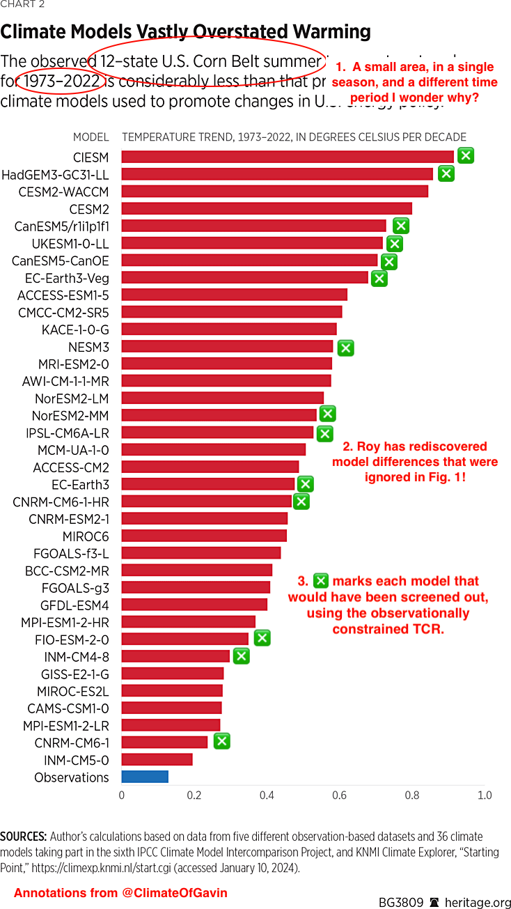
Roy agrees to look into it, but whether he ever got back to Koonin is unclear. In any case, no public statements or responses have been made. The conversation did however reveal where the data came from and Roy’s method for making the comparison, inspiring me to try and replicate the analysis more appropriately. So let’s see what we can find out.
NOAA Climate Divisions
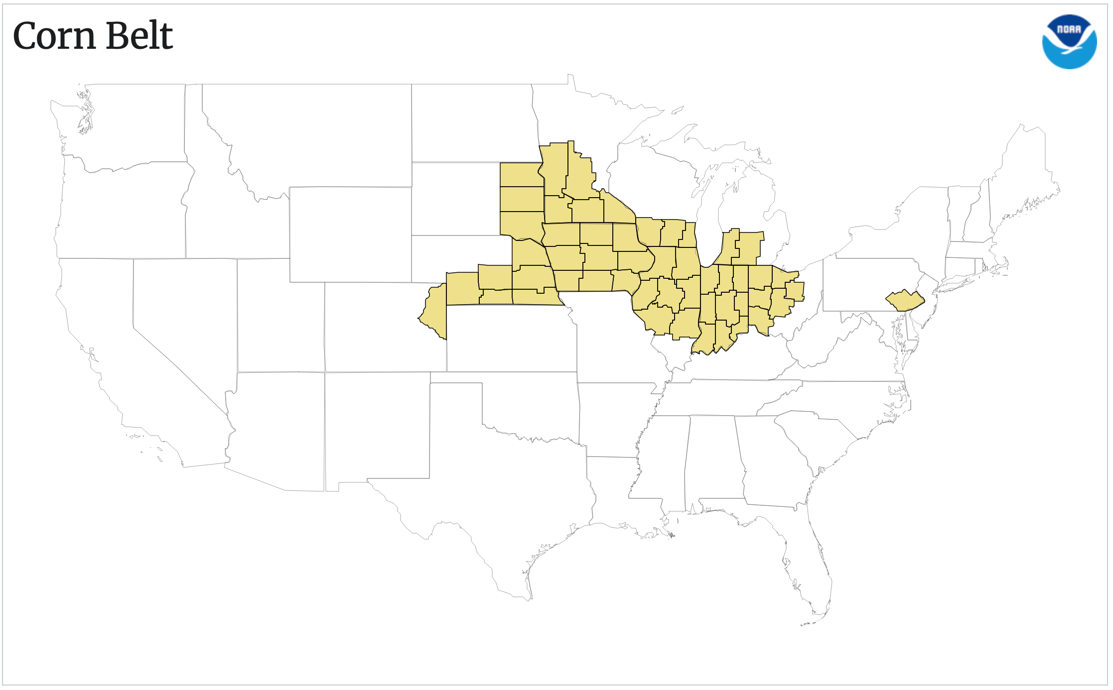
NOAA has a great website with its Climate Division data (ClimDiv) which is an aggregated product from the individual station data, but averaged at the division, state, and regional levels. It has averages for 9 regions of CONUS, the big river basins, NWS areas, and multiple agricultural regions. The Corn Belt map for averages is below:
Spencer most likely used this precomputed index (across 11 states, though his figure says 12 – he might have tried making his own 12-state index but I don’t think it matters much, other than making it trickier to replicate). Anyway, the Corn Belt data (code 261 for the area weighted observational data) can be downloaded directly and the JJA trends computed for the 50 year period 1973-2022 (following Spencer’s graph). I’m sure it will come as a great shock to our readers that of all the regions computed in the NOAA ClimDiv dataset over this period, the Corn Belt index has almost the lowest summer trend (0.1ºC/dec though with a wide (95%) confidence interval [-0.07,0.27]). Quel surprise!
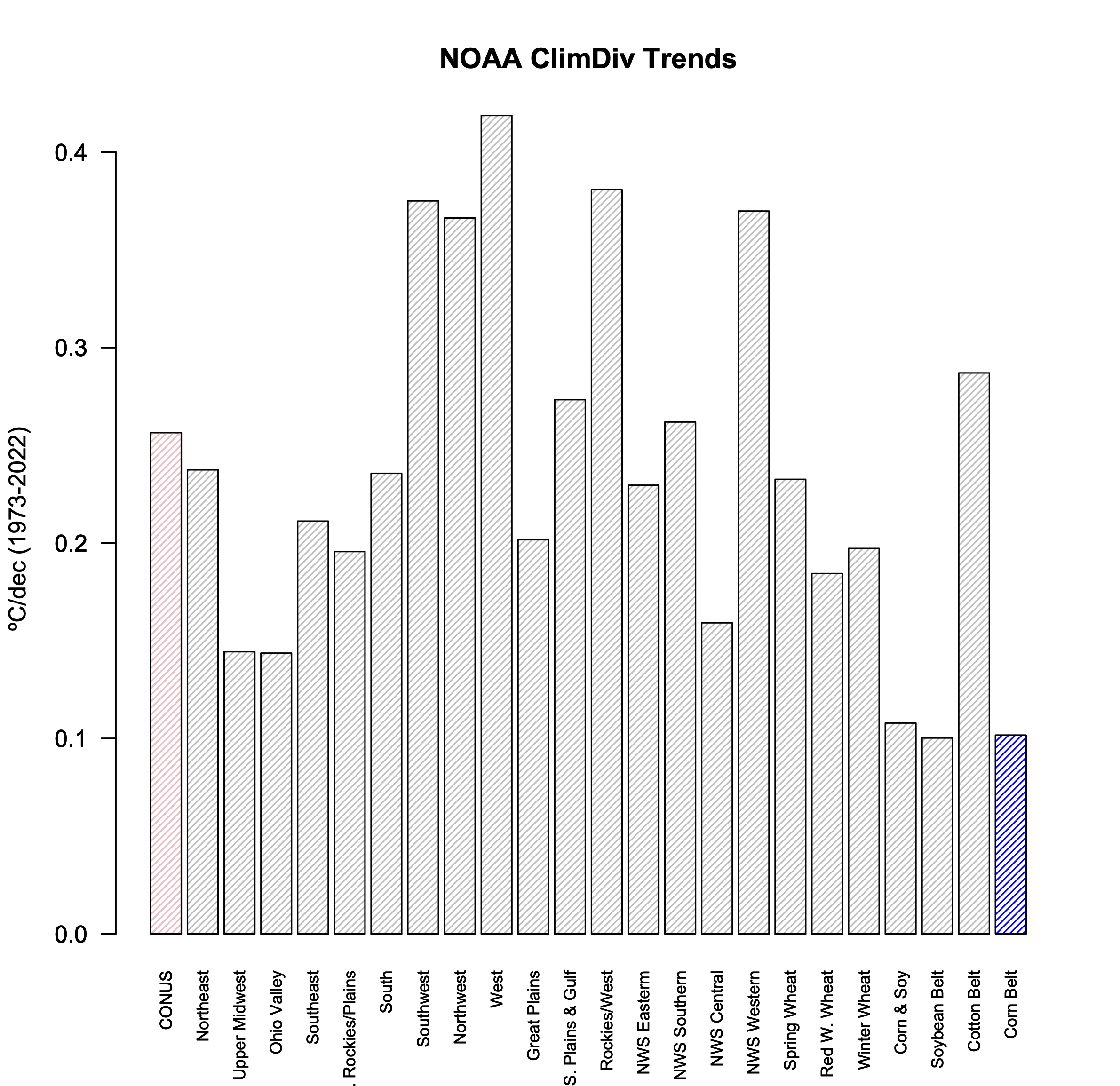
Note that the annual trends are much less noisy and more similar across the regions (but that wouldn’t be as useful, now, would it?).
This can be compared with the CMIP6 models data from a roughly analogous area (100-81ºW, 40-46ºN). This is relatively easy to extract from the ClimateExplorer website for 144 individual simulations (using the historical + SSP245 scenario). Spencer (I think) choose the option to download the ensemble mean for each model (or perhaps just a single run from each model). In either case, he discards very relevant information from the ensemble for each particular model.
So let’s plot the JJA trends for the Corn Belt region, including two elements that Spencer ignored. First, the uncertainty in the OLS trend in the observations (which is large) and, second, the spread across the individual model ensembles. As we did previously, we can plot the trends against the climate sensitivity (here I’ll use the Transient Climate Response) to see the difference that the ‘hot models’ make (IPCC AR6 assessed that the likely range of TCR was 1.4-2.2ºC, very likely 1.2-2.4ºC). Note that noisier the statistic (short periods, small regions, etc.) the less clear any difference related to climate sensitivity will be.
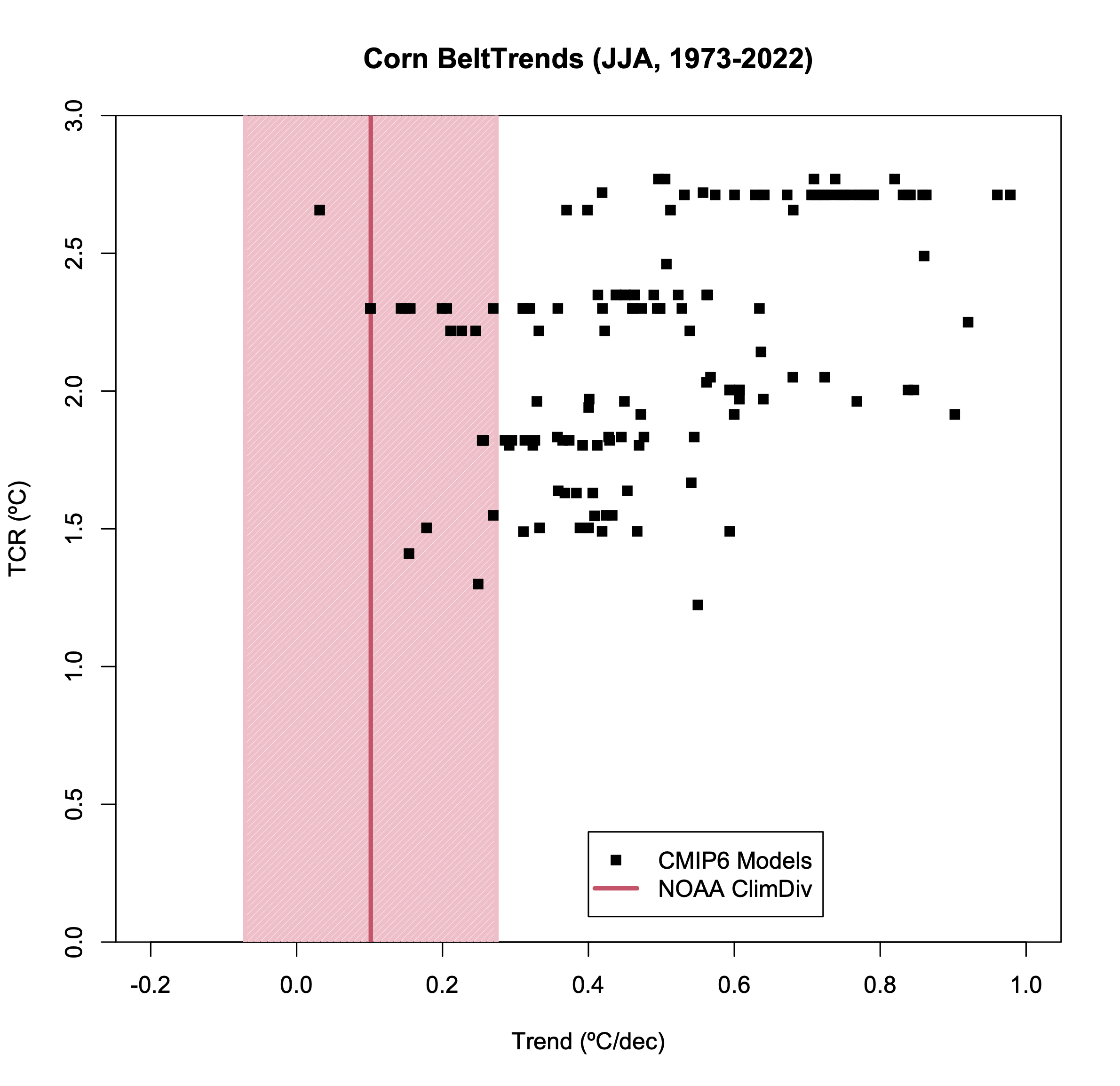
As in Spencer’s original plot, the bulk of the simulations have a larger trend than observed (all but 2 in fact). However, we are not done. Recall that the simulations are an ensemble of opportunity. Some of the models have sufficient ensemble members to reasonably estimate the standard deviation and the 95% spread for the trend in that model, but others have only one member and no spread can be calculated. If we assume that the average standard deviation where we can calculate it (in this diagnostic it’s 0.11ºC/dec), is a good estimate in those cases, we can plot the ensemble means, along with an estimated 95% spread, for each model.
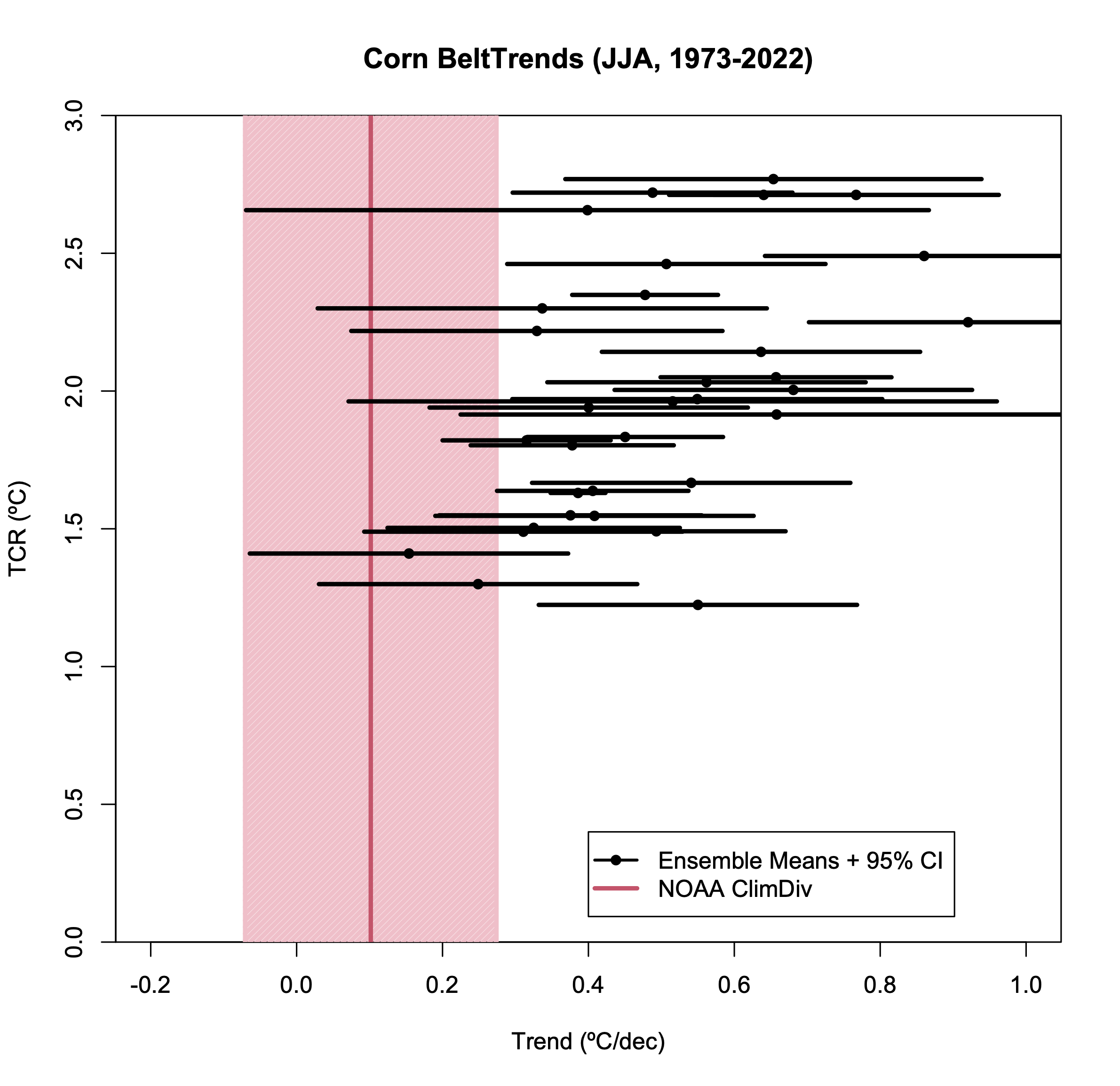
Now we have a slightly more regular statistical comparison, and we can see that this observation is within the 95% spread of about half a dozen models. Thus it’s a plausible (if not likely) match. Given the large number of comparison one could theoretically do, if one area (specifically chosen) is an outlier is not so surprising.
However, the point of the criticism of Spencer’s figure to begin with was not that these Corn Belt temperature trends have been well predicted, but rather that this index was cherry picked to provide the worst possible comparison. So what would a different index have given? I have not checked them all [The other crop regions are not so easily translated into lat/lon rectangles!], but I did look at the NorthWest region (124-111ºW, 42-49ºN) – this region has warmed more than the CONUS average by about the same degree that the Corn Belt region was below.
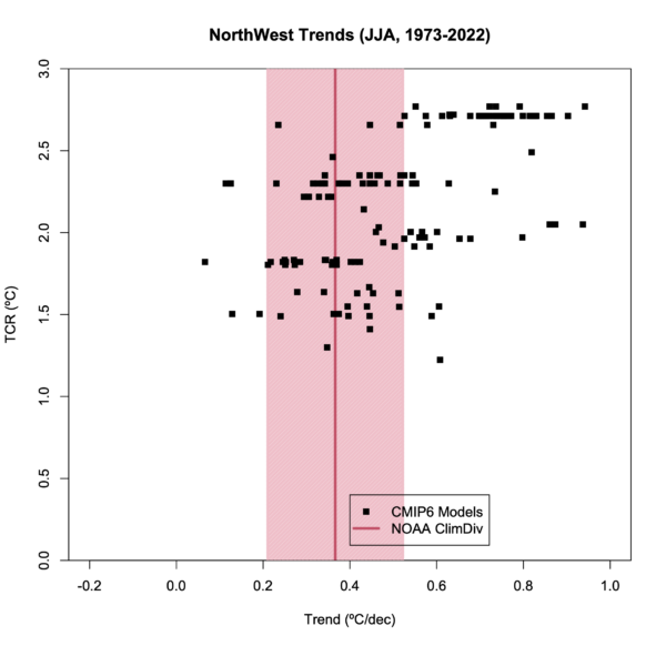
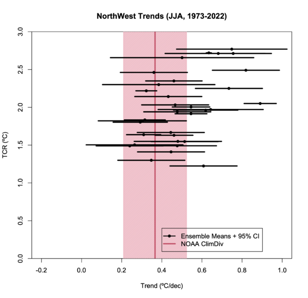
And… there is a much stronger coherence with the ensemble. But this would not have provided as useful a talking point of course. Does this mean the models are perfect? Of course not. A worthwhile analysis would have looked at a spread of such comparisons and made a statement about the utility of the models based on that collective analysis. Just looking at the one or two small areas or single seasons is not going to be informative.
Useful vs. Useless model-observation comparisons
My point here is not to discuss the utility of the CMIP6 projections for the corn, wheat, soy regions of the US etc. That is best left to people who have better domain knowledge about those applications. However, I do want to (again) stress a few points:
- Observations have uncertainty too. Whether it is in the linear trend and/or structural, it needs to be accounted for in any comparison.
- Observational data comes from a single realization. You need to think about what the irreducible uncertainty associated with internal variability means.
- The model ensembles are complex. You cannot substitute what is easily downloadable from ClimateExplorer for an analysis in and of itself.
- Whether the observed trend is or is not close to the model ensemble mean(s) is not a good test of the skill of the model(s) or multi-model ensemble.
- The appropriate test is whether the real world observation is exchangeable with an ensemble member from the model. The visual comparisons shown above address this, but it can also be done quantitatively in ways that take into account both the observational uncertainty and spread.
- Comparisons such as presented by Spencer in the DOE or Heritage Foundation reports are fundamentally flawed since they never deal seriously with any of this, and will continually be called out as cherry picking.
One last thought. Steve, take a moment and think about why Roy didn’t ever address the critiques. Just spitballing here, but the intersection between people generally thought of as ’eminent’ scientists and folks that engage in this kind of hackery is empty.
Comment Policy:Please note that if your comment repeats a point you have already made, or is abusive, or is the nth comment you have posted in a very short amount of time, please reflect on the whether you are using your time online to maximum efficiency. Thanks.