Almost two decades ago, some scientists predicted that Arctic summer sea ice would ‘soon’ disappear. These predictions were mentioned by Al Gore and got a lot of press. However, they did not gain wide acceptance in the scientific community, and were swiftly disproven. Unsurprisingly, this still comes up a lot. Time for a deeper dive into what happened and why…
[Read more…] about “But you said the ice was going to disappear in 10 years!”Instrumental Record
Time and Tide Gauges wait for no Voortman
Here we go again. An obscure, methodologically poor, paper published with little to no review makes a convenient point and gets elevated into supposedly ‘blockbusting’ science by the merchants of bullshit, sorry, doubt. Actual scientists drop everything to respond, but not before the (convenient) nonsense has spread widely. Rebuttals are written and submitted, but by the time they are published everyone has moved on.
Lil’ NAS Express
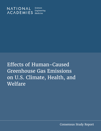
The fast-tracked update of the 2009 EPA Endangerment finding from the National Academies for Science, Engineering and Medicine (NASEM), has now been released.
[Read more…] about Lil’ NAS ExpressDOE CWG Report “Moot”?
Somewhat breaking news. A court filing (from 9/4) from DOE has noted that the Climate Working Group has been disbanded (as of 9/3). This was done to make the EDF/UCS lawsuit moot, but it also means that DOE is withdrawing the report, no-one will respond appropriately to the comments submitted, and (possibly) it becomes irrelevant for the EPA reconsideration of the Endangerment Finding.
What a farce.
Update: Via Andy Revkin, the EDF/UCS’s blistering response to the DOE filing. Pass the popcorn.
Climate Scientists response to DOE report
As we’ve mentioned, Andrew Dessler and Robert Kopp have been coordinating a scientific peer review of the DOW ‘CWG’ Critique of Climate Science. It is now out.
[Read more…] about Climate Scientists response to DOE reportCritique of Chapter 6 “Extreme Weather” in the DOE review
Guest commentary by Kerry Emanuel
Executive Summary
Chapter 6 of the draft DOE report examines whether global warming exacerbates extreme weather. It rightly notes that because events such as hurricanes are rare, detecting their response to climate change in short and imperfect historical records is extremely difficult—if not impossible. Yet the authors devote most of the remainder of the chapter to attempting just that. By omitting to frame such efforts in the context of theory and models, they commit three fundamental errors: 1) searching for trends where none were predicted, 2) neglecting important variables for which trends were predicted and 3) overlooking—or failing to acknowledge—that some predicted trends are of a magnitude that is not a priori detectable in existing noisy and short data sets. The draft report also overlooks recent literature on climate change effects on weather extremes, and quotes selectively and misleadingly from the most recent report of the Intergovernmental Panel on Climate Change (IPCC). For these reasons, I find much of Chapter 6 to be of questionable utility. There are at least three climate change-induced trends in hurricane-related hazards that were predicted theoretically, simulated by models, and confirmed by observations:
- Hurricanes are producing more rain, causing increased flooding. As water, not wind, is the source of most damage and mortality in hurricanes, this is the most consequential scientific finding.
- The proportion of hurricanes that reach high intensity is increasing.
- Hurricanes are intensifying more rapidly.
There is no robust scientific finding that hurricane frequency is increasing or expected to increase. Thus, much of Chapter 6 of the DOE report is devoted to refuting a hypothesis unsupported by scientific consensus. The short section on tornadoes does not include other more destructive aspects of severe convective storms, such as hail and damaging straight-line winds, and as with the section on hurricanes, omits inferences from theory and models.
[This commentary is also available as a pdf file]
[Read more…] about Critique of Chapter 6 “Extreme Weather” in the DOE reviewCritiques of the ‘Critical Review’
The first somewhat comprehensive reviews of the DOE critical review are now coming online.
[Read more…] about Critiques of the ‘Critical Review’The Endangerment of the Endangerment Finding?
The EPA, along with the “Climate Working Group” (CWG) of usual suspects (plus Judith Curry and Ross McKitrick) at DOE, have just put out a document for public comment their attempt to rescind the 2009 Endangerment Finding for greenhouse gas emissions.
[Read more…] about The Endangerment of the Endangerment Finding?Ocean circulation going South?
Some intriguing new measurements of salinity in the oceans around Antarctica have set off reams of sensationalist speculations. Maybe some context is helpful…
[Read more…] about Ocean circulation going South?Melange à Trois
In honor of the revelation today, that Koonin, Christy and Spencer have been made Special Government Employees at the Dept. of Energy, we present a quick round up of our commentary on the caliber of their arguments we’ve posted here over the last decade or so.
TL;DR? The arguments are not very good.
[Read more…] about Melange à Trois