I’ve been getting a lot of media queries about a new paper on the AMOC (Atlantic Meridional Overturning Circulation), which has just been published. In my view this large media interest is perhaps due to confusing messages conveyed in the title of the paper and in press releases about it by the journal Nature and by the Met Office. Whether intended or not, these give the impression that new model results suggest that the AMOC is more resilient than previously thought. That’s (unfortunately!) not the case.
[Read more…] about How will media report on this new AMOC study?Featured Story
Comparison Update 2024
One more dot on the graphs for our annual model-observations comparisons updates. Given how extraordinary the last two years have been, there are a few highlights to note.
[Read more…] about Comparison Update 2024The AMOC is slowing, it’s stable, it’s slowing, no, yes, …
There’s been a bit of media whiplash on the issue of AMOC slowing lately – ranging from the AMOC being “on the brink of collapse” to it being “more stable than previously thought”. AMOC, of course, refers to the Atlantic Meridional Overturning Circulation, one of the worlds major ocean circulation systems which keeps the northern Atlantic region (including Europe) exceptionally warm for its latitude. So what is this whiplash about?
As is often the case with such media whiplash, there isn’t much scientific substance behind it, except for the usual small incremental steps in the search for improved understanding. It is rare that one single paper overthrows our thinking, though media reports unfortunately often give that impression. Real science is more like a huge jigsaw puzzle, where each new piece adds a little bit.
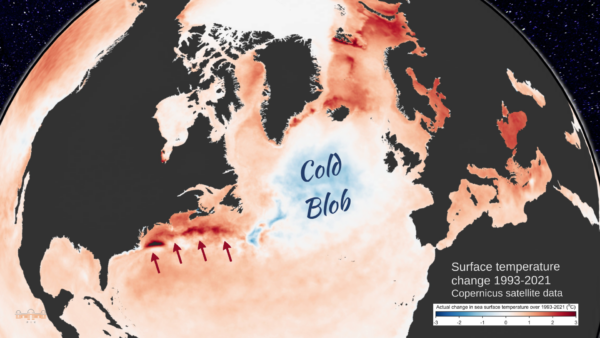
The latest new piece is a new reconstruction of how the AMOC has changed over the past 60 years, by Jens Terhaar and colleagues. The background to this discussion is familiar to our regular readers (else just enter ‘AMOC’ in the RealClimate search field): proper measurements of the AMOC flow are only available since 2004 in the RAPID project, thus for earlier times we need to use indirect clues. One of these is the sea surface temperature ‘finger print’ of AMOC changes as discussed in our paper Caesar et al. 2018 (Fig. 1). There we used the cold blob temperature anomaly (Nov-May) as an index for AMOC strength. Other studies have used other sea surface temperature or salinity patterns as well as paleoclimatic proxy data (e.g. sediment grain sizes), and generally found an AMOC decline since the 19th Century superimposed by some decadal variability. The new paper critices our (i.e. Caesar et al) reconstruction and suggests a new method using surface heat fluxes from reanalysis data as an indicator of AMOC strength.
Here’s three questions about it.
1. Does the ‘cold blob’ work well as AMOC indicator?
We had tested that in the historic runs of 15 different CMIP5 climate models in Caesar et al. 2018 (our Fig. 5) and found it works very well, except for two outlier models which were known to not produce a realistic AMOC. Now Terhaar et al. redid this test with the new CMIP6 model generation und found it works less well, i.e. the uncertainty is larger (although for future simulations where the AMOC shows a significant decline in the models, our AMOC index also works well in their analysis).
Which raises the question: which models are better for this purpose: CMIP5 or CMIP6? One might think that newer models are better – but this does not seem to be the case for CMIP6. Irrespective of the AMOC, the CMIP6 models created substantial controversy when their results came out: the climate sensitivity of a subset of ‘hot models’ was far too high, these models did not reproduce past temperature evolution well (compared to observed data), and IPCC made the unprecedented move of not presenting future projections as straightforward model average plus/minus model spread, but instead used the new concept of “assessed global warming” where models are weighted according to how well they reproduce observational data.
In the North Atlantic, the historic runs of CMIP6 models on average do not reproduce the ‘cold blob’ despite this being such a striking feature of the observational data, as shown clearly in the Summary for Policy Makers of the IPCC AR6 (see Fig. 2 below). Of the 24 CMIP6 models, a full 23 underestimate the sea surface cooling in the ‘cold blob’. And most of the CMIP6 models even show a strengthening of the AMOC in the historic period, which past studies have shown to be linked to strong aerosol forcing in many of these models (e.g. Menary et al. 2020, Robson et al. 2022). The historic Northern Hemisphere temperature evolution in the models with a strong aerosol effect “is not consistent with observations” and they “simulate the wrong sign of subpolar North Atlantic surface salinity trends”, as Robson et al. write. Thus I consider CMIP6 models as less suited to test how well the ‘cold blob’ works as AMOC indicator than the CMIP5 models.
2. Is the new AMOC reconstruction method, based on the surface heat loss, better?
In the CMIP6 models it looks like that, and the link between AMOC heat transport and surface heat loss to the north makes physical sense. However, in the models the surface heat loss is perfectly known. In the real ocean that is not an observed quantity. It has to be taken from model simulations, the so-called reanalysis. While these simulations assimilate observational data, over most of the ocean surface these are basically sea surface temperatures, but surface heat loss depends also on air temperature, wind speed, humidity, radiation and cloud cover in complex ways, all of which are not accurately known. Therefore these surface heat loss data are much less accurate than sea surface temperature data and in my view not well suited to reconstruct the AMOC time evolution.
That is supported by the fact that two different reanalysis data sets were used, leading to quite different AMOC reconstructions. Also the AMOC time evolution they found differs from other reconstruction methods for the same time period (see point 3 below).
And there is another issue: we’ve previously looked at ERA5 surface heat flux trend, as shown here from my article in Oceanography 2024:
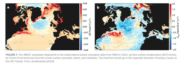
You see in both figures (in temperature as well as surface heat flux) the AMOC slowdown ‘fingerprint’ which includes both the ‘cold blob’ and a warming along the American coast due to a northward Gulf Stream shift, which is also a symptom of AMOC weakening. However, Terhaar et al. integrate over the whole northern Atlantic north of 26 °N so that the red area of increasing heat loss largely compensates for the blue area of decreasing heat loss. So in their analysis these two things cancel, while in the established concept of the ‘fingerprint’ (see Zhang 2008: Coherent surface-subsurface fingerprint of the Atlantic meridional overturning circulation) these two things both reinforce the evidence for an AMOC weakening.
3. How do these new reconstructions compare to others?
Here is how the Terhaar reconstructions (bottom two) compare:
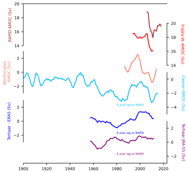
The reconstruction at the bottom using a reanalysis product from Japan doesn’t resemble anything, while the blue one using the European ERA5 reanalysis at least has the 1980s minimum and early 2000s maximum in common with other data, albeit with much smaller amplitude; it is a lot smoother. Thus it also misses the strong AMOC decline 2004-2010 and subsequent partial recovery seen in the RAPID measurements as well as the Caesar and Worthington reconstructions. A main reason for the lack of significant trend in the Terhaar reconstructions further is the time interval they used; for the same time span the Caesar reconstruction also does not show an even remotely significant trend (p-value is only 0.5), so in this respect our reconstructions actually agree for the period they overlap. The fact that ours shows a significant AMOC decline is because of the stable AMOC we find during 1900-1960, which is stronger than in the following sixty years. Here our reconstruction method shows its advantage in that reliable and accurate sea surface temperature data exist so far back in time.
Hence, I do not believe that the new attempt to reconstruct the AMOC is more reliable than earlier methods based on temperature or salinity patterns, on density changes in the ‘cold blob’ region, or on various paleoclimatic proxy data, which have concluded there is a weakening. But since we don’t have direct current measurements going far enough back in time, some uncertainty about that remains. The new study however does not change my assessment of AMOC weakening in any way.
And all agree that the AMOC will weaken in response to global warming in future and that this poses a serious risk, whether this weakening has already emerged from natural variability in the limited observational data we have, or not. Hence the open letter of 44 experts presented in October at the Arctic Circle Assembly (see video of my plenary presentation there), which says:
We, the undersigned, are scientists working in the field of climate research and feel it is urgent to draw the attention of the Nordic Council of Ministers to the serious risk of a major ocean circulation change in the Atlantic. A string of scientific studies in the past few years suggests that this risk has so far been greatly underestimated. Such an ocean circulation change would have devastating and irreversible impacts especially for Nordic countries, but also for other parts of the world.
Post script
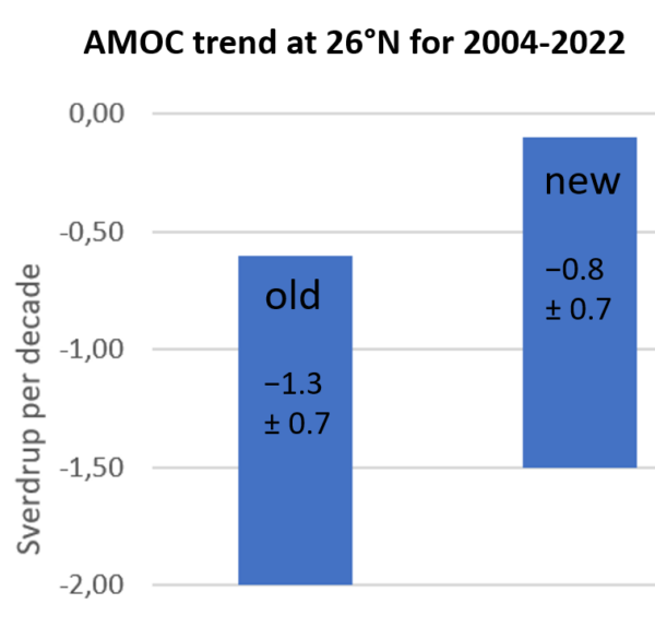
Since I’m sometimes asked about that: last year a data study by Volkov et al. revised the slowing trend of the Florida current as well as the AMOC. Contrary to ‘climate skeptics’ claims, it has no impact on our long-term estimate of ~3 Sv slowing since 1950, i.e. -0.4 Sv/decade (Caesar et al. 2018). Both the original and the revised trend estimates for the RAPID section data (see Figure) suggest the recent AMOC weakening since 2004 is steeper than the long-term trend we estimated.
2024 Hindsight
To no-one’s surprise 2024 was the warmest year on record – and by quite a clear margin.
[Read more…] about 2024 Hindsight¡AI Caramba!

Rapid progress in the use of machine learning for weather and climate models is evident almost everywhere, but can we distinguish between real advances and vaporware?
[Read more…] about ¡AI Caramba!Nature 2023: Part II
This is a follow-on post to the previous summary of interesting work related to the temperatures in 2023/2024. I’ll have another post with a quick summary of the AGU session on the topic that we are running on Tuesday Dec 10th, hopefully in the next couple of weeks.
6 Dec 2024: Goessling et al (2024)
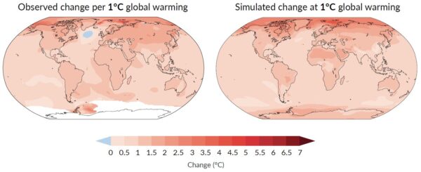
This is perhaps the most interesting of the papers so far that look holistically at the last couple of years of anomalies. The principle result is a tying together the planetary albedo and the temperature changes. People have been connecting these changes in vague (somewhat hand-wavy ways) for a couple of years, but this is the first paper to do so quantitatively.
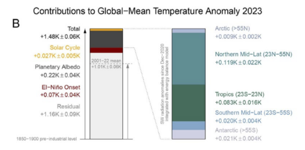
The authors use the CERES data and some aspects of the ERA5 reanalysis (which is not ideal for these purposes because of issues we discussed last month) to partition the changes by latitude, and to distinguish impacts from the solar cycle anomaly (~0.03 K), ENSO (~0.07K) and the albedo (~0.22K) (see figure above).
What they can’t do using this methodology is partition the albedo changes across cloud feedbacks, aerosol effects, surface reflectivity, volcanic activity etc., and even less, partition that into the impacts of marine shipping emission reductions, Chinese aerosol emissions, aerosol-cloud interactions etc. So, in terms of what the ultimate cause(s) are, more work is still needed.
Watch this space…
References
- H.F. Goessling, T. Rackow, and T. Jung, "Recent global temperature surge intensified by record-low planetary albedo", Science, vol. 387, pp. 68-73, 2025. http://dx.doi.org/10.1126/science.adq7280
Twenty years of blogging in hindsight
It’s 20 years since we started blogging on climate here on RealClimate (December 10, 2004). We wanted to counter disinformation about climate change that was spreading through various campaigns. In those days it was an unusual move that prompted a welcome from Nature.
[Read more…] about Twenty years of blogging in hindsightOperationalizing Climate Science
There is a need to make climate science more agile and more responsive, and that means moving (some of it) from research to operations.
[Read more…] about Operationalizing Climate ScienceScience is not value free
An interesting commentary addressing a rather odd prior commentary makes some very correct points.
[Read more…] about Science is not value freeNew journal: Nature 2023?
[Last update Dec 6, 2024] There were a number of media reports today [May 11, 2024] related to Yuan et al. (2024), for instance, New Scientist, The Guardian etc. However, this is really just the beginning of what is likely to be a bit of a cottage industry in the next few months relating to possible causes/influences on the extreme temperatures seen in 2023. So to help people keep track, we’ll maintain a list here to focus discussions. Additionally, we’ll extract out the key results (such as the reported radiative forcing) as a guide to how this will all eventually get reconciled.
[Read more…] about New journal: Nature 2023?References
- T. Yuan, H. Song, L. Oreopoulos, R. Wood, H. Bian, K. Breen, M. Chin, H. Yu, D. Barahona, K. Meyer, and S. Platnick, "Abrupt reduction in shipping emission as an inadvertent geoengineering termination shock produces substantial radiative warming", Communications Earth & Environment, vol. 5, 2024. http://dx.doi.org/10.1038/s43247-024-01442-3