It’s 20 years since we started blogging on climate here on RealClimate (December 10, 2004). We wanted to counter disinformation about climate change that was spreading through various campaigns. In those days it was an unusual move that prompted a welcome from Nature.
[Read more…] about Twenty years of blogging in hindsightFeatured Story
Operationalizing Climate Science
There is a need to make climate science more agile and more responsive, and that means moving (some of it) from research to operations.
[Read more…] about Operationalizing Climate ScienceScience is not value free
An interesting commentary addressing a rather odd prior commentary makes some very correct points.
[Read more…] about Science is not value freeNew journal: Nature 2023?
[Last update Dec 6, 2024] There were a number of media reports today [May 11, 2024] related to Yuan et al. (2024), for instance, New Scientist, The Guardian etc. However, this is really just the beginning of what is likely to be a bit of a cottage industry in the next few months relating to possible causes/influences on the extreme temperatures seen in 2023. So to help people keep track, we’ll maintain a list here to focus discussions. Additionally, we’ll extract out the key results (such as the reported radiative forcing) as a guide to how this will all eventually get reconciled.
[Read more…] about New journal: Nature 2023?References
- T. Yuan, H. Song, L. Oreopoulos, R. Wood, H. Bian, K. Breen, M. Chin, H. Yu, D. Barahona, K. Meyer, and S. Platnick, "Abrupt reduction in shipping emission as an inadvertent geoengineering termination shock produces substantial radiative warming", Communications Earth & Environment, vol. 5, 2024. http://dx.doi.org/10.1038/s43247-024-01442-3
Much ado about acceleration
There has been a lot of commentary about perceived disagreements among climate scientists about whether climate change is (or will soon be) accelerating. As with most punditry, there is less here than it might seem.
[Read more…] about Much ado about accelerationMore solar shenanigans*
Going back a few months, I spent a bit of time pointing out the strategy and nonsense in the various Willie Soon and company’s efforts to blame current warming on solar activity. I specifically pointed out their cultish devotion to a single solar activity reconstruction (Hoyt and Schatten, 1993) (HS93); with an update from Scaffeta (2023), and their increasingly elaborate efforts to create temperature series that correlate to it.
Well, Theodosios Chatzistergos has just published a deep dive into the HS93 reconstruction (Chatzistergos, 2024) (C24) and… let’s say the results will not be surprising to regular readers.
[Read more…] about More solar shenanigans*References
- D.V. Hoyt, and K.H. Schatten, "A discussion of plausible solar irradiance variations, 1700‐1992", Journal of Geophysical Research: Space Physics, vol. 98, pp. 18895-18906, 1993. http://dx.doi.org/10.1029/93JA01944
- N. Scafetta, "Empirical assessment of the role of the Sun in climate change using balanced multi-proxy solar records", Geoscience Frontiers, vol. 14, pp. 101650, 2023. http://dx.doi.org/10.1016/j.gsf.2023.101650
- T. Chatzistergos, "A Discussion of Implausible Total Solar-Irradiance Variations Since 1700", Solar Physics, vol. 299, 2024. http://dx.doi.org/10.1007/s11207-024-02262-6
New study suggests the Atlantic overturning circulation AMOC “is on tipping course”
A new paper was published in Science Advances today. Its title says what it is about: “Physics-based early warning signal shows that AMOC is on tipping course.” The study follows one by Danish colleagues which made headlines last July, likewise looking for early warning signals for approaching an AMOC tipping point (we discussed it here), but using rather different data and methods.
The new study by van Westen et al. is a major advance in AMOC stability science, coming from what I consider the world’s leading research hub for AMOC stability studies, in Utrecht/Holland. (Some of their contributions spanning the past 20 years are in the paper’s reference list, with authors Henk Dijkstra, René van Westen, Nanne Weber, Sybren Drijfhout and more.)
The paper results from a major computational effort, based on running a state-of-the-art climate model (the CESM model with horizontal resolution 1° for the ocean/sea ice and 2° for the atmosphere/land component) for 4,400 model years. This took 6 months to run on 1,024 cores at the Dutch national supercomputing facility, the largest system in the Netherlands in terms of high-performance computing.
It is the first systematic attempt to find the AMOC tipping point in a coupled global ocean-atmosphere climate model of good spatial resolution, using the quasi-equilibrium approach which I pioneered in 1995 with an ocean-only model of relatively low resolution, given the limited computer power available 30 years ago.
If you’re not familiar with the issues surrounding the risk of abrupt ocean circulation changes, I briefly summarized ten key facts on this topic last year in this blog post.
But now, let’s get straight to the main findings of the new paper:
1. It confirms that the AMOC has a tipping point beyond which it breaks down if the northern Atlantic Ocean is diluted with freshwater (by increasing rainfall, river runoff and meltwater), thus reducing its salinity and density. This has been suggested by simple conceptual models since Stommel 1961, confirmed for a 3D ocean circulation model in my 1995 Nature article, and later in a first model intercomparison project in 2005, among other studies. Now this tipping point has been demonstrated for the first time in a state-of-the-art global coupled climate model, crushing the hope that with more model detail and resolution some feedback might prevent an AMOC collapse. (This hope was never very convincing, as paleoclimate records clearly show abrupt AMOC shifts in Earth history, including full AMOC breakdowns triggered by meltwater input (Heinrich events). The last AMOC breakdown occurred about 12,000 years ago and triggered the Younger Dryas cold event around the northern Atlantic.)
2. It confirms by using observational data that the Atlantic is “on tipping course”, i.e. moving towards this tipping point. The billion-dollar question is: how far away is this tipping point?
3. Three recent studies (for more on these see this blog post), using different data and methods, have argued that we are approaching the tipping point and that it might be too close for comfort, even posing a risk of crossing it in the next decades. However, the reliability of the methods used has been questioned (as discussed here at RealClimate). Based on their epic computer simulation, the Dutch group proposed a new, physics-based and observable type of early warning signal. It uses a diagnostic – the freshwater transport by the AMOC at the entrance of the South Atlantic, across the latitude of the southern tip of Africa – which I proposed in a 1996 study. They do not present a particular time period estimate for reaching the tipping point, as more observations of the ocean circulation at this latitude will be needed for that, but they note about last year’s Ditlevsen study that “their estimate of the tipping point (2025 to 2095, 95% confidence level) could be accurate.”
4. The new study confirms past concerns that climate models systematically overestimate the stability of the AMOC. About the crucial AMOC freshwater transport in models, they point out that most models don’t get it right: “This is not in agreement with observations, which is a well-known bias in CMIP phase 3 (38), phase 5 (21), and phase 6 (37) models.” Most models even have the wrong sign of this important diagnostic, which determines whether the feedback on Atlantic salinity is stabilising or destabilising, and this model bias is a key reason why in my view the IPCC has so far underestimated the risk of an AMOC collapse by relying on these biased climate models.
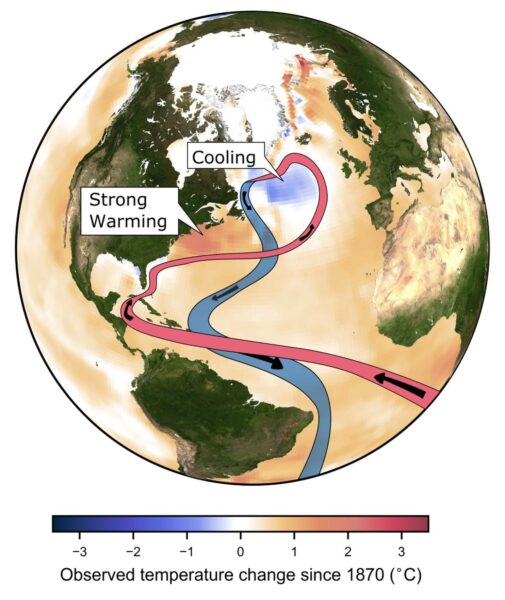
5. The study also provides more detailed and higher resolution simulations of the impacts of an AMOC collapse on climate, albeit considered in isolation and not combined with the effects of CO2-induced global warming (Fig. 2). They show how particularly northern Europe from Britain to Scandinavia would suffer devastating impacts, such as a cooling of winter temperatures by between 10 °C and 30 °C occurring within a century, leading to a completely different climate within a decade or two, in line with paleoclimatic evidence about abrupt ocean circulation changes. In addition they show major shifts in tropical rainfall belts. These (and many more) impacts of an AMOC collapse have been known for a long time but thus far have not been shown in a climate model of such high quality.
Given the impacts, the risk of an AMOC collapse is something to be avoided at all cost. As I’ve said before: the issue is not whether we’re sure this is going to happen. The issue is that we need to rule this out at 99.9 % probability. Once we have a definite warning signal it will be too late to do anything about it, given the inertia in the system.
Overall the new study adds significantly to the rising concern about an AMOC collapse in the not too distant future. It thus adds even more weight to recent reports sounding strong warning sirens, such as the OECD Climate Tipping Points report of December 2022 and the Global Tipping Points report published December 2023. We will continue to ignore this risk at our peril.
Update 10. February: In the reactions to the paper, I see some misunderstand this as an unrealistic model scenario for the future. It is not. This type of experiment is not a future projection at all, but rather done to trace the equilibrium stability curve (that’s the quasi-equlibrium approach mentioned above). In order to trace the equlibrium response, the freshwater input must be ramped up extremely slowly, which is why this experiment uses so much computer time. After the model’s tipping point was found in this way, it was used to identify precursors that could warn us before reaching the tipping point, so-called “early warning signals”. Then, the scientists turned to reanalysis data (observations-based products, shown in Fig. 6 of the paper) to check for an early warning signal. The headline conclusion that the AMOC is „on tipping course“ is based on these data.
In other words: it’s observational data from the South Atlantic which suggest the AMOC is on tipping course. Not the model simulation, which is just there to get a better understanding of which early warning signals work, and why.
Spencer’s Shenanigans
A recent sensible-sounding piece by Roy Spencer for the Heritage foundation is full of misrepresentations. Let’s play spot the fallacy.
[Read more…] about Spencer’s ShenanigansNot just another dot on the graph? Part II
Annual updates to the model-observation comparisons for 2023 are now complete. The comparisons encompass surface air temperatures, mid-troposphere temperatures (global and tropical, and ‘corrected’), sea surface temperatures, and stratospheric temperatures. In almost every case, the addition of the 2023 numbers was in line with the long term expectation from the models.
[Read more…] about Not just another dot on the graph? Part IINot just another dot on the graph?
As the climate monitoring groups add an additional dot to their graphs this week, there is some disquiet among people paying attention about just how extraordinary 2023 really was.
[Read more…] about Not just another dot on the graph?