• Skip to primary navigation
  • Skip to main content
  • Skip to primary sidebar
  • Skip to footer

RealClimate

Climate science from climate scientists...

  • Start here
  • Model-Observation Comparisons
  • Miscellaneous Climate Graphics
  • Surface temperature graphics
You are here: Home / Search for "rahmstorf"

Search Results for: rahmstorf

Extremely hot

26 Mar 2012 by Stefan

By Stefan Rahmstorf and Dim Coumou

One claim frequently heard regarding extreme heat waves goes something like this: ”Since this heat wave broke the previous record by 5 °C, global warming can’t have much to do with it since that has been only 1 °C over the 20th century”. Here we explain why we find this logic doubly flawed.

One can ask two different questions about the influence of global warming on heat waves (Otto et al. 2012), and we take them in turn.

1. How much hotter did global warming make this heat wave?
[Read more…] about Extremely hot

Filed Under: Climate Science

The dog is the weather

17 Jan 2012 by rasmus

Update January 27: There is also another recent dog-based animations from Victoria (southeast Australia) explaining some of the key drivers of our climate and how some are changing.

A TV series that ran on Norwegian TV (NRK) last year included a simple and fun cartoon that demonstrates some important concepts relative to weather and climate:

In the animation, the man’s path can be considered as analogous to a directional climatic change, while the path traced by his dog’s whimsical movements represent weather fluctuations, as constrained by the man’s path, the leash, and the dog’s moment-by-moment decisions of what seems important to investigate in his small world. What might the leash length represent? The man’s momentary pause? The dog’s exact route relative to concepts of random variation? The messages in this animation are similar to the recent results of Grant Foster and Stefan Rahmstorf in ERL (see post here).

We’d also like to praise the TV-series ‘Siffer‘, hosted by an enthusiastic statistician explaining how most things in our world relate to mathematics. The series covers a range of subjects, for instance gambling theory, the Tragedy of the Commons, anecdotes about mathematical riddles, medical statistics, and construction design; it even answers why champagne from a large bottle tastes better than that from a smaller one. There is also an episode devoted to weather forecasting and climate.

Success in understanding our universe often depends on how the ‘story’ about it is told, and a big part of that often involves how mental images are presented. Mathematics and statistics can describe nature in great detail and “elegance”, but they are often difficult and inaccessible to the average person. Conversely, the man-and-dog animation is intuitive and easy to comprehend. Similarly, Hans Rosling’s Fun with Stats provides some very nice demonstrations of how to convey meaning via the creative display of numbers.

Filed Under: Climate impacts, Communicating Climate, El Nino, Greenhouse gases, Tutorials

The most popular deceptive climate graph

8 Dec 2014 by Stefan

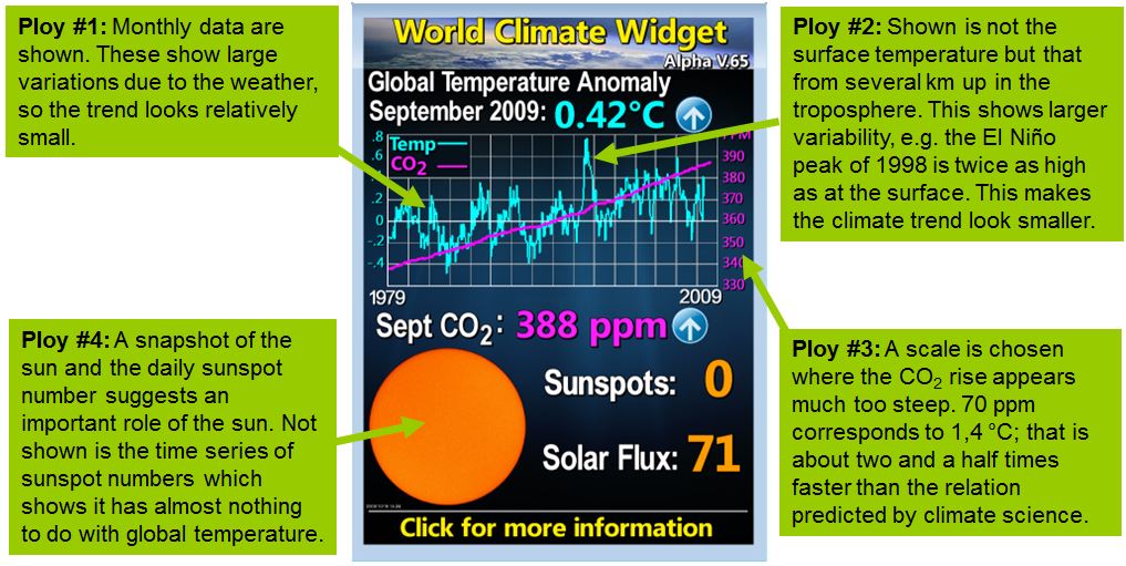
The “World Climate Widget” from Tony Watts’ blog is probably the most popular deceptive image among climate “skeptics”.  We’ll take it under the microscope and show what it would look like when done properly.

So called “climate skeptics” deploy an arsenal of misleading graphics, with which the human influence on the climate can be down played (here are two other  examples deconstructed at Realclimate).  The image below is especially widespread.  It is displayed on many “climate skeptic” websites and is regularly updated.

Watts_world_climate_widget

The “World Climate Widget” of US “climate skeptic” Anthony Watts with our explanations added.  The original can be found on Watts’ blog

What would a more honest display of temperature, CO2 and sunspots look like? [Read more…] about The most popular deceptive climate graph

Filed Under: Climate Science, Communicating Climate, Instrumental Record, skeptics, Sun-earth connections

A Well Deserved Honor

18 Oct 2011 by group

The rest of us here would like to congratulate Gavin on a well-deserved honor. He is the recipient of the inaugural AGU Climate Communication Prize. Since co-founding RealClimate back in 2004, Gavin has emerged as the de facto leader of RealClimate, having written the majority of our posts–and many of our best ones. One of his very first contributions “Michael Crichton’s State of Confusion” remains one of our most highly cited posts. One of his most recent, about what the recent CERN experiments do (and don’t) tell us about cloud processes, is a good example of his characteristic knack for explaining complex scientific issues with clarity and wit. Gavin also takes the lead role in dealing with the comments on RC posts. His almost non-stop, patient, response to the flood of comments that ensued in the week following the CRU email server hack in late 2009 impressed us all.

Gavin’s communication efforts, of course, go well beyond RealClimate. He is frequently quoted in mainstream news venues and often appears on radio and television news programs, to help communicate key aspects of climate science to the public. Here he is in an interview articulating both the science and the history of the science, and putting the recent politicizing of climate science into context. (It’s worth watching this interview to the end, by the way, for some thoughts on what you can do to improve communication of climate science.) He’s also produced a very accessible and beautiful book, Climate Change: Picturing the Science (with photographer Josh Wolfe).

Gavin’s efforts go well beyond the classic ‘public understanding of science’, since what he so successfully promotes is the ‘public understanding of research’. He makes it understandable and tangible how scientists work and think, not just what their results are. Gavin is a champion of easy access to data: see our Realclimate section on data sources. And, of course, a champion of making good use of the available data: see his many articles where he explains how particular questions (such as whether climate models agree with data) should not be speculated about but can be answered by anyone with basic skills simply by using publicly available data archives. Gavin’s work is often about empowering people to draw their own conclusions.

All of this is based on a solid foundation of his own scientific research: Gavin is a top-notch climatologist with an excellent publication record (h-index: 33), and we and our colleagues refer frequently to Gavin’s numerous papers in our own research and teaching. We only sometimes wonder whether his days have 30 hours, or how he finds the time to achieve all this.

Of course we’re a bit biased here at RealClimate, but it is truly hard to imagine a more deserving recipient for this award than Gavin.

Congratulations, once again, to our colleague and friend.

Mike Mann, Eric Steig, Stefan Rahmstorf, Jim Bouldin, Ray Pierrehumbert, David Archer, and the rest of RealClimate

Filed Under: Climate Science, Communicating Climate

AMOC slowdown: Connecting the dots

19 May 2016 by Stefan

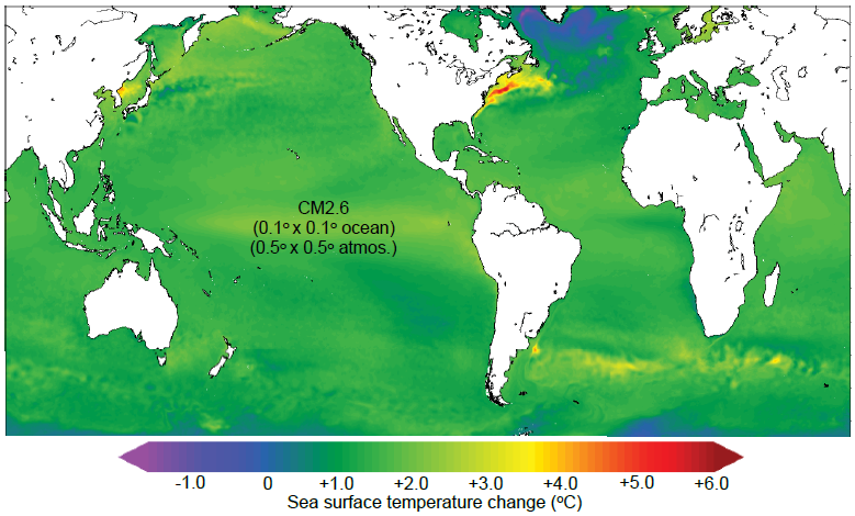
I want to revisit a fascinating study that recently came from (mainly) the Geophysical Fluid Dynamics Lab in Princeton. It looks at the response of the Atlantic Ocean circulation to global warming, in the highest model resolution that I have seen so far. That is in the CM2.6 coupled climate model, with 0.1° x 0.1° degrees ocean resolution, roughly 10km x 10km. Here is a really cool animation.

When this model is run with a standard, idealised global warming scenario you get the following result for global sea surface temperature changes.

Saba_Fig4

Fig. 1. Sea surface temperature change after doubling of atmospheric CO2 concentration in a scenario where CO2 increases by 1% every year. From Saba et al. 2016.

[Read more…] about AMOC slowdown: Connecting the dots

Filed Under: Climate Science, Oceans

A new sea level curve

14 Jan 2015 by Stefan

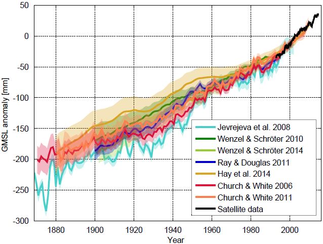
The “zoo” of global sea level curves calculated from tide gauge data has grown – tomorrow a new reconstruction of our US colleagues around Carling Hay from Harvard University will appear in Nature (Hay et al. 2015). That is a good opportunity for an overview over the available data curves. The differences are really in the details, the “big picture” of sea-level rise does not change. In all curves, the current rates of rise are the highest since records began.

The following graph shows the new sea level curve as compared to six known ones.

haysl1

Fig 1 Sea level curves calculated by different research groups with various methods. The curves show the sea level relative to the satellite era (since 1992). Graph: Klaus Bittermann.

All curves show the well-known modern sea level rise, but the exact extent and time evolution of the rise differ somewhat. Up to about 1970, the new reconstruction of Hay et al. runs at the top of the existing uncertainty range. For the period from 1880 AD, however, it shows the same total increase as the current favorites by Church & White. Starting from 1900 AD it is about 25 mm less. This difference is at the margins of significance: the uncertainty ranges overlap. [Read more…] about A new sea level curve

References

  1. C.C. Hay, E. Morrow, R.E. Kopp, and J.X. Mitrovica, "Probabilistic reanalysis of twentieth-century sea-level rise", Nature, vol. 517, pp. 481-484, 2015. http://dx.doi.org/10.1038/nature14093

Filed Under: Climate Science, Instrumental Record, Oceans

What’s going on in the North Atlantic?

23 Mar 2015 by Stefan

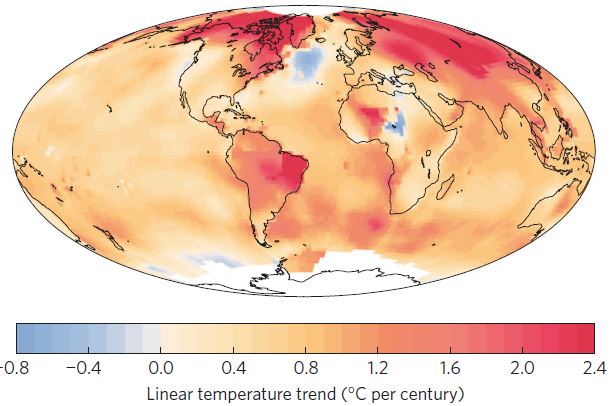
The North Atlantic between Newfoundland and Ireland is practically the only region of the world that has defied global warming and even cooled. Last winter there even was the coldest on record – while globally it was the hottest on record. Our recent study (Rahmstorf et al. 2015) attributes this to a weakening of the Gulf Stream System, which is apparently unique in the last thousand years.

The whole world is warming. The whole world? No! A region in the subpolar Atlantic has cooled over the past century – unique in the world for an area with reasonable data coverage (Fig. 1). So what’s so special about this region between Newfoundland and Ireland?

Rahmstorf_2015_1rc

Fig. 1 Linear temperature trend from 1900 to 2013. The cooling in the subpolar North Atlantic is remarkable and well documented by numerous measurements – unlike the cold spot in central Africa, which on closer inspection apparently is an artifact of incomplete and inhomogeneous weather station data.

[Read more…] about What’s going on in the North Atlantic?

Filed Under: Climate Science

The AMOC: tipping this century, or not?

25 Aug 2023 by Stefan

A few weeks ago, a study by Copenhagen University researchers Peter and Susanne Ditlevsen concluded that the Atlantic Meridional Overturning Circulation (AMOC) is likely to pass a tipping point already this century, most probably around mid-century. Given the catastrophic consequences of an AMOC breakdown, the study made quite a few headlines but also met some skepticism. Now that the dust has settled, here some thoughts on the criticisms that have been raised about this study.

I’ve seen two main arguments there.

1. Do the data used really describe changes in AMOC?

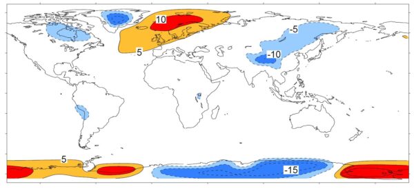
We have direct AMOC measurements only since 2004, a time span too short for this type of study. So the Ditlevsens used sea surface temperatures (SST) in a region between the tip of Greenland and Britain as an indicator, based on Caesar et al. 2018 (PDF; I’m a coauthor on that paper). The basic idea starts with the observation that this region is far warmer than what is normal for that latitude, because the AMOC delivers a huge amount of heat into the area. The following chart which I made 25 years ago illustrates this.

Temperature deviation relative to the average along each latitude circle (i.e. the zonal mean). The northern Atlantic region air temperature is a lot too warm for its latitude, which (in models) largely goes away when the AMOC is stopped. From Rahmstorf and Ganopolski 1999.

If the AMOC weakens, this region will cool. And in fact it is cooling – it’s the only region on Earth which has cooled since preindustrial times. This is commonly referred to as ‘warming hole’ or ‘cold blob’.

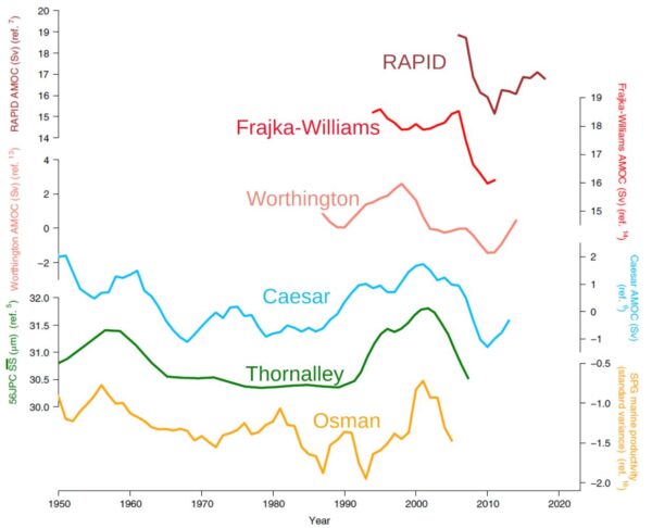
We argued in Caesar et al. that the sea surface temperature there in winter is a good index of AMOC strength, based on a high-resolution climate model. (Not in summer when the ocean is covered by a shallow surface mixed layer heated by the sun and highly dependent on weather conditions.) We checked this across other climate models and found that our AMOC index (i.e. based on SST in the ‘cold blob’ region) and the actual AMOC slowdown correlated highly there (correlation coefficient R=0.95).

There are some other indicators, either using measured ocean salinities or using various types of proxy data from sediment cores, e.g. sediment grain sizes at the ocean bottom as indicators of flow speed of the deep southward AMOC branch. The key point to me is: these different indicators provide rather consistent AMOC reconstructions, as we showed in Caesar et al. 2021. The sediment data go back further in time but are likely not as reliable and don’t reach up to the present.

For recent decades there are potentially better approaches like ocean state estimates, and those are also consistent with the SST fingerprint – but these don’t go back far enough in time for the Ditlevsen type of study. The next graph shows a comparison of different reconstructions for the relevant time period used in the Ditlevsen study.

A comparison of direct observational AMOC data (RAPID) and two recent reconstructions to both the SST-based AMOC index (blue, used by the Ditlevsens) and two paleo-proxies that extend into the twenty-first century: the sortable-silt data and the marine productivity data. From Caesar et al. 2022.

Reconstructions based on salinity may also be good but they depend on precipitation, a notoriously variable quantity so it is rather doubtful whether analysing variance of salinity is doing any better than the SST signal.

The argument has been made that the ‘cold blob’ might not be caused by an AMOC decline but by heat loss at the ocean surface. That’s easy to check: if that were the case, then cooling in the area would be linked to increased heat loss at the surface. But if the AMOC is the culprit, then less heat should be lost, as a cooler ocean surface due to reduced ocean heat transport will lose less heat. The reanalysis data show the latter is the case.

This was shown by Halldór Björnsson of the Icelandic weather service and presented at the Arctic Circle conference 2016. I discussed this here in 2016 and also in my 2018 RealClimate article “If you doubt that the AMOC has weakened, read this”, together with possible other alternative explanations of the ‘cold blob’. We have recently repeated Halldór’s analysis at PIK and got the same results.

My conclusion: for the past century or so the SST data are probably the best AMOC indicator we have, and I don’t see concrete evidence suggesting that it’s unreliable.

2. The Ditlevsen study assumes that the AMOC follows a quadratic curve when approaching the tipping point.

That’s a more technical criticism. Their assumption follows from Stommel’s 1961 simple model of the AMOC tipping point. It results from the basic idea that (a) AMOC changes are proportional to density changes, and (b) the density change results from a balance between freshwater input and AMOC salt transport to the deep water formation (i.e. ‘cold blob’) region. Combined, these two assumptions lead to a quadratic equation.

These are very plausible basic assumptions, albeit using a linear equation of state, but we all know you can linearize things around a given point to get a first-order estimate. The argument that this is “too simple” doesn’t mean it’s wrong; rather this is correct at least to first order.

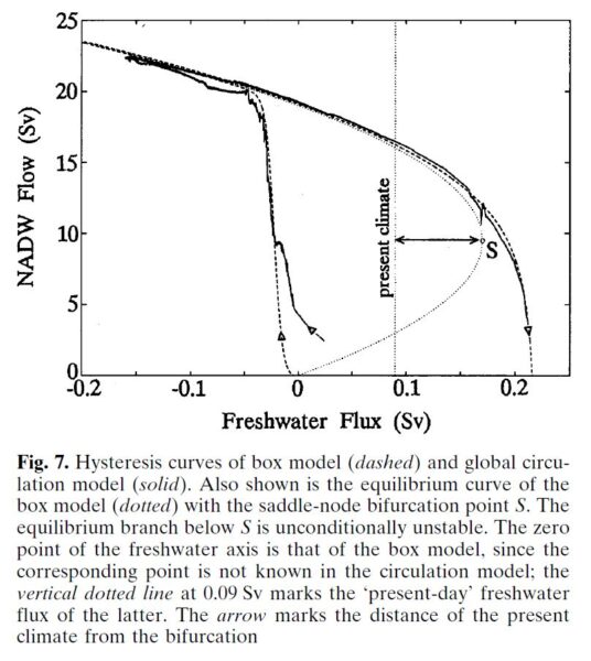
In a 1996 study I compared the results of a quadratic box model response to a fully-fledged 3D primitive equation ocean circulation model with nonlinear equation of state, the MOM model of the Geophysical Fluid Dynamics Lab in Princeton. It looks like this.

The AMOC strength (vertical axis) is shown as it depends on freshwater input (rain, meltwater) into the northern Atlantic. The box model equilibrium is shown as dotted parabola, the tipping point is S. By global warming we move from a past equilibrium toward the right – the box model run is the dashed line, the global ocean circulation model run is the solid line. Relevant is the upper branch, moving towards the right approaching the tipping point. From Rahmstorf (1996, PDF).

You can’t get a much better fit than that. A similar quadratic shape has also been found by Henk Dijkstra’s group at Utrecht University in a state-of-the-art global climate model, the CESM model (yet to be published). I have not seen any concrete evidence by the critics suggesting the shape may not be quadratic; that seems to be a purely hypothetical possibility. Also, if it is not exactly quadratic, the stated uncertainty range will be larger but it doesn’t fundamentally change the result.

What does it all mean?

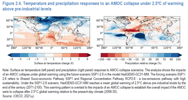
An AMOC collapse would be a massive, planetary-scale disaster. Some of the consequences: Cooling and increased storminess in northwestern Europe, major additional sea level rise especially along the American Atlantic coast, a southward shift of tropical rainfall belts (causing drought in some regions and flooding in others), reduced ocean carbon dioxide uptake, greatly reduced oxygen supply to the deep ocean, likely ecosystem collapse in the northern Atlantic, and others. Check out the OECD report Climate Tipping Points which is well worth reading, and the maps below. You really want to prevent this from happening.

A figure from the recent OECD report Climate Tipping Points, showing how an AMOC shutdown after 2.5 °C global warming would change temperature (left) and precipitation (right) around the world.

We know from paleoclimatic data that there have been a number of drastic, rapid climate changes with focal point in the North Atlantic due to abrupt AMOC changes, apparently after the AMOC passed a tipping point. They are known as Heinrich events and Dansgaard-Oeschger events, see my review in Nature (pdf).

The point: it is a risk we should keep to an absolute minimum.

In other words: we are talking about risk analysis and disaster prevention. This is not about being 100% sure that the AMOC will pass its tipping point this century; it is that we’d like to be 100% sure that it won’t. Even if there were just (say) a 40% chance that the Ditlevsen study is correct in the tipping point being reached between 2025 and 2095, that’s a major change to the previous IPCC assessment that the risk is less than 10%. Even a <10% chance as of IPCC (for which there is only “medium confidence” that it’s so small) is in my view a massive concern. That concern has increased greatly with the Ditlevsen study – that is the point, and not whether it’s 100% correct and certain.

Would you live in a village below a dammed lake if you’re told there is a one in ten chance that one day the dam will break and much of the village will be washed away? Would you say: “Not to worry, that’s 90 % chance it won’t happen?” Or would you demand action by the authorities to reduce the risk? What if a new study appears, experienced scientists, reputable journal, that says it is nearly certain that the dam will break, the question is only when? Would you demand immediate attention to mitigate this danger, or would you say: “Oh well, some have questioned whether the assumptions of this study are entirely correct. Let’s just assume it is wrong”?

For the AMOC (and other climate tipping points), the only action we can take to minimise the risk is to get out of fossil fuels and stop deforestation as fast as possible. One major assumption of the Ditlevsen study is that global warming continues as in past decades. That is in our hands – or more precisely, that of our governments and powerful corporations. In 2022, the G20 governments alone subsidised fossil fuel use with 1.4 trillion dollars, up by 475% above the previous year. They aren’t trying to end fossil fuels.

Yet, as soon as we reach zero emissions, global warming will stop within years, and the sooner this happens the smaller the risk of passing tipping points. It also minimises lots of other losses, damages and human suffering from “regular” global warming impacts, which are already happening all around us even without passing major climate tipping points.

Links

For more on this, see my long TwiX thread with many images from relevant studies.

What is happening in the Atlantic Ocean to the AMOC?

If you doubt that the AMOC has weakened, read this

AMOC slowdown: Connecting the dots

And for even more, just enter “AMOC” into the search field of this blog!

Filed Under: Climate Science, Featured Story Tagged With: AMOC, climate change

Extreme metrics

18 Aug 2012 by Gavin

There has been a lot of discussion related to the Hansen et al (2012, PNAS) paper and the accompanying op-ed in the Washington Post last week. But in this post, I’ll try and make the case that most of the discussion has not related to the actual analysis described in the paper, but rather to proxy arguments for what people think is ‘important’.
[Read more…] about Extreme metrics

References

  1. J. Hansen, M. Sato, and R. Ruedy, "Perception of climate change", Proceedings of the National Academy of Sciences, vol. 109, 2012. http://dx.doi.org/10.1073/pnas.1205276109

Filed Under: Climate impacts, Climate Science, statistics

Revealed: Secrets of Abrupt Climate Shifts

8 Nov 2006 by Stefan

This story is the dream of every science writer. It features some of the most dramatic and rapid climate shifts in Earth’s history, as well as tenacious scientists braving the hostile ice and snows of Greenland and Antarctica for years on end to bring home that most precious material: kilometre-long cores of ancient ice, dating back over a hundred thousand years. Back in their labs, these women and men spend many months of seclusion on high-precision measurements, finding ingenious ways to unravel the secrets of abrupt climate change. Quite a bit has already been written on the ice core feat (including Richard Alley’s commendable inside story “The Two Mile Time Machine”), and no doubt much more will be.

It was the early, pioneering ice coring efforts in Greenland in the 1980s and 90s that first revealed the abrupt climate shifts called “Dansgaard-Oeschger events” (or simply DO events), which have fascinated and vexed climatologists ever since. Temperatures in Greenland jumped up by more than 10 ºC within a few decades at the beginning of DO events, typically remaining warm for several centuries after. This happened over twenty times during the last great Ice Age, between about 100,000 and 10,000 years before present.

The latest results of the EPICA team (the European Project for Ice Coring in Antarctica) are published in Nature today (see also the News & Views by RealClimate member Eric Steig). Their data from the other pole, from the Antarctic ice sheet, bring us an important step closer to nailing down the mechanism of the mysterious abrupt climate jumps in Greenland and their reverberations around the world, which can be identified in places as diverse as Chinese caves, Caribbean seafloor sediments and many others. So what are the new data telling us?
[Read more…] about Revealed: Secrets of Abrupt Climate Shifts

Filed Under: Climate Science, Greenhouse gases, Oceans, Paleoclimate

  • « Go to Previous Page
  • Page 1
  • Page 2
  • Page 3
  • Page 4
  • Interim pages omitted …
  • Page 35
  • Go to Next Page »

Primary Sidebar

Search

Search for:

Email Notification

get new posts sent to you automatically (free)
Loading

Recent Posts

  • Unforced variations: July 2025
  • Unforced variations: Jun 2025
  • Predicted Arctic sea ice trends over time
  • The most recent climate status
  • Unforced variations: May 2025
  • Unforced Variations: Apr 2025

Our Books

Book covers
This list of books since 2005 (in reverse chronological order) that we have been involved in, accompanied by the publisher’s official description, and some comments of independent reviewers of the work.
All Books >>

Recent Comments

  • nigelj on Unforced variations: July 2025
  • jgnfld on Unforced variations: July 2025
  • jgnfld on Unforced variations: July 2025
  • zebra on Unforced variations: July 2025
  • David on Unforced variations: July 2025
  • Barry E Finch on Unforced variations: July 2025
  • Barry E Finch on Unforced variations: July 2025
  • Barton Paul Levenson on Unforced variations: July 2025
  • Barton Paul Levenson on Unforced variations: July 2025
  • zebra on Unforced variations: July 2025
  • Susan Anderson on Unforced variations: July 2025
  • Dan on Unforced variations: July 2025
  • CherylJosie on Unforced variations: July 2025
  • zebra on Predicted Arctic sea ice trends over time
  • CherylJosie on Unforced variations: July 2025
  • jgnfld on Unforced variations: July 2025
  • The Prieto Principle on Unforced variations: July 2025
  • Julian on Unforced variations: July 2025
  • The Prieto Principle on Unforced variations: July 2025
  • The Prieto Principle on Unforced variations: July 2025

Footer

ABOUT

  • About
  • Translations
  • Privacy Policy
  • Contact Page
  • Login

DATA AND GRAPHICS

  • Data Sources
  • Model-Observation Comparisons
  • Surface temperature graphics
  • Miscellaneous Climate Graphics

INDEX

  • Acronym index
  • Index
  • Archives
  • Contributors

Realclimate Stats

1,368 posts

11 pages

244,310 comments

Copyright © 2025 · RealClimate is a commentary site on climate science by working climate scientists for the interested public and journalists.